Mucho's identity for a holiday rental startup goes 'over the moon' to suggest pain-free family trips
Global studio Mucho is behind the name and identity of Overmoon, a holiday rental startup that offers family-orientated rentals owned and run by them. The inspiration behind the fresh brand is based on the British phrase, 'over the moon'.
Booking holidays was always a bit of a nightmare pre-pandemic, but since the world shut down for a while, finding something perfect for your family is, not surprisingly, a tad stressful these days. Enter Overmoon, a holiday rental startup that promises its collection of properties will provide all the comforts of home with the joy (and reliability) of your favourite hotel.
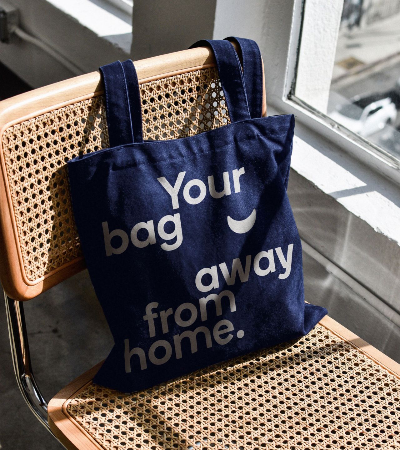
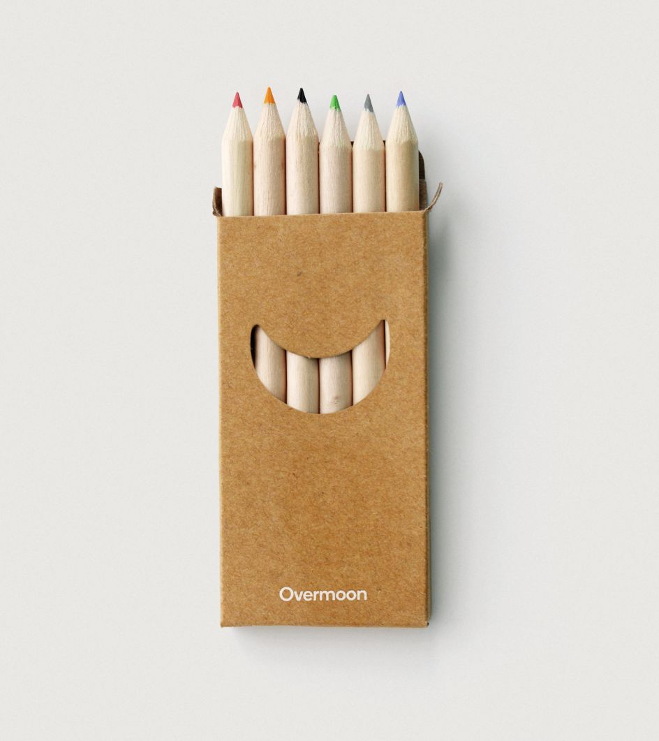
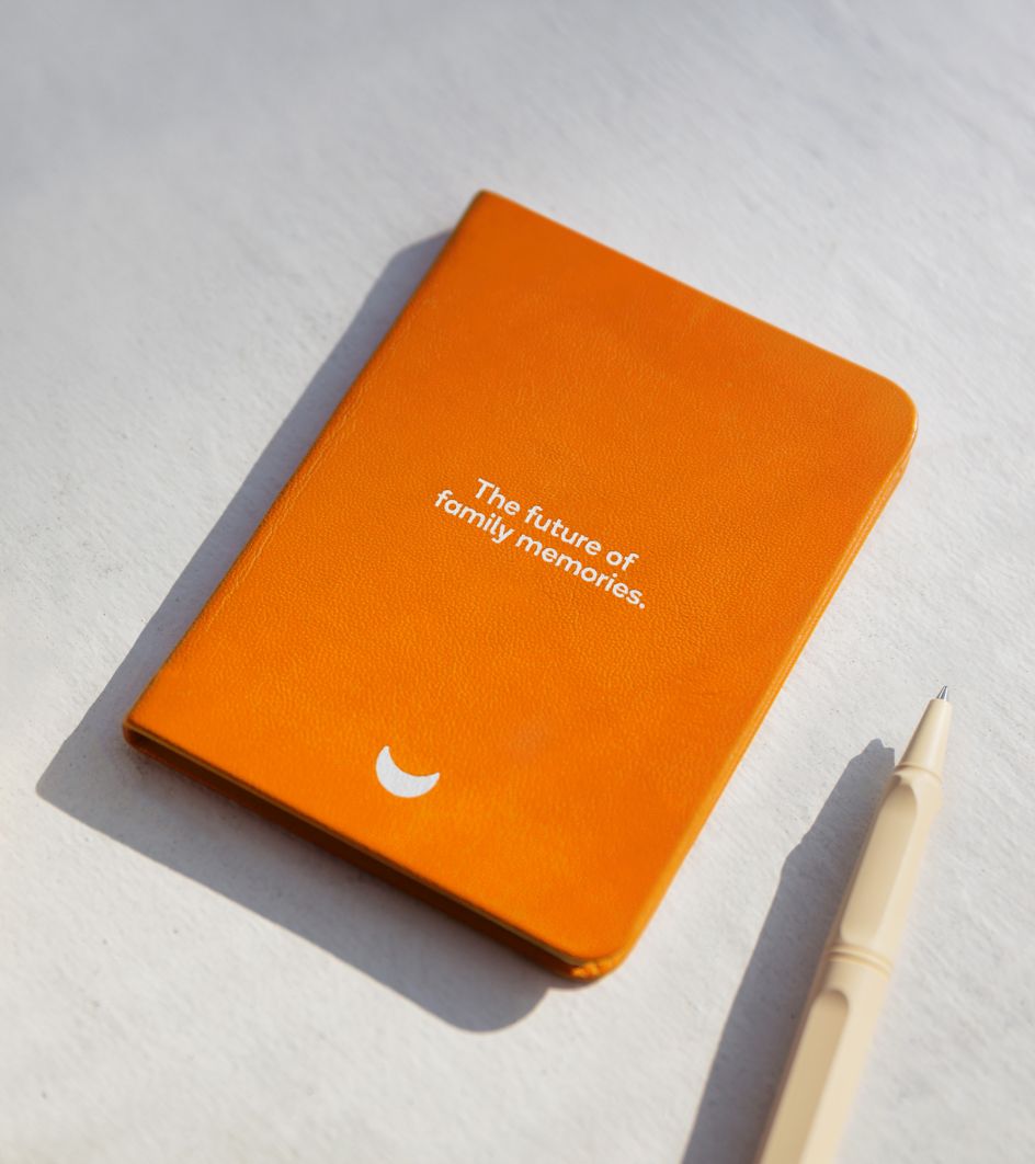
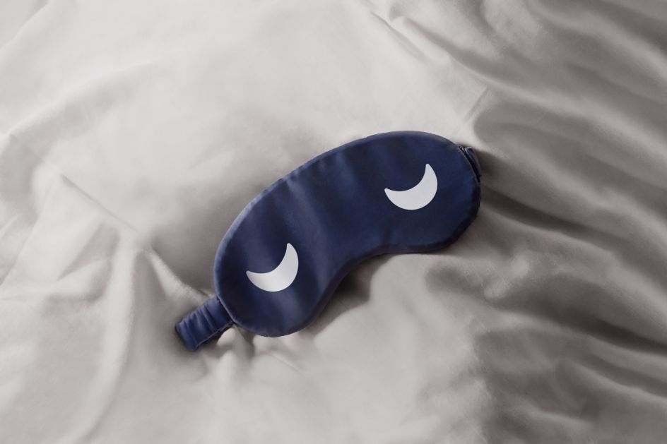
With this in mind, Mucho crafted an identity based on the joy of a holiday made easy. Understanding the pain points of family breaks with children, Mucho created the name Overmoon with A Hundred Monkeys, inspired by the cheeky British phrase 'over the moon'. This informed the symbol for the brand: a bold yet simple crescent moon that flips over to become a smile, hinting at the joys of a stay with Overmoon.

The supporting wordmark uses Boing by A2-Type, a sans serif font with subtle rounded corners, which only adds to the friendly roundedness of the symbol and gives the brand a soft and approachable feel. Rounded characteristics were then carried through other elements of the brand, such as the website and icon design, to create a cohesive visual experience. The accompanying colour palette is inspired by the night sky, hinting at comfort and calm – a chance to escape the occasional pains of modern life.
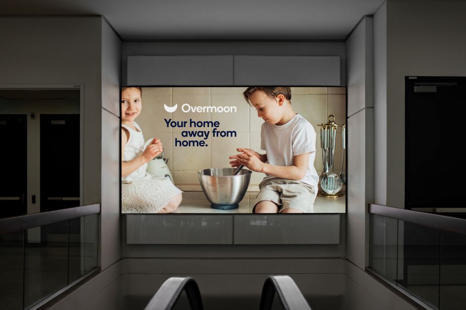
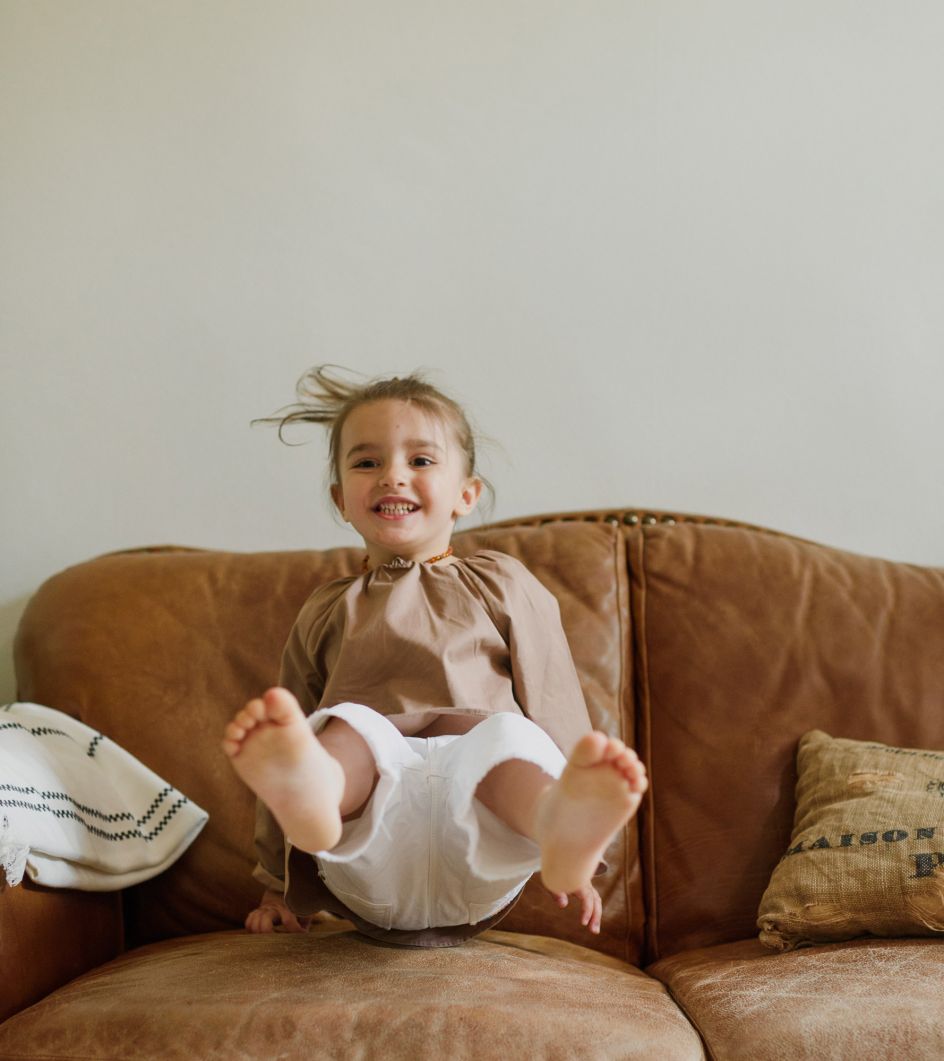
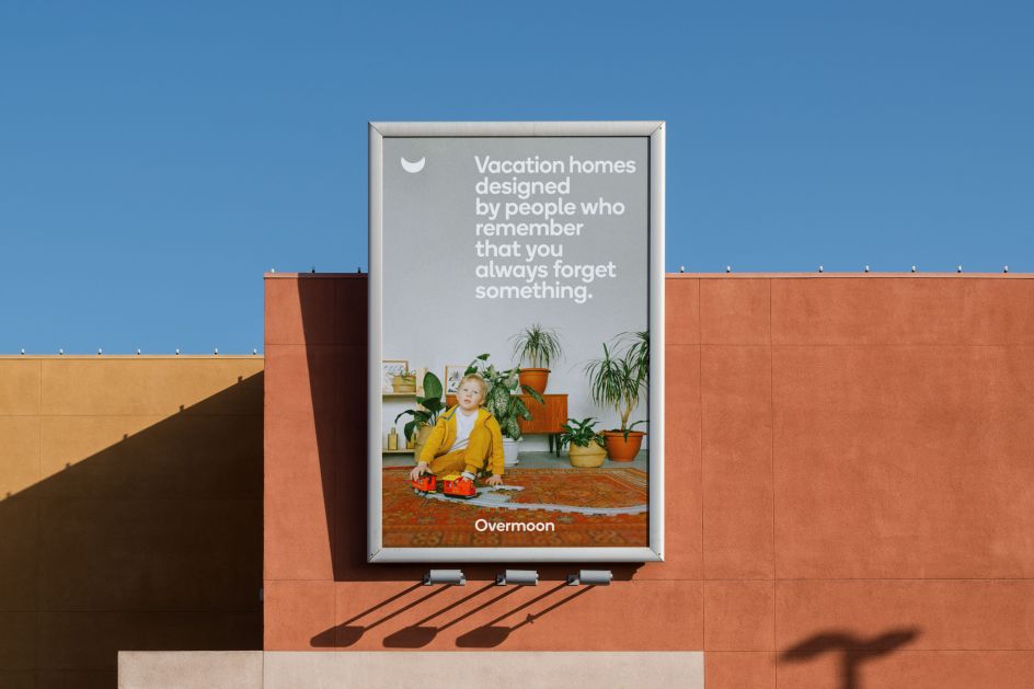
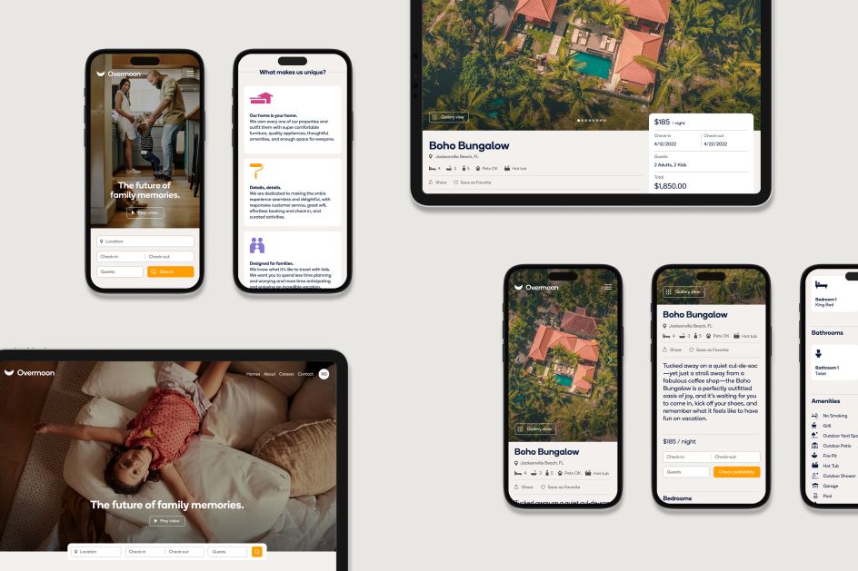
To hit home how guests might feel when enjoying a holiday with Overmoon, Mucho created a series of 'DIY' photography that suggests the kind of pictures families might capture of one another during a break. The homemade imagery style seeks to emulate those special, everyday moments we might share with loved ones and steers away from the industry standard, stereotypical stock photography of families on holiday.
Of course, the core of Overmoon is to develop trust with guests and the idea that a holiday with the startup will cater to everything you and your family might need. As such, Mucho developed a messaging system and tone of voice that's personable, trustworthy, and family-oriented. The headlines add a little cheekiness and have a slight twist to bring fun to the identity.
From the friendly icon and calming colour palette to the softly rounded typography and charming messaging, all these elements together form a visual identity that hopes to appeal to young families looking for a stress-free holiday.
"Having travelled with children, I completely understood the challenges and pain points that Overmoon were trying to overcome," says Rob Duncan, creative director at Mucho. "I immediately fell in love with what they are building. I think Mucho's curiosity and dedication to creating a memorable identity that connects with families, in particular, shows through in a charming and playful way. I would definitely want to stay here with my family."
The Overmoon identity has been rolled out to all touchpoints, including a brand new website that features friendly icons alongside the nighttime palette and deliberately homemade photography that we see elsewhere on brochures, posters, and other marketing materials.
Editor's Picks


Trending


](https://www.creativeboom.com/upload/articles/90/908fdb6378db1e95d12595416f54e6336d5e80b8_732.jpg)
Podcasts


Editor's Picks
Further Reading