B&B Studio creates identity for Humans Being, Rita Ora's new sustainable and style-conscious athleisure brand
London-based design agency B&B Studio has created the brand identity for Rita Ora's new athleisure brand Humans Being, which champions using sustainable materials across all its products and delivering high-level technical performance.
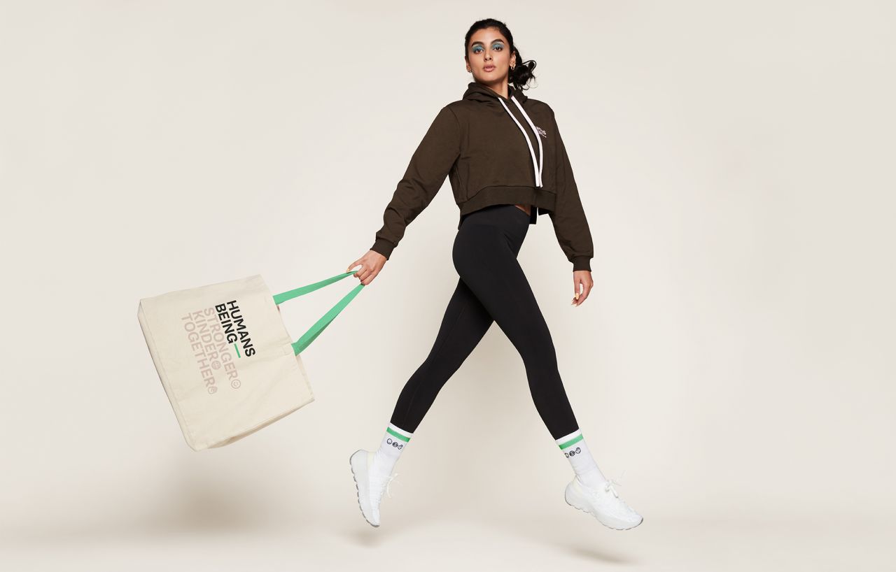
Photography that does not compromise on style is a key component of the brand
Sustainability is the word on everyone's lips as COP27 kicks off in Egypt, and one brand that's trying to make a positive change is Humans Being. Founded by pop star Rita Ora, the clothing range, which sells leggings, tops, bras and sweats made from recycled materials, has a "purposeful commitment to people and planet". This mission statement is reflected in the new branding produced by B&B Studio.
The decision to work with B&B Studio was a canny one. The agency is committed to creating brands that matter and make a difference, evident in everything from the imagery to the name they came up with for Humans Being. B&B Studio wanted to create an identity that conveyed "a sense of community, team spirit and proactivity". Thanks to a clever yet subtle rearrangement of the term human beings, they've elegantly captured the brand's whole ethos.
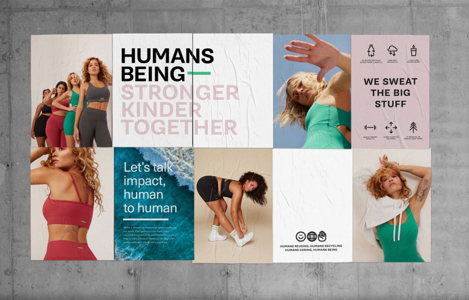
The brand identity by B&B Studio uses simple and accessible imagery
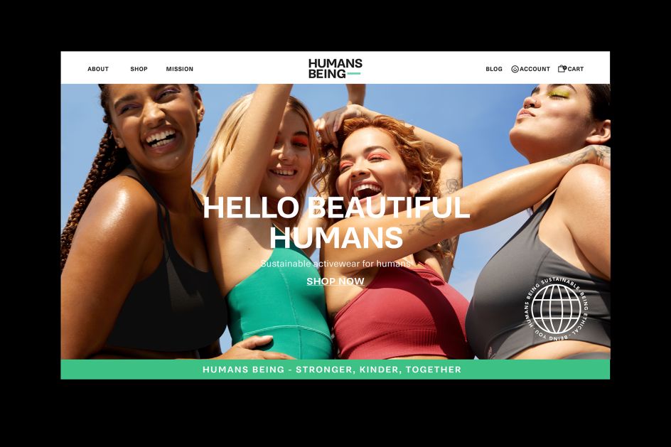
The new website for Humans Being
Simplicity and accessibility appear to be the foundation of the Humans Being brand identity, which includes a website design, bespoke logo, videos and photography, all of which take a stripped-back approach.
Jennie Potts, Associate Creative Director at B&B studio, reveals that getting all of these elements to pull together in the same direction was an enjoyable hurdle. "Crafting an identity able to work across communications platforms but also on the garments themselves was a brilliant challenge for our team to take on," she says. "Seeing the brand come to life on clothes - worn by a community of humans - has been incredibly rewarding."
It's not just the clothing where the brand comes to life. Take the logo, realised through clear typography and bold uppercase letterforms, along with a subtle nod to dynamism and movement within the M and the G.
Supporting this lettering is a vibrant mint green dash which underpins the whole brand. This design is a key visual asset that also serves as a "visible brand signifier" on the garments themselves. Think of it as Humans Being's answer to the Nike swoosh, the only one which proudly weaves its eco-credentials into the design.
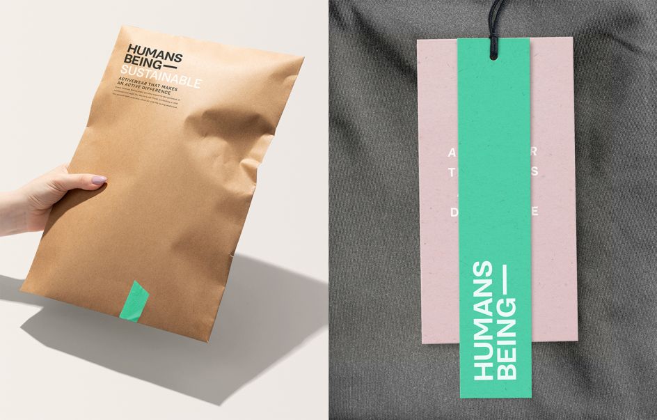
A cool mint colour brings the whole brand together
According to Shaun Bowen, B&B's co-founder and creative partner, bringing together fashion and sustainability awareness – not always the most comfortable of bedfellows – was a key factor when taking on the project: "It's important for everyone at B&B that we work with brands who are committed to doing things better," he explains.
"From changing perceptions around fast fashion to actively working to preserve rainforest habitats, Humans Being is exactly the kind of brave and brilliant brand we're proud to help create."
Propping up the brand's visuals is a series of three pillars that sum up its beliefs: Stronger, Kinder, and Together. These pillars represent the brand's philosophy, which extends from celebrating strength to protecting the planet and people supporting each other. They also take the shape of circular icons on the site, inspired by founder and chief creative officer Rita Ora's smiley face tattoo.
A good brand would be nowhere without good products, though, and fortunately, that's exactly what Humans Being has. Its range of multipurpose garments is designed to take people from the gym to the coffee shop and beyond, safe in the knowledge that they're helping the planet while doing so.
It was important for B&B Studio not to compromise its style credentials while creating the identity, hence why the art direction for the broader brand world leans on candid photography, which focuses on relaxed moments and fashion-inspired styling, as well as the more expected fitness shots.
Christopher Money, co-founder and director at Humans Being, thinks that all of the elements of the brand have been balanced perfectly: "As a long-term collaborator with B&B, I was keen to work with the team again on this exciting brand creation project, he says. "We're all thrilled with the result and can't wait to see it out in the world."
Editor's Picks


Trending


Podcasts


Editor's Picks
Further Reading