Minimal, striking designs of a philosophical nature
It can’t be easy designing for as diverse a bunch as a group of philosophers, designers, artists, scientists, and critical and creative practitioners; each would surely have very different ideas around what works and doesn't, and why.
But that was the task faced by Munich-based studio Moby Digg when it took on creating the new branding and website design and development for The Center for Philosophical Technologies, or CPT for short.
CPT is a strategic initiative from Arizona State University that looks to broadly examine the relationship between philosophical ideas and the rapid tech developments over the 21st century and into the future, such as advancements in AI, biotechnology, ecological communication, and community building.
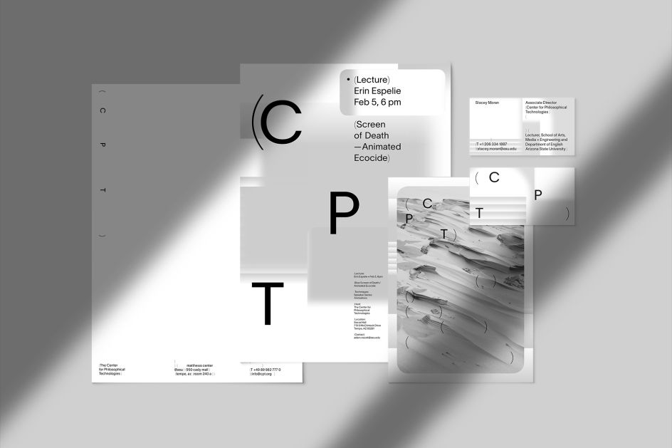
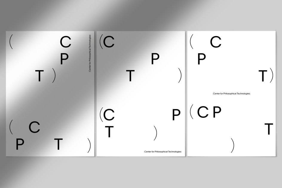
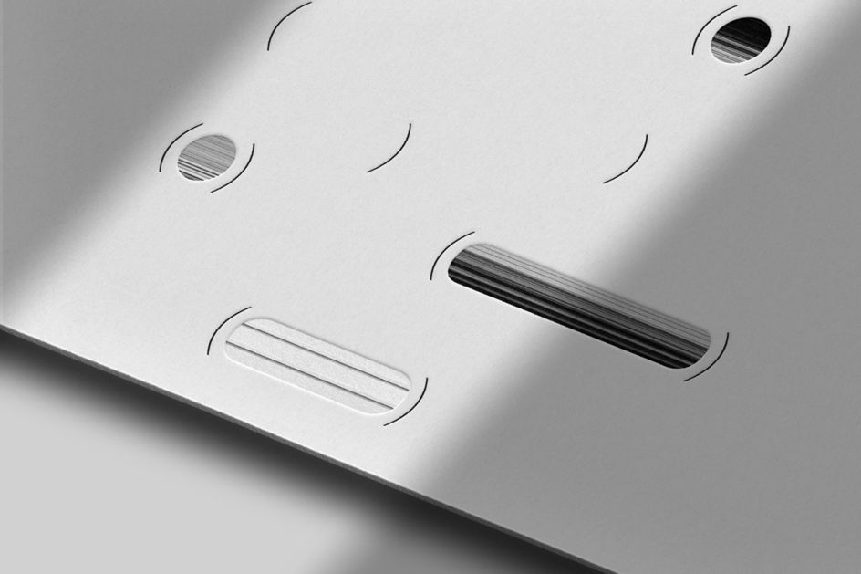
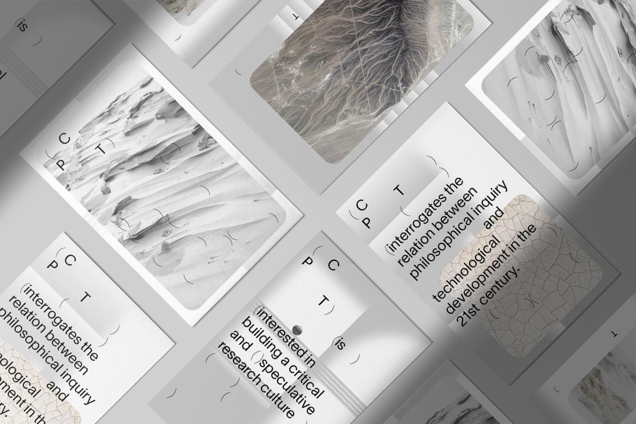
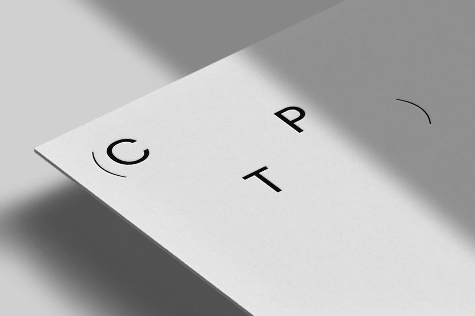
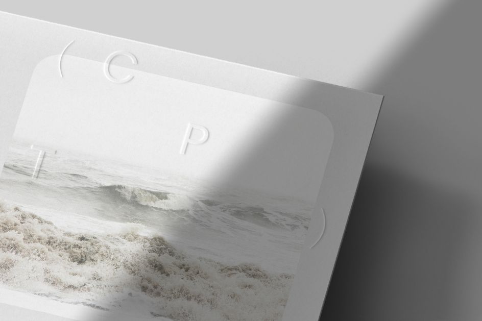
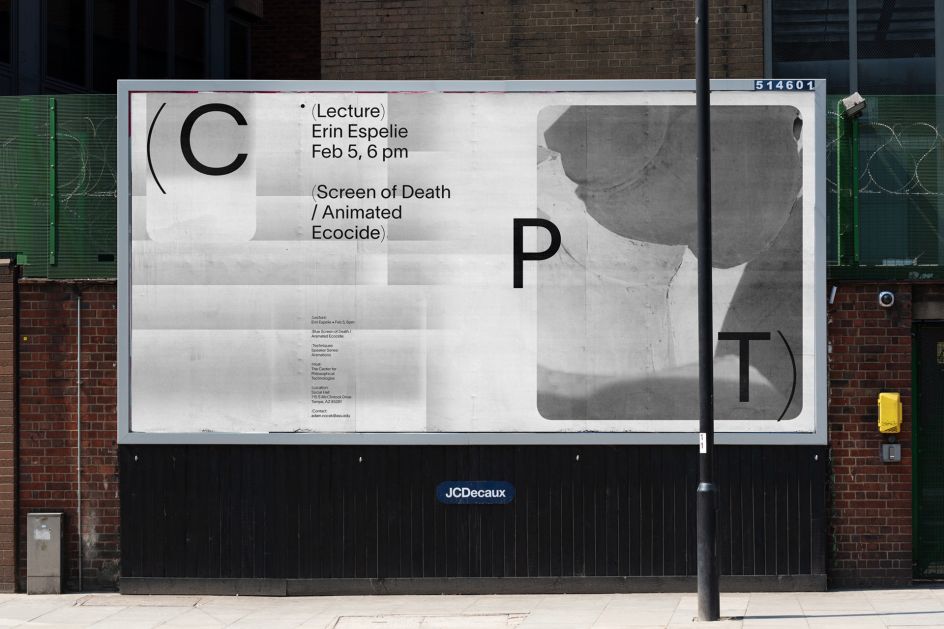
Moby Digg’s logo design aims to reflect the centre’s "dynamic DIY approach," says the studio. It’s based around the letters CPT; each of which can be arranged in various ways across a mutable design system framed within parentheses.
"Our research into language and expression of ideas through typography led the conceptual rediscovery of parentheses," says Moby Digg. "They allow writers the freedom to provide additional and clarifying information, inserting relevant thought, always providing context and content."
The variable branding system means it can be used across static and animated applications according to different contexts and spacial formats.
For the website design, the backgrounds look to represent Arizona's desert landscape and horizons. "We used blur to emphasise the intersection of disciplines at CPT and the vast information clouds those disciplines are made of," says Moby Digg. The website also uses floating forms to "show an abstracted version of the constantly moving (philosophical) thinking process."
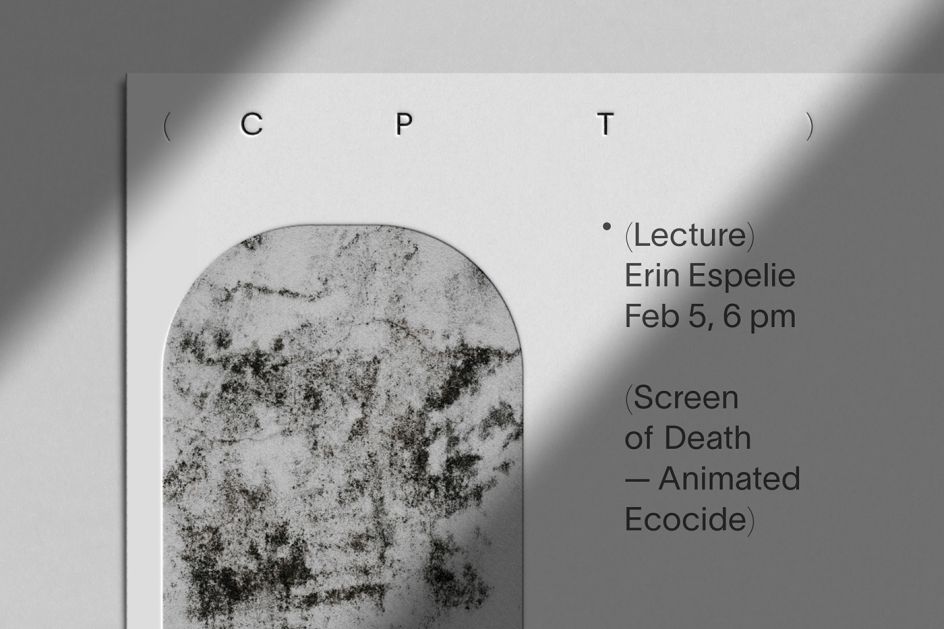
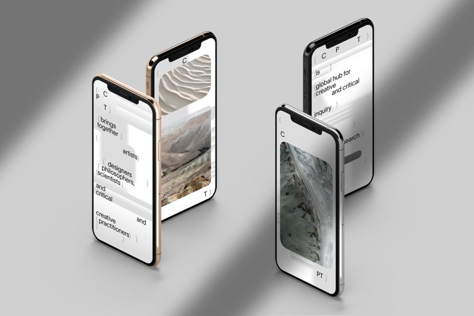
These website backgrounds work alongside animations and abstract images that "almost blend in with the background allows readers to think about new associations between the text, background and images" while making large blocks of text as accessible as possible without losing legibility.
The studio adds, "The resulting compositions of the logo, loose type and bubbles create a brand identity that should invite free associations in the poetic vastness of philosophy."
Editor's Picks


Trending


](https://www.creativeboom.com/upload/articles/90/908fdb6378db1e95d12595416f54e6336d5e80b8_732.jpg)
Podcasts


Editor's Picks
Further Reading