Midday's work for Everiday helps launch the whole foods brand into America
In a bold move to redefine the global pantry, Midday has unveiled its latest creative work: the rebranding of the Singapore-based whole foods company, now christened Everiday. We find out more.
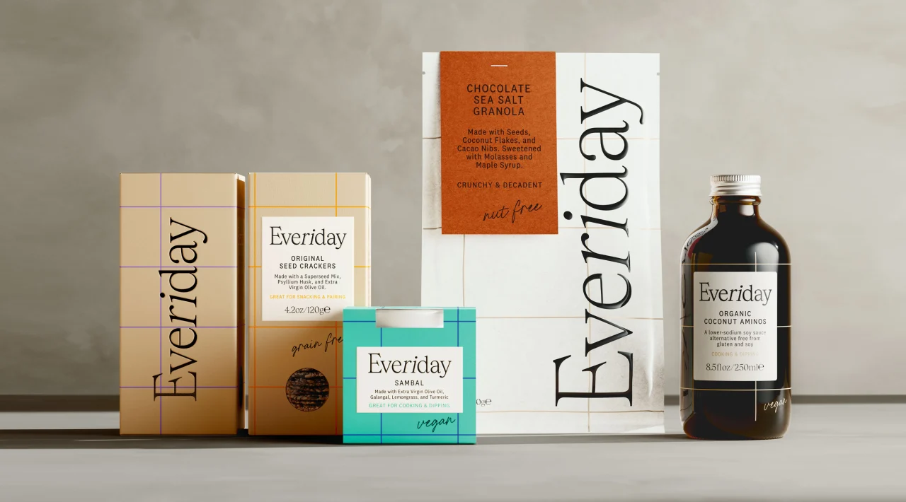
The rebranding by London studio Midday is part of Everiday's ambitious move into the US and international markets, with a vision to revolutionise pantry shelves worldwide by offering premium products in the competitive space.
The brand's journey from its original identity, 'Foods by Ri', to its new moniker, Everiday, marks a pivotal shift. Everiday aims to elevate the "everyday dining experience", rooted in the philosophy of offering "Whole Foods the Whole Time". Founded by the globe-trotting nutritionist Riyana Rupani, Everiday is a testament to the richness of global culinary traditions, offering a range of staple foods that are not only delicious but also made with the finest ingredients for a healthier choice. We're talking about the finest, better-for-you ingredients, from wholesome granola to delicious condiments.
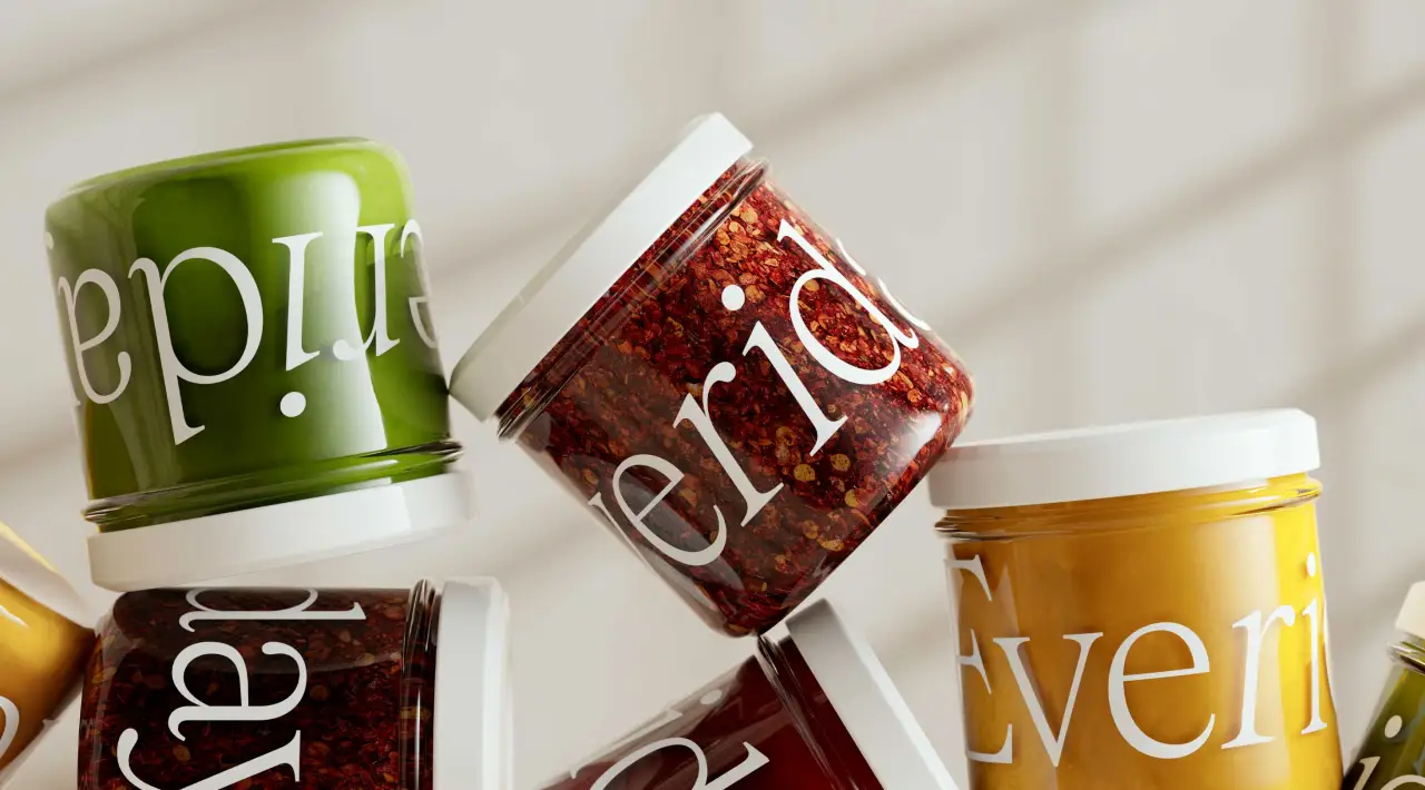
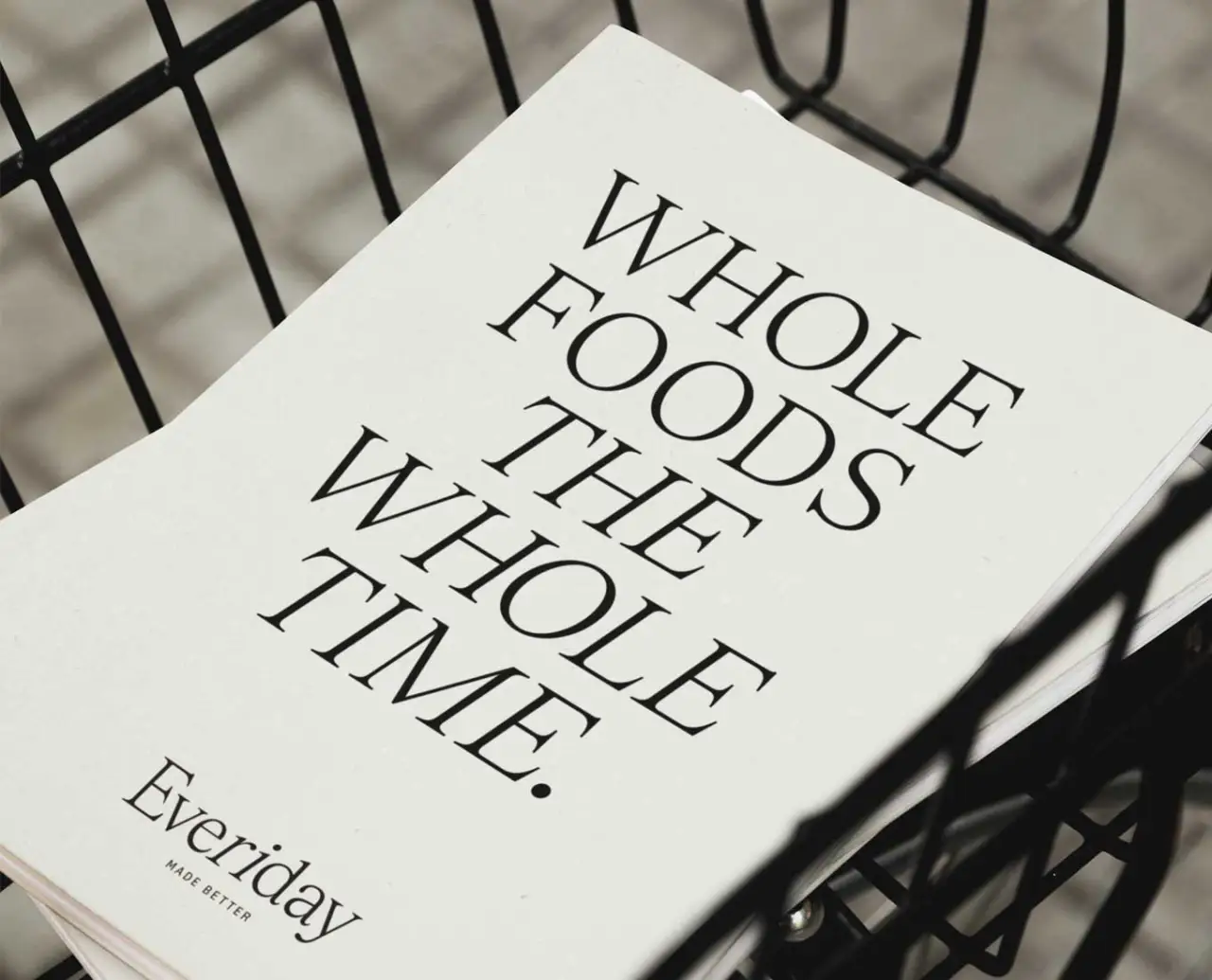
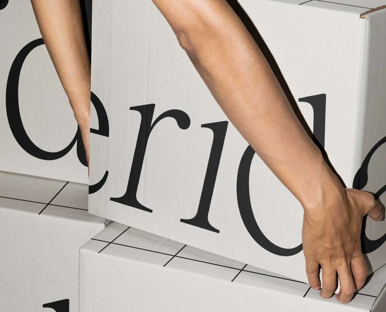
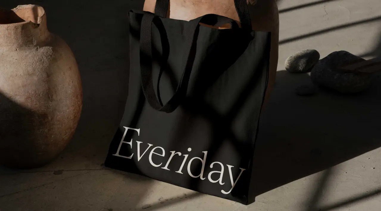
Midday's innovative design strategy builds on this mission and introduces a modular system that anticipates rapid growth across diverse product categories. Its approach perfectly aligns with Everiday's aspirations to enhance everyone's pantry shelves.
A unique calendar grid motif is central to the new visual identity, symbolising the brand's dedication to "making every day count". This design, which sits in harmony with the typographic logo, is versatile enough for broad application, from packaging to promotional materials, fostering a cohesive yet dynamic brand image.
Meanwhile, the primary packaging is deliberately bold, emphasising the key brand elements for instant recognition. We especially love the choice of typography, a classic serif dripping in confident style. The colour palette feels appetising, hinting at organic foods and earthy flavours. This is complemented by customised secondary labels and wraps, which detail each product's unique characteristics – a nice detail that gives extra credit to the brand's strengths.

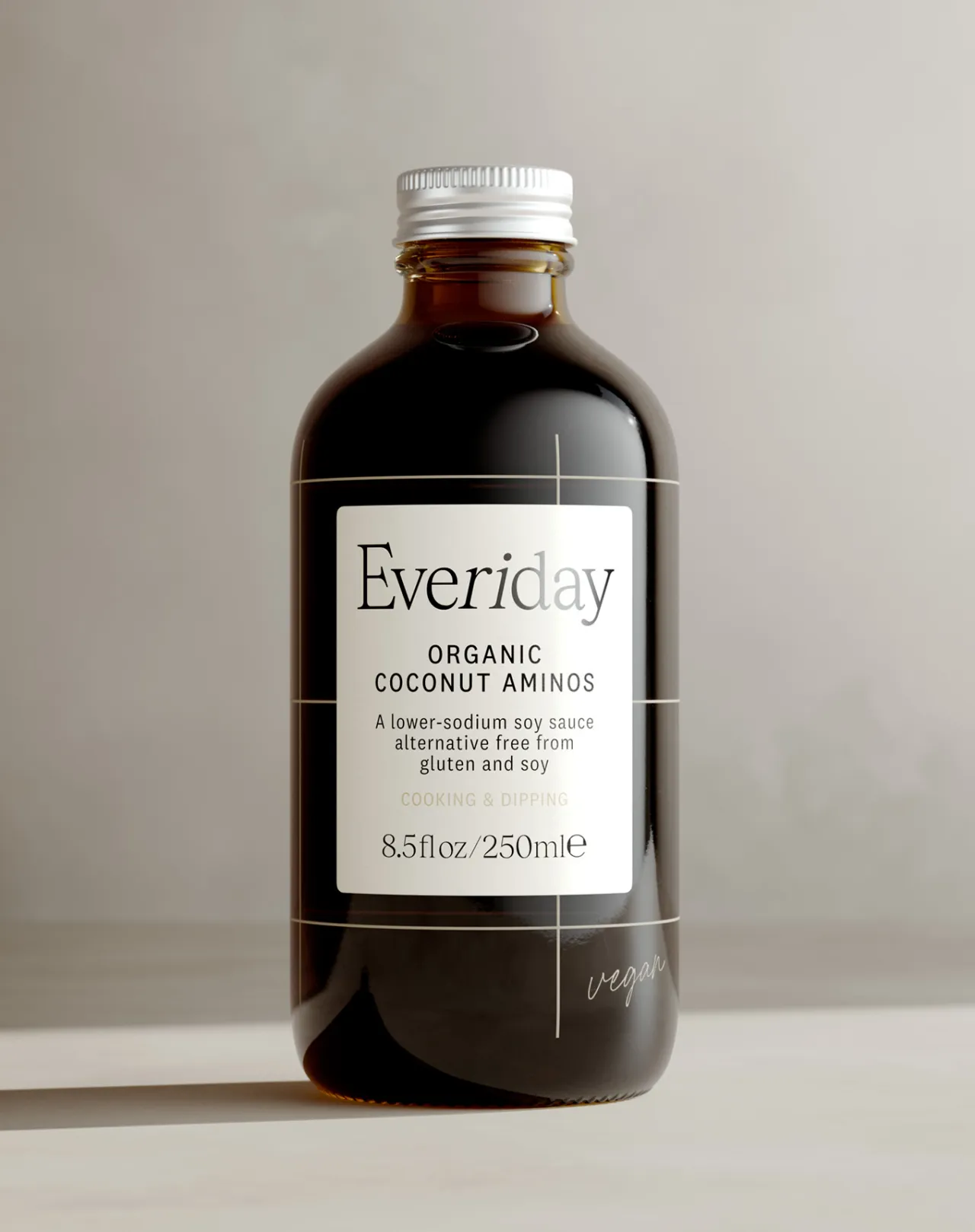
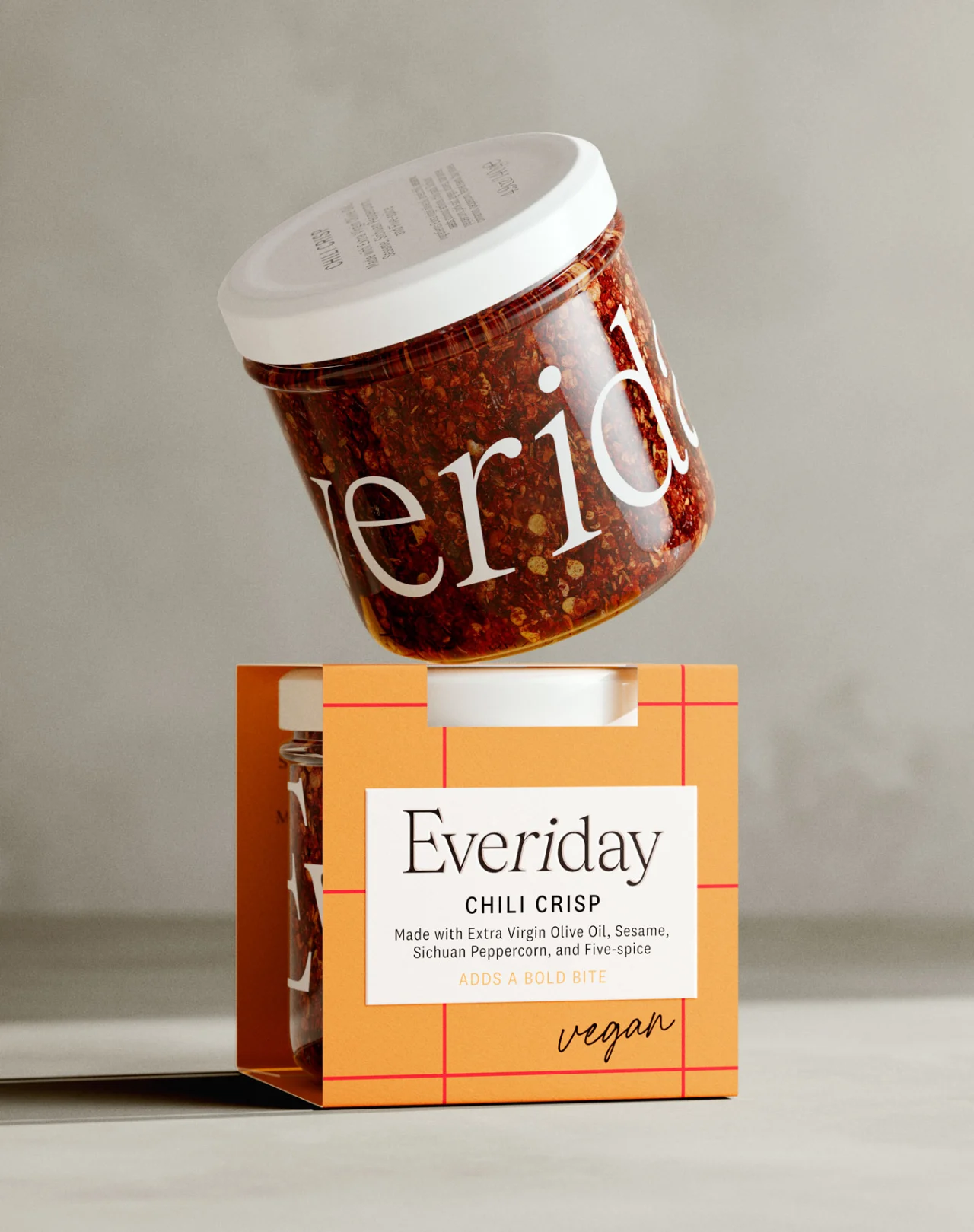
"Our design for Everiday reflects Ri Rupani's vision to make every day extraordinary with products that are made better," says Will Gladden, co-founder of Midday. "With Ri's name at the heart of the new name, we pay homage to the brand's founder, her passion and expertise. We are incredibly proud of the result and confident that Everiday will leave a lasting impression on consumers worldwide."
Editor's Picks





Trending






Latest Jobs
Marketing Copywriter at ustwo
Full-time·London·£40k-£50k
Design Director at Human After All
Full-time·London·£66k–£88k
Art Director at The New York Times
Full-time·New York·$120k–$130k
Midweight Designer at Catalyst Creative
Full-time·London·£32k-£36k
Brand Designer, Product Launches at Figma
Full-time·New York·$127k–$269k
Design Director, Opinion at The New York Times
Full-time·New York·$160k–$180k