Michael Arnold Studio lets rip with new candle branding
Based in Brighton, UK, Michael Arnold started off in a small town as a self-taught illustrator. The last eight years have seen him working on award-winning campaigns across advertising, branding, packaging and editorial as a commercial Illustrator.
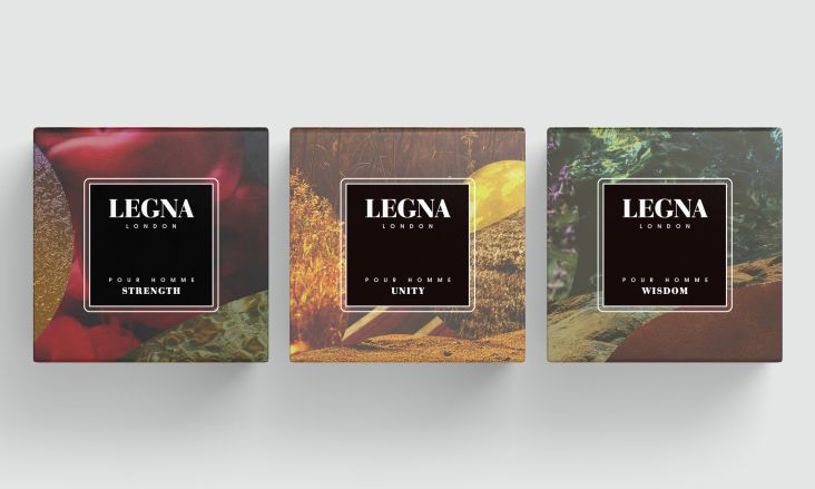
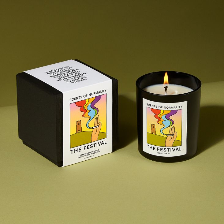
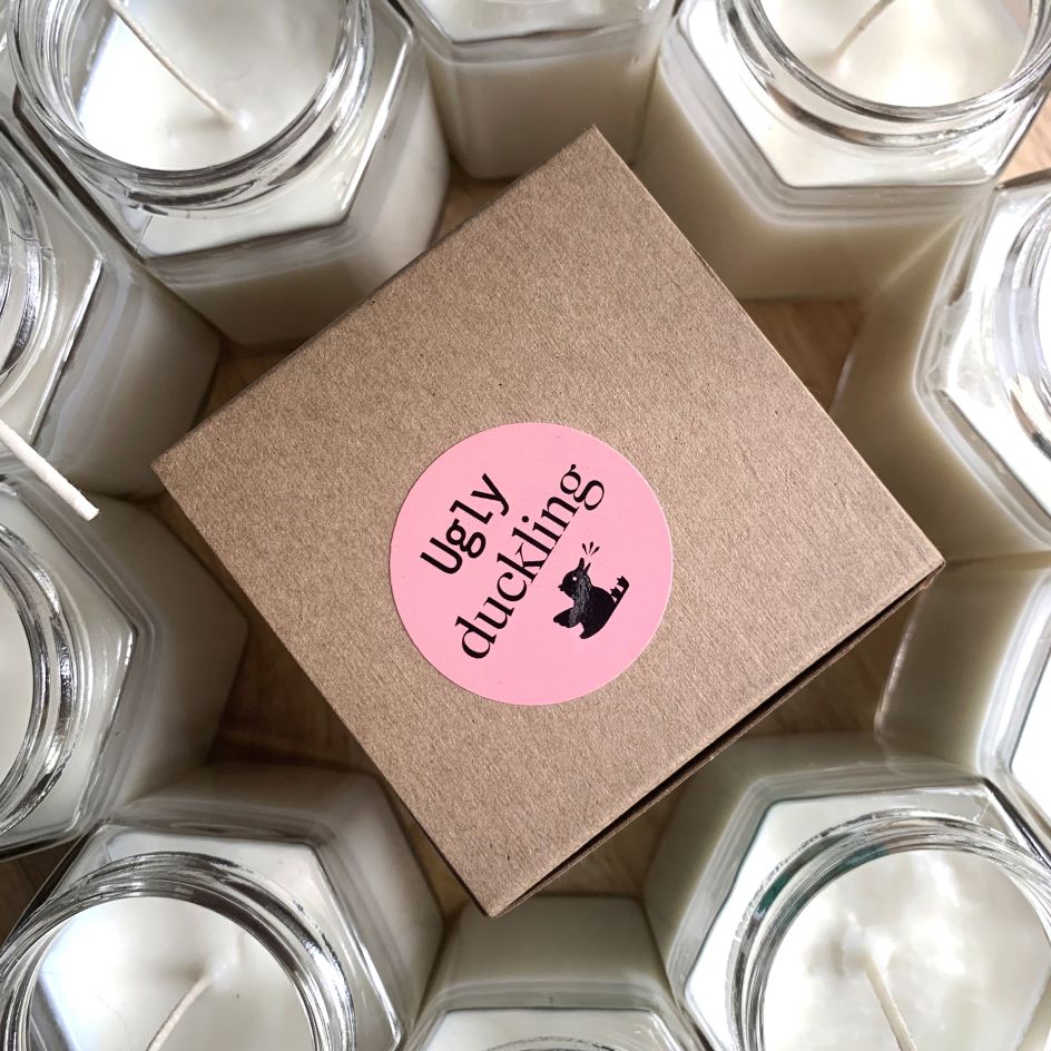
"Recently, I was tasked with creating a candle brand for launch that encompassed premium quality, balanced with a less serious tone compared with other lifestyle and brands in the market," he explains. "As each item was handmade it was important to create a tactile experience for the customer too."
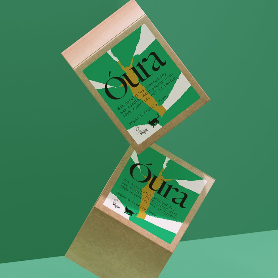
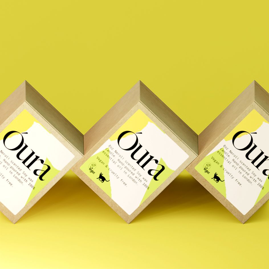
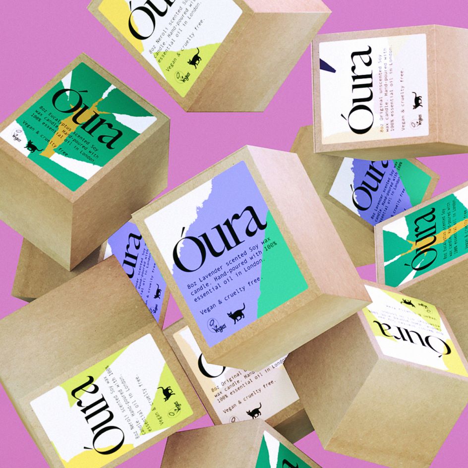
Taking his cues from the ethical and sustainable nature of Óura, he felt it important that the packaging be as environmentally and impactless as possible. "So we knew from the beginning we wanted to work with Kraft materials and eco-friendly printers that allowed us to re-use a lot of the packaging materials for various products," he says.
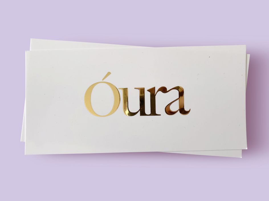
A wordmark was drawn up using the typeface Big Caslon that was ligatured in such a way as to invoke a wisp of smoke. This was coupled with Andale Mono, a suitably off kilter typeface to pair with the elegance of Big Caslon, and which helped create the atmosphere of fun through the brand.
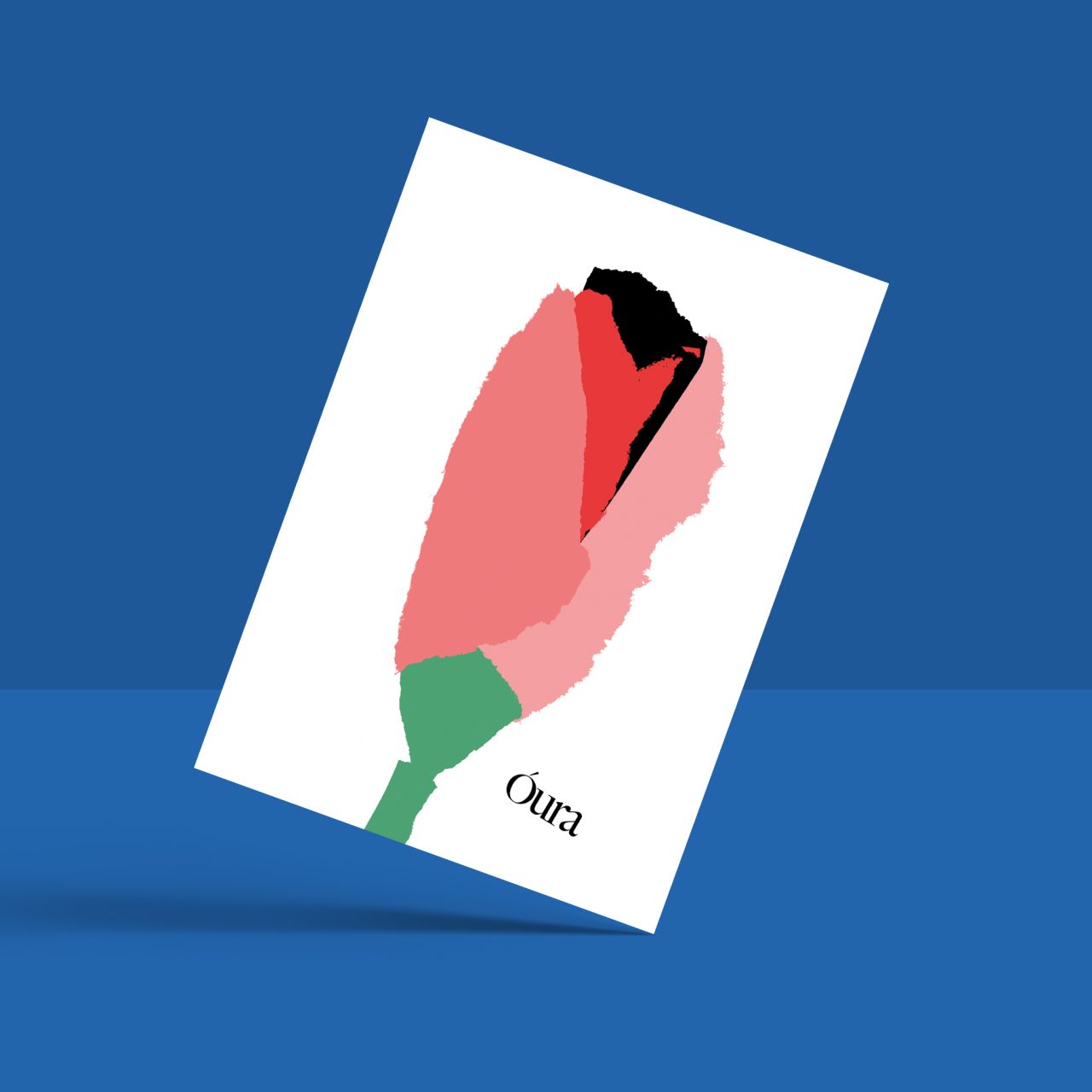
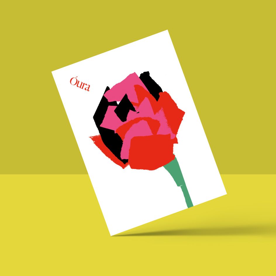
To counter the overly minimal approaches that litter the current lifestyle market, Arnold also hit on the notion of an alphabet of papercut shapes, each torn up to illustrate a different fragrance. "This idea, which was used across all the packaging, was formed almost completely by accident as literal off-cuts of paper from working on a different execution that I had planned to pitch," he explains. "But we hit upon it immediately as a strong direction to explore before refining it into a finished product."

Editor's Picks


Trending


Podcasts


Editor's Picks
Further Reading