MARK Studio's 'gender-neutral' identity for Manchester Literature Festival celebrates female authors
Manchester Literature Festival is one of the biggest and best annual urban literature festivals in the UK, showcasing the very best in contemporary writing from across the world. From author’s talks and readings, to book launches and panel discussions.
For the 12th consecutive year, MARK Studio created the visual identity for the annual event, with a challenge to "constantly reflect the diverse content and growing mix of festival visitors, whilst also aiming to attract new audiences".
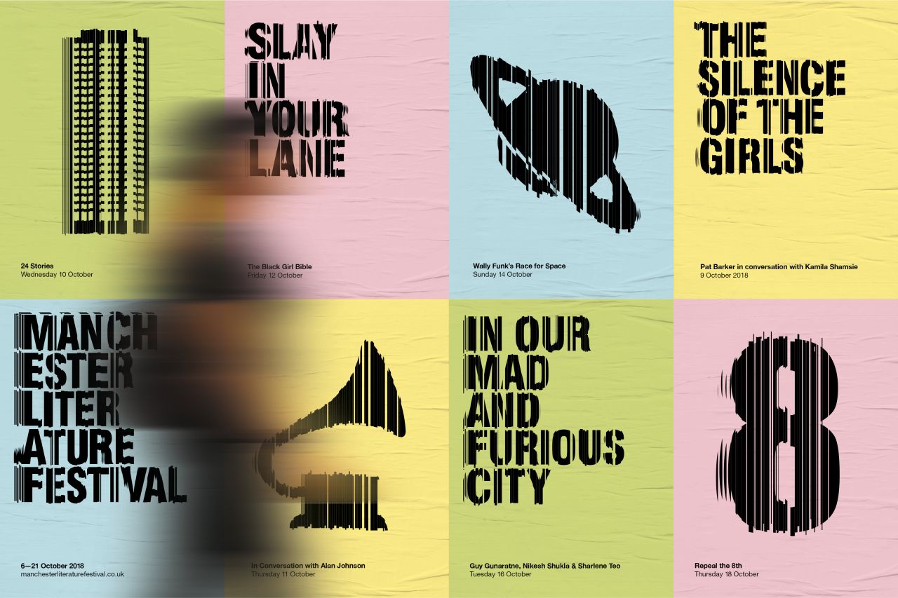
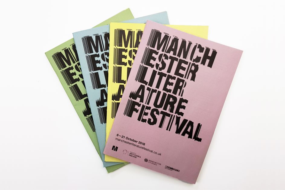
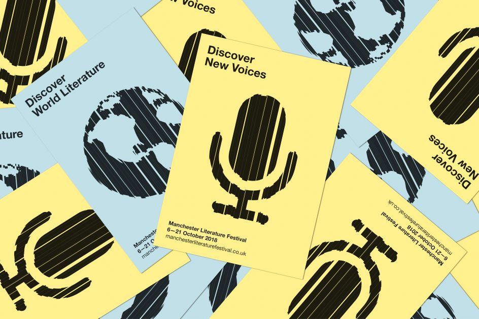
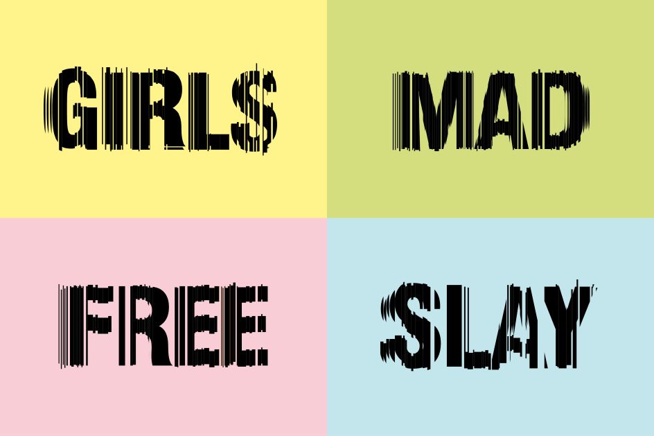
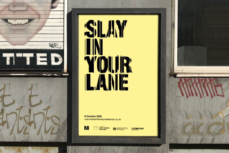
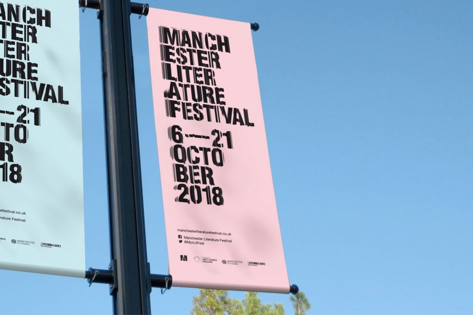
"MLF 2018 is built around the theme of pioneering female authors, to tie in with the 100-year anniversary since women were first given the right to vote," says Mark Lester, Creative Director at MARK. "But we decided to make the identity as gender-neutral as possible and so focussed on the word 'pioneering' – from which we made the link to 'edgy' – which then led us to take inspiration from the visual distortions created by the edges of book pages and the distortions they create."
This 'vertical blind' graphic language is used across typography, icons and imagery and applied to a broad range of marketing and campaign materials, such as posters, flyers, online platforms, event signage and promotional merchandise.
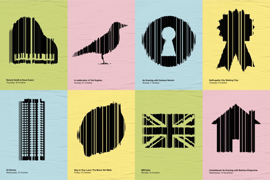
Alongside a bespoke font and bright/diverse colour palette, MARK also created a varied suite of bespoke icons to represent the broad range of events at the festival from metaphorical to literal interpretations. See more of MARK's work at markstudio.co.uk.
Editor's Picks


Trending


Podcasts


Editor's Picks
Further Reading