Superunion creates the 'first live-action film' for the London Symphony Orchestra
The new season's campaign for the London Symphony Orchestra (LSO) takes something of an unusual route for an organisation many might see as being rather traditional: a live-action film called Dancing on the Edge of a Volcano.
It's the fourth campaign Superunion has created for the LSO since the launch of its new brand in 2017. The agency worked with Found Studio and dancer Ella Robson Guilfoyle on the project, which is the first time the company has used moving image in such a way as part of its marketing activity.
"The campaigns have visualised the movement of the baton of the conductor Sir Simon Rattle and uses live-action rather than CGI to bring the motion capture to life. With Ella's dance choreographed to replicate the movement of Sir Simon's baton as he conducts Stravinsky's Rite of Spring," says Superunion.
"The film was inspired by a literal reinterpretation of the season's theme 'Dancing on the edge of a volcano' [a phrase Austrian composer Alban Beg and others used to describe the febrile atmosphere in Germany in the 1930s] and combined abstract and literal moments that fleetingly reveal the dancer in motion."
Dancing on the Edge of a Volcano is billed as "a two-year exploration of music written during the first four decades of the 20th century." The film itself aims to be "dramatic, explosive and tension-fuelled" to reflect the volatility of those years, which took in two world wars and a lot more besides.
Sir Simon Rattle says, "It's an extraordinary expression, one that inspires us to explore what was happening in the musical world in the first half of the 20th century. The era produced some of the darkest music possible."
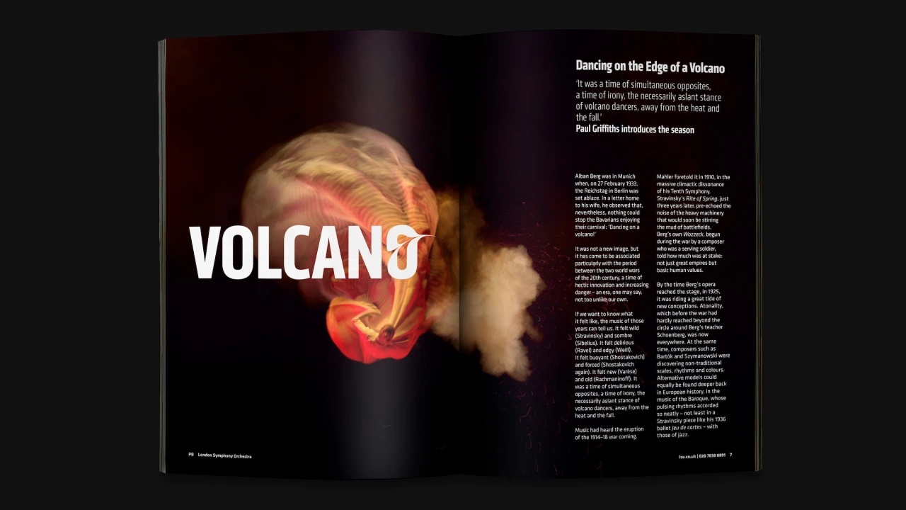
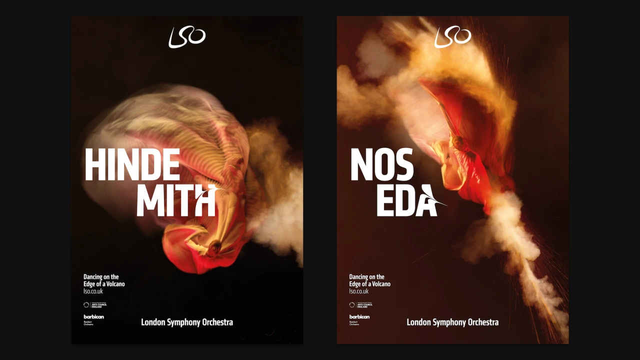
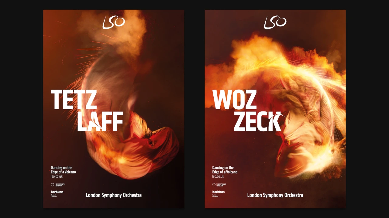
The film was inspired by a reinterpretation of the season's theme 'Dancing on the edge of a volcano' and combined abstract and literal moments that fleetingly reveal the dancer in motion. The filming and production took place over three stages. The first saw Guilfoyle dance with fabrics to create the "base layer" of movement to the 50-second clip of Stravinksy's Rite of Spring. To ensure she faithfully followed Rattle's conducting movement, she choreographed 19 individual 'bite-size' sequences shot in isolation from above.
The next stage aimed to reflect the power and explosive nature of moments within the music using pyrotechnics like sparklers, flares, smoke grenades and chalk dust, which Guilfoyle used as parts of her choreography for a series of expressive movements.
Finally, in post-production, a full-length dance piece was created from the individual 19 sequences and then retimed to match Rattle's timings. "This retimed sequence was then processed with a bespoke echo effect to create a motion trail that fades both in terms of opacity and saturation, creating a fiery flame-like effect," Superunion explains.
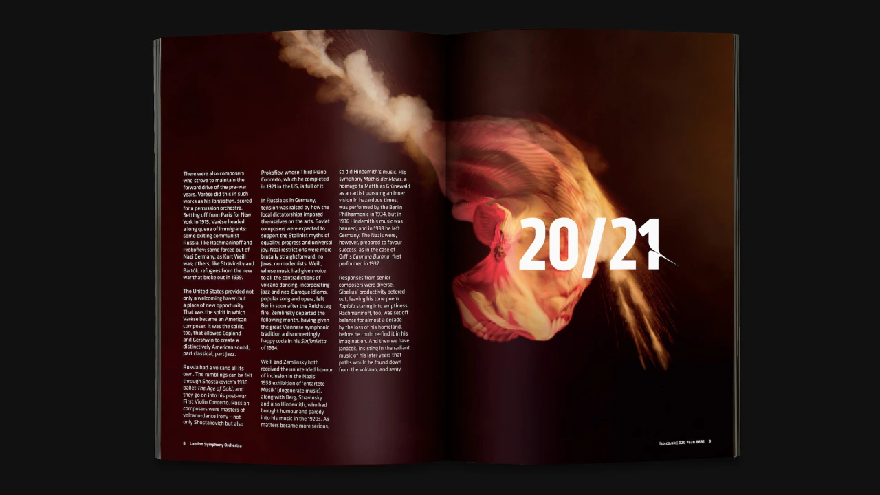

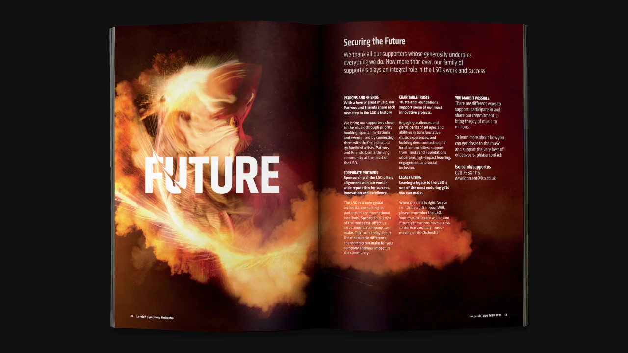
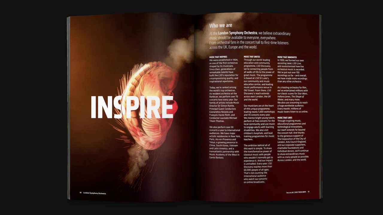
The film will be used across digital and social platforms, as well as featuring on screens at the Barbican; while its stills are used on print communications with a typographic style that ensures and aims to continue the idea of balancing the abstract and the literal.
"It's a very exciting stage of the evolution of the brand identity. Since the identity's inception, almost five years ago, we've been talking about using the digital motion data to create a physical expression that we could film," says Stuart Radford, executive creative director at Superunion. "'Dancing on the edge of a volcano' has given us that opportunity and collaborating with Found Studio has seen us take our idea beyond our expectations."
Editor's Picks





Trending






Latest Jobs
Principal Software Engineer at BBC Media Tech
Full-time·Glasgow·Up to £83,790
Senior 3D Motion Designer at Art&Graft
Full-time·London·£50k-£65k
Creative Social Content Producer at Bompas & Parr
Contract·London·£32k–£40k
Agent & Producer at The Jacky Winter Group
Full-time·London·£35k–£40k
Head of design at Cog Design
Full-time·London·£55K
Brand Strategist at DNCO
Full-time·London·£45k-£60k