Bielke&Yang's redesign of one of Norway's biggest magazines aims to help build 'a better future'
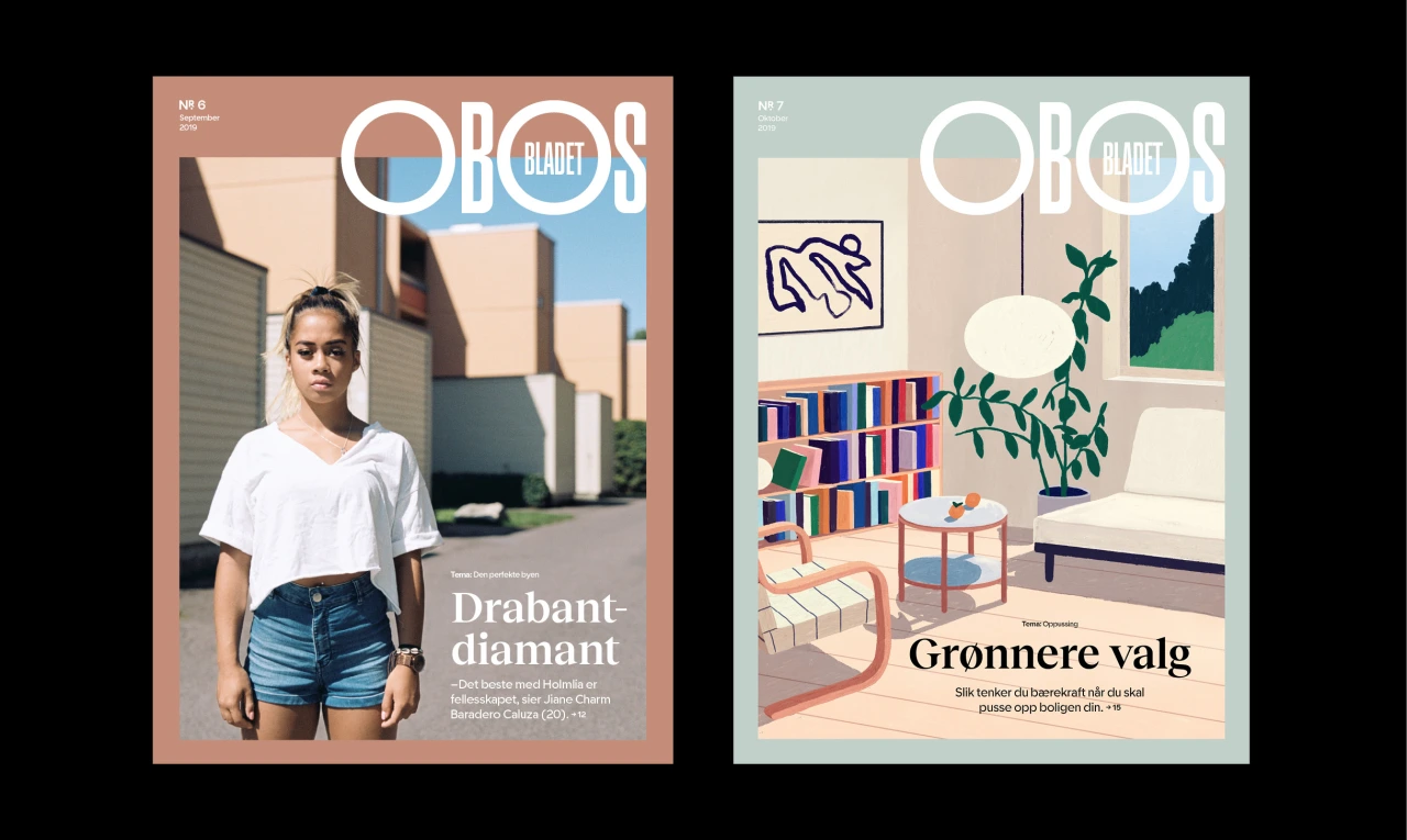
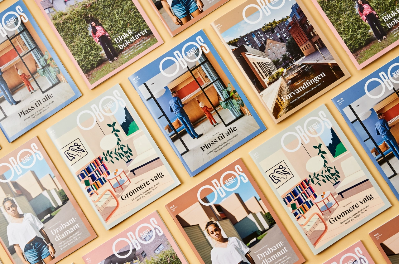
Oslo-based Bielke&Yang has recently completed a significant redesign of one of Norway's biggest magazines, OBOS-bladet.
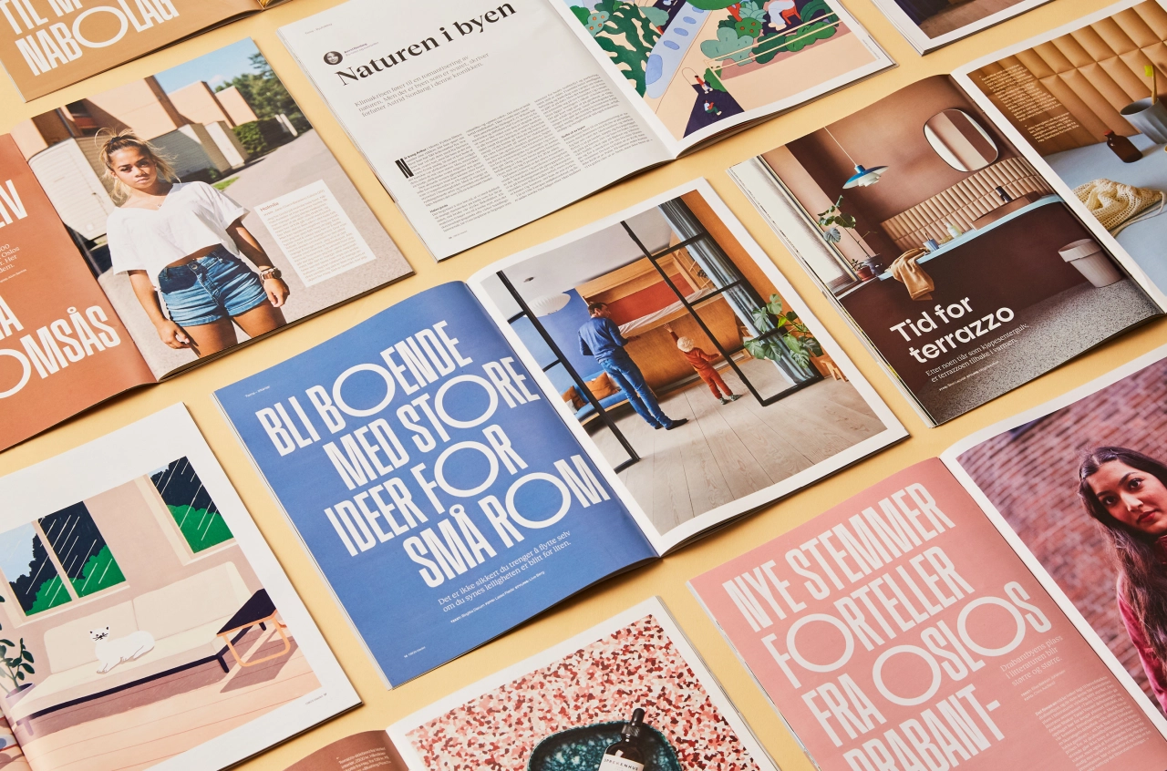
Published by OBOS, the largest housing developer in Norway and one of the largest in Scandinavia, the publication's history dates back to 1947; and furthers the company's broader vision to help "build the society of the future," according to Bielke&Yang.
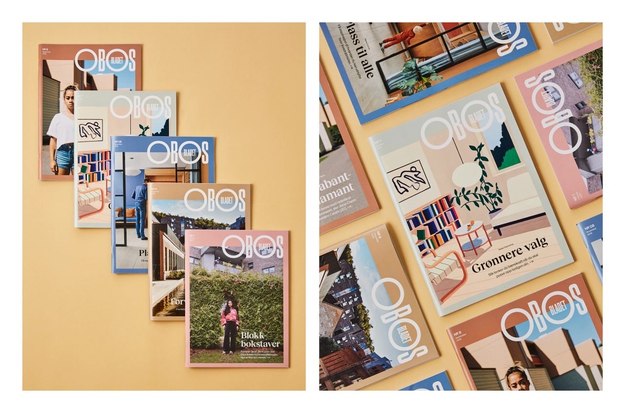
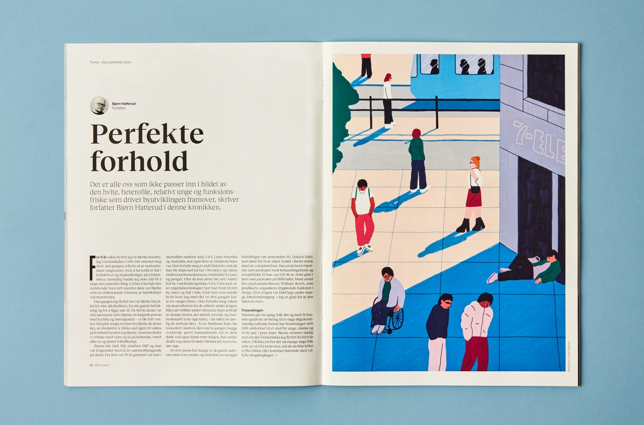
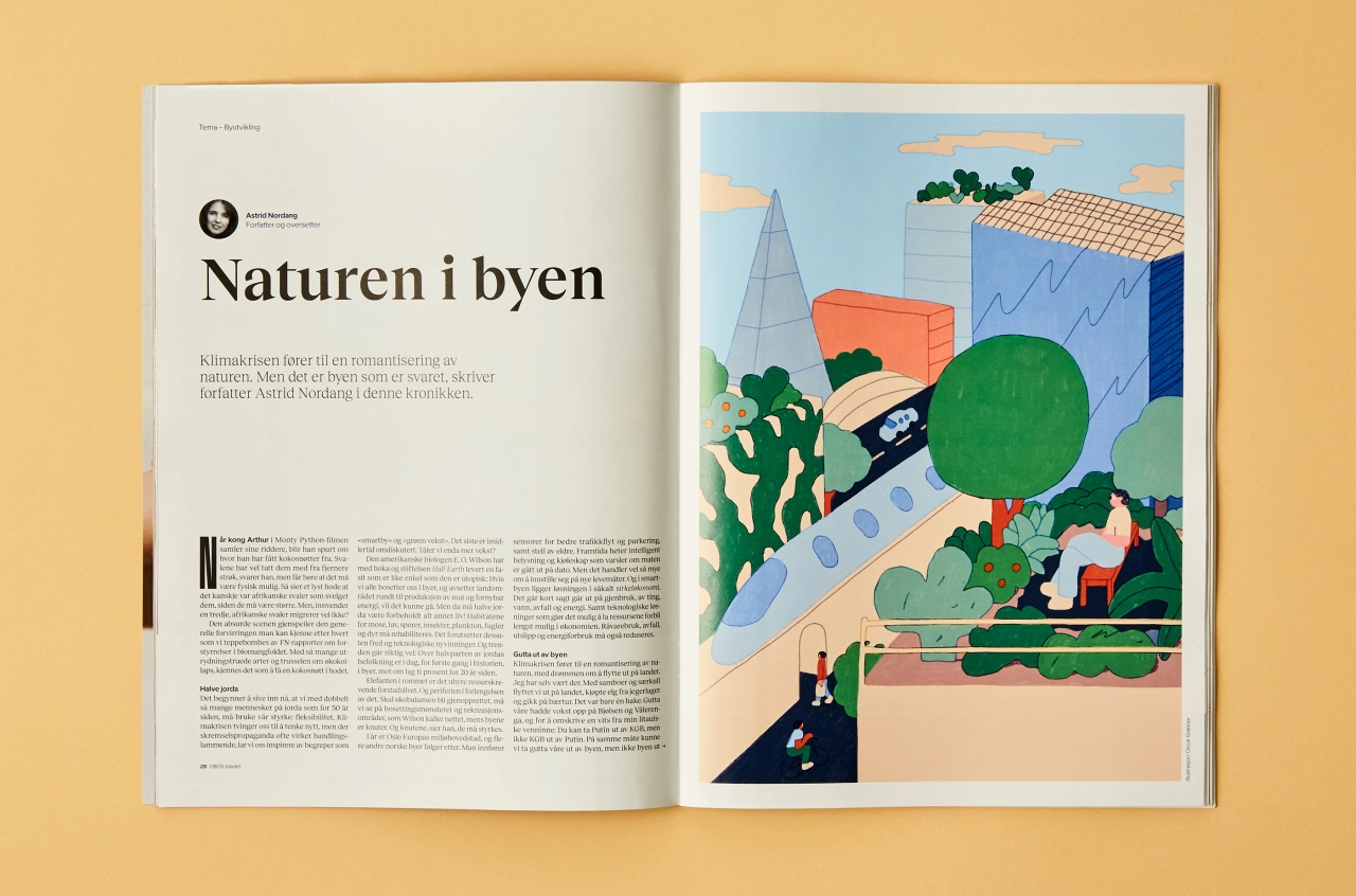
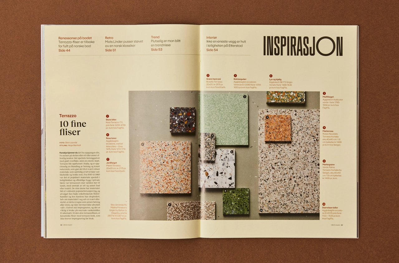
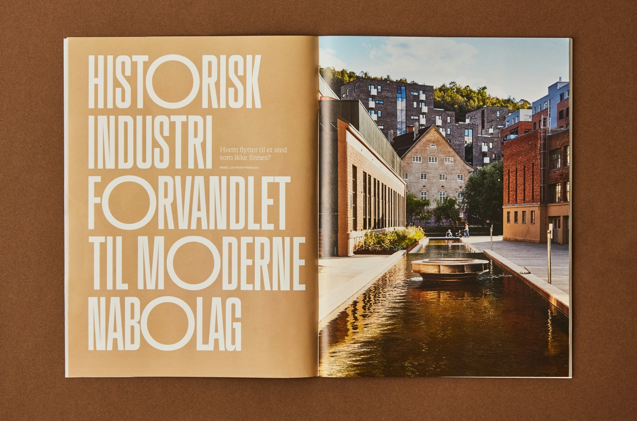
The redesign aims to highlight the future of urban development while acknowledging the company's history of developing housing in line with social, environmental responsibility. "We wanted to highlight the OBOS vision of a smarter, greener and more humane urban development," says the agency, adding that the new look is a "warmer and more compassionate expression."
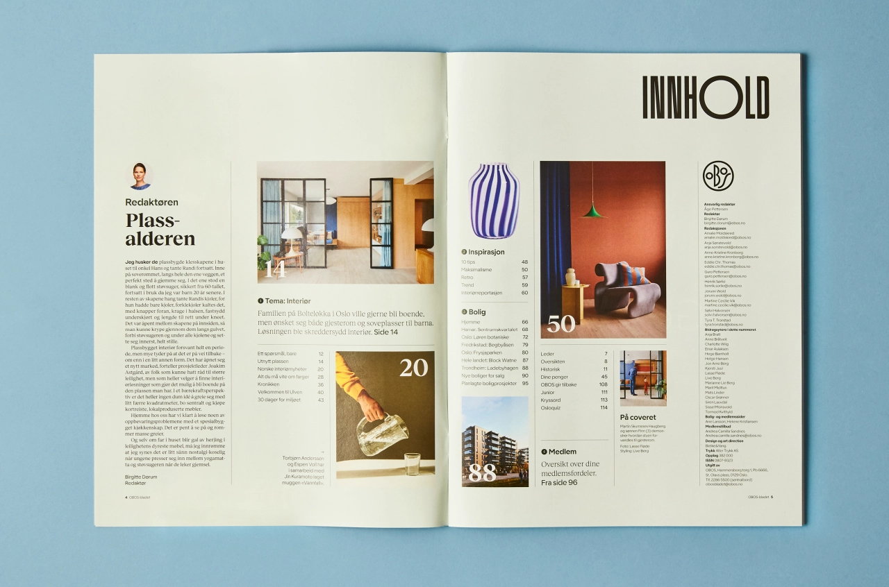
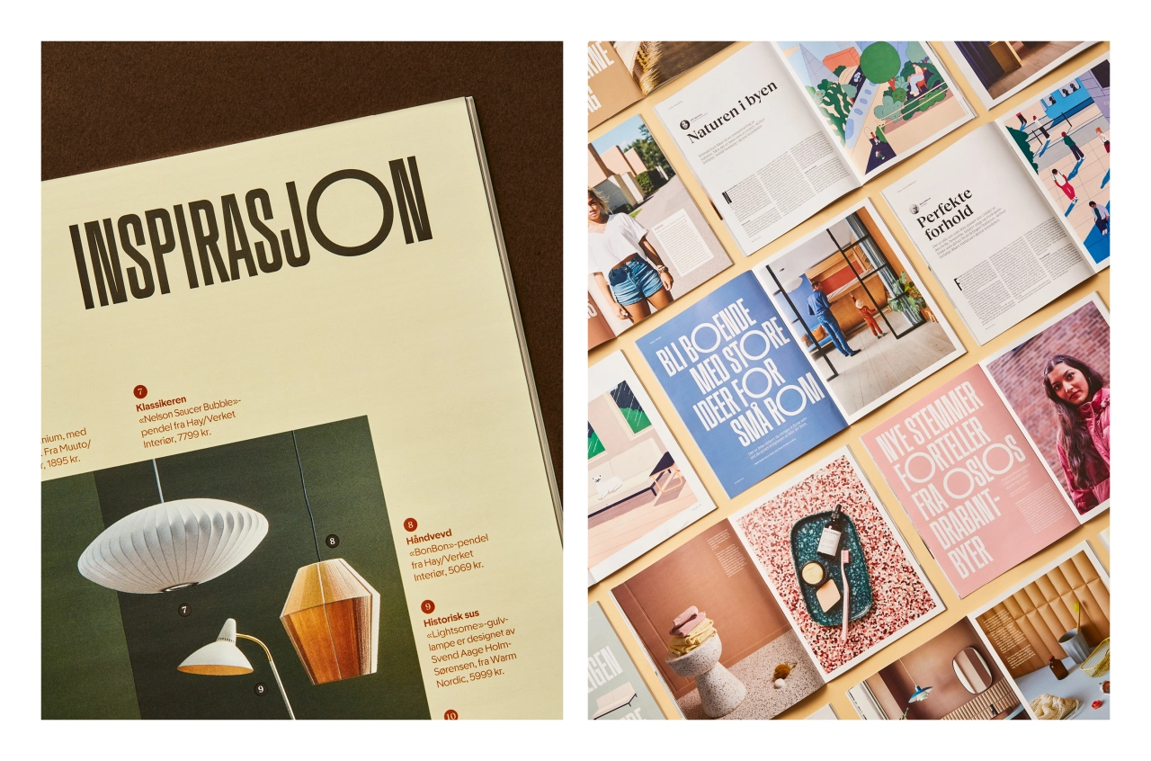
Following research conducted through surveys with readers and writers of the magazine, as well as OBOS-members; the team created a new format, paper, grid, layout, photographic style, illustrations, colour palette and typography.
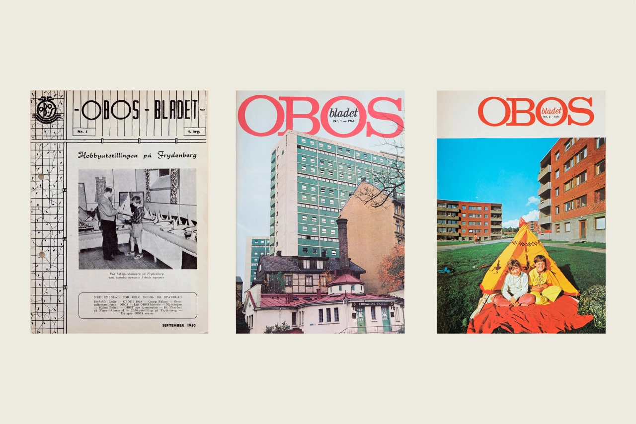
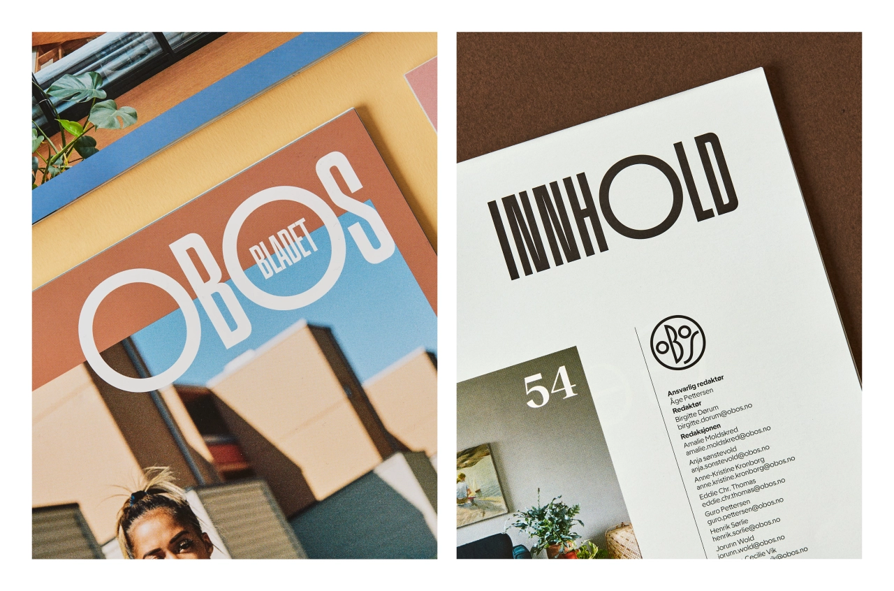
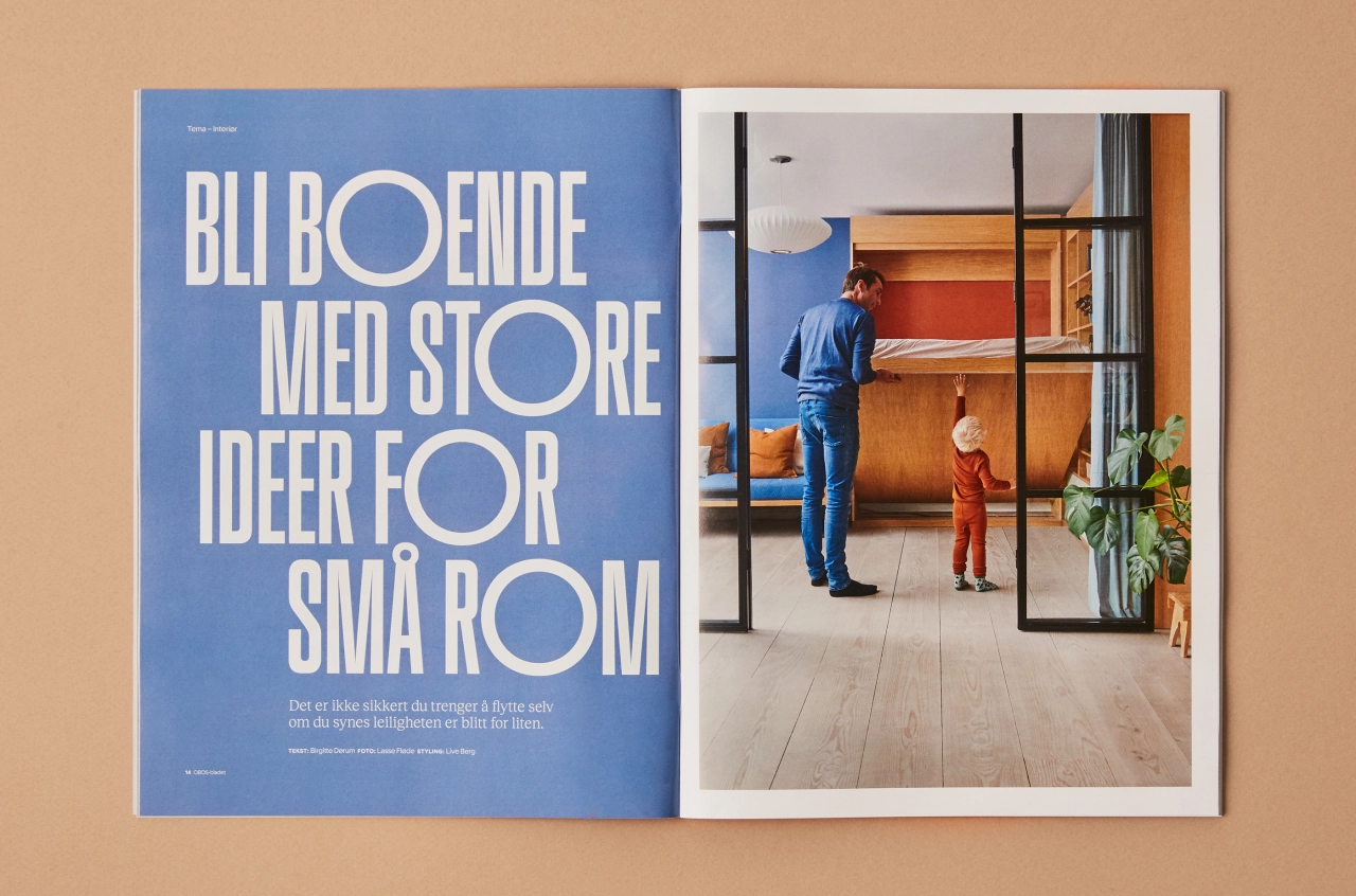
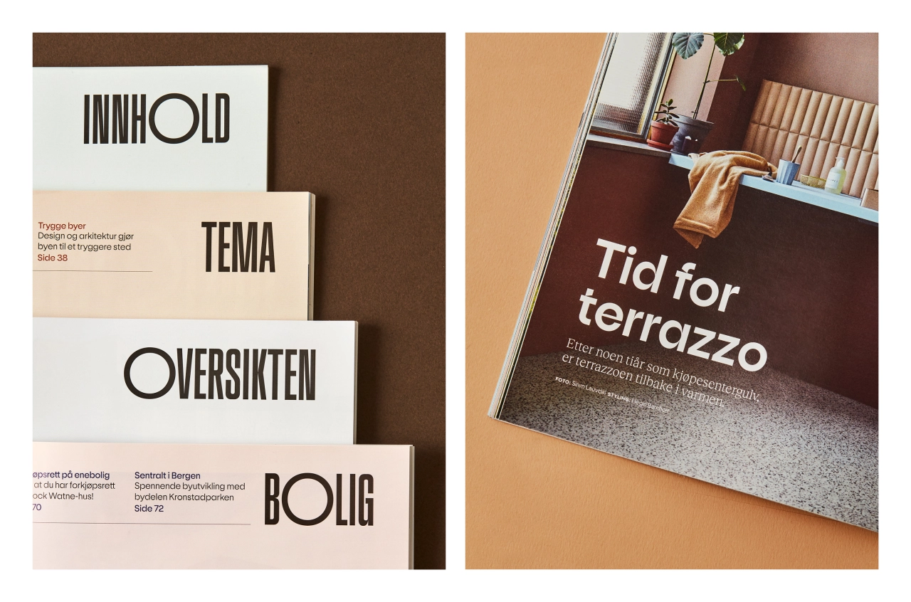
Many of these design decisions were based on the publication's history from the last 72 years; including the geometric style of the 1950s masthead, which inspired Bielke&Yang to create a new custom typeface, OBOS Sans, that is also used as a display type elsewhere in the publication.
OBOS Sans' letterforms reference Scandinavian functionalism, facade lettering and architectonic type in Oslo with a contemporary twist. The grid for the magazine's design is based on architectural drawings referencing one of OBOS' first housing projects in Oslo, and the system acts as an aid for consistency in elements like image ratios.
"For OBOS, it has always been a goal to help young people to get into the housing market. Therefore it was essential to develop attractive housing and member sections," says Bielke&Yang. "With the redesign, OBOS celebrated their 90th anniversary. OBOS aimed to express some of the substantial OBOS history, but also to look ahead to match their goal of 'building a better future'."
Editor's Picks





Trending





Latest Jobs
Senior 3D Motion Designer at Art&Graft
Full-time·London·£50k-£65k
Digital Marketing Executive at Arise
Full-time·Sheffield·From £23,750
Art Director at The New York Times
Full-time·New York·$120k–$130k
Principal Software Engineer at BBC Media Tech
Full-time·Glasgow·Up to £83,790
Design Lead at Madeo
Full-time·New York City·$85k–$120k
Senior Designer at Creative Spark
Full-time·Manchester·£35k-£50k