Land of Plenty takes inspiration from an English football pub for its identity for a Portland beer brand
London studio Land of Plenty has created this football-themed identity for a Portland beer brand, inspired by a traditional English pub based next door in Portland, Oregon.
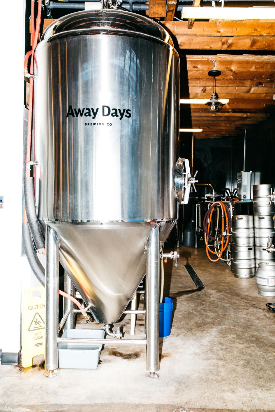
The British owners of The Toffee Club were recently offered the chance to take over the brewery space next door. With a passion for the beautiful game, they wanted to carry this theme forward, without alienating any of the "beer-drinking purists".
"The solution lay in the name; Away Days," says the studio. "It's the name of their best-selling collab beer, so we took this as the starting point and built a concept around its double meaning. In the US it relates to days off from work – holidays. Whereas in the UK it's a reference to following your (footy) team on the road. This creates an interesting space for the brand to exist, a balance between travel, adventure, passion and dedication with that subtle nod of the football."
From the outset, the studio wanted to create a "new-wave brewery brand". Land of Plenty says the existing Portland craft beer scene is one of "dark wood, heavily illustrated labels and industrial bar fit-outs". Instead, it opted for a brand rooted in "youthful thinking and street culture".
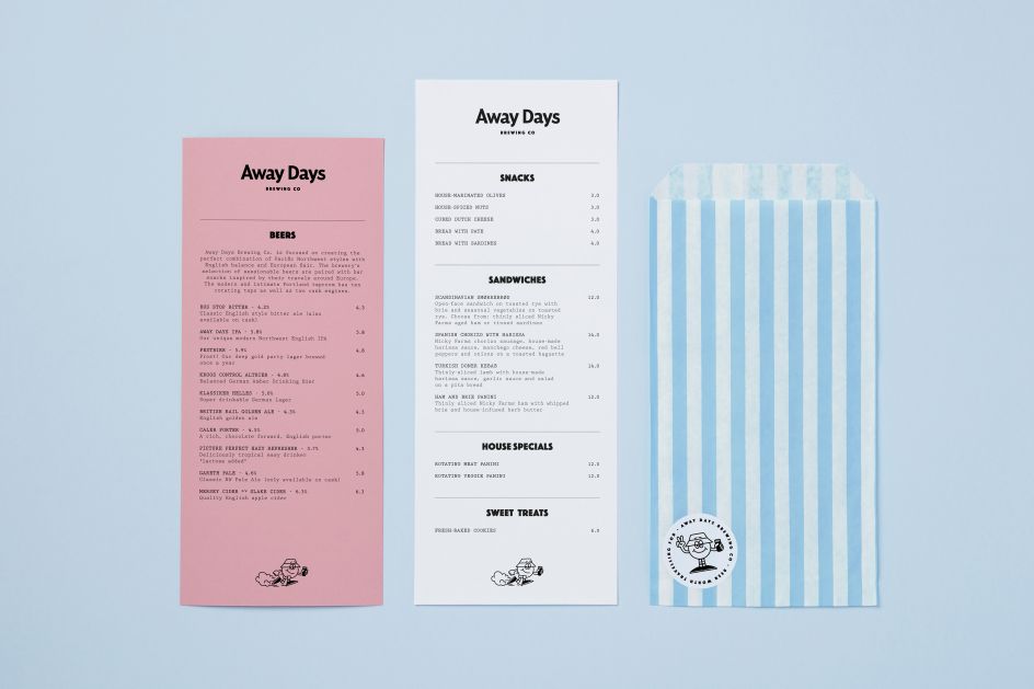
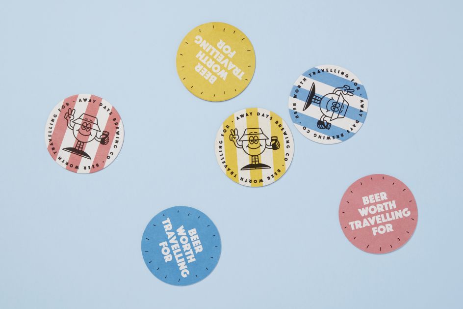
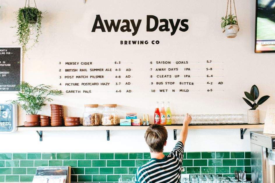
Land of Plenty helped to build the brand from the ground up, taking a strategic approach, first defining the proposition, the positioning and the key messaging. This led to the qualifier line: 'Beer Worth Travelling For'.
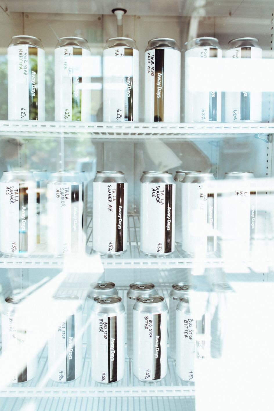
The beer follows in the owners' footsteps, from European roots to Portland mainstays – taking the best ingredients and styles from around Europe and bringing them back to the Pacific Northwest to brew with a sprinkle of Portland know-how.
Land of Plenty built out this thinking to inform the Away Days internal process: Travel, Discover, Create, Enjoy – "bringing a sense of purpose and clarity to what they do and how they do it".
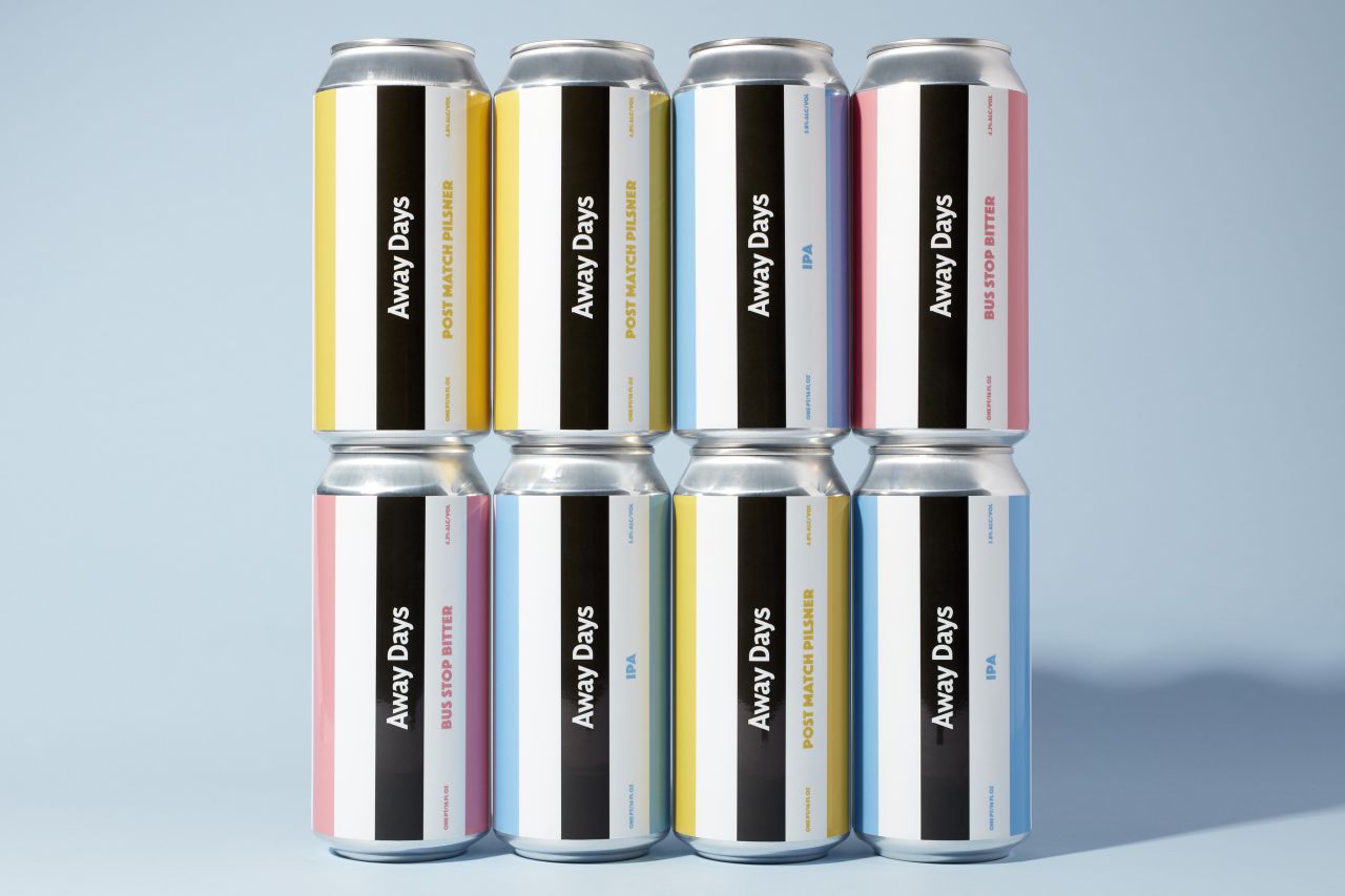
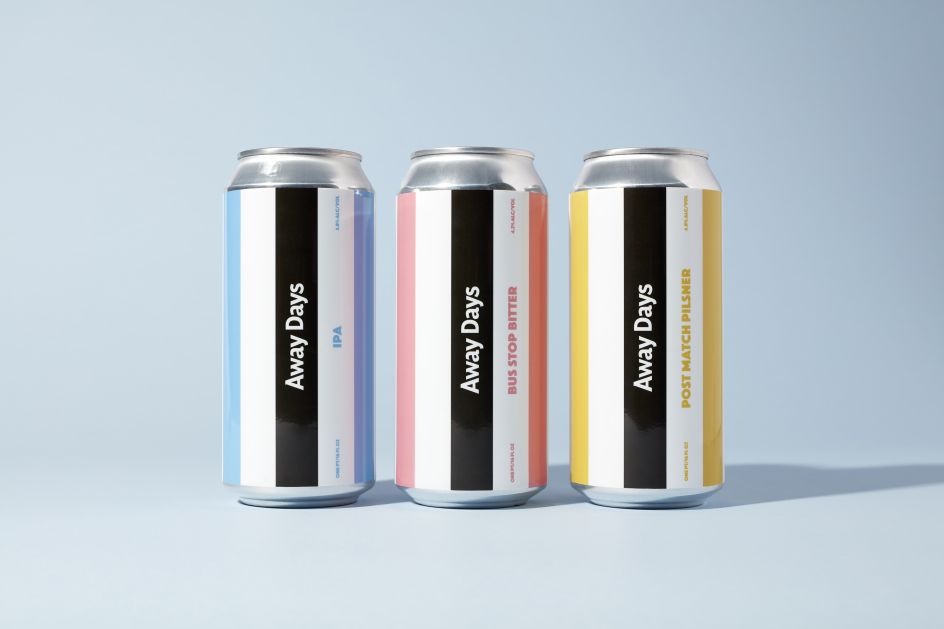
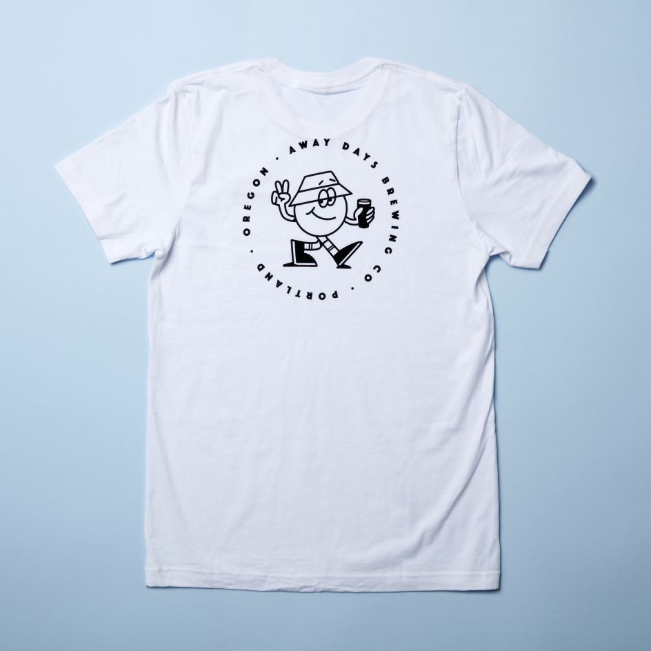
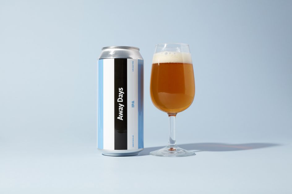
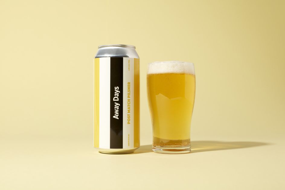
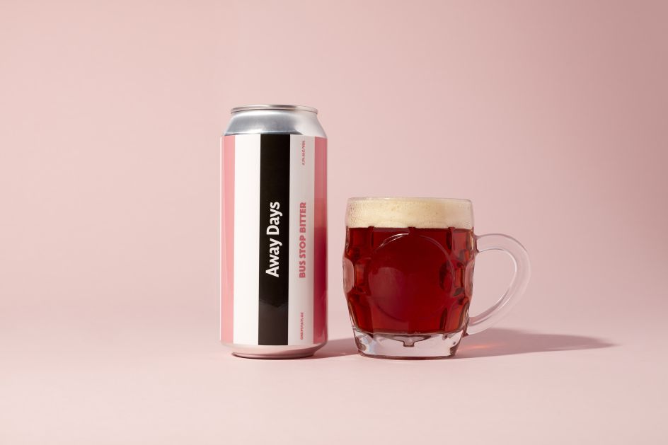
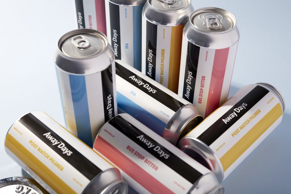
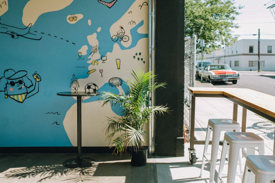
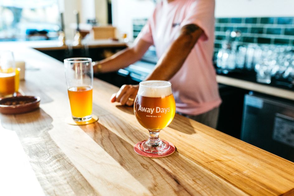
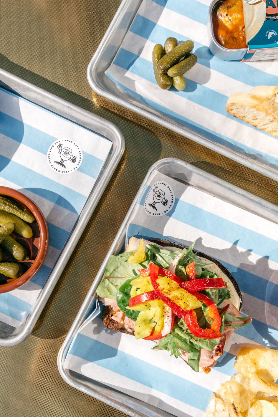
The visual identity hangs on a bold stripe reminiscent of parasols and awnings shading continental bar terraces on warm summer evenings – but also evoking a sense of nostalgia for classic football jerseys. This is complemented by a wordmark and mascot (Away Dave), more in-keeping with a streetwear brand than a brewery. "This was, of course, all part of the plan to appeal to the younger beer-drinking crowd, those with fresh ideas about what a modern brewery should look like and behave like," adds the studio.
Editor's Picks


Trending


](https://www.creativeboom.com/upload/articles/90/908fdb6378db1e95d12595416f54e6336d5e80b8_732.jpg)
Podcasts


Editor's Picks
Further Reading