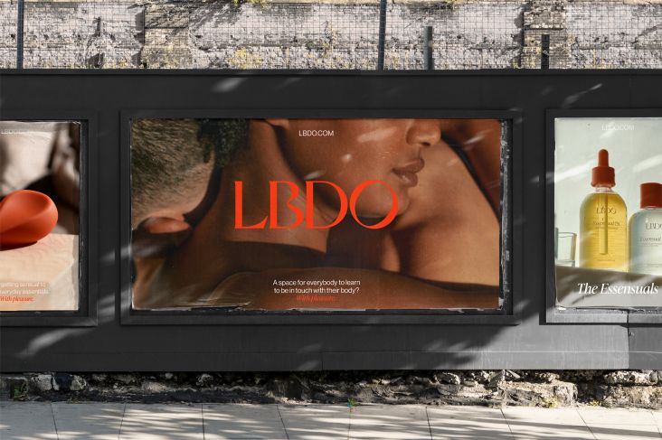
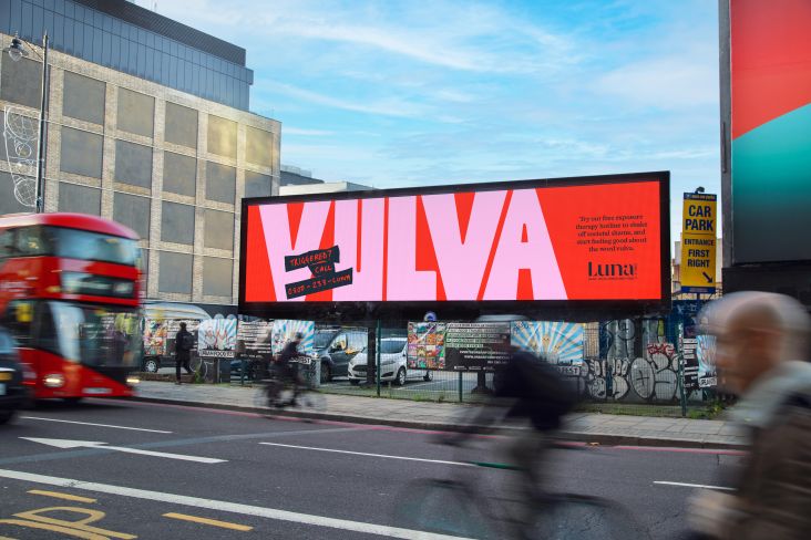
K-Y Jelly's new vulva-based designs aim to 'help women have better sex'
I personally can't hear the brand name KY Jelly without thinking of the superbly wry poetry of the equally superb (if womanising) Leonard Cohen. "You were Marlon Brando; I was Steve McQueen. You were K-Y Jelly, I was vaseline," he croons on 1973's Is This What You Wanted.
However, little did I know that the lube brand has a "legacy of celebrating female sexuality since 1904", apparently: according to agency Design Bridge, K-Y was launched with the explicit aim of targeting women.
Design Bridge's New York office has just unveiled its new identity and packaging designs for K-Y, in an announcement planned to time with International Women's Day – a slightly depressing move, some might suggest, in co-opting a feminist movement in the name of commerce.
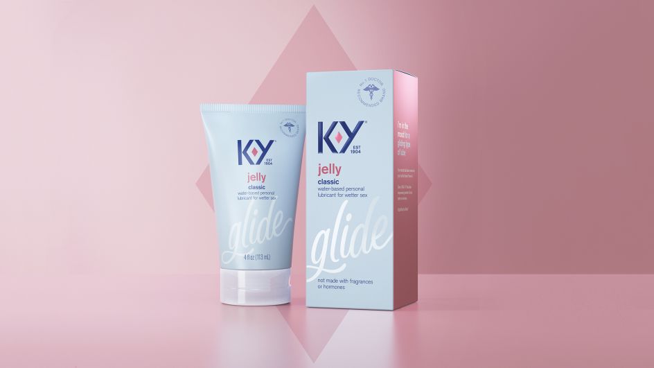
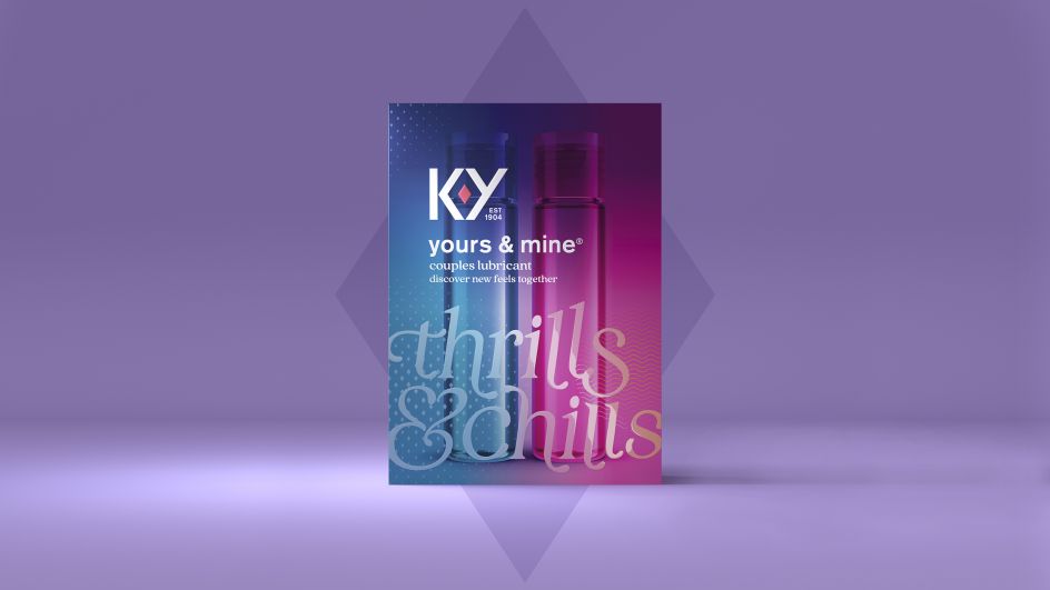
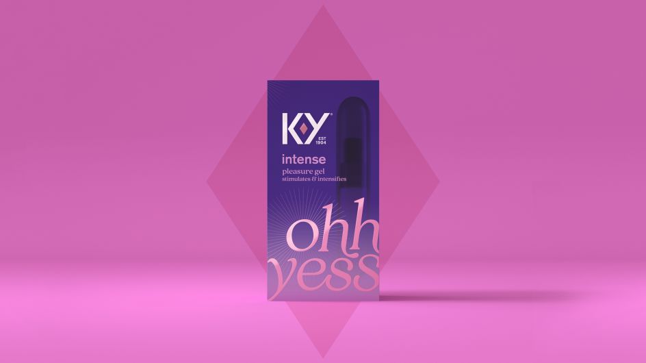
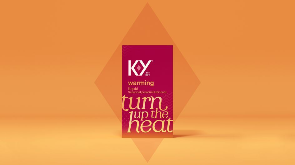
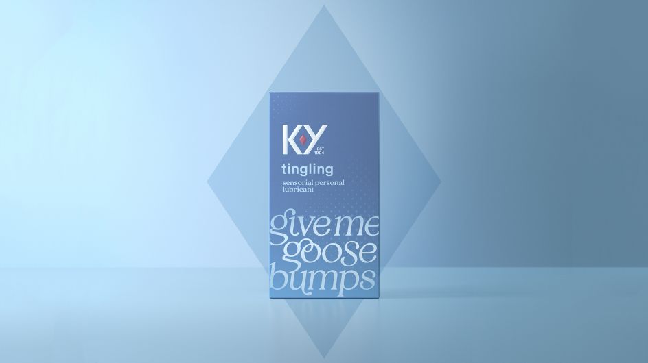
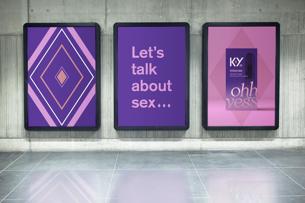
In another move slightly antithetical to some feminist principles, the new packaging designs often lean on shades of pink, purple, baby blue and "deep ruby red – a colour that universally represents love and passion – used consistently across the brand" says Design Bridge; with gradient-shaded, serif typography spelling out slogans like "Ohh yes."
But Design Bridge says its branding looks to show that female comfort and pleasure (ahem) come first; with the new look "empowering women to pursue and own their sexual pleasure in a market that predominantly talks to men." It aligns with K-Y's new brand mission, to "empower women to have better sex, always".
A diamond-like graphic device euphemistically termed the "ruby" is central to the new designs – ruby being a vulva, of course but framed in more commodifiable language. The shape is formed from the redrawn K and Y lettering, and according to Design Bridge, the ruby acts as a symbol of "uncompromising passion and enjoyment."
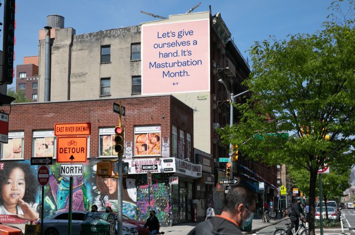
The symbol is used across all touchpoints from packing to billboards and digital campaigns and is said to encompass the forms of sexual pleasure the brand wants to entourage (despite its lack of visible clitoris).
"We've unleashed a distinctive brand asset that was always there, it just never had any strength or purpose," says Claire Parker, executive creative director at Design Bridge New York. "By making it intentional, we've loaded it with meaning and brought sensuality and confidence to the brand that was lacking before. An enormous step for a brand that was previously at best asexual, at worst clinical."
The Design Bridge team says it came up with 'the simple yet powerful creative idea of "Let's talk about sex",'—conveniently forgetting that Salt-N-Pepa came up with that concept word for one in their catchy 1991 hit. The agency says it was "inspired by the brand's curious and sensual, yet uncompromising and expert new personality. With the vulva now so clearly celebrated at the heart of the brand, the surrounding brand world and assets were developed to normalise female pleasure further and build confidence between the sheets."
Alongside the redrawn bespoke typography and iconography, packaging bears messaging that looks to speak in a playful, slightly controversial tone of voice that also helps women easily navigate the product range.
Design Bridge New York's design director says, "Through the new brand, packaging and tone of voice, we've turned a medical-looking lubricant—that was often associated with female problems – into a trusted lifestyle brand that women are proud to purchase."