Jamhot takes a deep dive with new trout branding
How does one go about rebranding the UK's sole producer of Steelhead Trout? Scottish studio Jamhot offers some insight with its work for Kames.
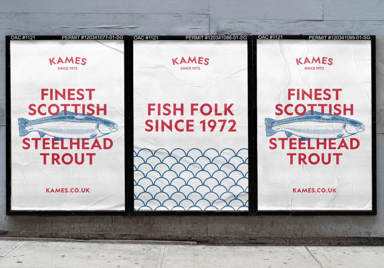
Founded in 1972, Scottish trout company Kames was one of the first companies in Europe to pioneer new sea-grown techniques for seawater trout. Now the firm has partnered with Glasgow creative and design studio Jamhot to launch a new brand identity.
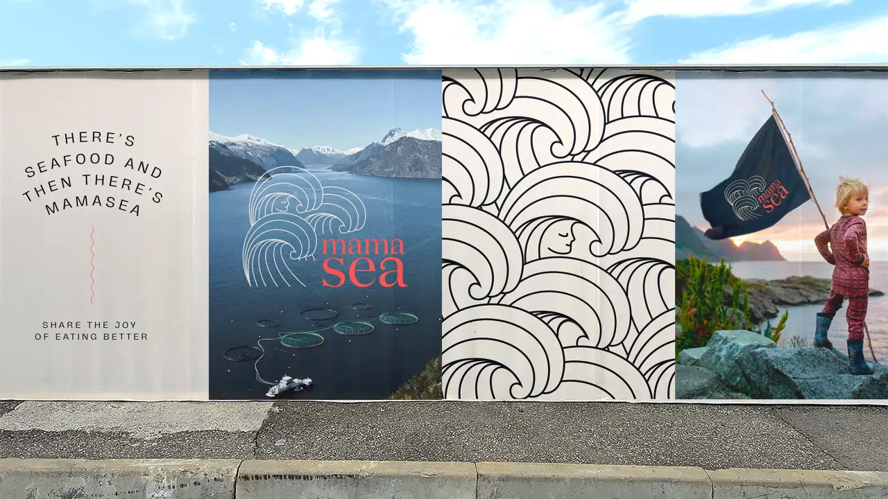
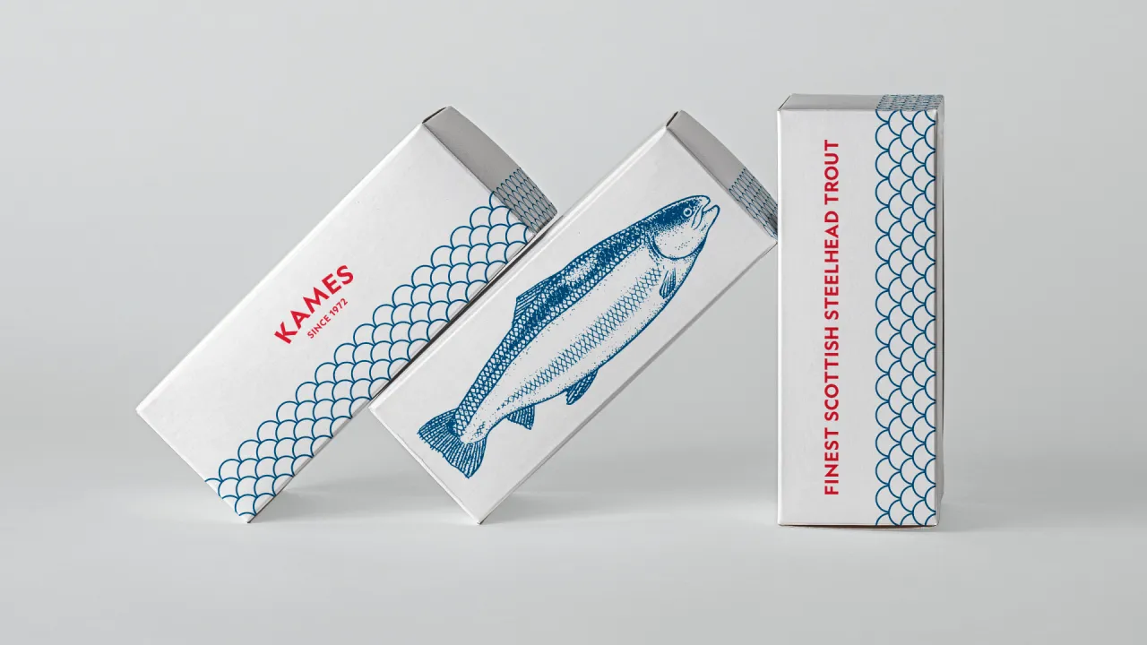
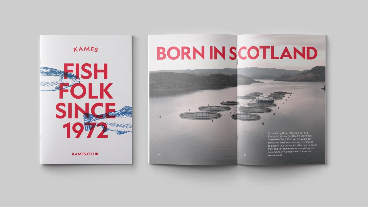
Drawing on Kames founder Stuart Cannon's dedication to a single craft and vision for over 45 years, the design focus was on simplicity and quality, communicating the product’s Scottish heritage with nods to the waves where the fish are grown, in Oban’s Loch Melfort.
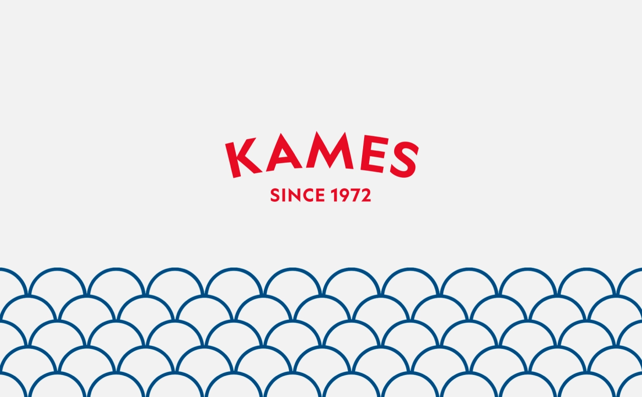
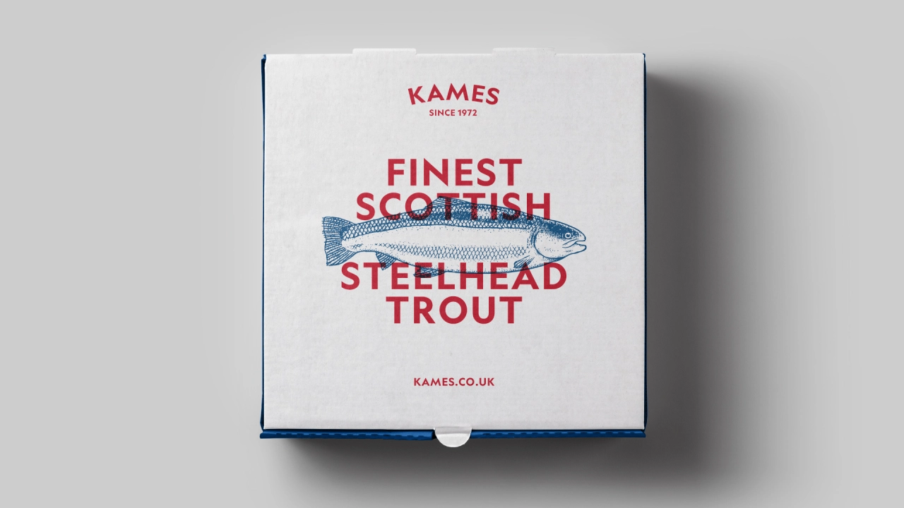
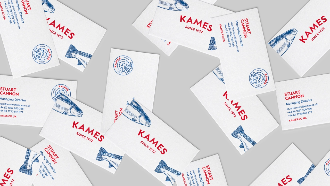
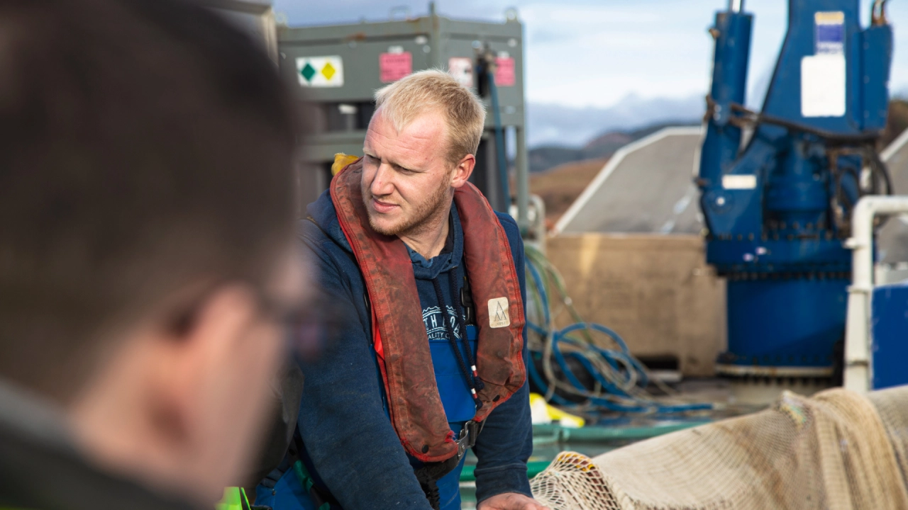
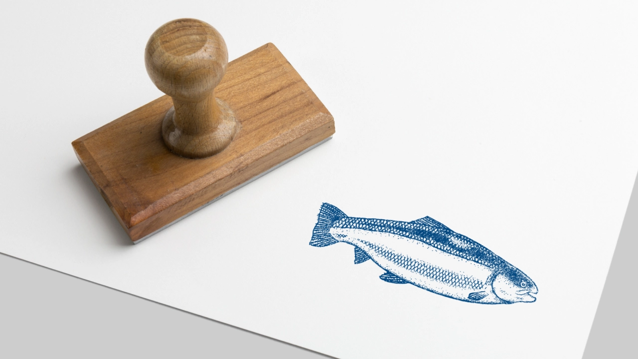
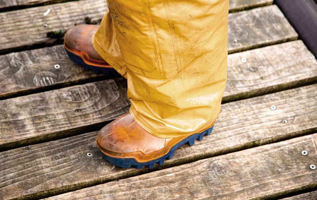
The new brand, which hits the sweet spot between evocatively retro and minimally modern, has been rolled out to a full suite of assets including packaging for direct-to-consumer ranges. It includes delicate illustrations of the product in question, a calming blue and white palette with red-coloured bold headlines and patterns that hint at the scales of a fish. Accompanying photography helps bring the new brand to life.
"We were delighted to partner with a food company with such a rich history and heritage as Kames," says Craig Laverty, creative partner at Jamhot. "And we hope that the new brand will take this growing family business forward over the next 45 years."
Editor's Picks





Trending






Latest Jobs
Graphic Designer at Crux Product Design
Full-time·Bristol·Up to £36k
Brand Designer, Product Launches at Figma
Full-time·New York·$127k–$269k
Senior Designer at Definition
Contract·London·£45k–£50k
Junior Project Coordinator at Colorido Studios
Full-time·Twickenham·£28k–£32k
Brand Designer at Adfin
Full-time·London·£30k–£50k
Digital and Marketing Manager at Manchester Art Gallery
Contract·Manchester·£38,126 pro rata