These cute, minimalist packaging designs are sweet but sugar-free
Jo Cutri Studio is behind these simple, joyful and very effective packaging designs for Denada Sugar-Free Ice Cream.
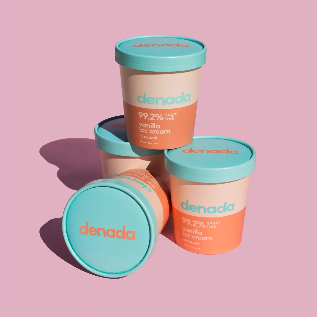
The brand’s name loosely translates to “it’s nothing” – hinting at the fact the product’s ingredients are all natural – and the packaging designs take a similarly minimal feel.
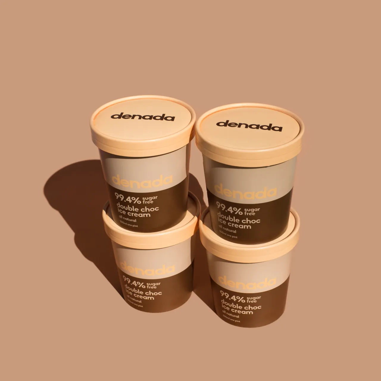
Each variant uses a different pastel palette, with all packs bearing no more than three colours. “We wanted the packaging design look as good as a set as they do individually,” says Cutri. “This stemmed from being a new product and needing a point of difference to have some impact in the marketplace. Where most contemporary packaging might feel the need to cover the entire face with information, we made a considered decision to keep this to a minimum and let the colour stand to attract customers on the shelf.”
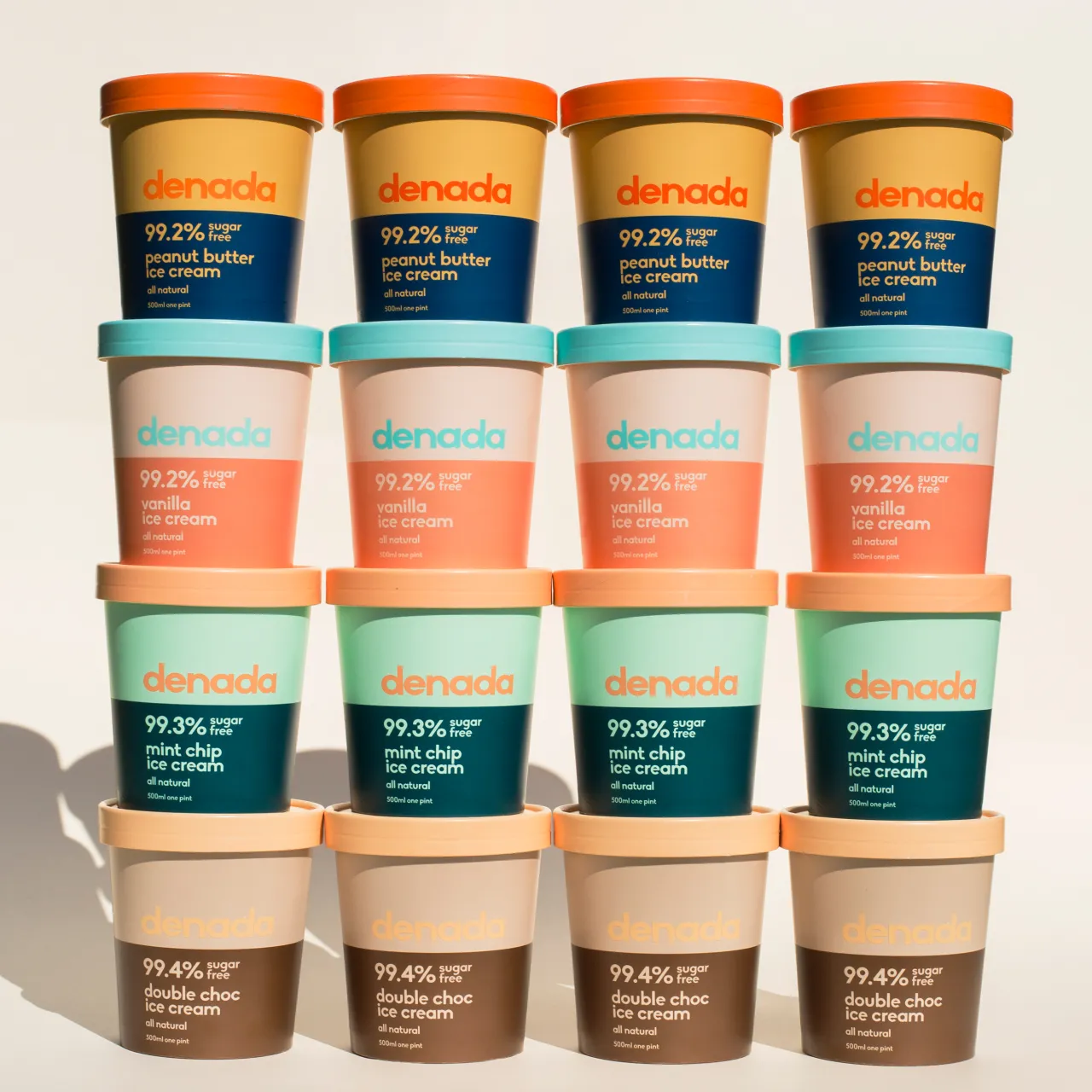
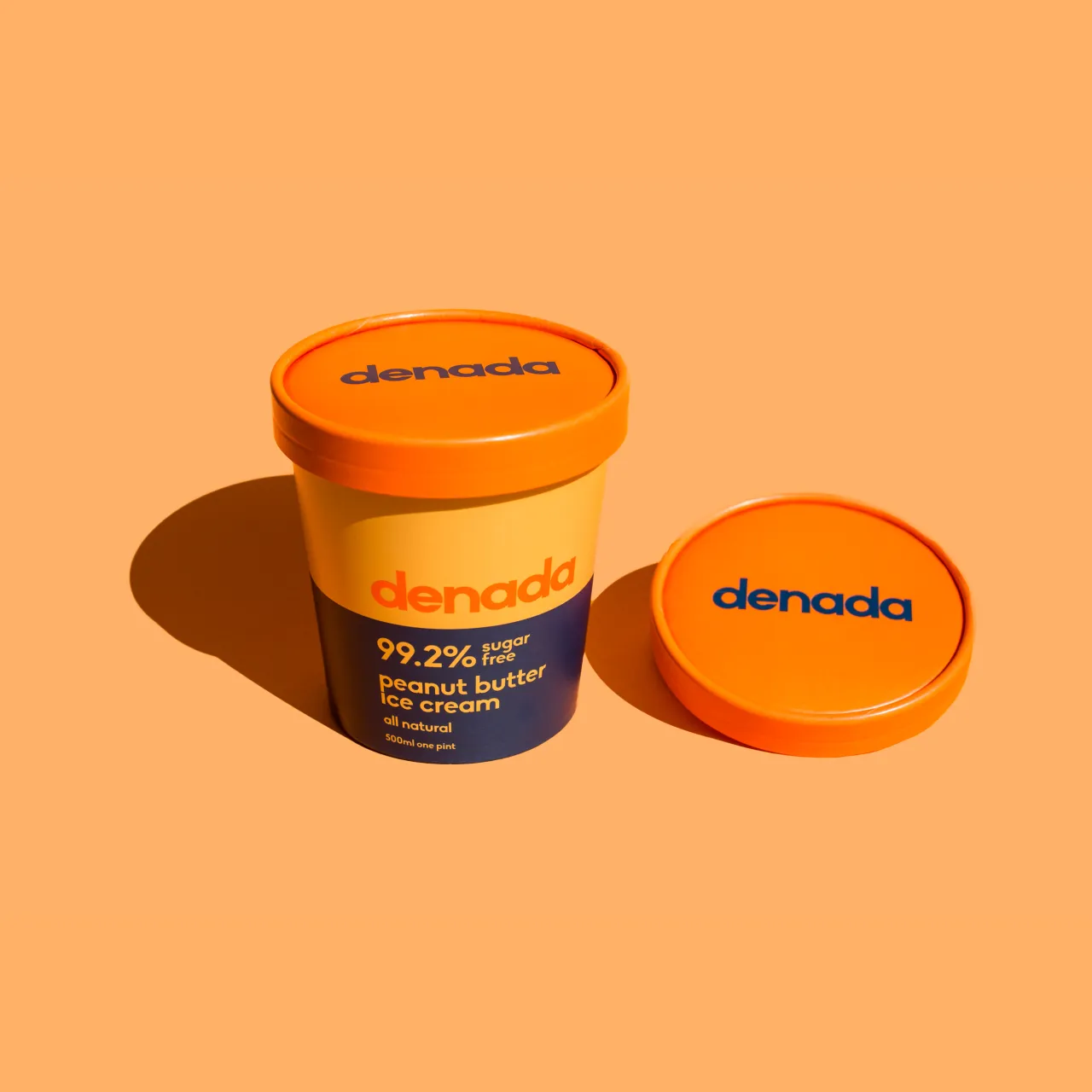
The free font Biko by Marco Ugolini, a geometric sans serif with a strong and yet friendly character, is used throughout the branding and packaging, from titles to fine print. It appears for the most part in lower case, “which helped to make it more light, clean and feminine,” says Cutri.
The designs are inspired from a range of sources including modern interior colour design trends to retro Japanese medical packaging. “The philosophy was to develop a set of colours for each flavour that not only represented the ingredients but were a palette you could wear or colours you would decorate a room with,” Cutri adds.
“This also tied in with the target demographic being modern women interested in healthy eating and lifestyle. Once a strategy was in place, there was experimentation with dozens of colour combinations. The concept was then developed until the selected Pantone colours looked as delectable as the ice cream itself.”
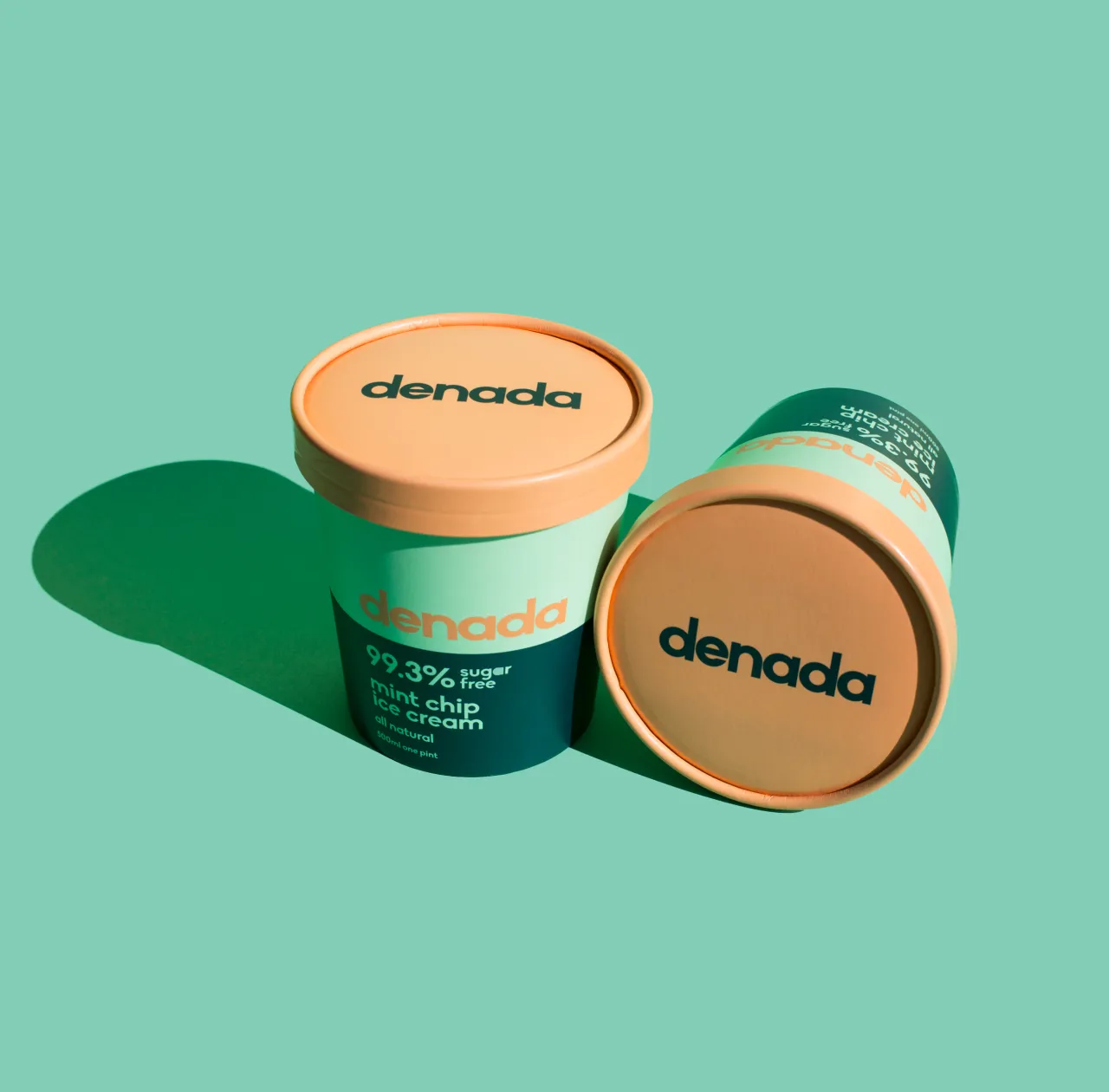
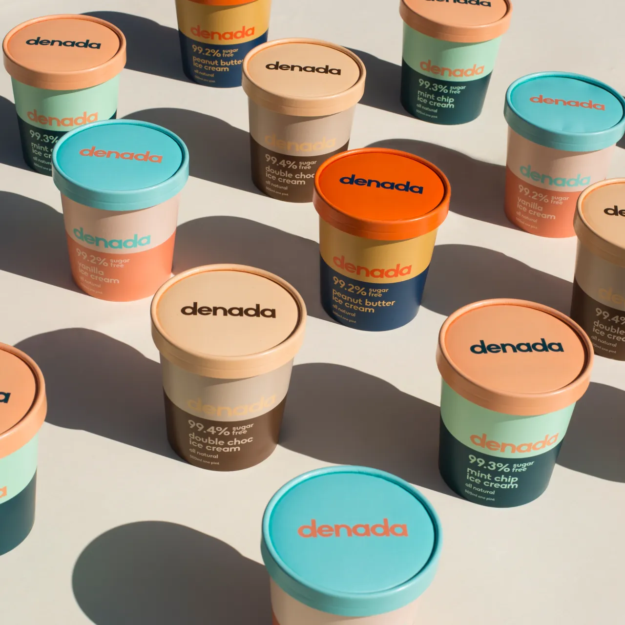
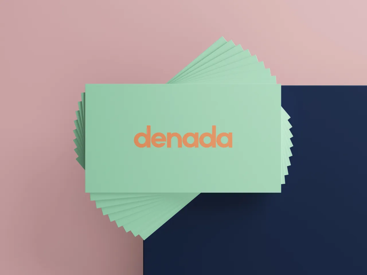
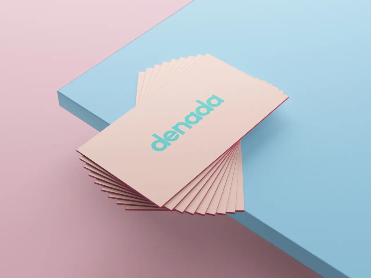
The Denada logo has no set colour; instead changing depending on the design it’s used in. All Denada’s packaging was designed to be recyclable: “Being a health-conscious product, there was a clear decision to extend this philosophy to the environment also."
Editor's Picks





Trending






Latest Jobs
Design Lead at Madeo
Full-time·New York City·$85k–$120k
Brand Designer at Adfin
Full-time·London·£30k–£50k
Designer at New Genre
Full-time·London·£36k–£48k
Art Director at SPOKE
Full-time·London·£55k-65k
Midweight Graphic Designer at We Are Your Friends
Full-time·London·£36k–£44k
Principal Software Engineer at BBC Media Tech
Full-time·Glasgow·Up to £83,790