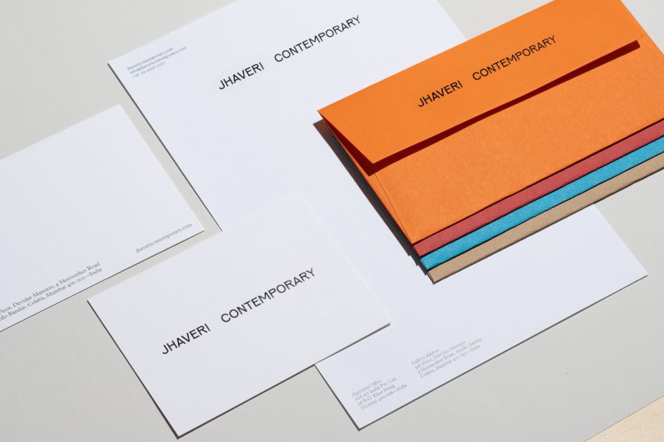
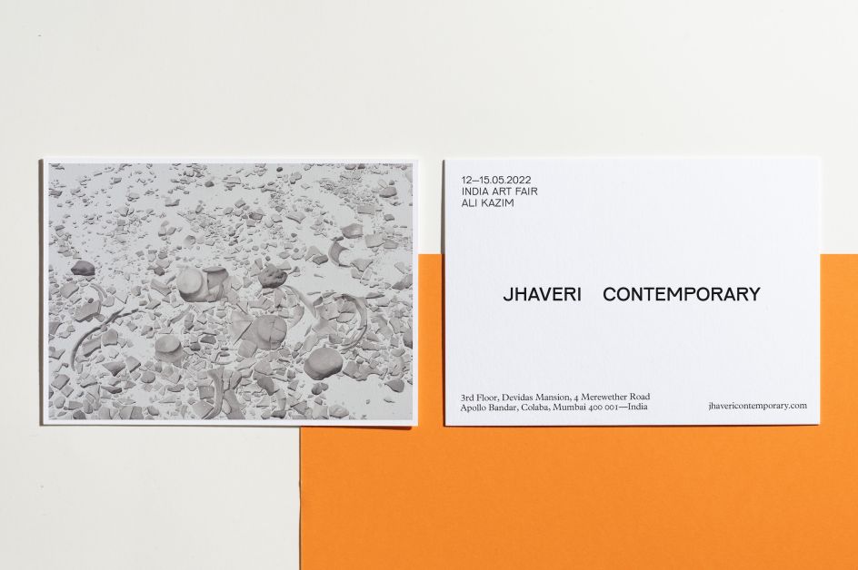
Sthuthi Ramesh's Jhaveri Contemporary gallery identity is inspired by a 1966 milk kiosk
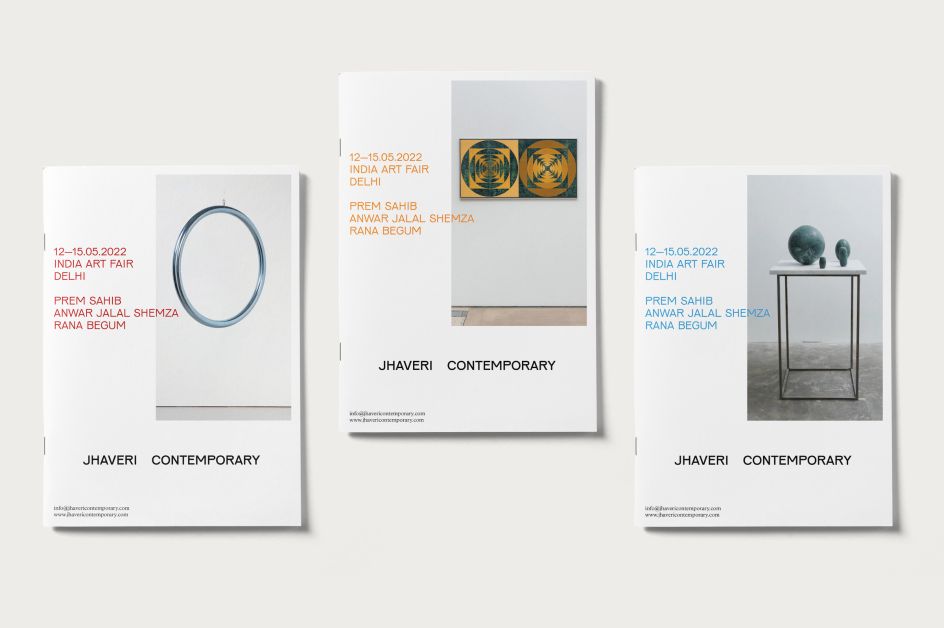
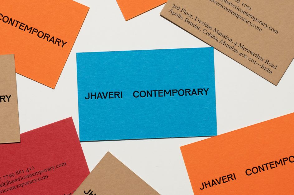
London-based graphic designer Sthuthi Ramesh has created a new brand identity for Mumbai-based contemporary gallery Jhaveri Contemporary.
The gallery was founded in 2010 by sisters Amrita and Priya and focuses on representing artists of all ages and nationalities whose work is informed by South Asian connections and traditions. Jhaveri Contemporary's space in Mumbai is on the third floor of a heritage building which overlooks the Gateway of India monument. To enter its second decade, it was looking to refresh its branding to create a stronger, more distinctive visual language.
"The brief was to create a brand that encapsulates young modern India, and nuances of the midcentury/post-independence design aesthetics," says Ramesh. "As a small-sized contemporary gallery in Mumbai, the client wanted the gallery's identity to appear confident, smart, simple and to capture nuances from the gallery's interiors."
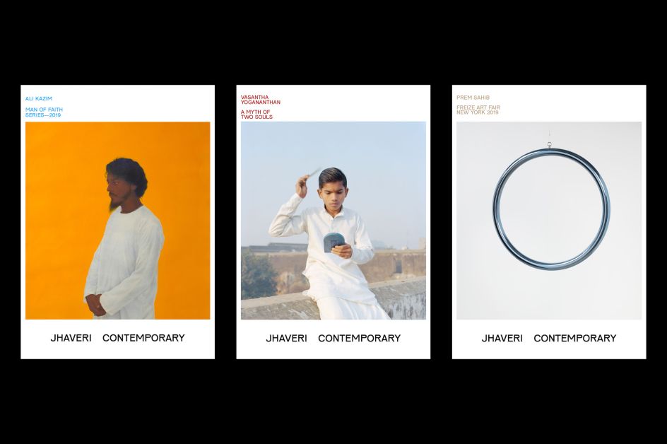
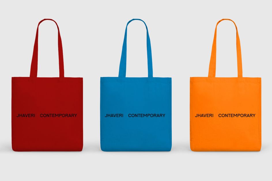
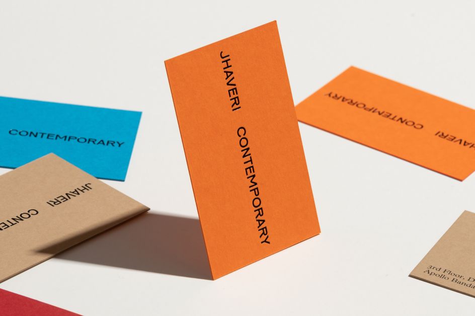
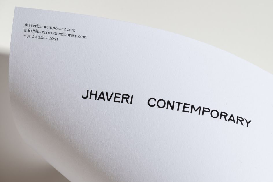
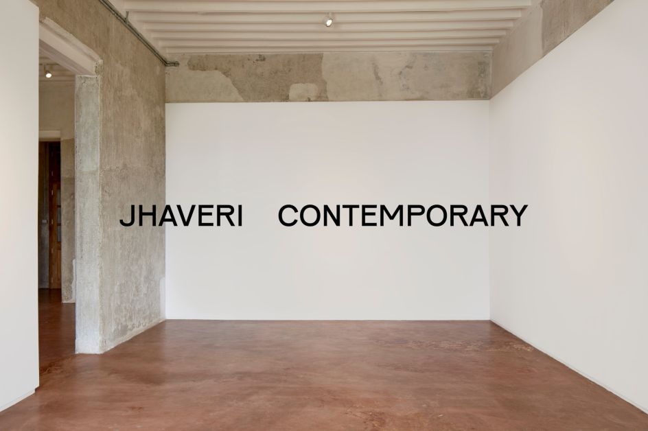
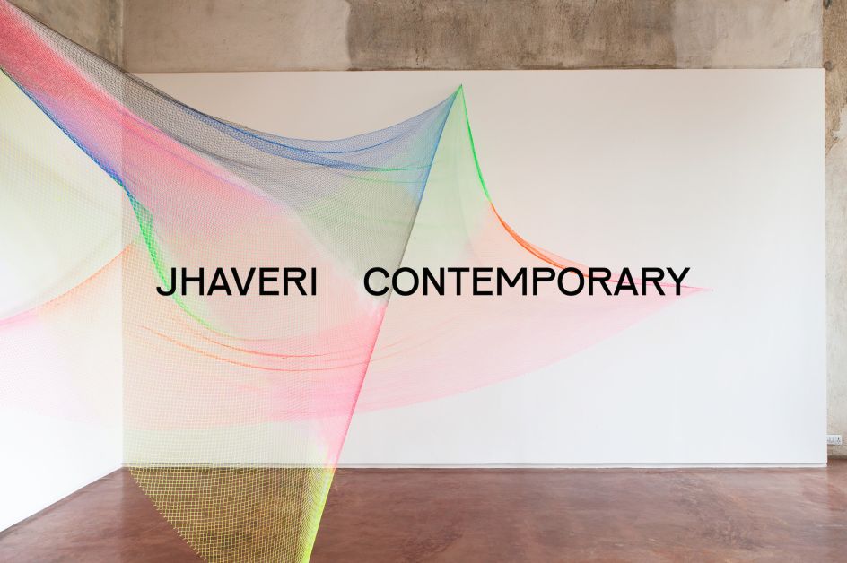
She created a new wordmark is influenced by the gallery’s unique interiors, using a typeface designed by Karel Martens and Jungmyung Lee. This was chosen for its distinctive motif of unusual high-waisted capitals, with touches of wabi-sabi adding a sense of timelessness," adds Ramesh.
This typographic system was informed by lettering that Ramesh found on a Milk Kiosk designed by Indian designer Prof Sudhakar Nadkarni in 1966 at the Ulm Design school. The hand-drawn sans serif type read "दूध" "Dhoodh," which translates as "milk". She went on to discover more about post-independence typefaces in India. "Most of the typefaces were modern sans serif but had these irregular hand-drawn features to all of them," she says. Lacking the time and budget to create the bespoke typeface she'd hoped for; instead, she used Pirelli font, "which is exactly what I wanted with its nice irregularities, yet has a monoline structure, which reminded me of the type I saw on the Milk Kiosk image," she says.
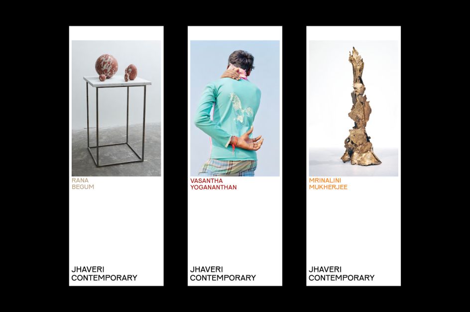
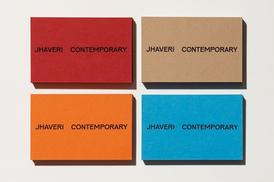
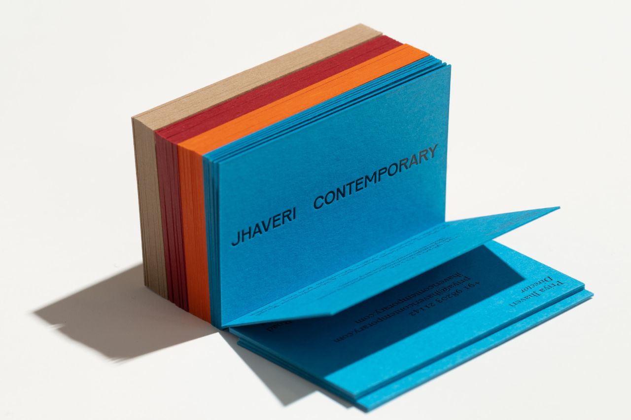
The spacing between the two words in the gallery name is deliberately striking to create a "pause" that looks to places the gallery's artists at its centre. This negative space also makes the identity more flexible for use across various applications and sizes. The identity's colour palette was inspired again by the architecture of the building: blue echoes the galleries rafters, red replicates the red-oxide floors and earth tones look to reflect the raw walls and reclaimed teak windows.
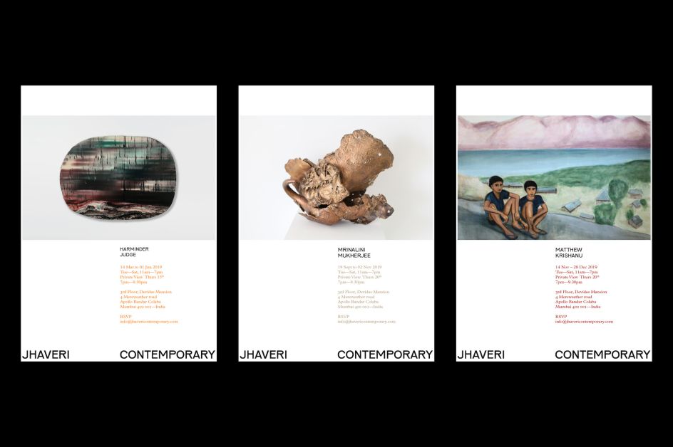
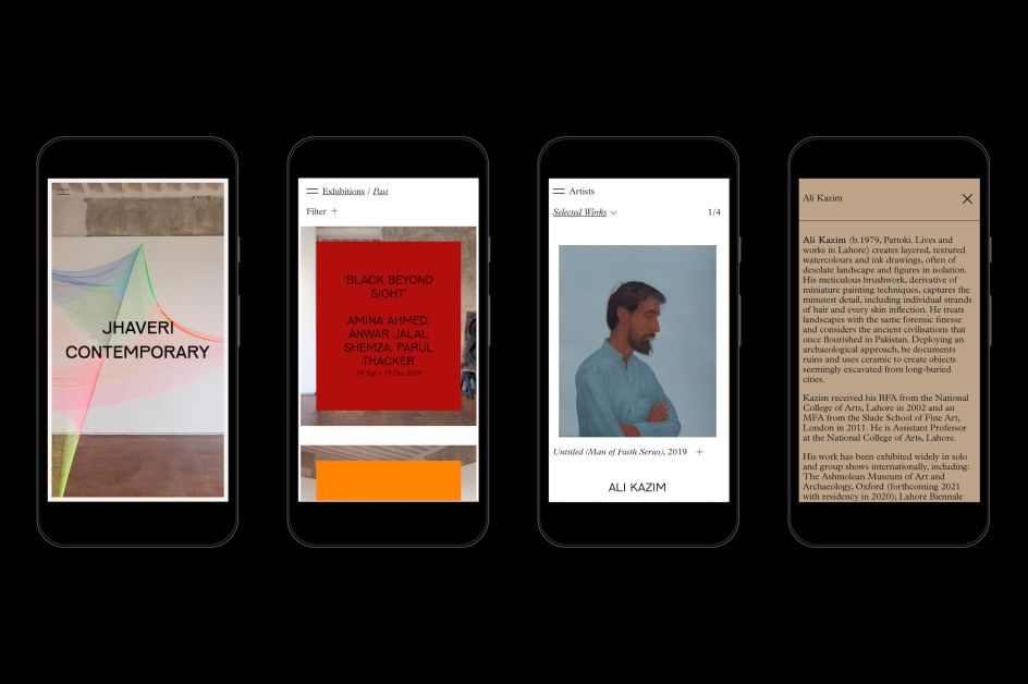
The year-long project saw Ramesh work across the brand identity, gallery website, viewing room and printed matter; she also created brand guidelines and digital templates to pass on to the internal team. "On the website, the client soon realised they needed a virtual Viewing Room to feature online exhibitions now that everybody was going online," she says. "This was a very interesting challenge to solve for me as a designer. Along with our developer, we created a simple system the client can use to easily create interesting online exhibitions. We also added an in-room viewing feature for artworks using their gallery space as a backdrop, which looks quite cool. It is launching next month which we are thrilled about."
Ramesh has previously worked for Pentagram, Made Thought, Moving Brands, Studio Koto, Browns Design and Wieden+Kennedy.
