Earthy but electric: Two Stories creates vibrant branding for new sustainability body
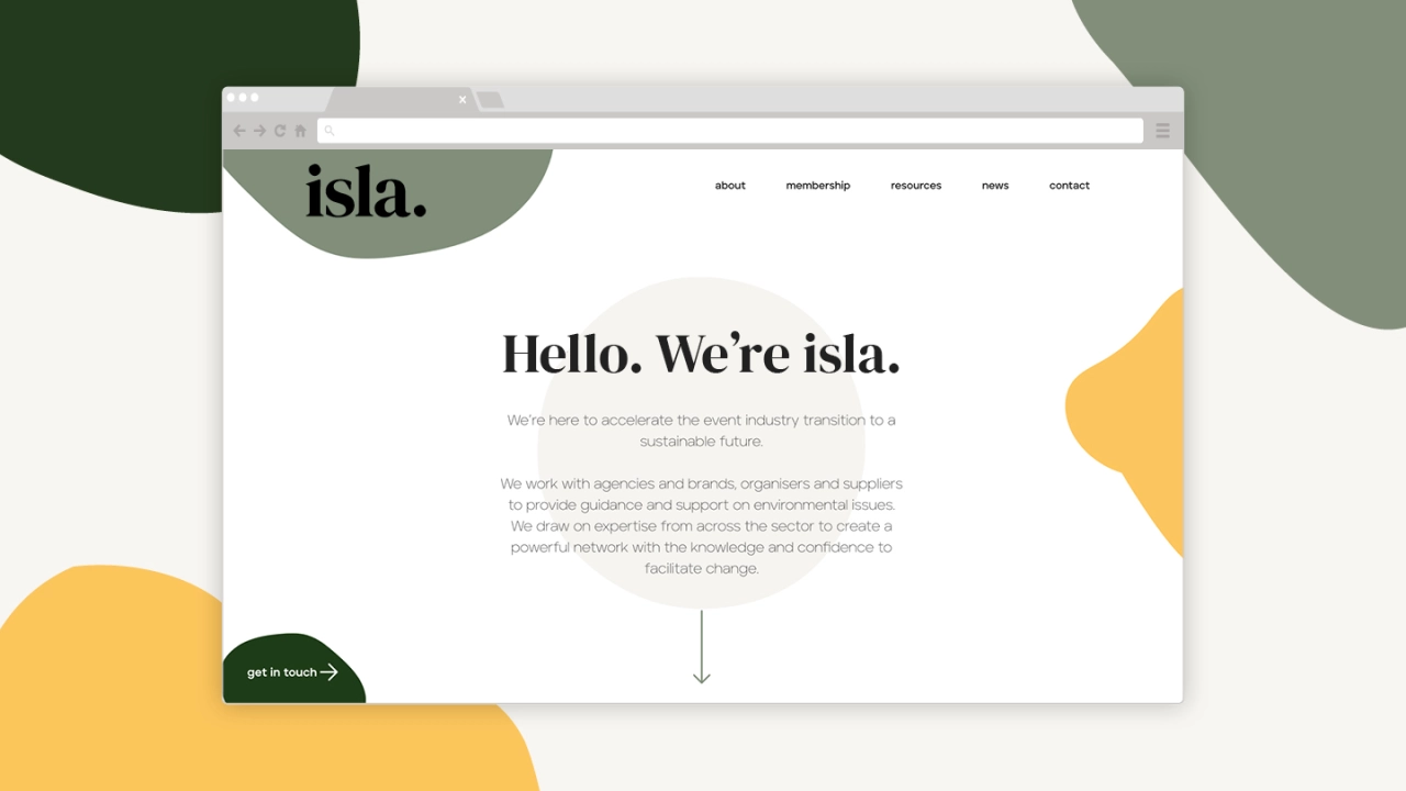
Few sectors of the economy have been affected more by the pandemic than events. But the industry is fighting back with new initiatives. Recently, for example, 12 event agencies have come together to found isla, a new organisation to promote environmental sustainability within the business. And Lancaster based design studio Two Stories have delivered some lovely looking branding and web design to help them get up and running.
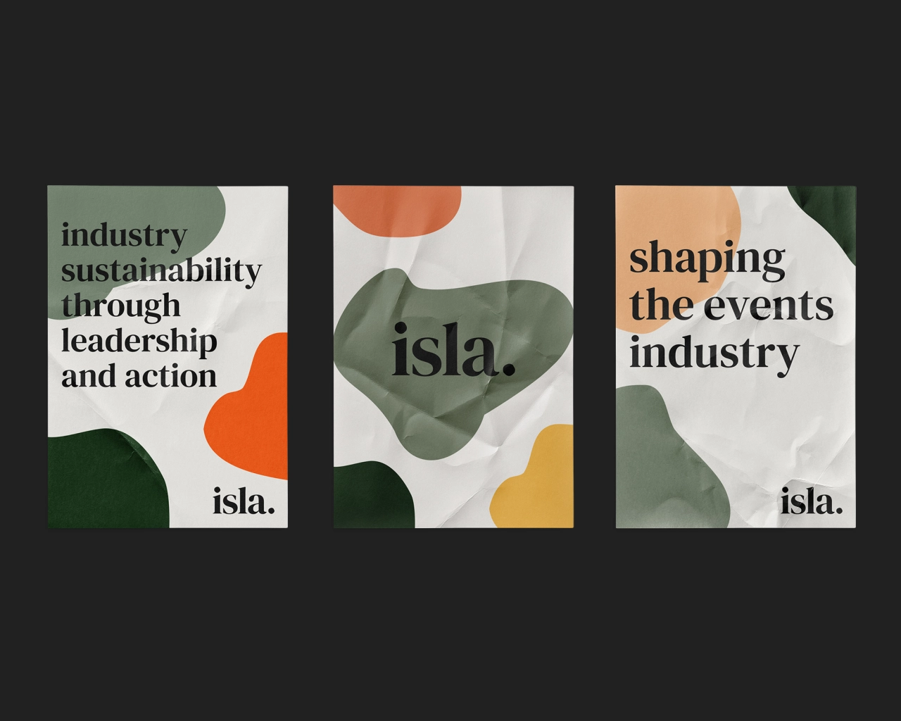
The studio was approached by isla for the project with nothing but the organisation's name in place. The brief was to create a brand and website that would accelerate its launch and represent the movement, whilst pushing the transition to a sustainable future. "isla has such a strong ethos and business objective; they want to empower people with the right information to engage in and promote behavioural change within the events industry," explains Two Stories' creative director Bekkie Hull.
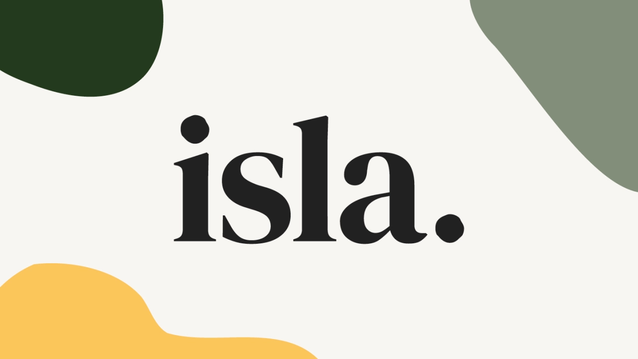
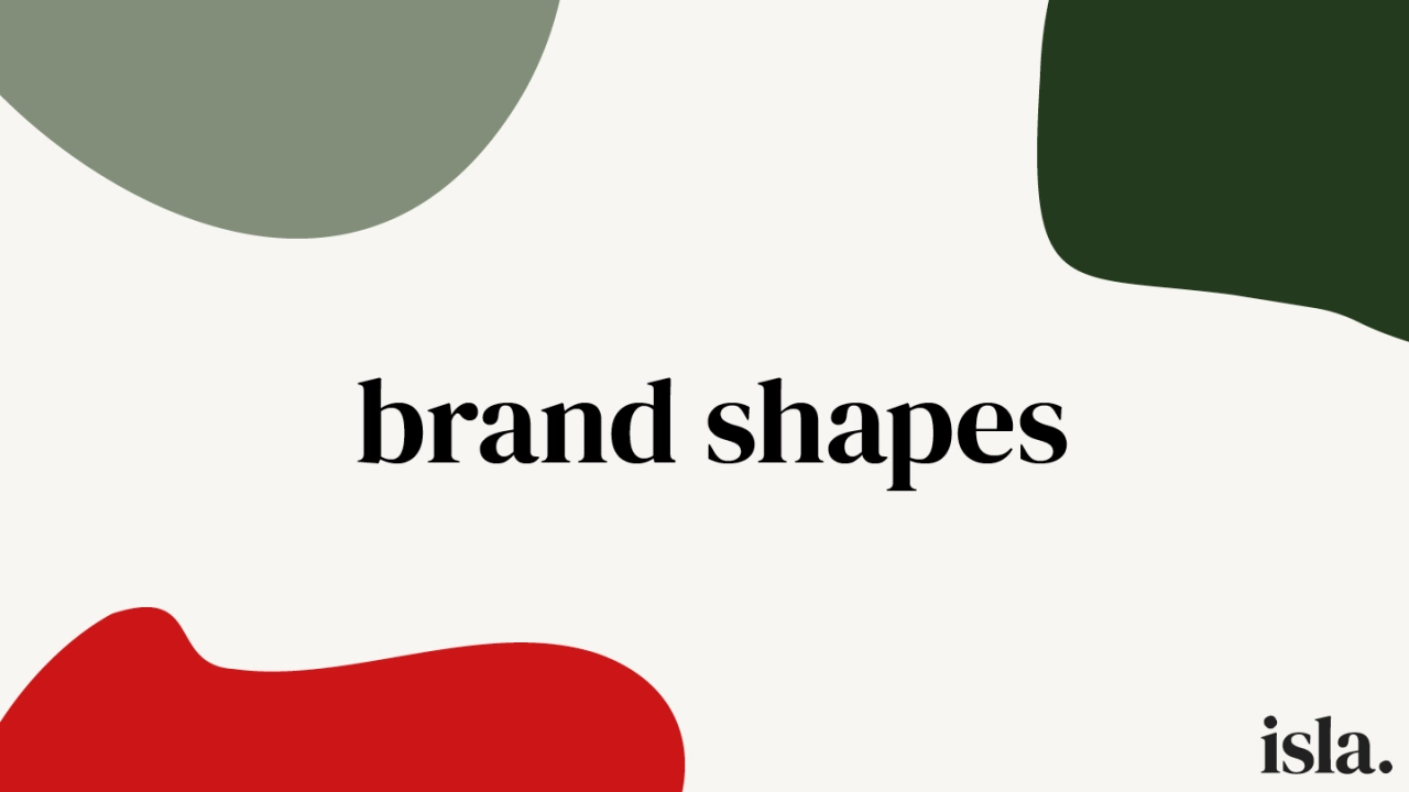
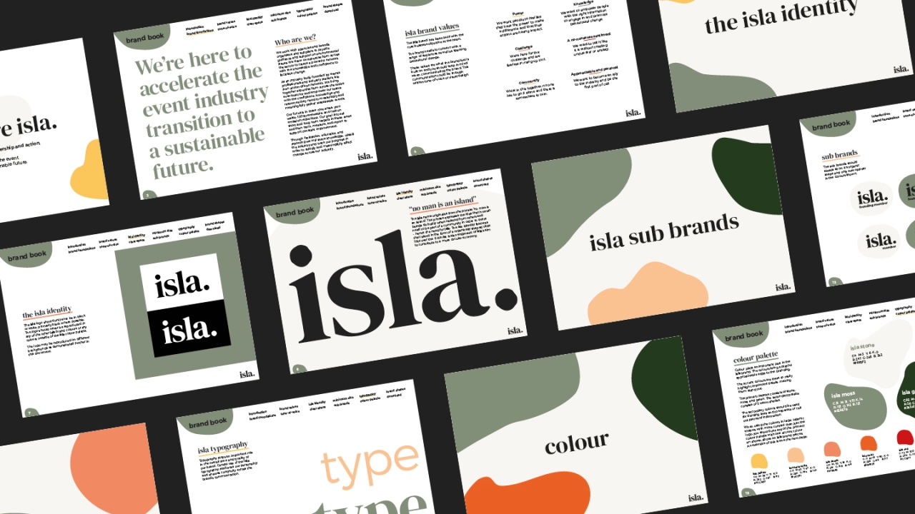
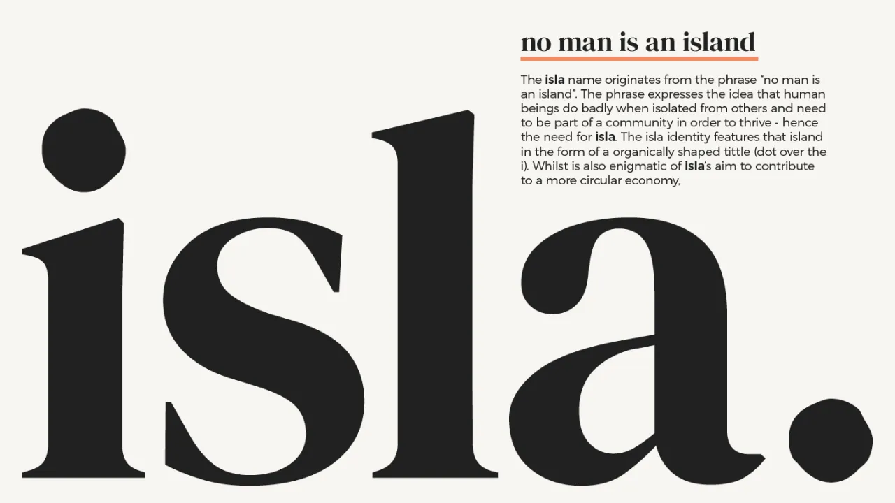
The brand and website are centred around those exact values. The organic brand shapes are enigmatic of isla shaping the event industry, and their contribution to a more circular economy. The core earthy colour palette oozes sustainability but is injected with strong vibrant accent colours to give the electric vibe of the events industry.
"When you see the shapes morph on the website, you really get a sense of the brand," says Bekkie. "It needed to have those elements of fun and vibrancy to be approachable, but with a real seriousness and stark messaging behind. The brand might be playful, but it will accelerate change, and it will change the shape of the events industry."
Editor's Picks





Trending






Latest Jobs
Creative Content Executive at Cognition
Full-time·Birmingham·£28k–£35k
Client Director at Koto
Full-time·Berlin·€70k-€85k
Senior 3D Motion Designer at Art&Graft
Full-time·London·£50k-£65k
Midweight Graphic Designer at We Are Your Friends
Full-time·London·£36k–£44k
Senior Brand Designer at Analogue
Full-time·Leeds·£38k-£45k
Creative Director at Koto
Full-time·London·£95k-£130k