Hudson-Powell's Impala rebrand finds the human side to empowering tech
Pentagram partners Luke Powell and Jody Hudson-Powell have collaborated with tech-driven travel platform Impala to create a new brand identity which finds the engaging, human side to its services. It's all part of an effort to create a fairer and more sustainable ecosystem for Impala and its audience.
The phrases "tech-dominated travel" and "business-to-business" aren't the most friendly or accessible you're likely to hear, even if their intentions are good. That was the challenge facing Hudson-Powell as they were tasked with rebranding Impala with a new identity: to create a look that demonstrated that the company had the same love of travel as their audience.
To achieve this more approachable tone, Impala's new look centres around Hudson-Powell's clear strategic framework. It includes a friendly tone of voice, a colourful visual identity and a bespoke typeface. Importantly, all of these elements needed to be ownable, contain a direct connection to travel and translate seamlessly into Impala's products. No easy feat.
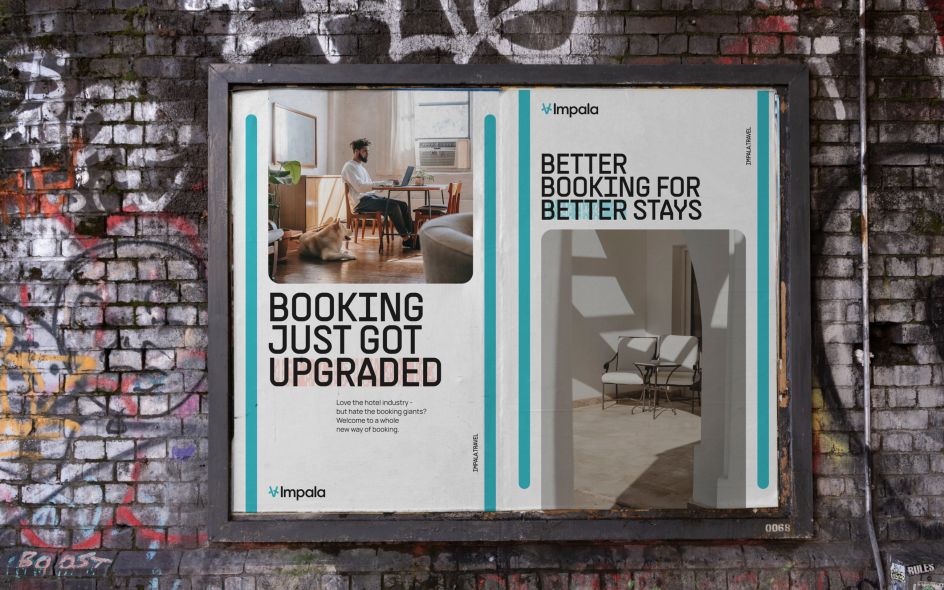

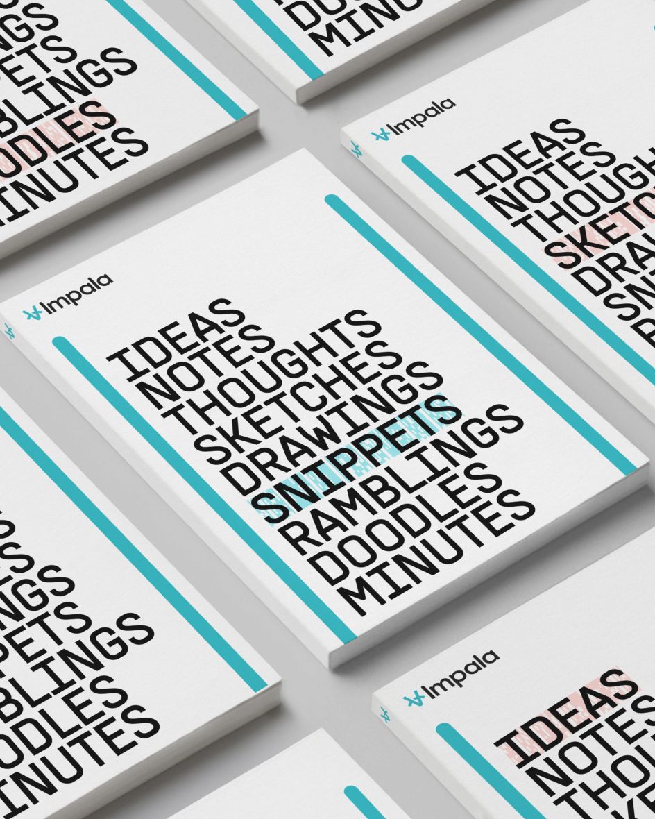
To achieve all of these criteria, Hudson-Powell took inspiration from the everyday graphic language of travel. Symbols and signage from airport arrival boards, railway tickets and luggage labels were all a major influence. They instantly evoke the jittery excitement travellers feel as they prepare to set off on a trip. By echoing the procedures and aesthetics of travel via typography that wouldn't look out of place on an electronic departure sign, users are subtly put into the jet setting mindset before they've even left the front door.
Type experts will undoubtedly recognise that the primary Impala typeface, named Impala Supply, is an adaptation by PangramPangram of its original supply typeface. Thanks to the inclusion of precise curves and sharp, industrial design-inspired angles, its bold forms further capture air ticket and air tag typography. Which, if you've ever waited for a layover, will be an all too familiar sight.
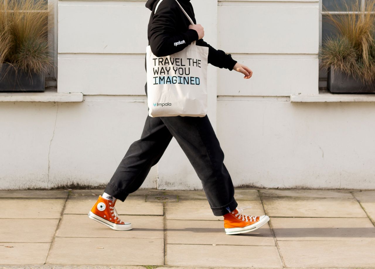
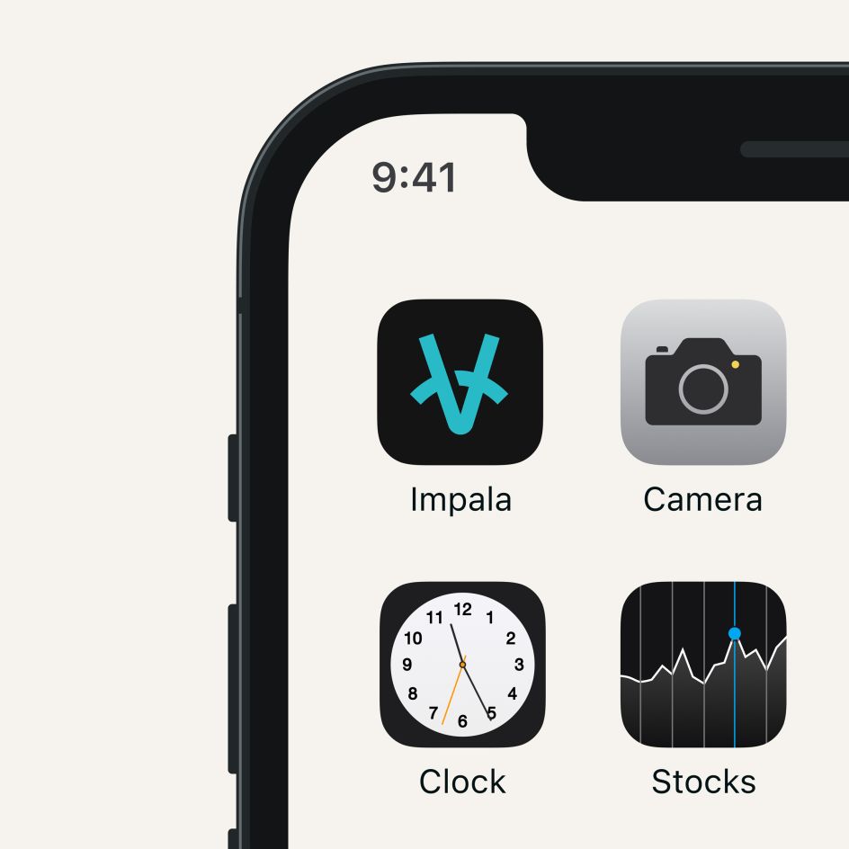
Even the stylised, cool blue Impala logo embraces this graphic language. By combining the image of a compass - a classic guide that has long been used to help people explore new territories - with the sleek profile of the impala - an antelope that embodies speed and efficiency - Hudson-Powell have crystalised the essence of the brand in one image that really pops from home screens cluttered with other icons.
And speaking of the colour palette, even this has been specially chosen to appear inviting and relaxing. Channelling as it does the soothing hues of sunsets, sand and the sea, the new Impala identity captures everything that travellers hope to experience as they traverse the globe.
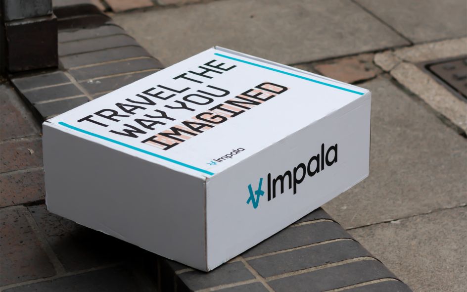
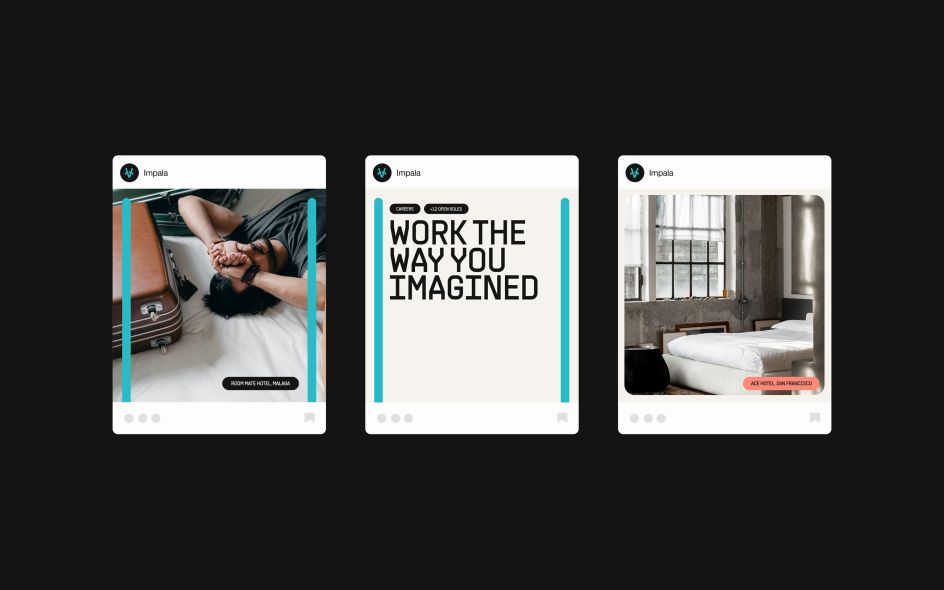
This travel vernacular-inspired graphic language can be seen across various Impala applications, both on and off-line. A pair of colourful vertical bars taken from the design language of tickets neatly bracket Impala's content, whether that's on boxes, posters and in-app photos. A coloured barcode device is also used to emphasise certain words on marketing material in a way that is not only wholly unique to Impala but also impactful and legible.
Topping off Impala's new design identity is a system of colourful, travel-inspired typographic tags and buttons. Along with three different sets of icons - which are broken down into functional, illustrative and technical designs - Hudson-Powell have managed to create a striking rebrand that seamlessly combines online environments for its customers while also ensuring Impala stands out in the competitive world of B2B travel.
Editor's Picks


Trending


Podcasts


Editor's Picks
Further Reading