Hopscotch helps small businesses skip the BS with a fun and approachable brand system
Branding agency Motto has collaborated with B2B payment platform Hopscotch to create a new bright and friendly identity that communicates how it can help users hop, skip and jump over the various obstacles of running a small business.
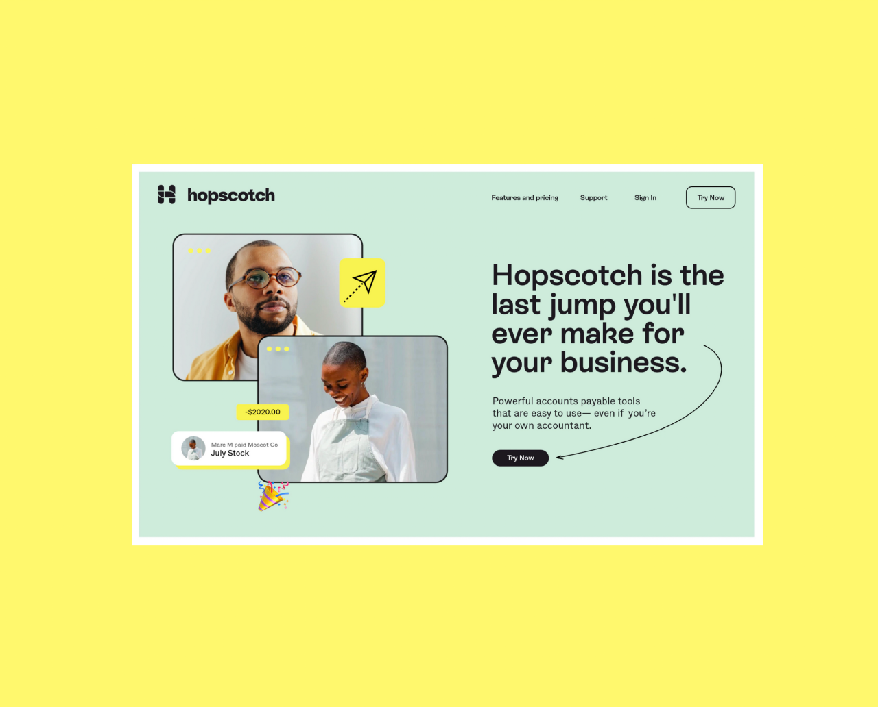
Anyone who's ever taken the leap and started their own business will tell you that there are many things to consider besides providing your actual service. And among these many concerns, money is a top priority. Enter Hopscotch – a community-oriented, fee-free platform designed to help startups and small businesses process their accounts.
Having recently launched its private beta, Hopscotch has opened its virtual doors to waitlist customers. And a crucial part of that onboarding process rests on the shoulders of the brand identity, carefully crafted by Motto. Bright, pleasant, and above all approachable, Hopscotch's brand system is there to reassure users and help them skip the BS of running a business.
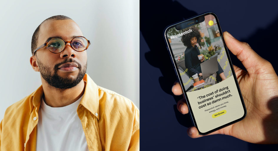
Speaking to Creative Boom, Motto co-founders Sunny Bonnell and Ashleigh Hansberger reveal that the CEO of Hopscotch reached out to them under the stealth name 'Zuro' to request their flagship brand package. "Flagship is our most holistic brand offer where we fuse strategy and creativity for ultimate brand cohesion," they say.
"Thankfully, the Hopscotch team understood the value of a brand and saw us as a true partner. They didn't ask us to do the dog and pony show because they knew our reputation as a top branding agency. Pitching de-values our industry, so we steer clear of those types of engagements."
As for the genius idea to name the platform Hopscotch – which is, of course, a popular playground game where players hop and jump over obstacles - that was Ashleigh's idea. "She names many of our client's brands, several of which have become household names," says Sunny. "She named the Hopscotch brand to suggest overcoming obstacles and finding the quickest path through and around to achieve a goal.
"With Hopscotch, small business owners can seamlessly hop, skip, and jump through the hoops of B2B payments. She chose a name that perfectly captures the feeling of Hopscotch which is a game-changing B2B payments platform created by tech innovators obsessed with simplicity."

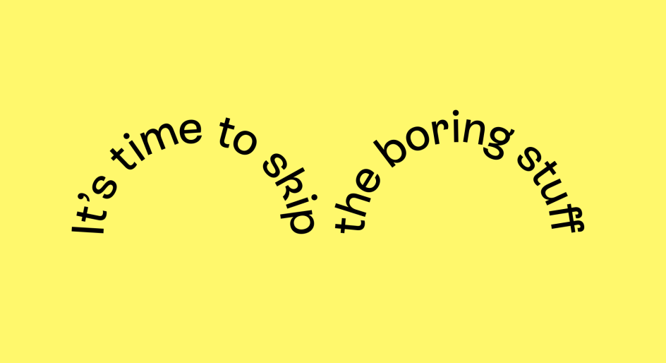
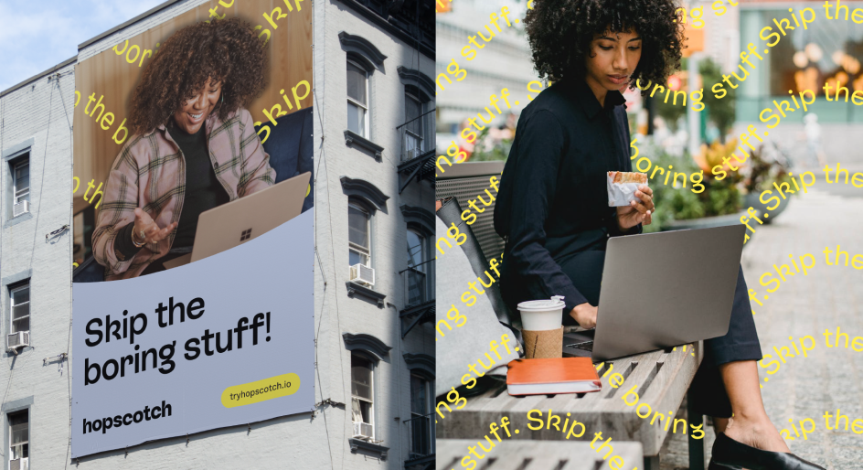
When it comes to developing brand systems, one of Motto's approaches is to develop the big idea, Worth Rallying Around™. This is the simplest encapsulation of what the client is all about, and in the case of Hopscotch, the big idea was 'Skip the BS'. Sunny and Ashleigh explain: "The brand system was designed to emanate the simplicity of the platform and a 'skip' of the typical business pain points - fees, platform incompatibility, or the 'boringness' of bookkeeping.
"BS = bulls**t, bad service, boring stuff, and/or business stress. We wanted to create a brand and business strategy that speaks to this audience and could solve the problems within today's financial platforms."
Covering everything from strategic workshops with leadership, brand naming, messaging, visual identity, and art direction, Motto's brand identity for Hopscotch is the result of thorough work, research, and a keen understanding of the platform, its clients and their needs. "It's a revolutionary approach to business – in a human way, with an intuitive interface, backed up by the latest technology trends, a vibrant community, and financial expertise.
"Motto was able to go deep into the strategy and encapsulate the challenges involved in managing a business. The late nights. The headaches. The time-sucking, anxiety-inducing reality of managing the money side of things. The pains of running a business are real. Avoiding this type of BS is where the brand flag was planted."
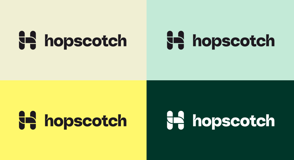
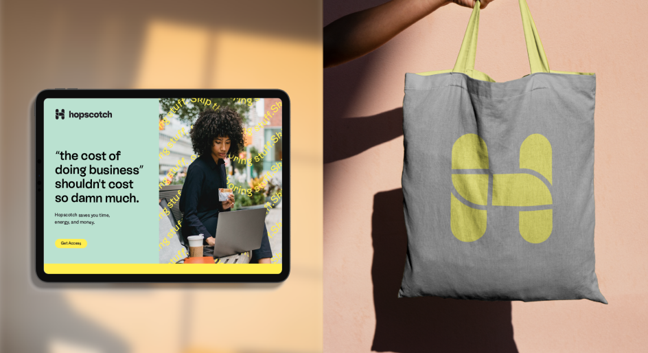
This approach extends to the logo design, which uses the skipping and hopping movements people make when leaping across a hopscotch board. "The typography mirrors this bouncing feel with the rounded curves and loops of ES Rebond Grotesque and Whyte."
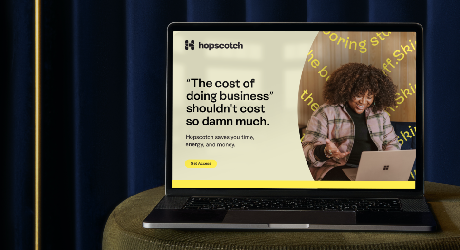
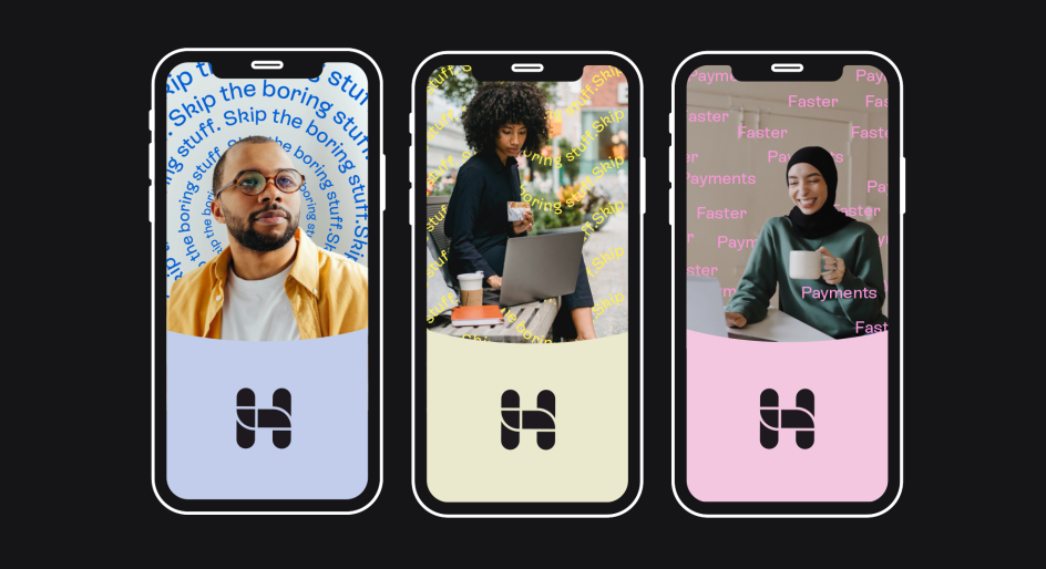
Bringing together the value-driven photography, which shows happy business owners during daylight hours (which suggests Hopscotch's ability to save time), is a colour palette based on optimism. The promise of bright, sunny days ahead is partnered with softer, monochromatic hues to make the colours stand out.
"A darker secondary accent was incorporated to give the brand lots of room and flexibility and to be used for more professional CTAs like purchasing and partnering pages," explain Sunny and Ashleigh. "The comprehensive brand system gives Hopscotch a fun, approachable feel while using loads of brand personality to drive the brand's voice. The result is a 360° brand language that is innovative, clever, cool, and game-changing."
Editor's Picks


Trending


](https://www.creativeboom.com/upload/articles/90/908fdb6378db1e95d12595416f54e6336d5e80b8_732.jpg)
Podcasts


Editor's Picks
Further Reading