Here Design creates nature-inspired visual identity for new sugar-free chocolate
London-based agency Here Design has created the colourful, nature-inspired designs for new sugar-free chocolate brand NOMOSU.
NOMOSU chocolate is created from cacao and other organic ingredients. The name stands for No More Sugar. The brand's founder, nutritional therapist Sakiko Reuterskiöld, appointed Here Design to create an identity "that will present the brand to chocolate-lovers and conscious consumers," according to the agency.
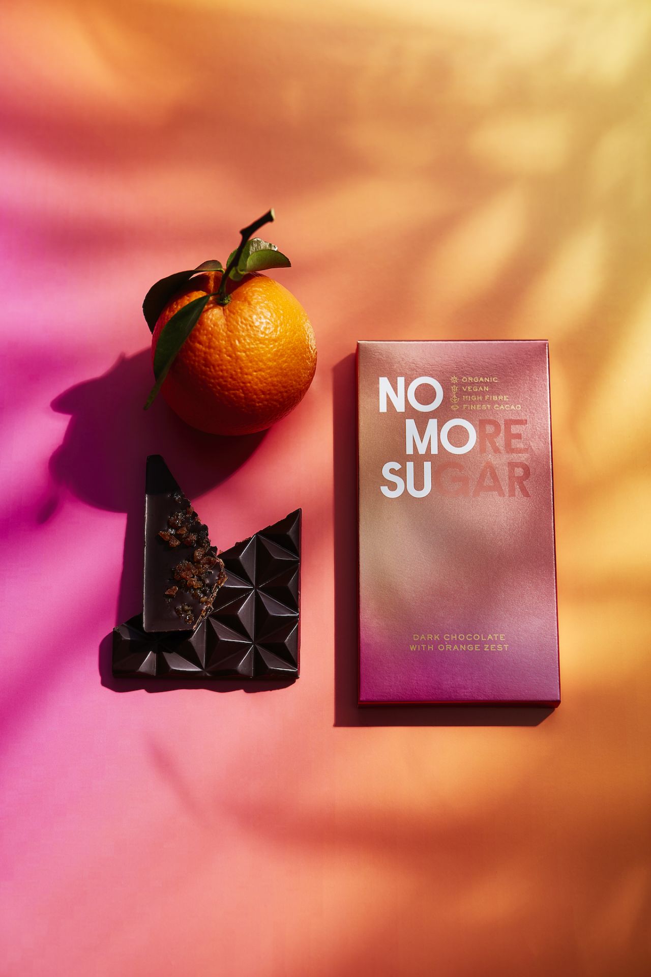
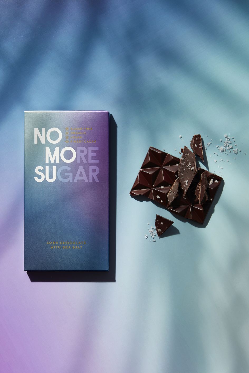
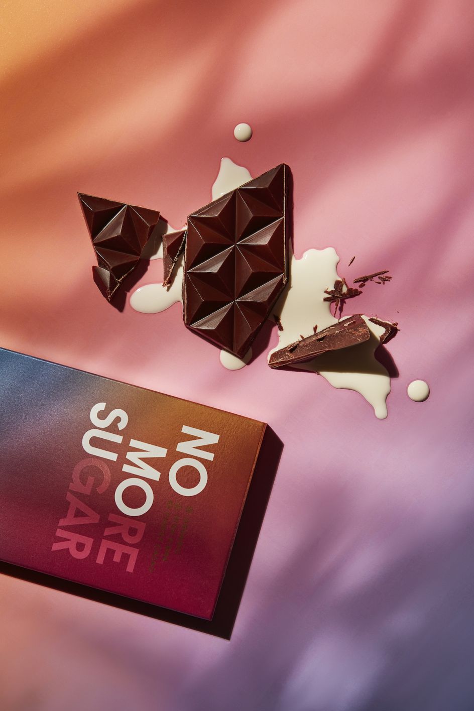
The designs use a rich, vibrant aesthetic with bursts of soft colour that look to nod to the "clarity that a sugar-free diet brings". The palette also references the forests of Central and South America from which NOMOSU's cacao is sustainably sourced.
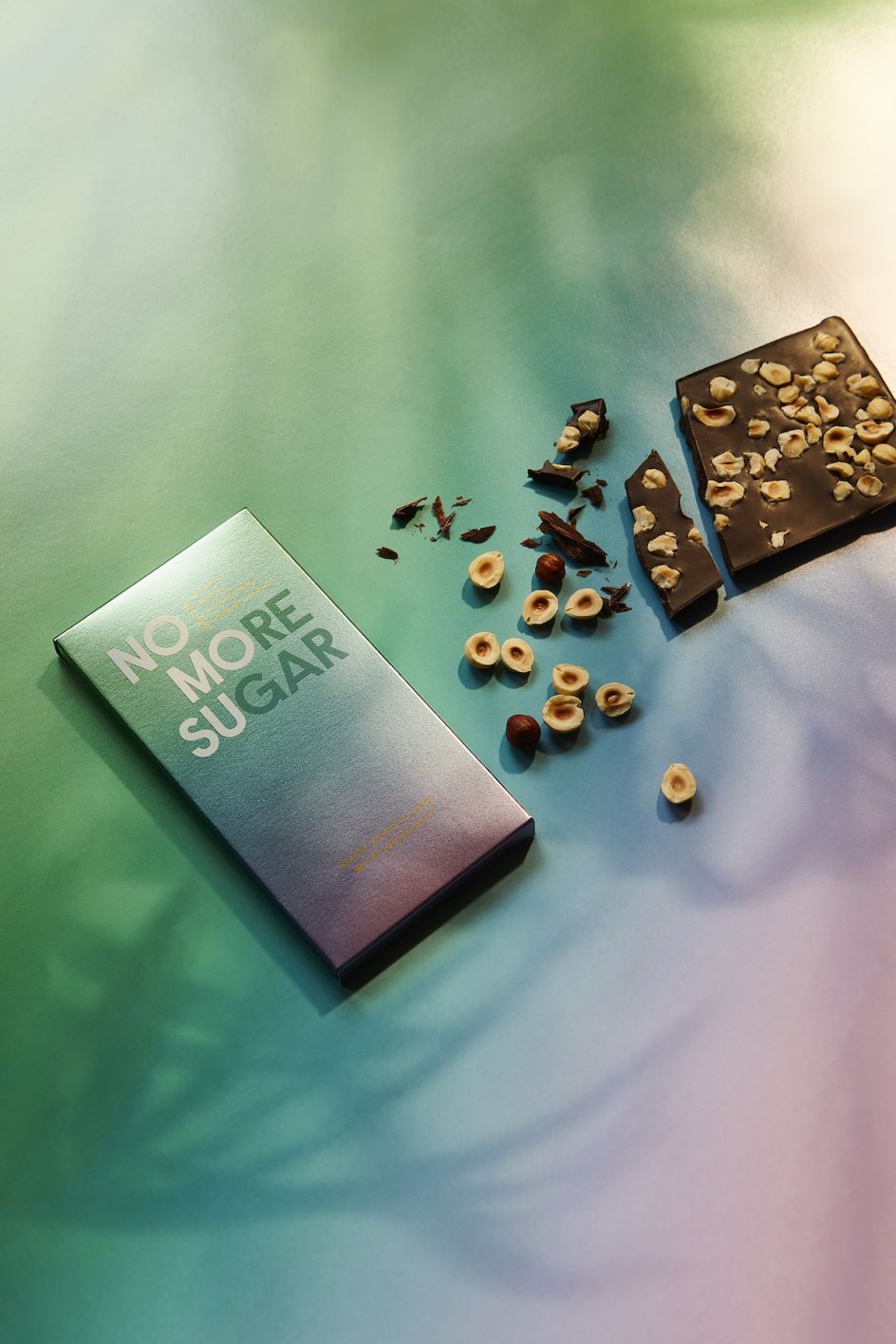
The recyclable packaging uses colours that reference the chocolates' flavours, such as green on Matcha Chocolate and deeper colours for the Dark Chocolate selections to suggest "mature, sophisticated" flavours.
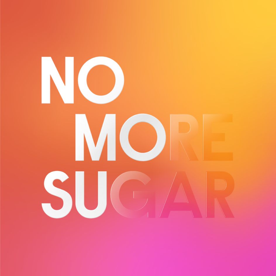
The words 'No More Sugar' are clearly displayed on each bar, with No Mo Su highlighted in a bold white font against the background clouds of colour.
"We wanted to create an aesthetic that reflected the effect of living sugar free – the vibrant clarity that is brought to flavour," says Mark Paton, co-founder of Here Design. "We also wanted to ensure that our work was refined and mature enough to echo the brand's incredibly thorough science-led foundations."
Editor's Picks


Trending


](https://www.creativeboom.com/upload/articles/90/908fdb6378db1e95d12595416f54e6336d5e80b8_732.jpg)
Podcasts


Editor's Picks
Further Reading