Here Design creates new identity for prison-based coffee company
In an interesting project, Here Design has developed a new brand identity for Redemption Roasters – a coffee company that employs the help of prison inmates at Aylesbury Young Offenders Institute.
The aim of the programme is to reduce reoffending rates through purposeful activity in an otherwise aimless confinement. Through a partnership with the Ministry of Justice, Redemption Roasters operates a roastery and barista academy within the Institute, delivering freshly roasted beans to their coffee shop in Bloomsbury and network of wholesalers and consumers.
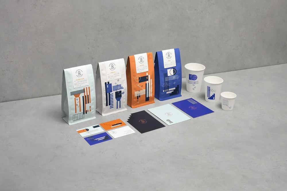
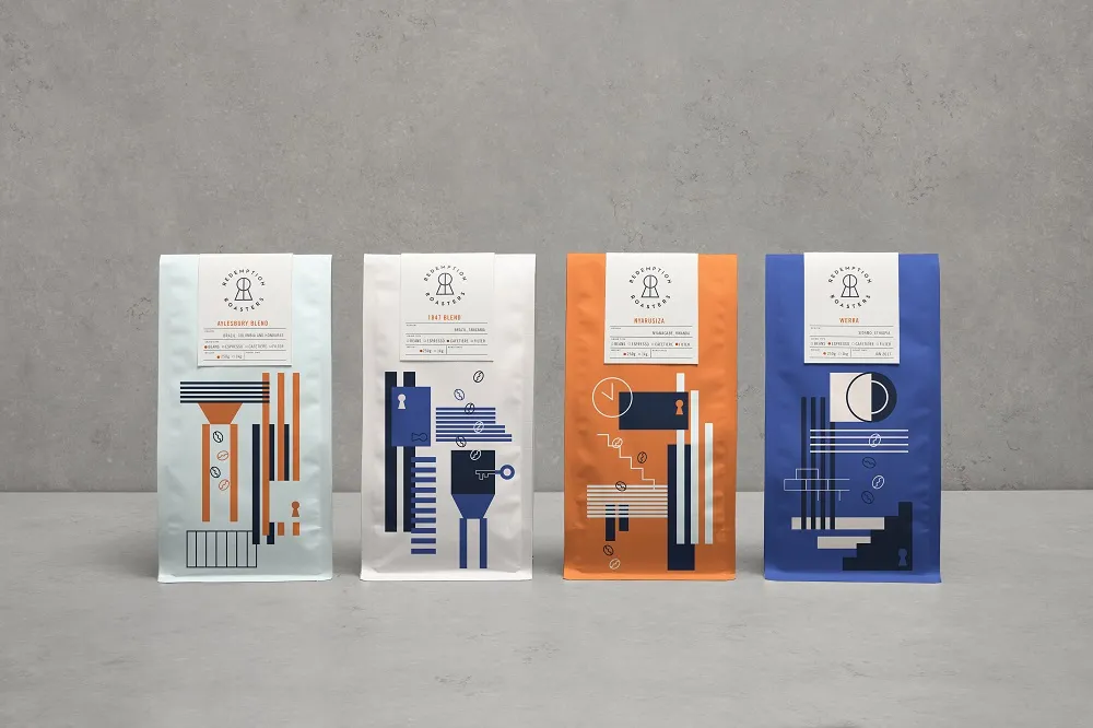
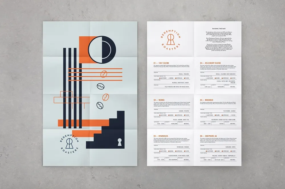
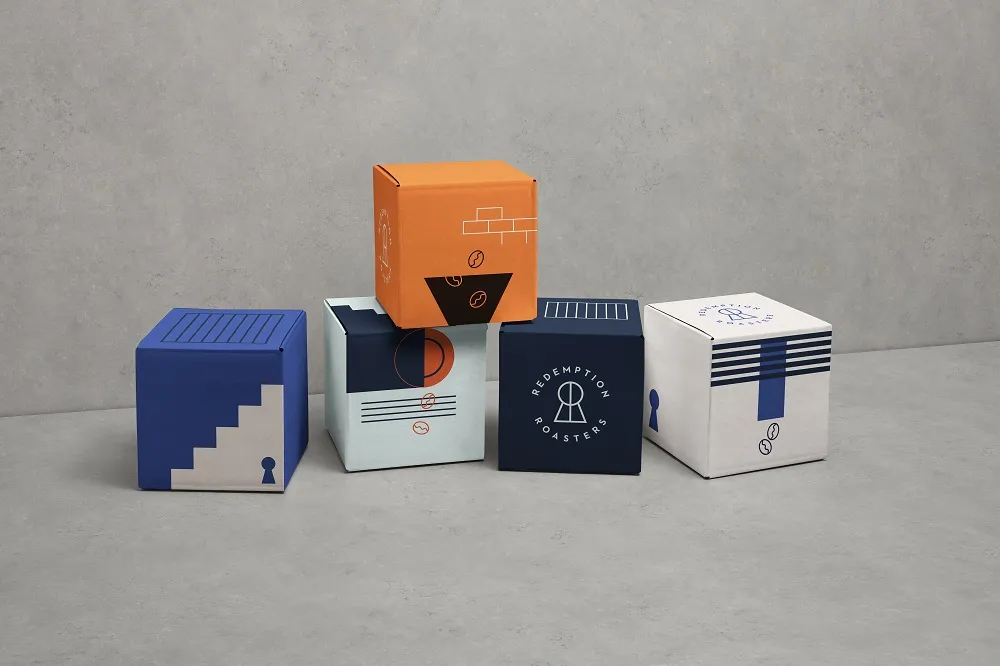
Here Design took inspiration from this powerful story of redemption through skill-building within the inmate population in the design of the new Redemption Roasters identity, following the journey with a series of colourful graphics, symbols and illustrations.
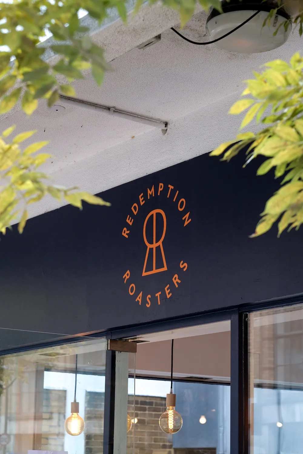
Introducing a strong, simple logo that brings together the two ‘Rs’ of the brand name, a keyhole is formed to represent the unlocking of a prison door and the unlocking of untapped potential.
A secondary language uses a playful mix of colours and symbols to ensure that the Redemption Roasters brand stands out in a category dominated by craft brown – and more recently, black – packaging, whilst telling the story of the beans from roast to cup.
Whilst the new identity highlights Redemption Roasters as pioneers for purposeful activity, the design also speaks to the redemptive powers of coffee as a restorative drink for the weary, appealing to a wider consumer audience. Discover more at www.heredesign.co.uk.

Editor's Picks





Trending






Latest Jobs
Account Manager at Moxie and Mettle
Full-time·Cheltenham·Up to £35k
Account Manager at BUILDHOLLYWOOD
Full-time·London·£34k–£38k
Senior Creative Lead at Random Studio
Full-time·Amsterdam / Paris·€90k-€110k
Design Director, Opinion at The New York Times
Full-time·New York·$160k–$180k
Creative Project Manager at Analogue
Full-time·Leeds·£28k–£35k
Account Director at How&How
Full-time·London·£73k-£79k