Blok's identity for a landmark show honours Toronto's local artists and the stories they tell
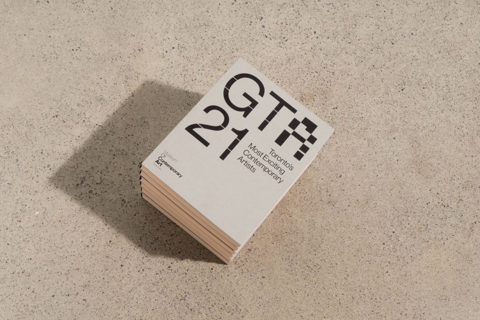
Canadian studio Blok Design has just launched a new identity for the Museum of Contemporary Art Toronto (MOCA) for one of its largest exhibitions to date, bringing together 21 local artists answering the question, What is urgent to you today?
Greater Toronto Art 2021 (GTA21) is the first in-person show at MOCA since the outbreak of the global pandemic in early 2020. Blok was appointed to come up with the exhibition's identity, environmental graphics and all accompanying materials, including a new book, which marks the museum's first foray into publishing.
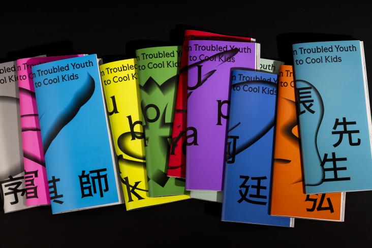
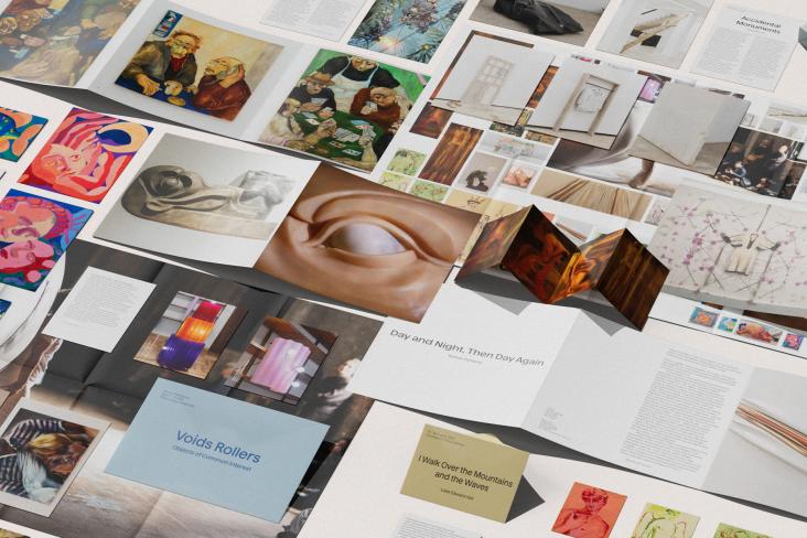
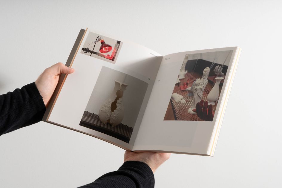
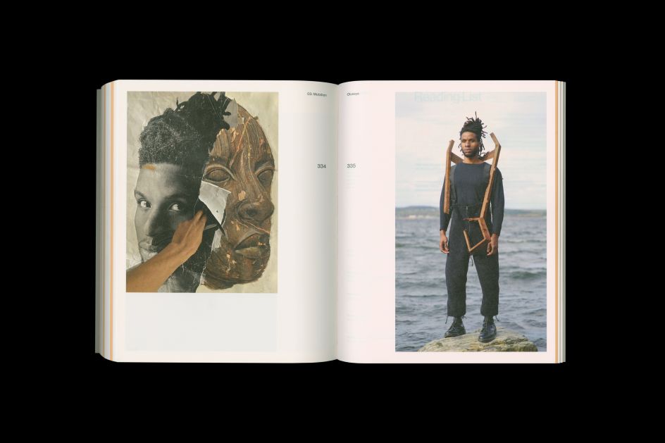
"Rooted in the profound belief of remembering, storytelling, questioning, resisting, celebrating and making, this identity and publication had to honour the re-imagining of a city and the artists working in it," explains Blok, speaking of the brief. "The result was a 416-page book including interviews and images of works in process, as well as contributions by writers Dionne Brand, Sheila Heti, and John Paul Ricco."
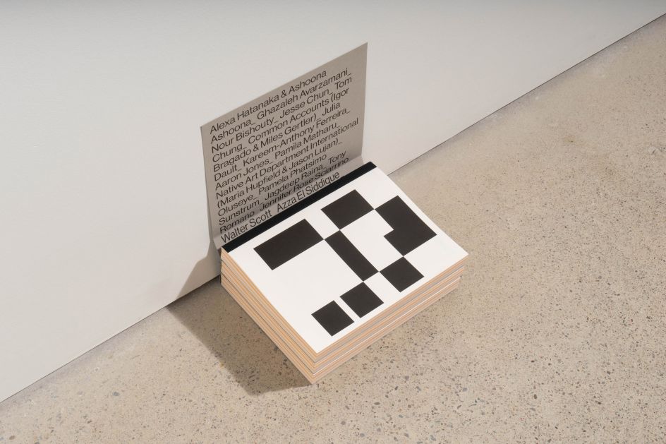
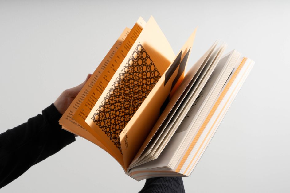
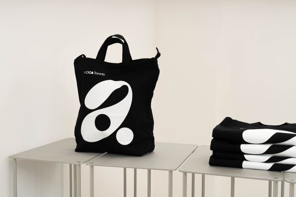
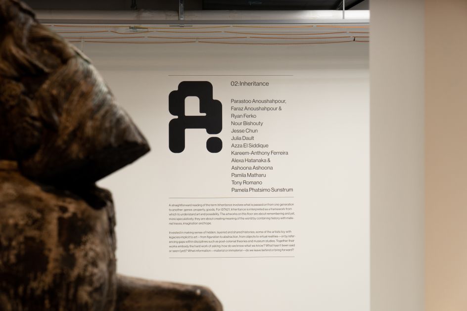
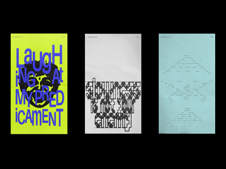
The identity is flexible and aims to "shift" with the art, artists and narratives themselves. This is demonstrated with the expanding and contracting logo, which has movement and space to hold content, as well as the custom 'A's that represent each floor of the exhibition, each one named differently: Ambivalence, Inheritance, and Mutation. For the book, a lightweight coloured paper was chosen for its transparent qualities to weave in and out of the pages, "blending content and form".
To keep consistency with the MOCA identity, Blok used Neue Haas Grotesk throughout. "We also explored custom slits cut into type which create space and a sense of dynamism plus variability," Blok tells Creative Boom. "This allowed us to have an elastic system that responded to the content while also keeping the identity's strength and boldness."
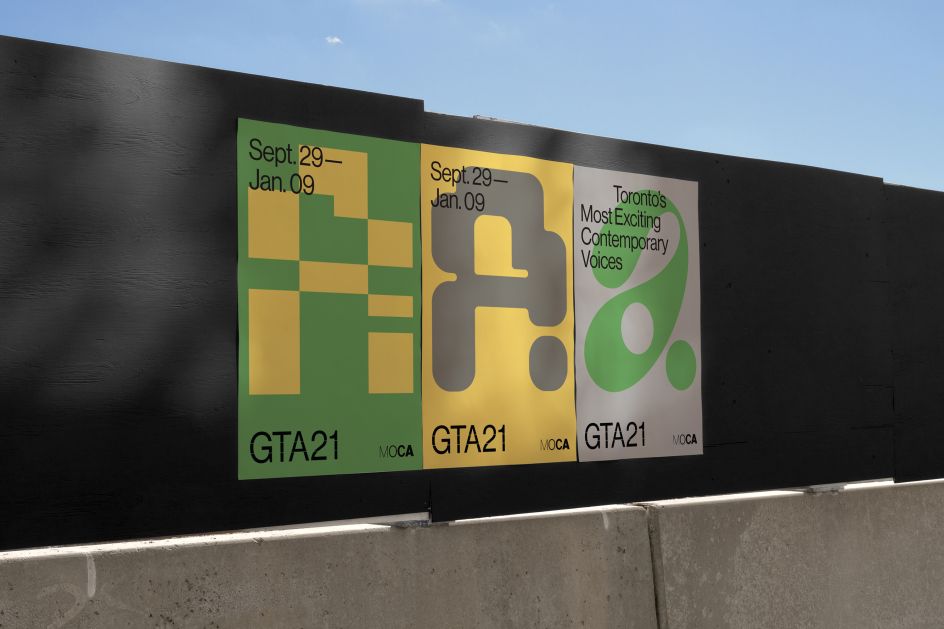
Additionally, Blok created custom hand-drawn letters that can be seen in the exhibition graphics as well as the publication to "highlight the diversity of perspectives and people while adding variation and insinuating shifts between ideas and in turn each of the floors," the studio explains.
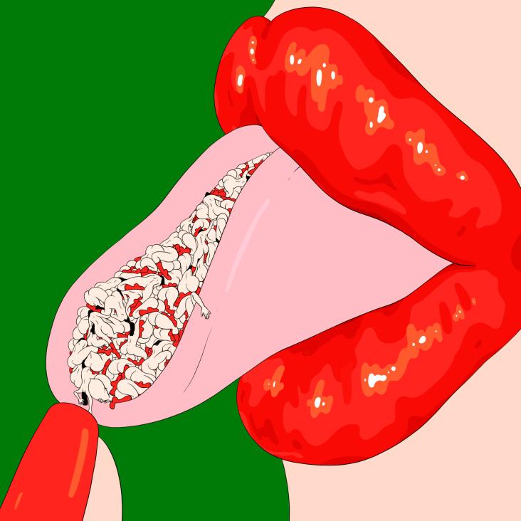
The inspiration for the entire project came from the content and work itself. "It was a deep dive into visual languages, broader narratives and thought processes," says Blok. "It makes the exhibit of 21 unique voices and artists so wonderfully potent. The typography reflected ideas and emotions as well as having a consistent point of reference – a dot – that metamorphoses from floor to floor."
Editor's Picks


Trending


Podcasts


Editor's Picks
Further Reading