Good news for seagulls fans (the football club, not the bird)
Honestly, as no sports fan – and even having lived a stone's throw from a Brighton & Hove Albion pub for years – I only knew of seagulls as those big, chuckling birds with a penchant for chips.
However, turns out Seagulls is the fond nickname for Brighton & Hove Albion football club, which has had a good few years of late—in the 2016–17 season, the team was promoted to the Premier League, ending a 34-year absence from the top flight.
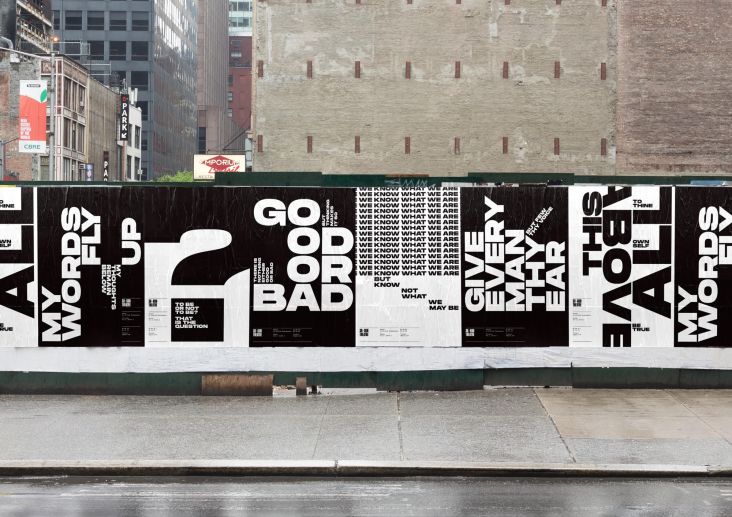
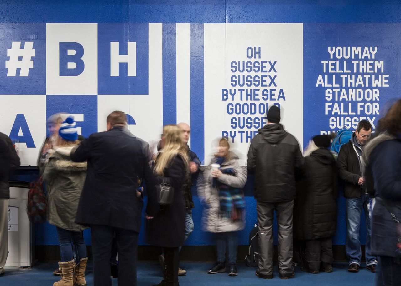
It's also done alright for itself design-wise. Last year local design firm Filthy Media designed the club a new typeface, Filthy Seagull Display, ahead of its first game of the season. "We are immensely proud of our local club and our hometown of Brighton, so we decided to create a typographic campaign that celebrates their second season in the Premier League," the team said when it launched the project in 2018.
"Using one of their famous chants as the basis for our posters, Filthy Seagull Display is a typeface full of imperfections and character, a true reflection of the city we call home."
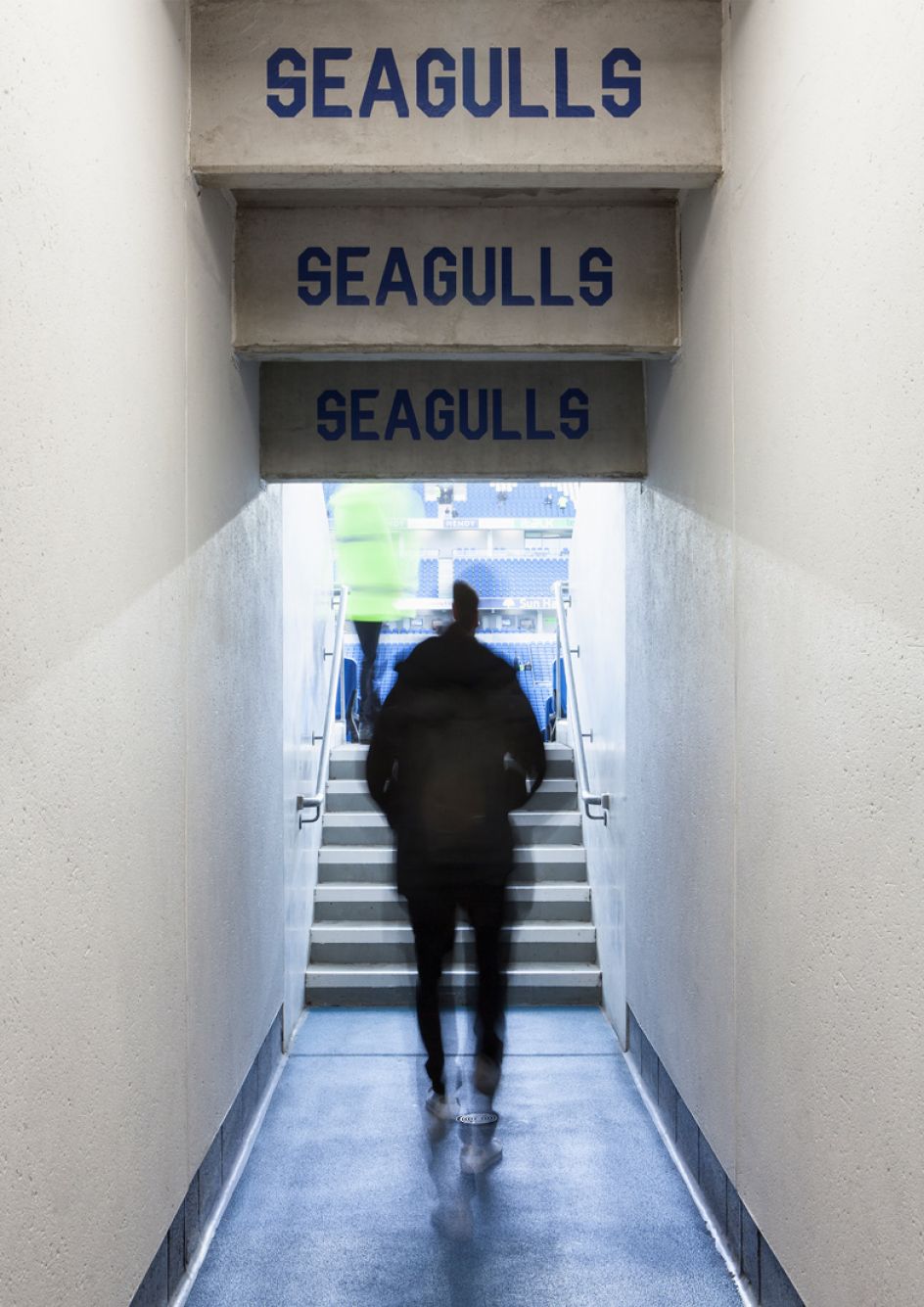
Now, the typeface is being used across a set of wall graphics for the East Stand concourse at the Falmer Stadium in Brighton.
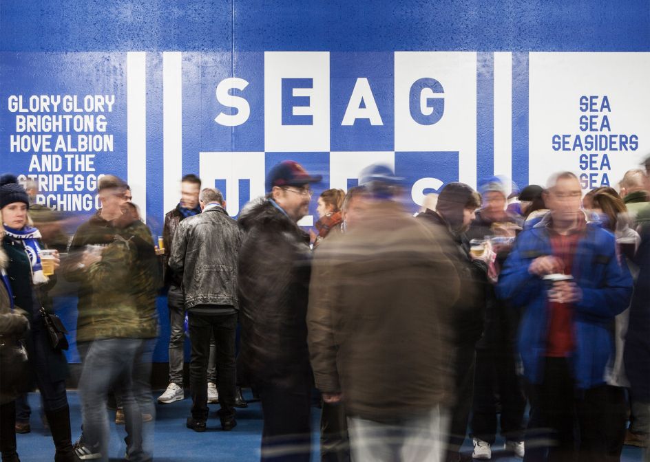
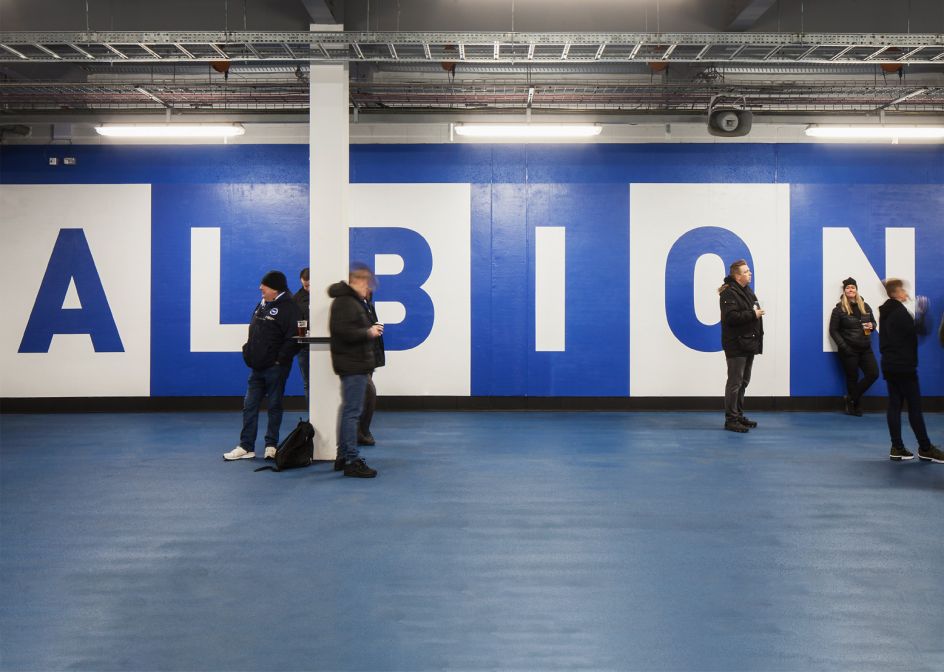
"The concept for the main wall was to utilise the typeface to create a fly poster campaign, illustrating the clubs chants and songs from the stadium terraces," says Filthy Media.
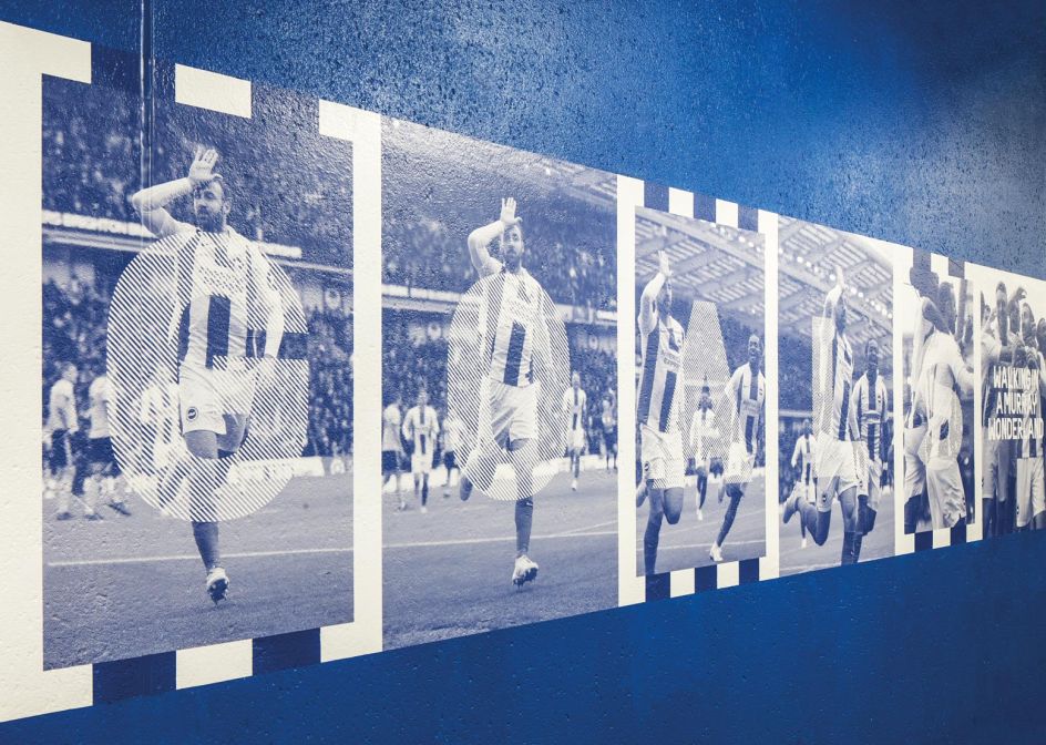
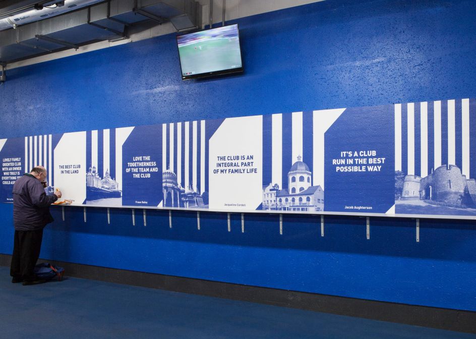
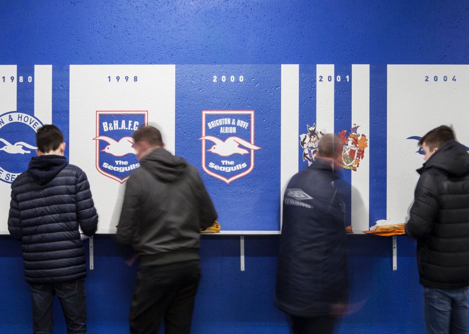
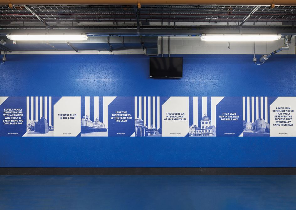
"The second wall displays statistics, celebrating the seagulls first season in the Premier League, the third wall pays homage to Glenn Murray's 100th goal for the club, the fourth wall features quotes from fans alongside location photography from the Sussex coastline, and the fifth wall shows a history of the club crests from 1948 to 2011."
The team produced and installed all the wall graphics using a 3M Film Wrap, heat-sealed directly onto the concrete render, "lending itself perfectly to the fly poster aesthetic."
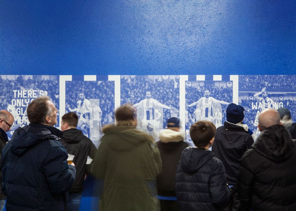
And while, again, I know next to nothing about football, what I do know is that this is a strong, bold and somehow nostalgic but modern display font; and boy oh boy is that a nice shade of blue. Apparently, though, Brighton & Hove Albion football club is the "best team in the land", according to one fan whose words have been immortalised in print for the campaign. We've no reason to argue.
Filthy Media was set up in 2004, and it says its "benchmark for graphic design came from our love of music, where creativity ran free, and the rules were there to be broken... every project we tackle is still based on this ethos. This means there is no house style and no preconceptions."
The agency works with clients including Adidas, BBC, David Rodigan, Boxpark and Sony BMG across everything from advertising and brand identity to strategy, film production, packaging, typeface design, web design and build and more.
Editor's Picks


Trending


](https://www.creativeboom.com/upload/articles/90/908fdb6378db1e95d12595416f54e6336d5e80b8_732.jpg)
Podcasts


Editor's Picks
Further Reading