Fitzroy gives Norwegian salmon brand an indie-band makeover
Mamasea is a salmon brand whose branding might remind you of your favourite indie album, and that's no accident. Amsterdam studio Fitzroy explains how they responded to the challenge of creating a "seafood love brand".
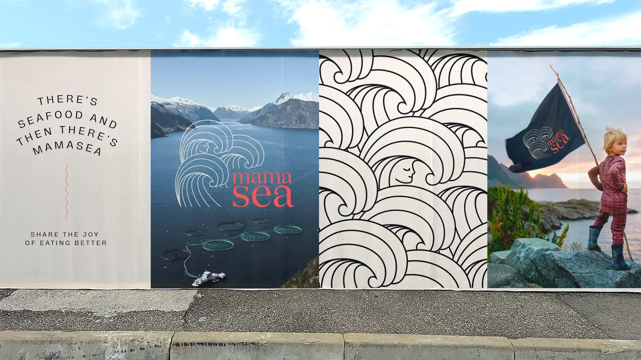
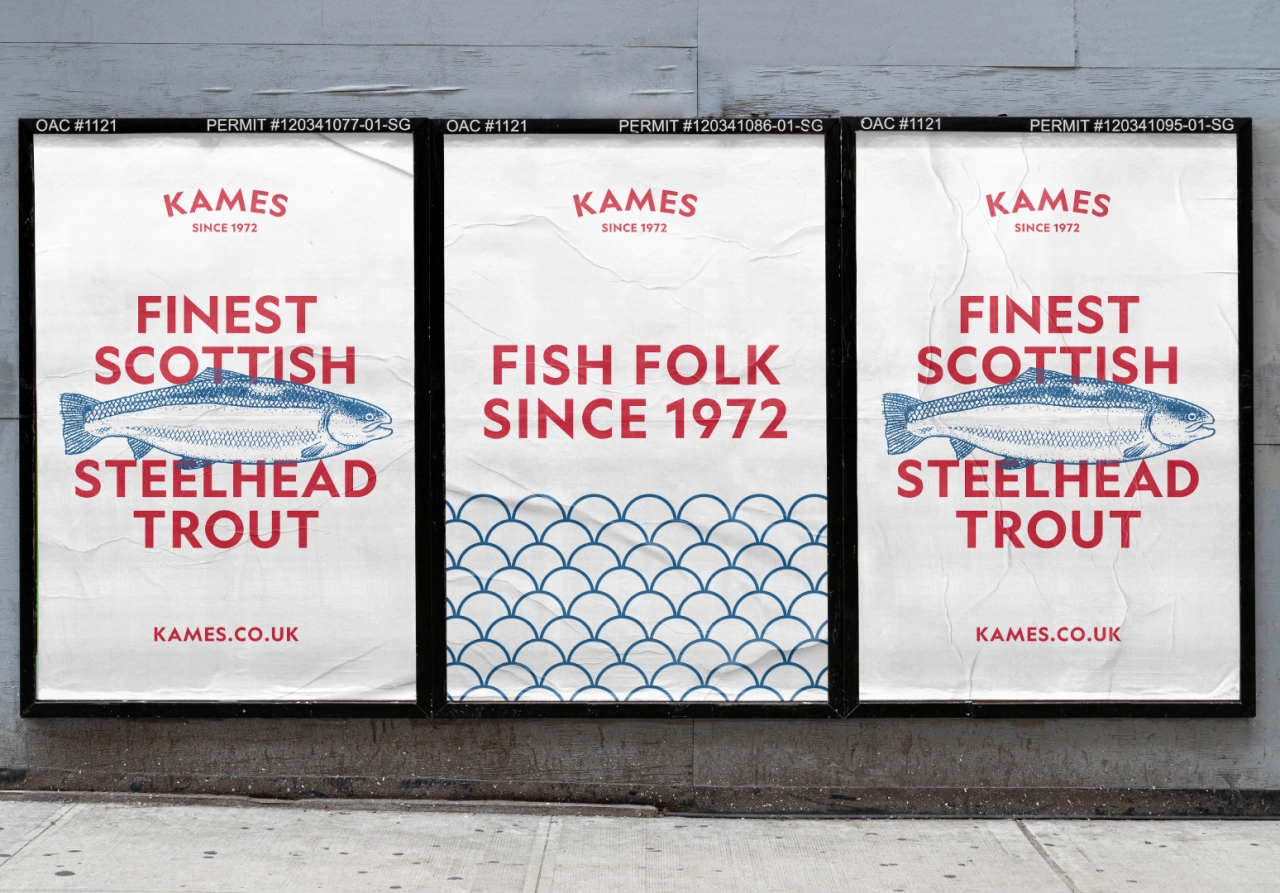
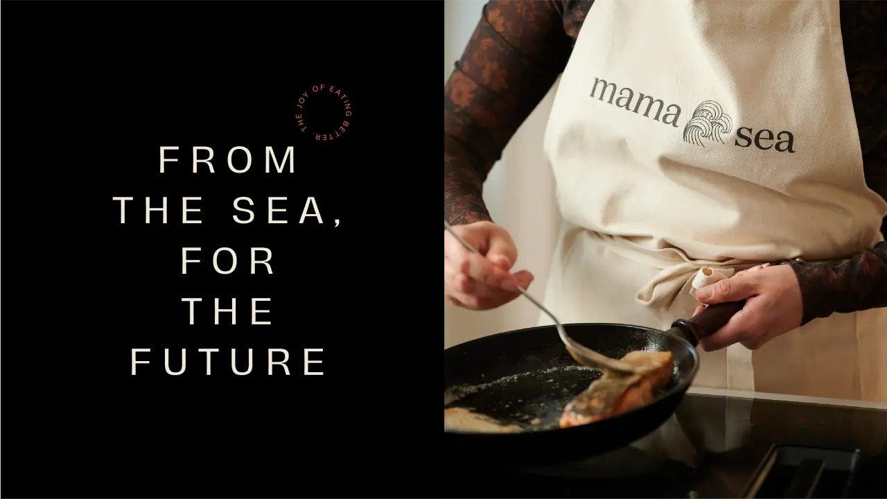
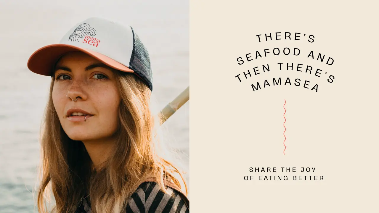
We've seen some great examples lately of clever branding giving new life to seafood and fish brands, from Jamhot's reinvention of Scottish trout firm Kames to Span's rebranding of Asian carp as Copi. But taking an approach inspired by indie band album covers: well, that's a new one for us. Yet, as you can see from this page's images, it works.
The commission for Fitzroy, a boutique strategic creative agency based in Amsterdam, came from the Eide family, who are the third generation of hands-on Norwegian salmon farmers. The ask was "develop a seafood love brand".
"The family have an open mind towards innovation and technology and an ambitious vision for the future," explain the team at Fitzroy, whose audio branding for Interrail we covered last year. "But above all, love and respect for nature shone through. The brand needed to represent a progressive mindset and break from the seafood aquaculture norm. Therefore we approached this challenge as though we were creating an indie brand."
Fitzroy went on to create the positioning, name and visual identity for Mamasea. The logo consists of a wordmark and an icon of the mother of the ocean: Mamasea. "As she cares over the ocean and sea life, she is projected in a caring way while embracing the word 'sea'," the team explain. "The upward movement of a wave has been incorporated into the letter 'a' of the wordmark, making the logo a complete family."
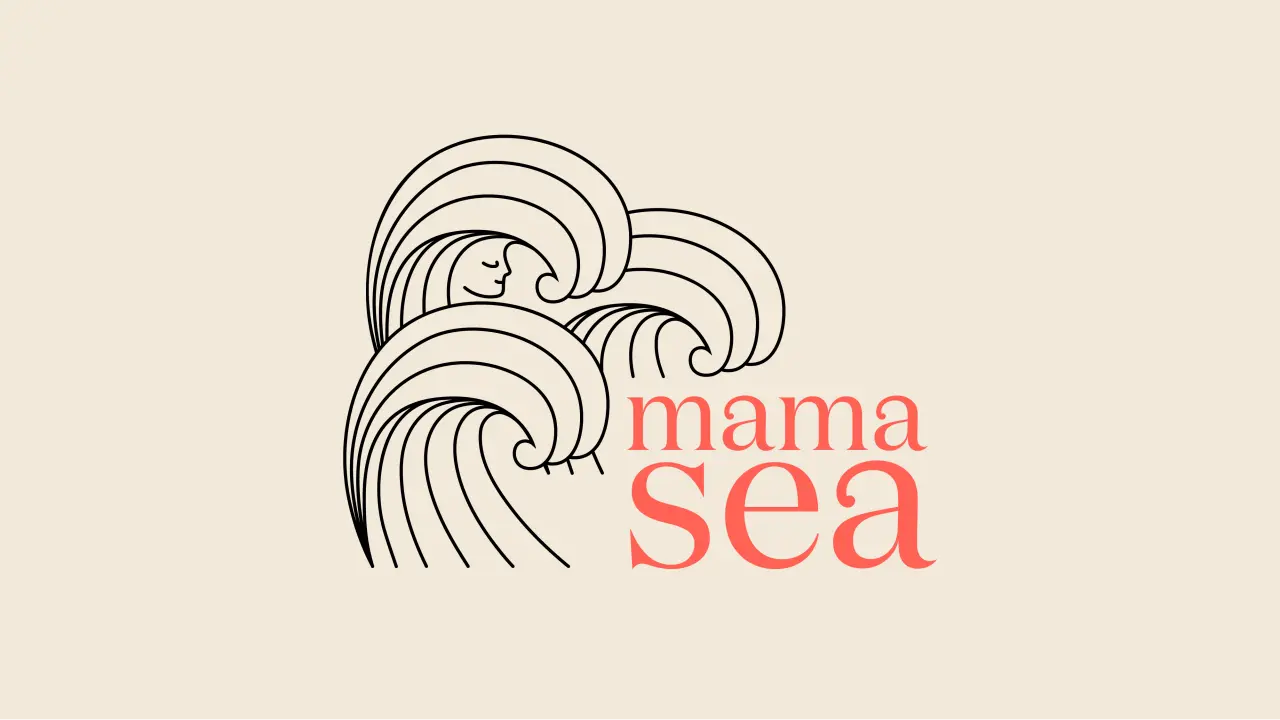
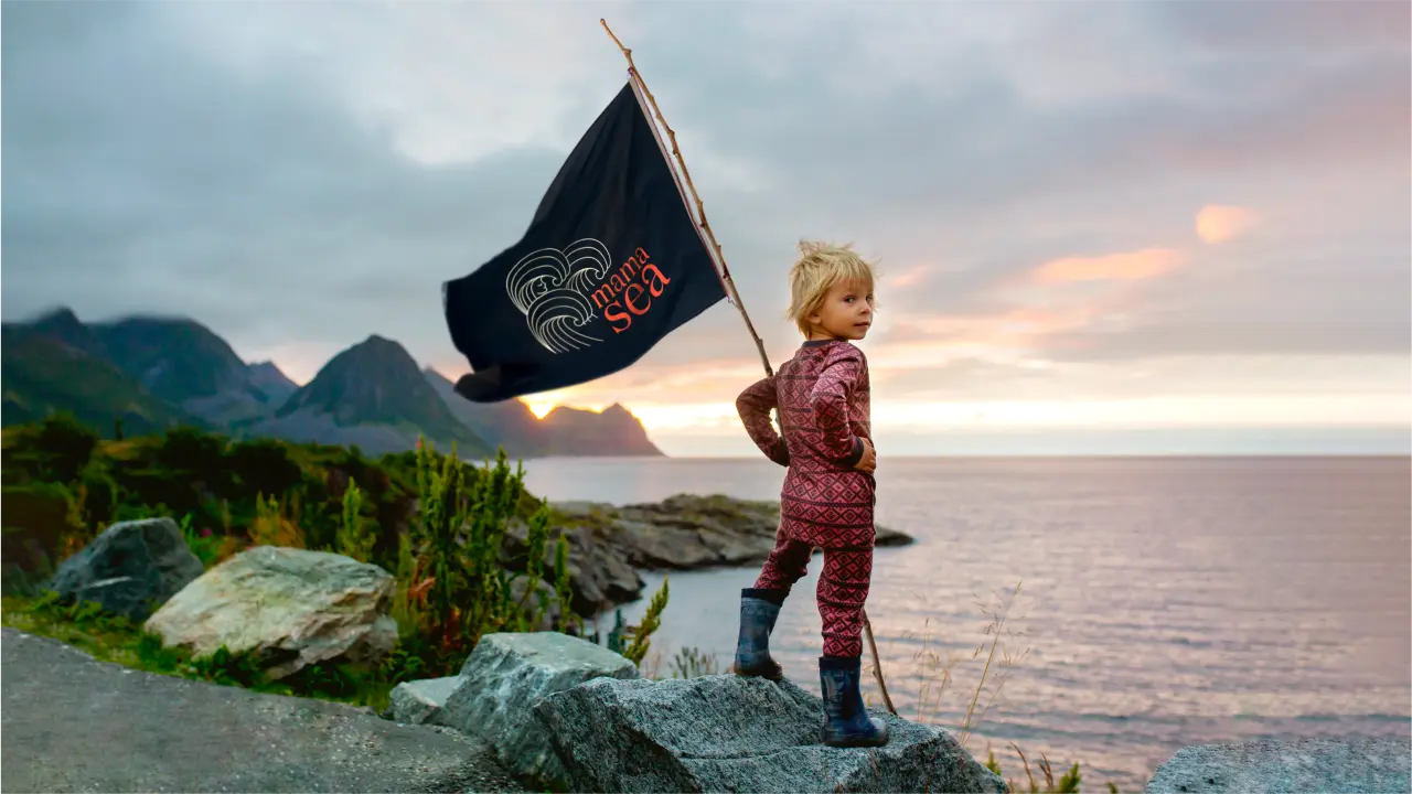

The icon itself is inspired by Japanese art. It owes a debt to The Great Wave off Kanagawa by 19th-century ukiyo-e artist Hokusai with its clean, minimal and repetitive character giving a calm yet powerful feel to Mamasea's branding. "Together with the embracing gesture and the serene face within, the icon represents all the brand stands for. The Japanese-inspired tattoo-like illustration and the lifestyle cues feel warm and intimate."
It's a well-chosen approach for a brand that is all about caring for the sea and ensuring a safe and healthy future for generations to come. "The face within the icon is the caring, familiar and trusted reminder that we should care for the sea in the same way that she cares for us," says the team at Fitzroy. "At the same time, it suggests a nod of approval to go ahead and enjoy the goodness of Mamasea salmon, knowing that when it comes from Mamasea, no compromises have been made."
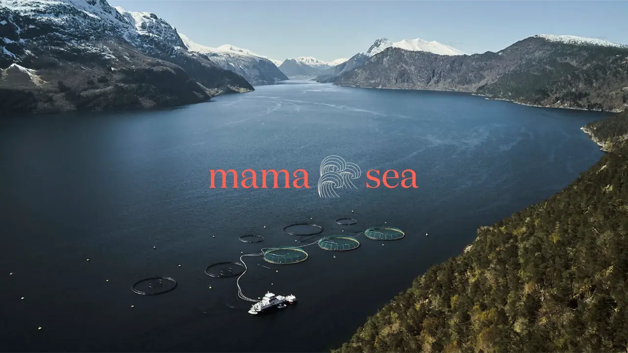
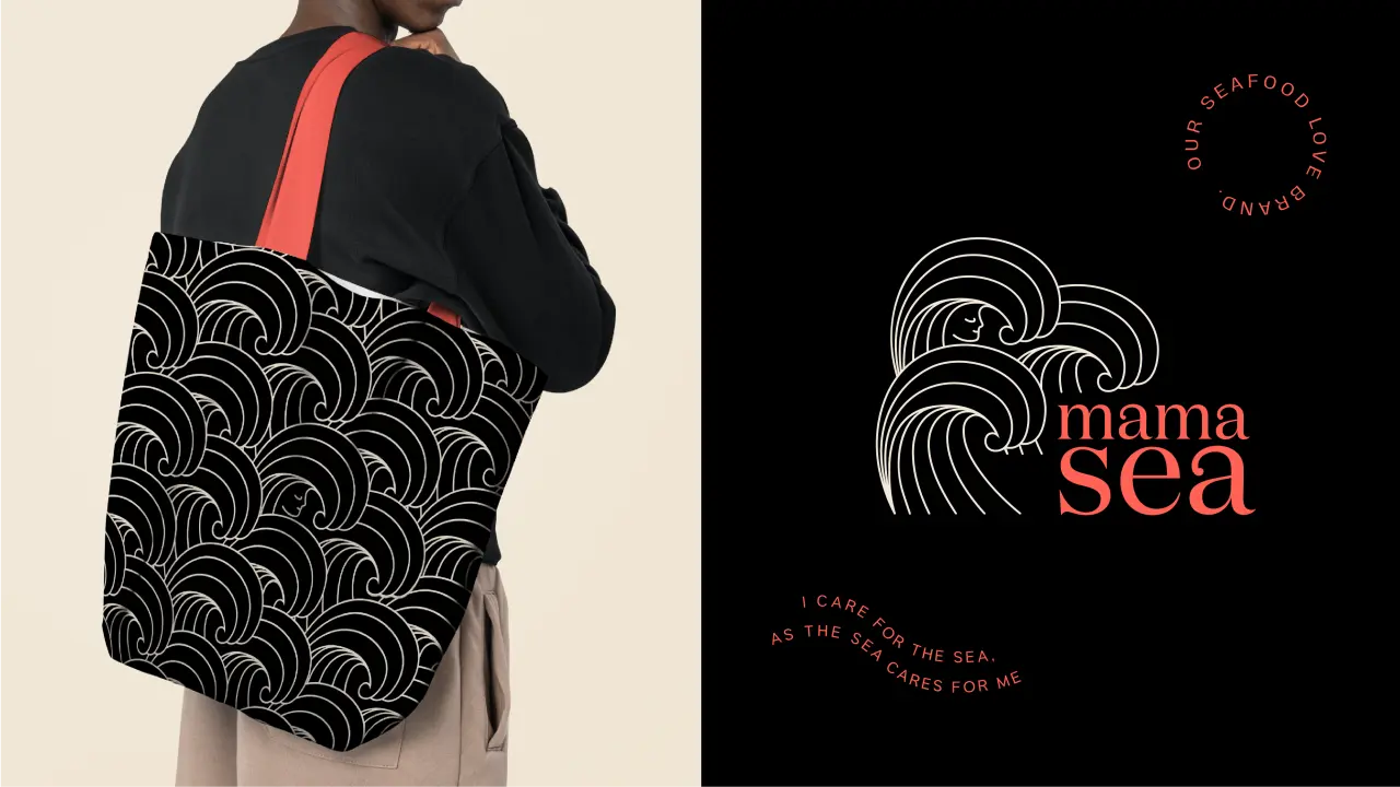
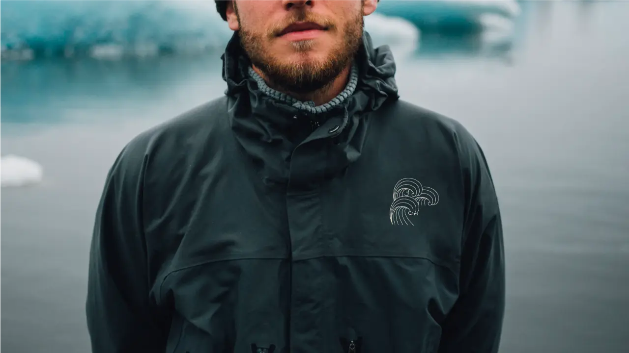
The brand name itself is pretty self-explanatory: bringing together the source of the salmon with a mother figure, humanising our responsibility to be more aware of our natural resources.
"While Mamasea's salmon is undeniably the hero product today, Mamasea is more than salmon," the team explains. "Hence, we needed to develop a name and identity design that would stand the test of time and work with various products. The Mamasea brand conveys an almost childlike sense of awe because the sea is full of possibilities and power. We believe this will have a contagious effect and help ignite excitement and boost imagination."
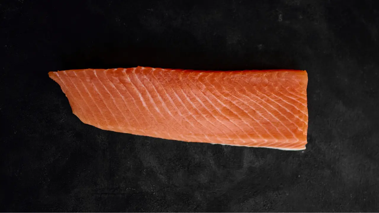
The challenge with this kind of illustration is to keep it adult and sophisticated rather than childish and to make it attractive without losing focus on the taste of the product. Here, Fitroy's chosen colour palette of sand, black and coral with pops of blue echoes the hues of the Norwegian fjords and the seafood that live there. This ensures taste appeal and a high-end feel while maintaining the indie-brand accessibility and charm they were striving for. Not a bad trick to pull off.
Editor's Picks





Trending






Latest Jobs
Midweight Designer at Catalyst Creative
Full-time·London·£32k-£36k
Client Director at Koto
Full-time·Berlin·€70k-€85k
Senior Front End Developer at Crown Creative
Full-time·Belfast·£50k–£60k
Creative Social Content Producer at Bompas & Parr
Contract·London·£32k–£40k
Senior Brand Designer at Analogue
Full-time·Leeds·£38k-£45k
Account Manager at Moxie and Mettle
Full-time·Cheltenham·Up to £35k