Pentagram's brand strategy, identity and messaging app for Fashion for Good
In 2017, Fashion for Good launched as a global initiative to reimagine how fashion is designed, made, worn and reused. With an innovation hub in Amsterdam, a startup accelerator in Silicon Valley and a worldwide network of collaborators and changemakers, it aims to demonstrate a better way for the fashion industry to work; a way in which companies, communities and the planet can flourish.
Fashion for Good, and its founding partner C&A Foundation, recently tasked Pentagram with creating a brand strategy, visual identity and messaging platform that could be compelling enough to unite brands, producers, retailers, suppliers, non-profit organisations, innovators and funders around a shared ambition – and that would be sharp enough to inspire them to act.
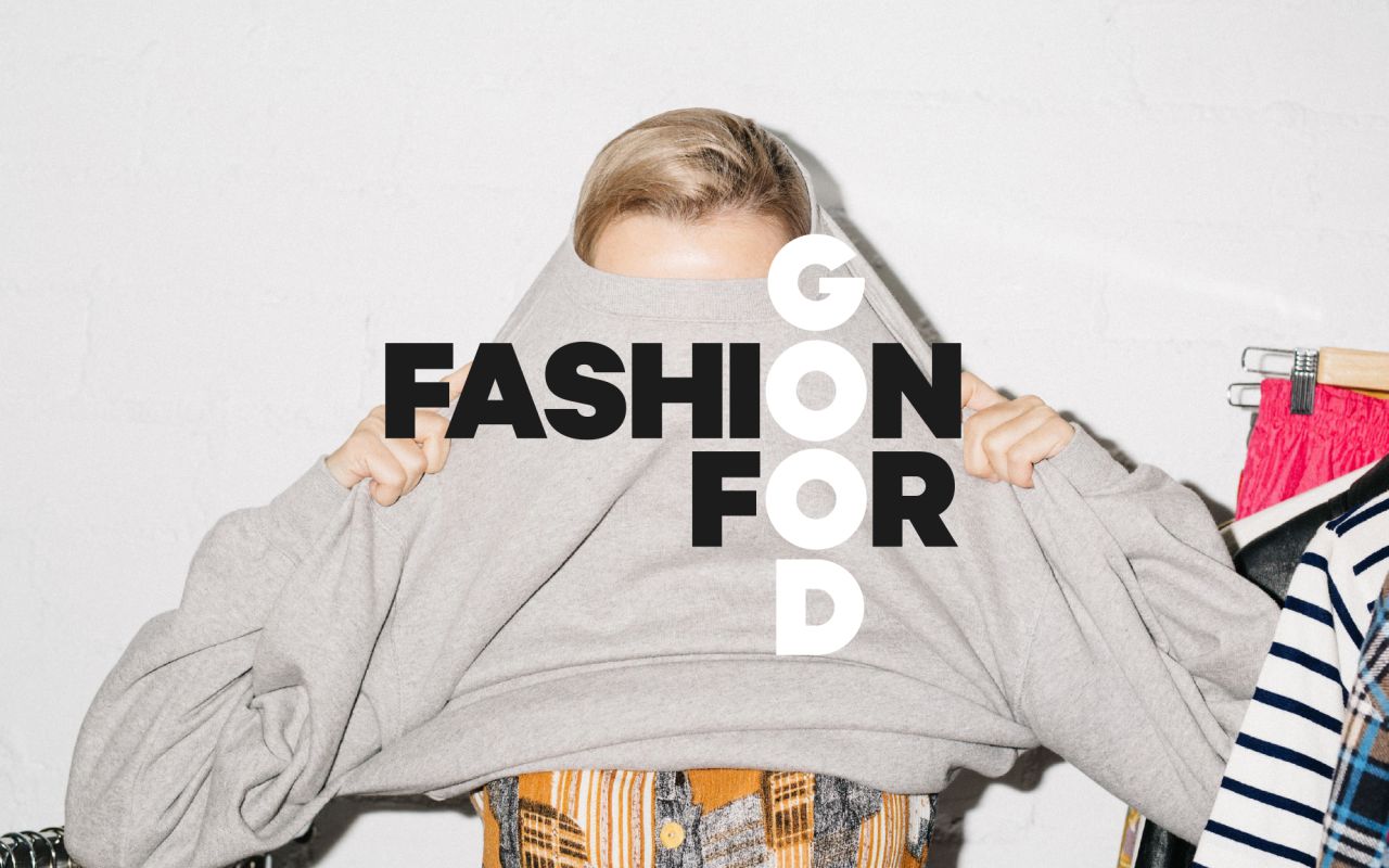
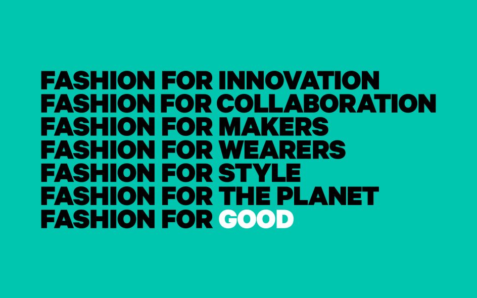
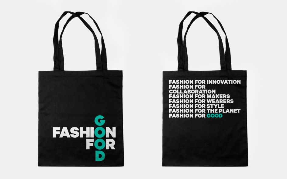
Pentagram developed a succinct brand idea that acts as a three-word manifesto for Fashion for Good: 'Only good fashion'. "Because good fashion at scale is not only possible, it is within reach. And by harnessing the power of innovation, practical action and cross-sector collaboration, Fashion for Good shows that good fashion is more attractive, accessible and affordable than its opposite.
"The Fashion for Good brand behaves with daring, style and practicality, expressed by a tone of voice that is brave, wise and accessible. The identity is informed by the brand idea, demanding that ‘good’ should run through all aspects of the fashion industry," explains Pentagram.
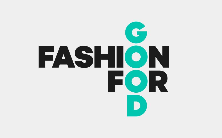
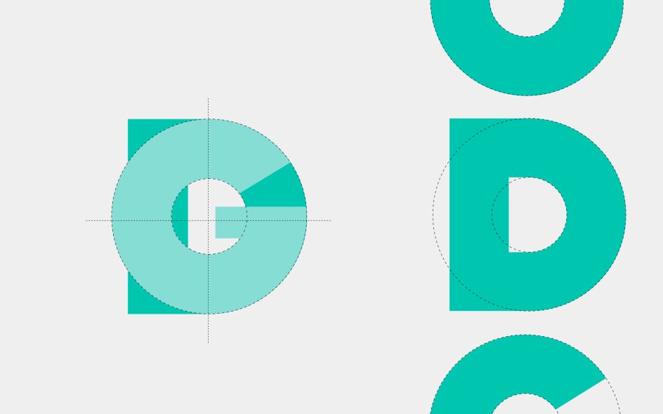
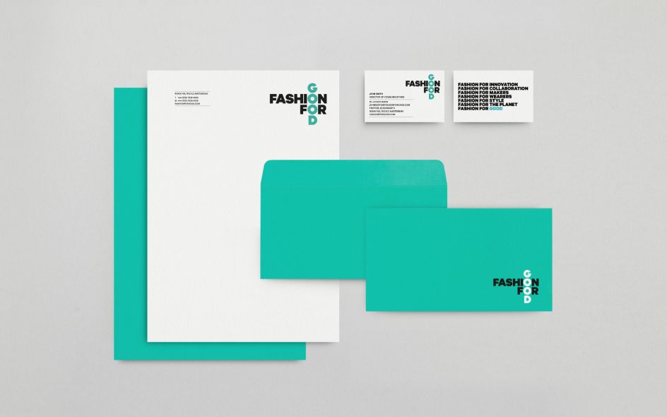
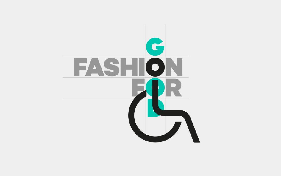
The modern typographic logo designed by Pentagram is a visual manifestation of the brand idea, with the overlapping ‘good’, running through ‘fashion’. The logotype has been modified slightly to produce rounded letterforms, born from complete circles, reflecting the circular and sustaining nature of the organisation’s Cradle to Cradle ethos.
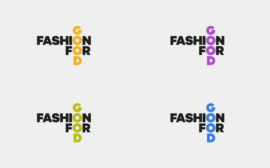
The identity provides the initiative with a flexible visual language that can be creatively used to communicate campaigns and align with third-party partnerships. The brandmark’s colourways are flexible, adapting to the space in which it sits and responding empathetically to its partners. The partner’s primary colour runs through the ‘Good’, emphasising their adherence to the initiative’s core value.
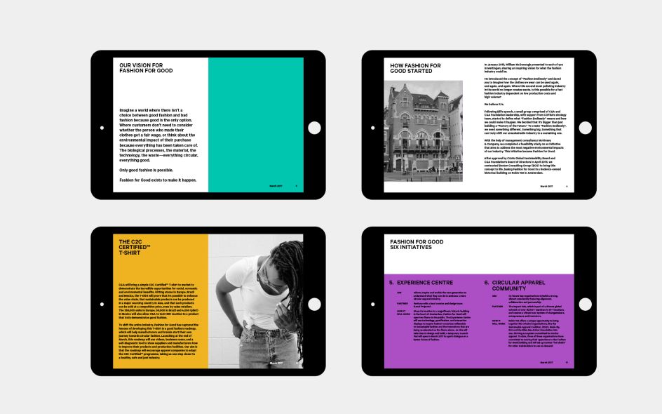
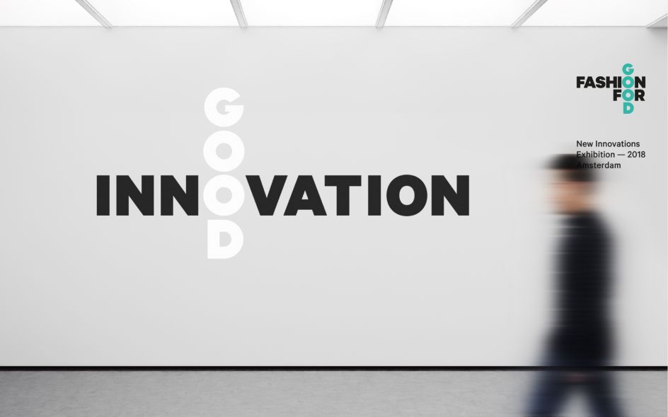
"By utilising modern colour palettes, consistent layouts and inclusive imagery styles across print and digital applications, the brand guidelines deliver a clear type-led aesthetic that allows plenty of room for expression," adds Pentagram.
Editor's Picks


Trending


](https://www.creativeboom.com/upload/articles/90/908fdb6378db1e95d12595416f54e6336d5e80b8_732.jpg)
Podcasts


Editor's Picks
Further Reading