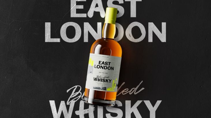
Ragged Edge's rebrand for East London Liquor Co. gives it some local 'fighting spirit'
London creative studio Ragged Edge is behind a rebrand that's "full of fighting spirit" for the East London Liquor Co., helping it to stand out in the increasingly competitive craft spirits industry.
Already deemed a favourite among bartenders, the brand felt it was the right time to speak directly to drinkers everywhere. It also wanted to address the issue that despite distilling its spirits with "all the care and attention of a craft product", the "affectations and high price points associated with the sector are the direct opposite of its ethos".
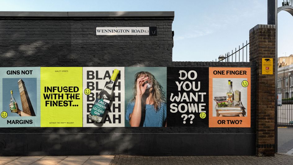
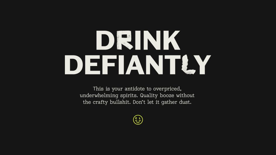
Max Ottignon, a co-founder at Ragged Edge, says: "East London Liquor Co. makes great drinks without the crafty bullshit. But to really succeed, it needed to take the fight beyond the idiosyncratic world of craft spirits. And needed to be ready to ruffle a few feathers along the way. So, we helped them build a brand that's unpretentious, unapologetic, and unabashed in its flagrant disregard for convention. A brand designed to transcend a category."
This approach went much further than a pack redesign. Ragged Edge transformed the visual and verbal identity, too. That meant moving away from a much-loved design language "rooted in craft", to a bold identity bristling with East London spirit.
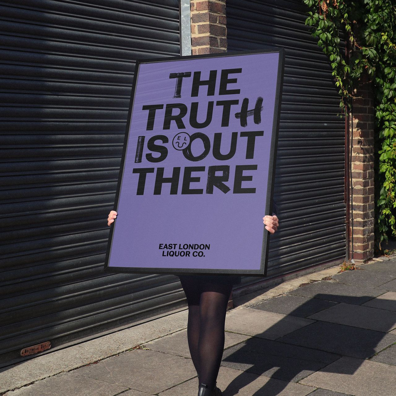
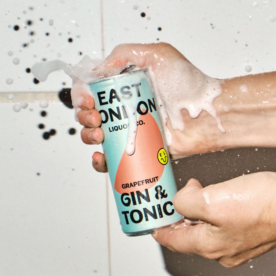
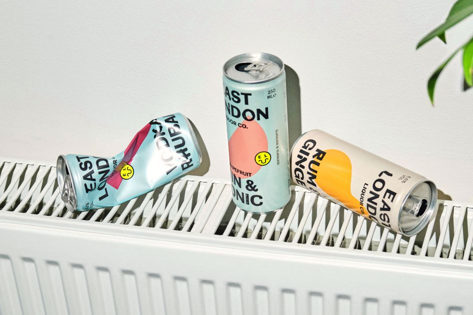
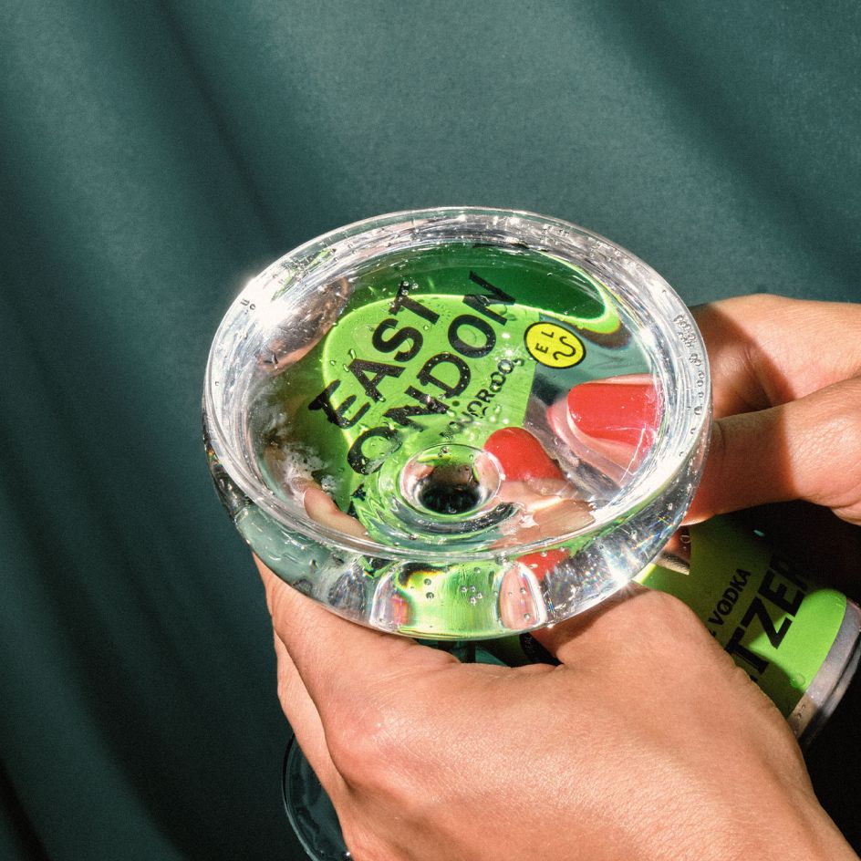
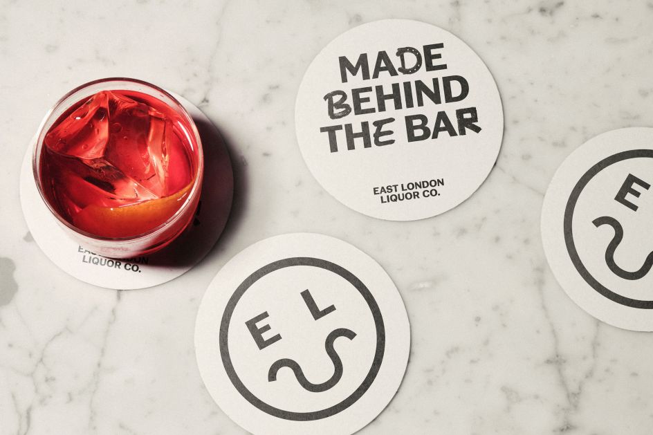
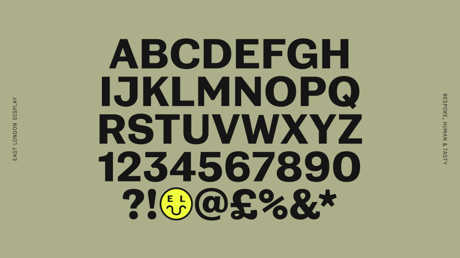
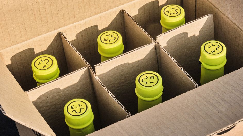
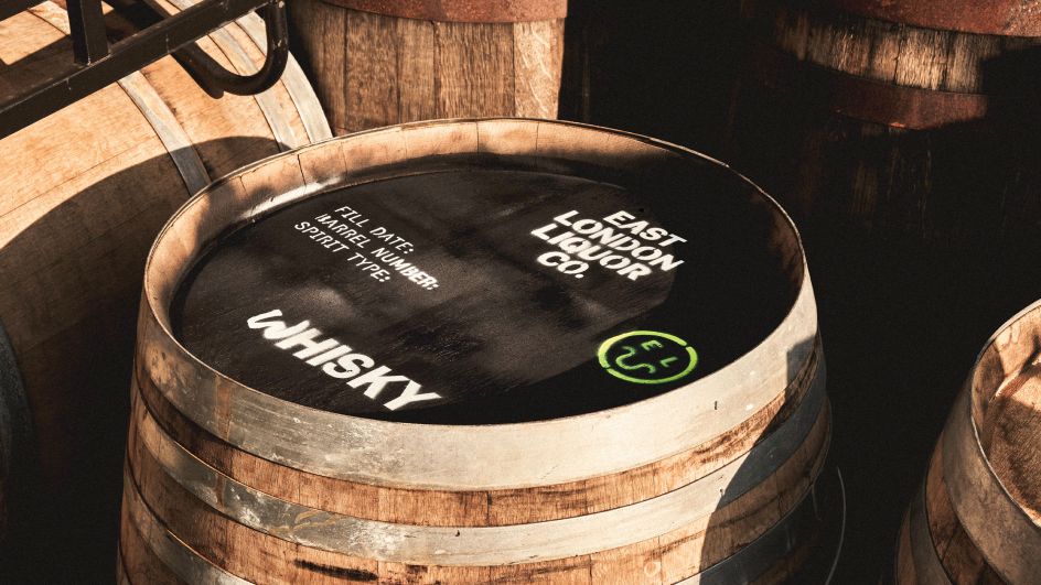
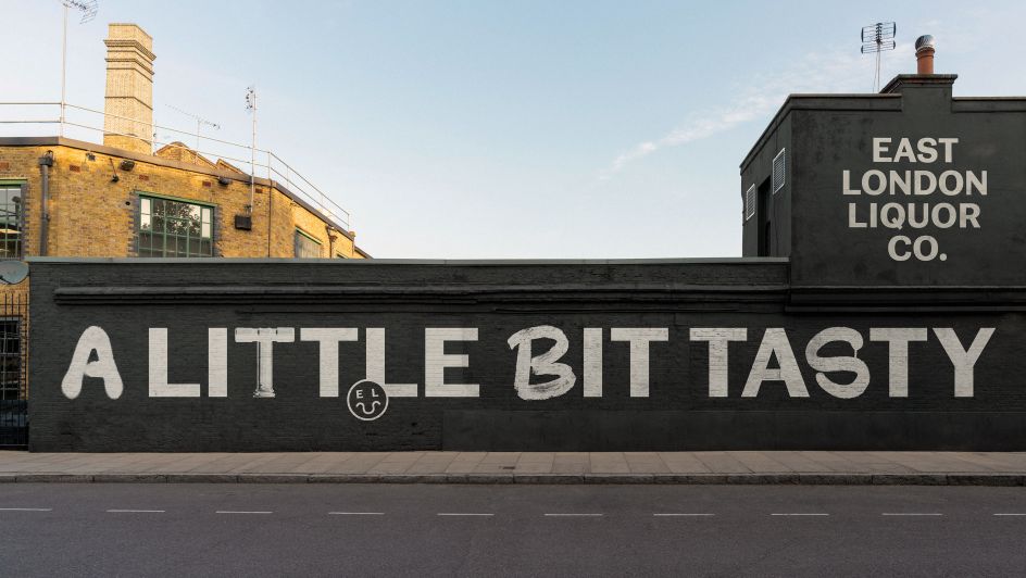
A custom typeface, developed in close collaboration with NaN Foundry, is made even more unique with glyphs (found letters) inspired by the local area, the distillery, and the production process. A 'smiler' icon was inspired by an old crest found in nearby Victoria Park and incorporates the Thames to make a smiley emoji. Fluorescent yellow, used in defiant bursts, it certainly demands attention. And a defiant tone of voice speaks without fluff and façade.
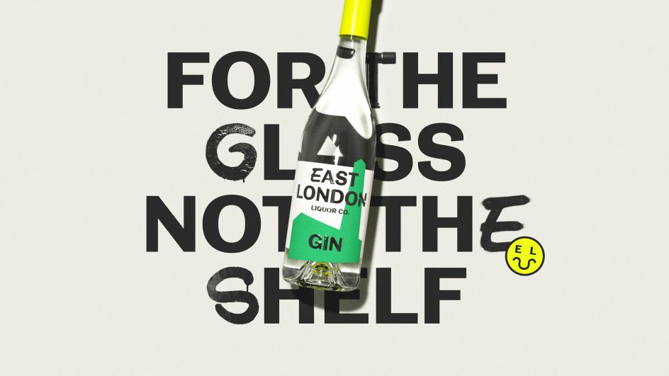
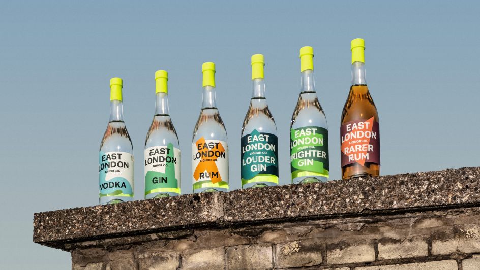
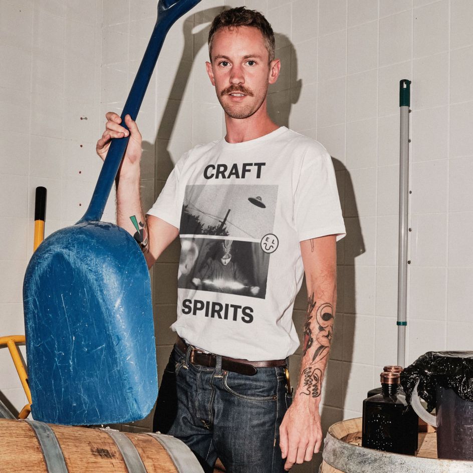
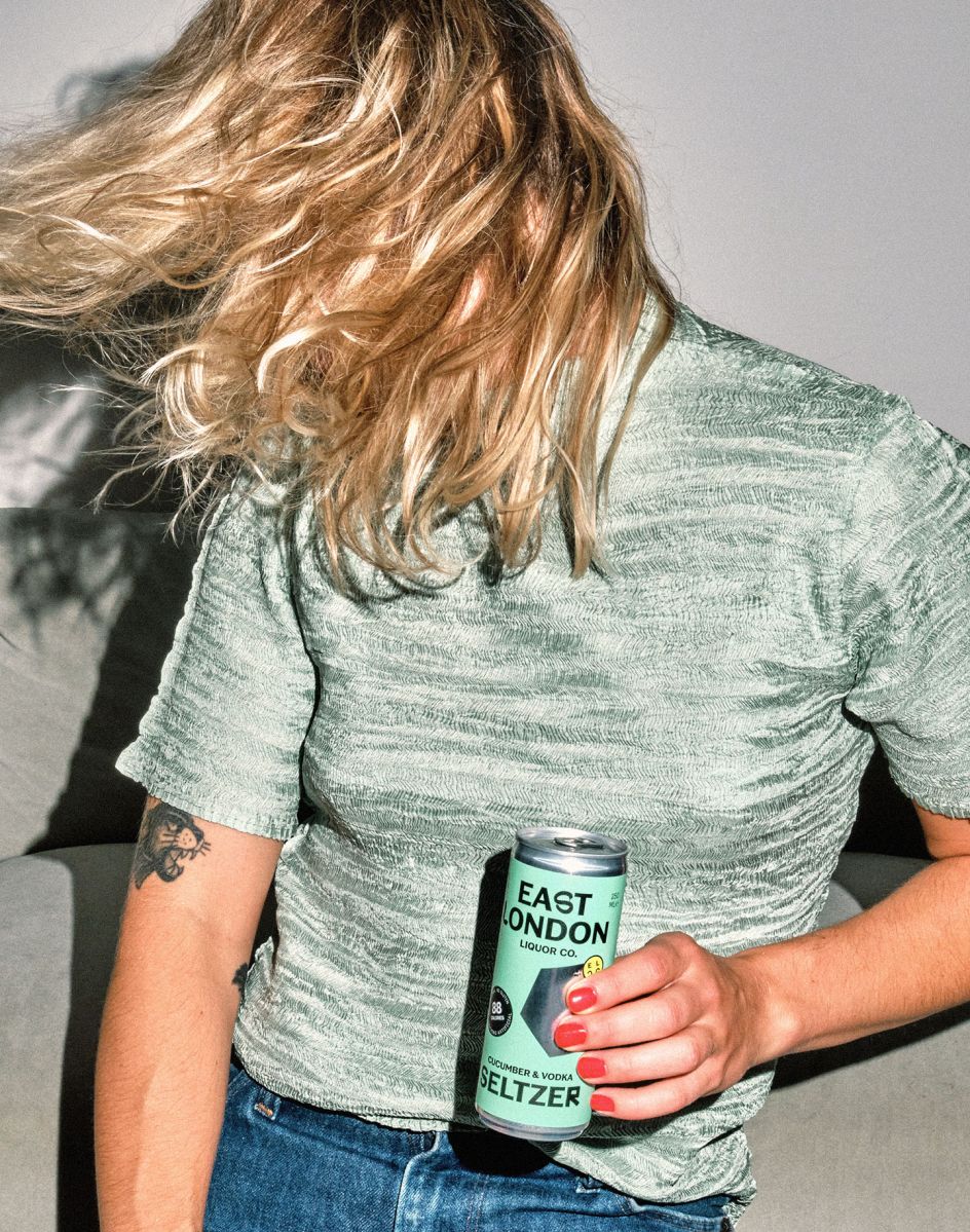
The identity was brought to life across new and existing product ranges. The core range of spirits feels raw, with the occasional premium flourish. Abstracted graphics referencing each liquid's story form an immediately recognisable visual language, designed to disrupt both the optic lineup and the supermarket shelf. While off pack, the art direction brings candid energy to the brand’s digital presence, with lifestyle imagery created in partnership with photographer Charlie McKay.
Editor's Picks


Trending


Podcasts


Editor's Picks
Further Reading