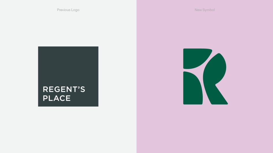
DixonBaxi's Regent's Place identity opts for 'radical softness'
Brand and design consultancy DixonBaxi has created a new brand identity for Regent's Place, a central London development featuring food and drink offers, gym facilities, a theatre, an arts centre and more.
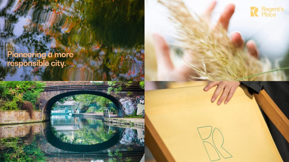
The development itself is focused on "responsible urbanism", according to DixonBaxi, using sustainable architecture, green spaces and a sense of connection with the community.
The start of the project saw the agency spend ten weeks working to gain insights from across the business, as well as key industry and local community leaders to "define the authentic spirit" of Regent's Place and its "human-centred mission".
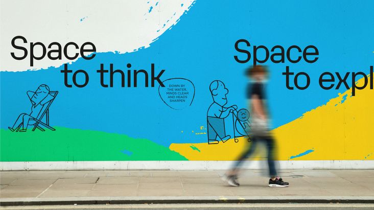
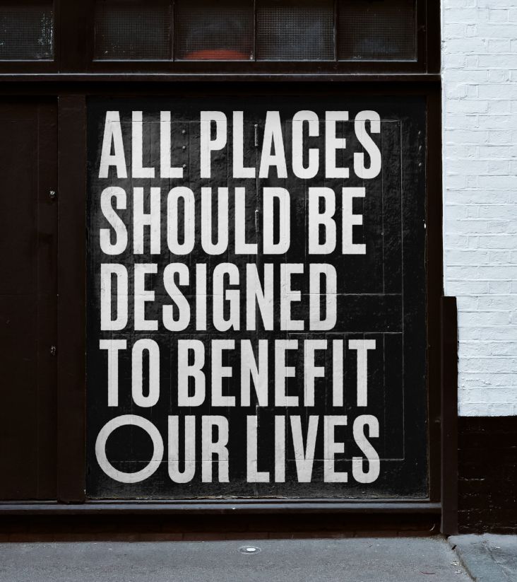
The new positioning looks to promote the idea of Regent's Place as a "pioneering destination where people and planet rise," says DixonBaxi, adding that it's a "truly authentic, low-carbon, socially inclusive, intellectually progressive, incredibly interesting, honest place to be."
The new designs were created to become the foundation of the development for the next decade as the area around Euston Road continues to change rapidly.
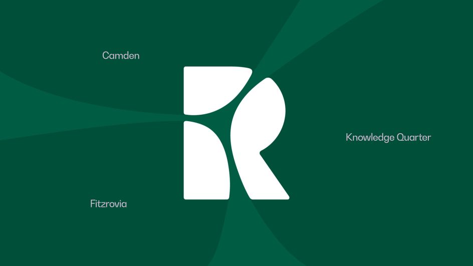
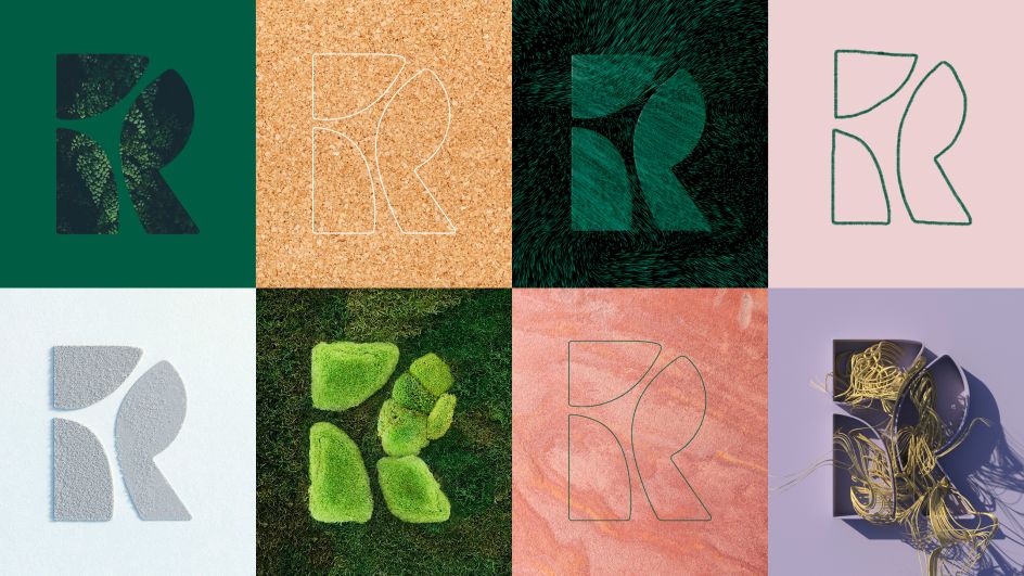
At the heart of the identity is the idea of unifying the three districts that interest at Regent's Place: the Knowledge Quarter (a small; area near Bloomsbury housing sites like The British Library, The British Museum, The Wellcome Trust and University College London); Camden; and the West End. As such, there's a rich mixture of arts, science, research and creativity.
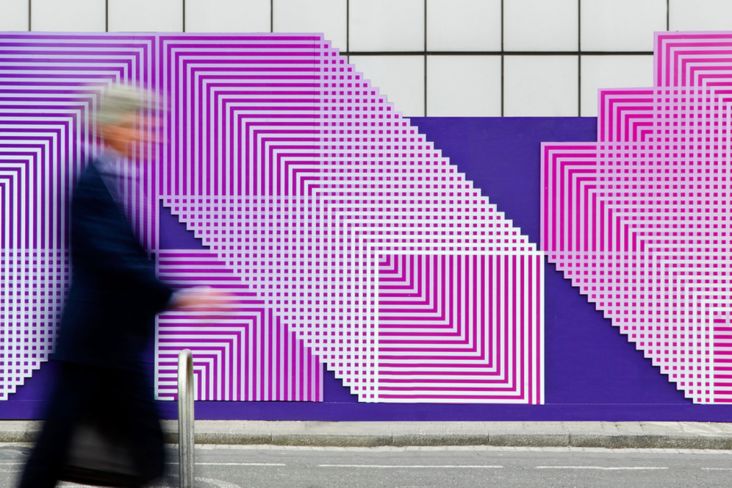
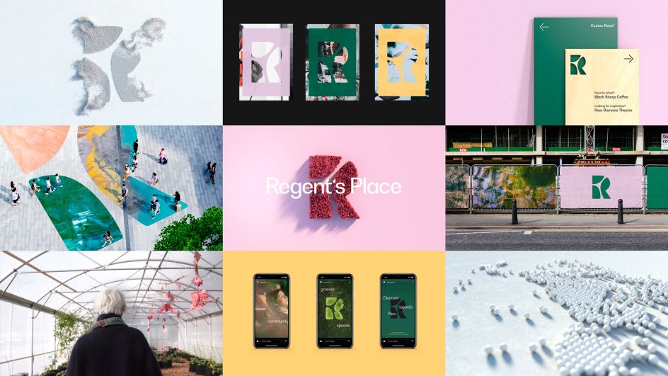
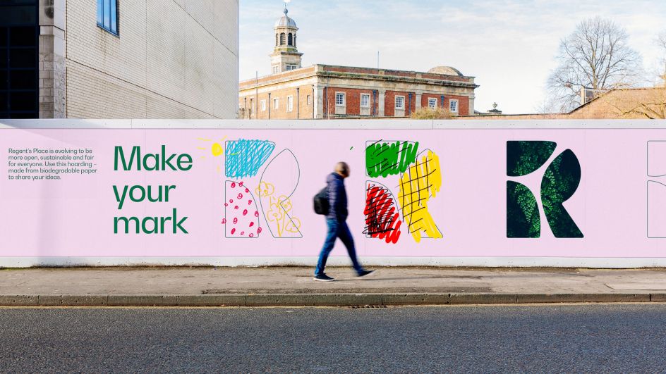
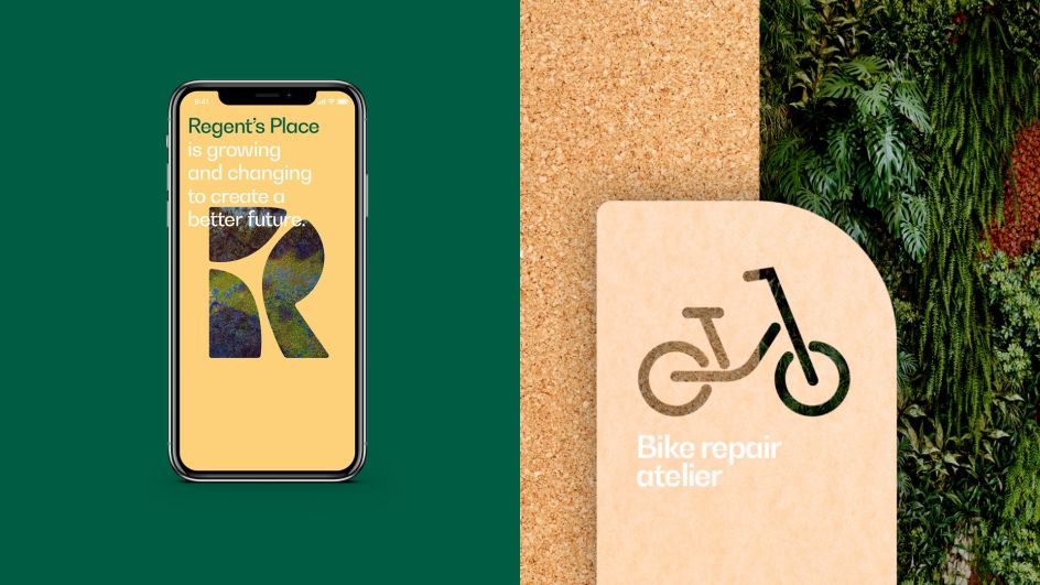
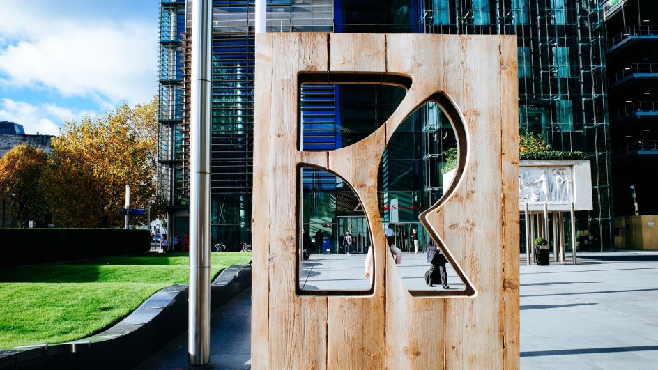
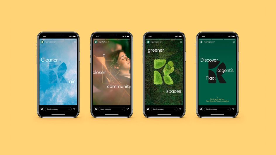
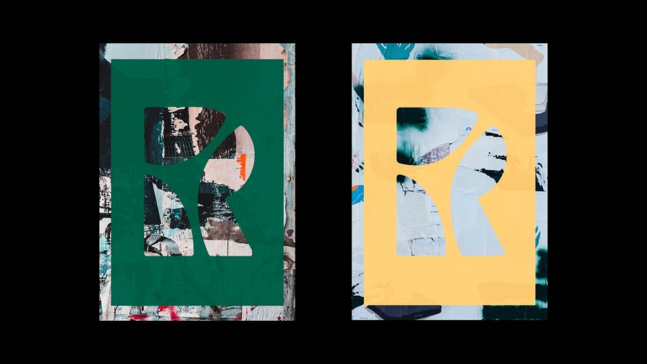
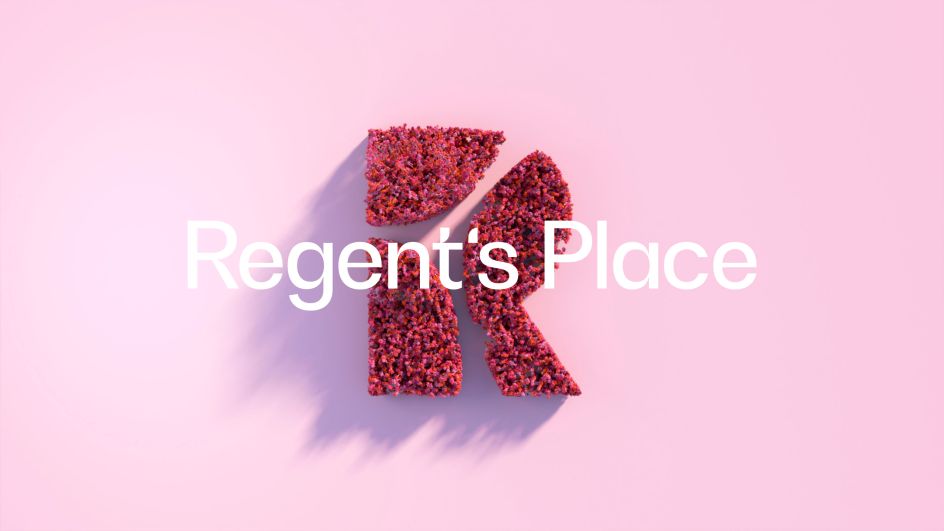
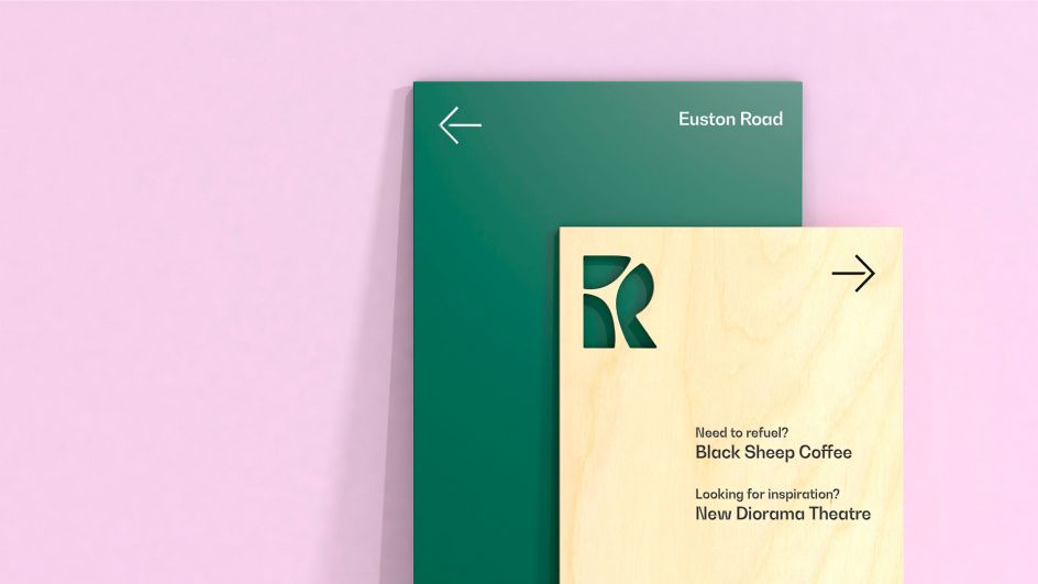
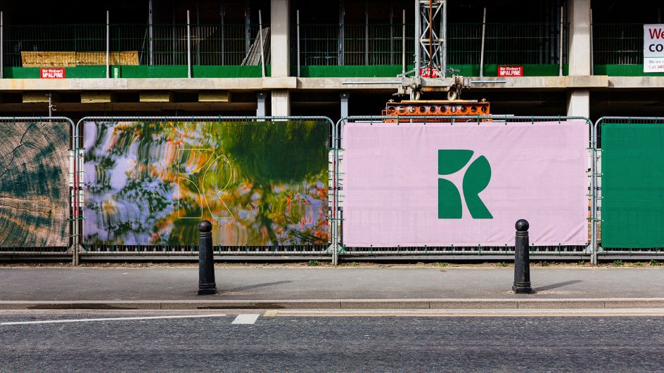
DixonBaxi created an 'R' symbol to represent the three districts. It was designed to be "transparent and almost disappear", acting as "a window to Regent's Place and the community," says the agency. "It allows the framing of different perspectives and provides a canvas for the community's vision and creativity. Each application becomes a space to tell a story." The symbol plays a central role in the identity alongside a new wordmark.
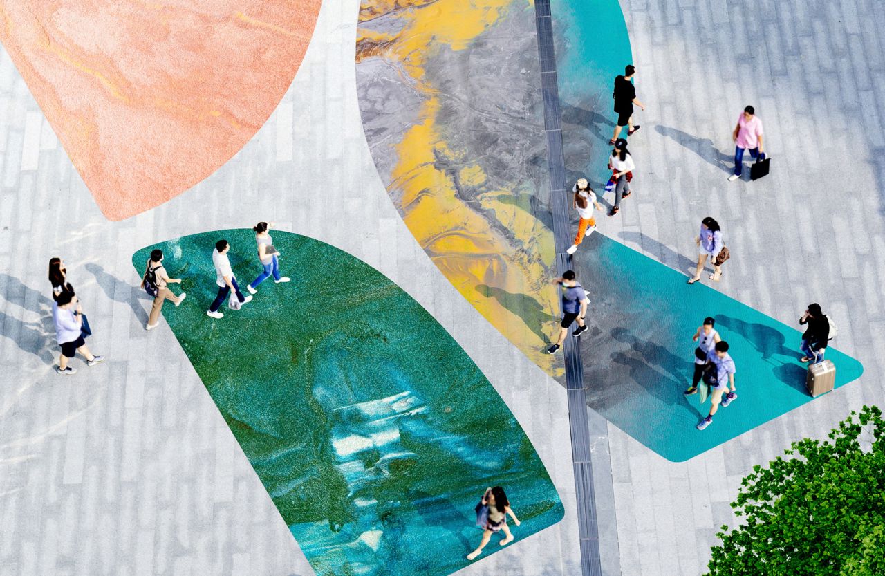
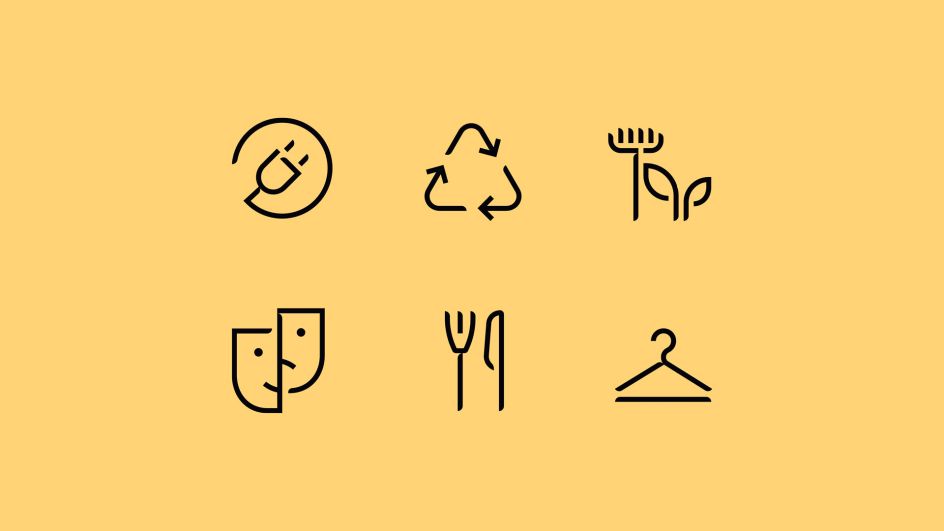
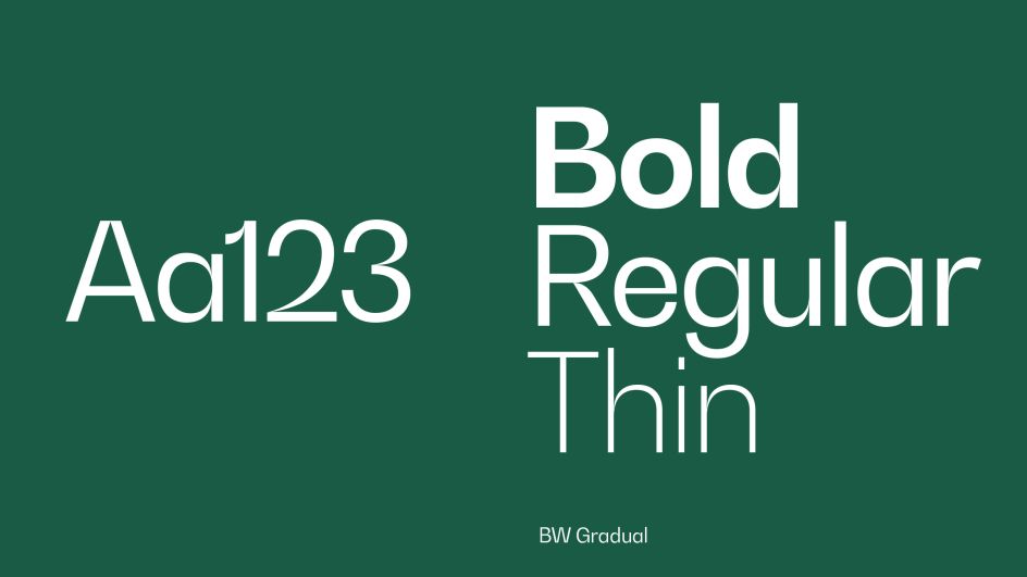
Every element of the design was influenced by the natural environment, as shown in the organic lines and natural colours that aim to create a "more calming experience", says DixonBaxi, which adds that "Softness is used with confidence." An editorial style visual language was used to create clarity across digital experiences and printed surfaces such as hoardings and signage systems.
The decisions around materials and how users participate in the space were driven by the tenets of re-use, reduce, recycle, and when this was not possible sustainable, pioneering technology and materials have been opted for.

Editor's Picks


Trending


Podcasts


Editor's Picks
Further Reading