Studio Bennü's bold identity for Critics' Club helps to champion art and culture for all
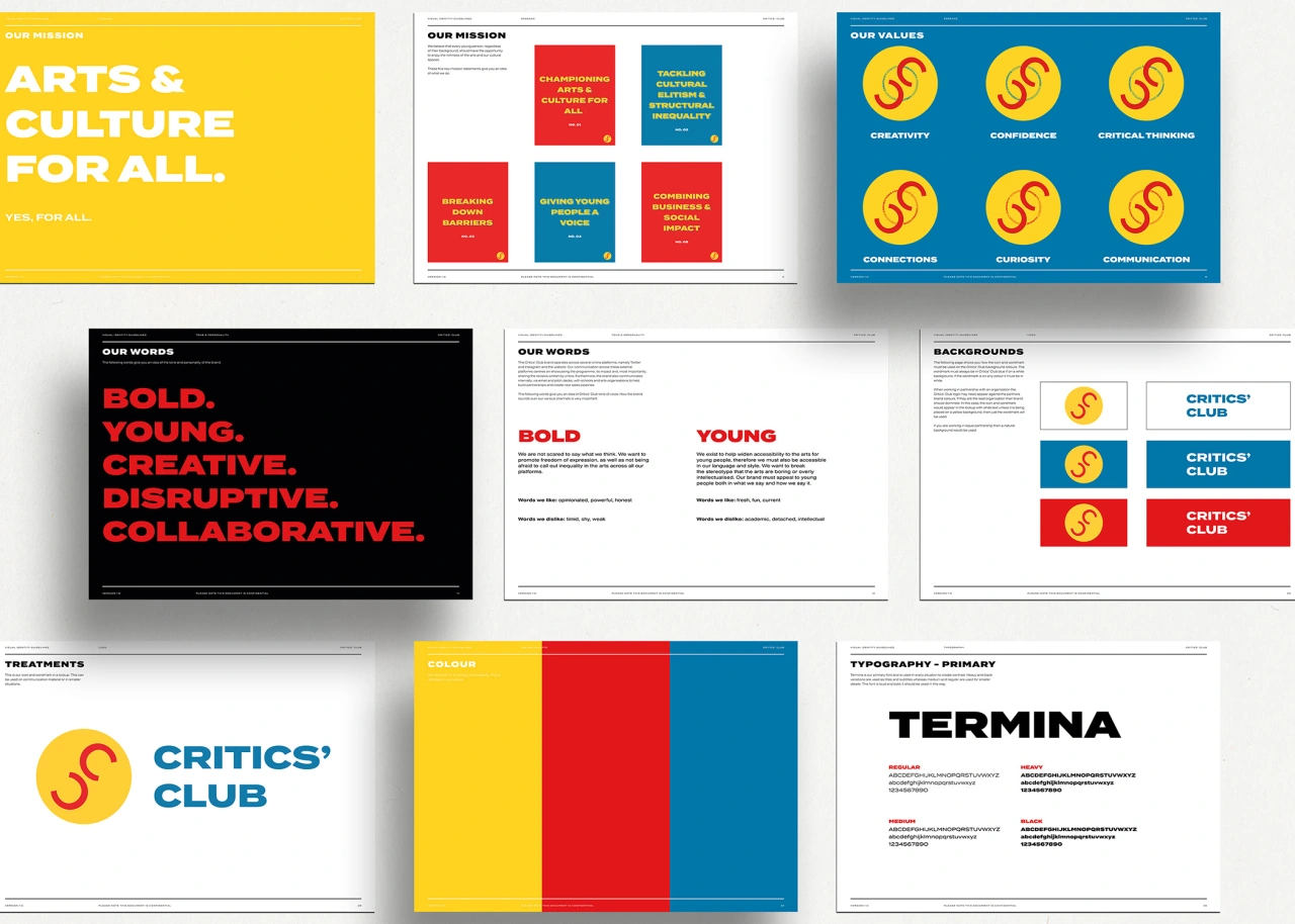
Studio Bennü has created a bright and bold identity for Critics' Club, a social enterprise which runs programmes in the UK to introduce young people to art and cultural spaces.
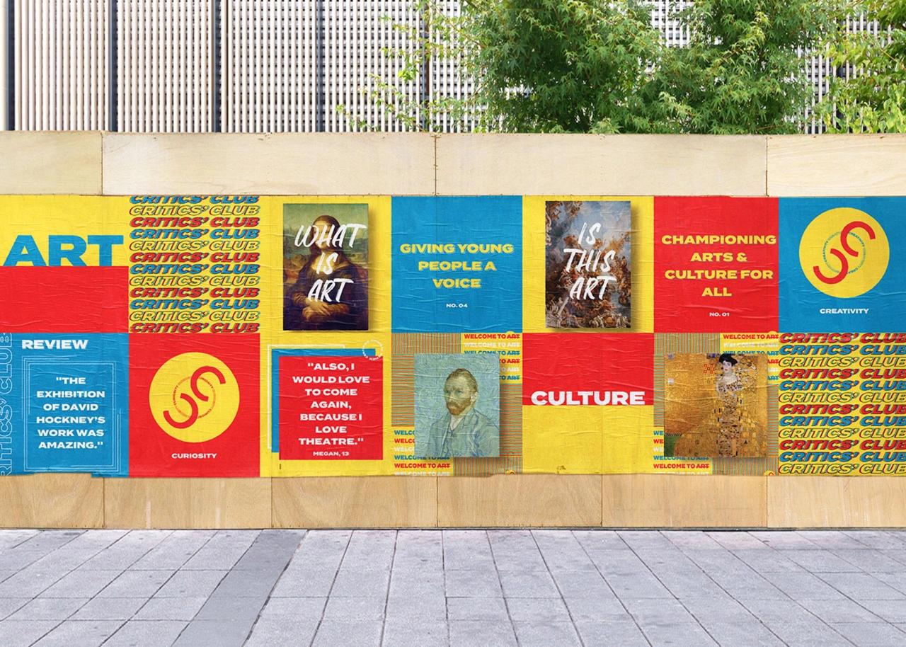
The heart of the brand focuses on challenging cultural norms while championing creativity for all, regardless of their background – the very core values and mission statements that the London studio chose to reflect.
"The demographic of the brand is very broad with many additional stakeholders to consider (parents, schools, teachers) which is reflected in the visual identity and tone of the brand across its various touchpoints," explains Tom Berry, founder of Studio Bennü.
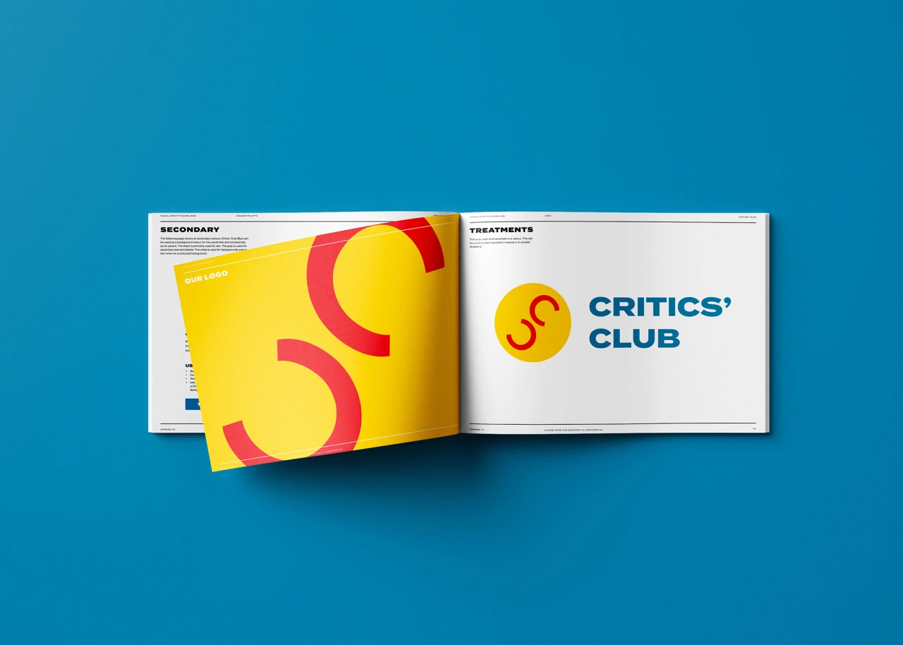
A vibrant and bright colour palette, combined with powerful and bold typography also helps the brand to stand out in its "uniqueness and mission". While the social media strategy "celebrates people's reviews through quotes and informs through the imagery of art and events".


Editor's Picks





Trending






Latest Jobs
Head of design at Cog Design
Full-time·London·£55K
Junior Project Coordinator at Colorido Studios
Full-time·Twickenham·£28k–£32k
Creative Social Content Producer at Bompas & Parr
Contract·London·£32k–£40k
Growth Strategist (Ecommerce) at Tribe
Full-time·Exeter / London·£50k + Bonuses
Senior Designer at Creative Spark
Full-time·Manchester·£35k-£50k
Midweight Designer at All Purpose
Full-time·London·£30k–38k