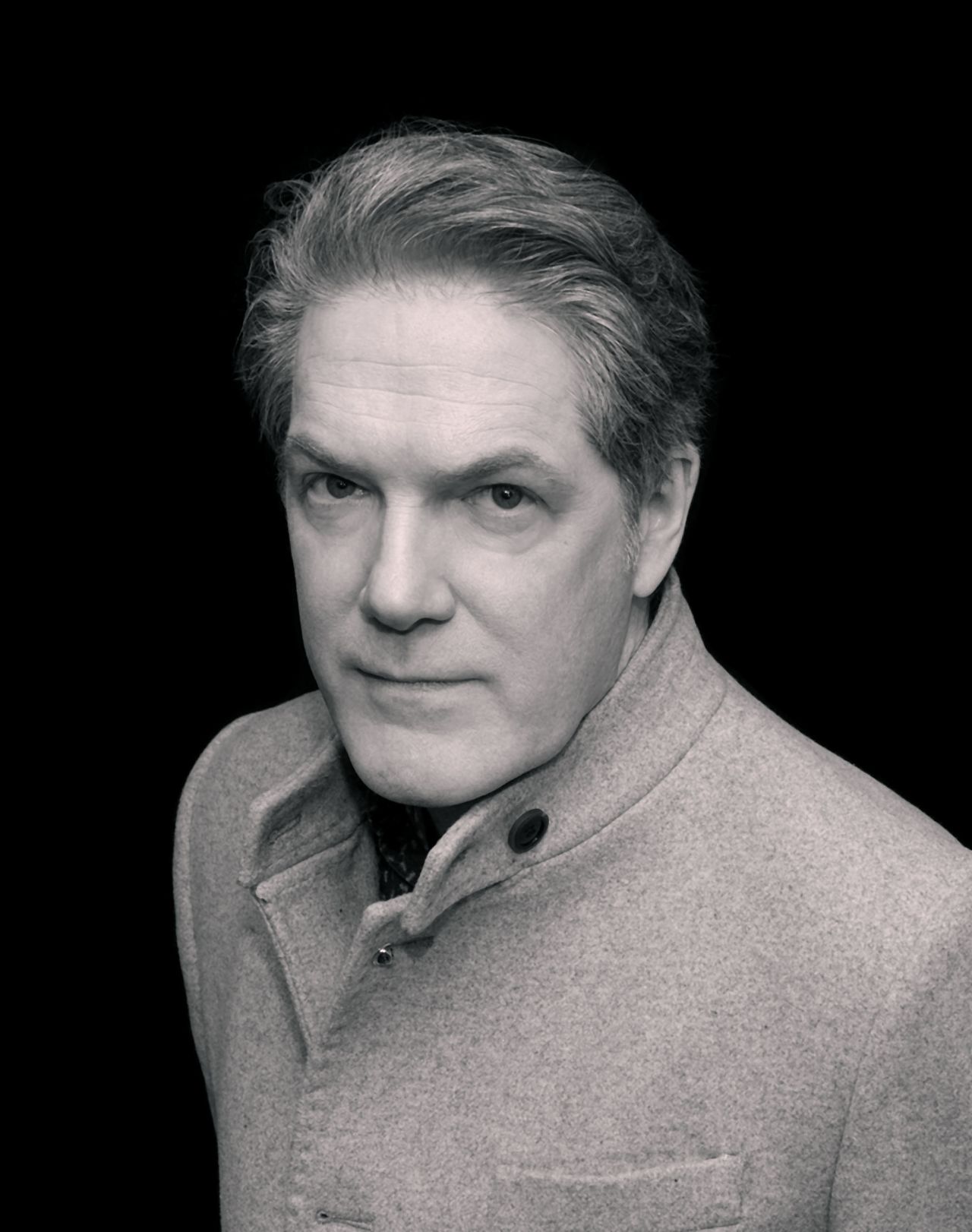
Rian Hughes on narrative design, creating fonts for aliens, and reinventing the novel
Digital publishing has shaken up the world of literature, but the humble novel still takes a traditional approach in terms of type design. Enter Rian Hughes. The graphic designer and 2000AD veteran has pushed the form to its limits with XX, a book where type and layout are as integral to the story as plot and character.
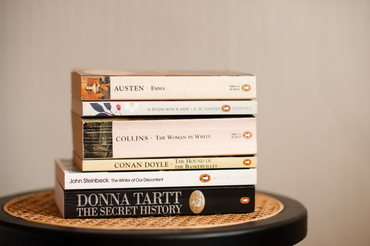
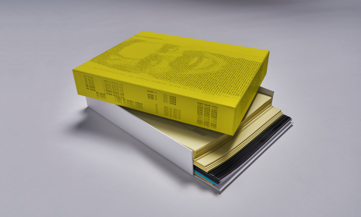
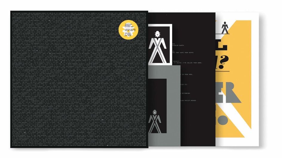
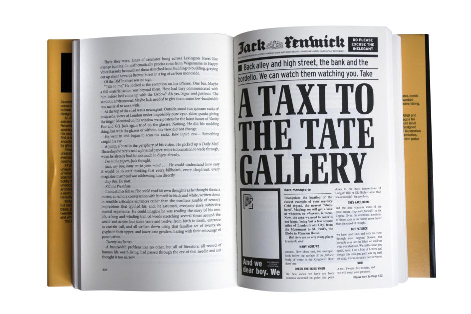
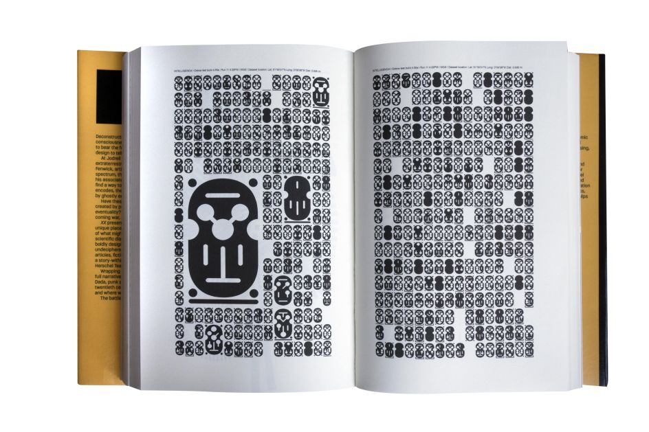
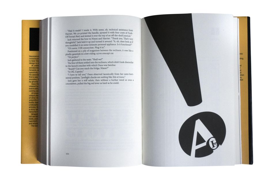
Recently released in paperback, XX is an epic sci-fi thriller that tells the story of humanity's first contact with an alien intelligence via a transmission called the Signal. Clocking up at nearly 1,000 pages, it's a sweeping tale told through multiple text formats and layouts. These include newspaper pages, fictional alien languages, Wikipedia entries, and even album covers.
A feast for the eyes and the imagination, XX brings Rian's varying talents together in groundbreaking fashion. Having honed his keen eye for design and storytelling across a career that includes designing the covers for the UK edition of the comic book series Love and Rockets, designing logos for James Bond, the X-Men, Superman, Hed Kandi and The Avengers, and setting up his own type foundry, Device Fonts, his debut novel is a masterpiece of design that's been years in the making.
We chatted to Rian to learn more about this incredible book and how it came to life.
What inspired you to create a novel that played with design and typography so much?
For several years after leaving art college, I drew comics for 2000AD (amongst others) before moving into mainstream illustration and design for advertising, book jackets and the like. Because of this, I thought of comics as "narrative illustration" and always wanted to get back to telling a story – to add the dimension of time. I'd sometimes use two or more illustrations to show a change, a development between the front and back cover of a CD, for example, but this was a very limited form of narrative.
By analogy, I always thought there could be a form of "narrative design" — that rather than the standard format of the novel, which is usually something like Times, 9pt, set justified, there was a much broader range of possibilities. Different fonts, sizes, layouts could be used to convey character, tone of voice. It seemed obvious to me. It just took me 25 years to get around to doing it.
There's a fictitious music review within its pages. What's the story behind that?
In the novel the Signal from Space is leaked onto the internet. People then start to explore it, try and decipher it. But they also use it to make art, make music. I wrote a fictitious review about a fictitious album in my best 'Pretentious NME Music Journalist' style. My sister, a classic pianist, and DJ Food, remixer and musician, then took this review as their brief and actually made the album a reality.
I included a QR code on the novel that takes you to a Bandcamp page where you can listed to it while you read. Alex Egan of Utter then saw the Bandcamp page and offered to turn it into a real vinyl release – so there is now a beautiful yellow vinyl pressing available, with a bonus 7", also on yellow vinyl, and a print. In what may be a first, the review preceded the actual record.
Side Two of the album is a three-part epic that features the voice of my late father, Alan Hughes, reading a poem. I discovered this recording while searching for other music on my Mac, and though it was recorded on a phone with no purpose in mind, the themes – reincarnation, the wheel of life – were in tune with the novel, so it seemed perfect to incorporate it here. I think he'd approve.
How did your background as a type designer inform the creative decisions you made in the book?
As a type designer, I did have more options. The palette I used need not just include existing fonts — I could also design new ones to fit the circumstance. So I attempted new forms of punctuation, for example, or explored what alien iconography might look like. When you can drill right down to the bedrock of design – and type design is the particle physics of graphic design – it's possible to get everything to look exactly how you want it and mould everything to the story's requirements.
I used existing fonts to evoke a specific historical era or mimic the design of an old magazine or an existing website. But there were also passages where I could come up with completely new forms.
Can you tell us about the typefaces you created, especially for the book? We'd love to know what influenced them and how you went about creating them.
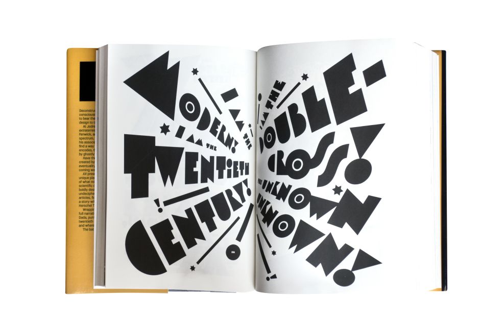
I created a Futurist-inspired font for the XX passages. XX, after whom the book is named, is the spirit of the 20th Century, and so I needed something that suggested the angular geometry of Fortunato Depero or Marinetti. Something bold and shouty and declarative.
For a later scene in which the Omniscient Narrator (me, the author) somehow incarnates inside my own book, I designed a font that tries to convey thought more closely. There are also new forms of punctuation and weird ligatures that suggest sounds produced by an alien vocal tract. In another chapter, I created an orthography that I imagined a creature like an evolved dolphin might use, based on rising columns of bubbles of different sizes, and another based on the interference patterns that a creature with a chitin carapace might produce as light filters through. I also used fonts of my own design that are more traditional in form – Paralucent or Albiona, for example, that just had the right tone I was after.
How did you ensure the reader didn't get confused or overwhelmed by the different designs and text layouts on display?
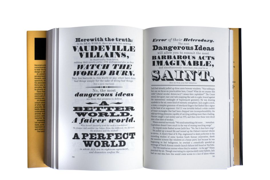
I attempted to have a through-thread of narrative that would pull you along. The chapters are all very short - just a few pages - so if the typographic shenanigans aren't to your taste, hopefully, the story itself will hold your attention. I didn't want it to just be design for design's sake – I've tried to read too many of those – and ignore the actual story. I wanted to create characters with whom the reader is invested, and the design should only enhance that, not obfuscate it.
What were the biggest challenges you faced when designing and creating this book, and how did you overcome them?
It did grow and grow. I did a pretty heavy edit towards the end and culled around 350 pages to keep it under the one thousand page mark, as I didn't want to tax my readers' patience (and pocket!) too much. It meant excising an entire subplot, but I think it is better for it – some readers, I'm sure, think I could have edited it down even more.
It was written directly into Indesign, in the final fonts I intended to use, so I could see immediately how it looked on the page. There have been novels that use different fonts before, but as far as I'm aware, they were written first and designed later, usually by someone else. It was designed and written at the same time by the same person. The Indesign master file became very unstable, and at a late stage, crashed — when I opened it again, half the pages were blank! For a week or so, I thought I'd have to rewrite and redesign it from memory, but then I found out that Dropbox archives a version every time you save – and there was a version I could download from just before the crash that still had everything, intact. The proofing and corrections were also very time consuming, as I, of course, had to do them all myself.
Was it difficult coming up with so many different layouts without running into repetition?
No – in fact, there were many more ideas that I couldn't use for space reasons, or I couldn't find a suitable place for in the narrative. Some of these made their way into my subsequent novel, The Black Locomotive, which has just been published in hardback. There is no shortage of interesting ways in which design can be employed to tell a story, just as there is no end to new forms of graphic design.
Do you think more authors should be embracing the creative opportunities design offers?
Yes. I think the novel's format, as we usually see it, is a product of the limitations of hot metal technology. Books like Mark Z. Danielewski's House of Leaves or Alfred Bester's Tiger, Tiger! (published in the US under the title The Stars My Destination) use type in innovative and interesting ways — in Bester's case to convey telepathy — but you can see the typesetter is struggling a bit with the limitations of the technology. We've been free of these constraints for at least twenty five years now, so there's no excuse for making your book "vessel agnostic" – for writing something in plain text in which the final visual form is not a consideration.

Do you plan to take the experimental design of XX even further in the future? It feels like ebooks could present even more possibilities for creative layouts.
We did have problems with the Kindle, as readers expect to be able to make the text reflow, enlarge, reverse. It is just not possible with a fixed-format novel, and though we tried to flag this up in the end, we withdrew it. Buy the book – that's the intended form it should be read in. I'm sure there are many more ways to tell a story that could include animated type, hotlinks, other forms of interactivity, but you do get to the point where the form perhaps becomes something else entirely.
Some years ago, there was a fad for comics that included limited animation, ambient sound and so on – but, as one reviewer said, they were less "comics plus" and more "animation minus". The UK hardback of XX includes the byline "A Novel, Graphic", a bad pun that sums up what I'm attempting here – though inadvertently it meant that the book got shelved in the graphic novel section, so it was dropped from the paperback. Maybe one day, there will be a standalone "novel, graphic" section.
Editor's Picks


Trending


Podcasts


Editor's Picks
Further Reading