Crown Creative challenges Irish stereotypes with New York bar identity
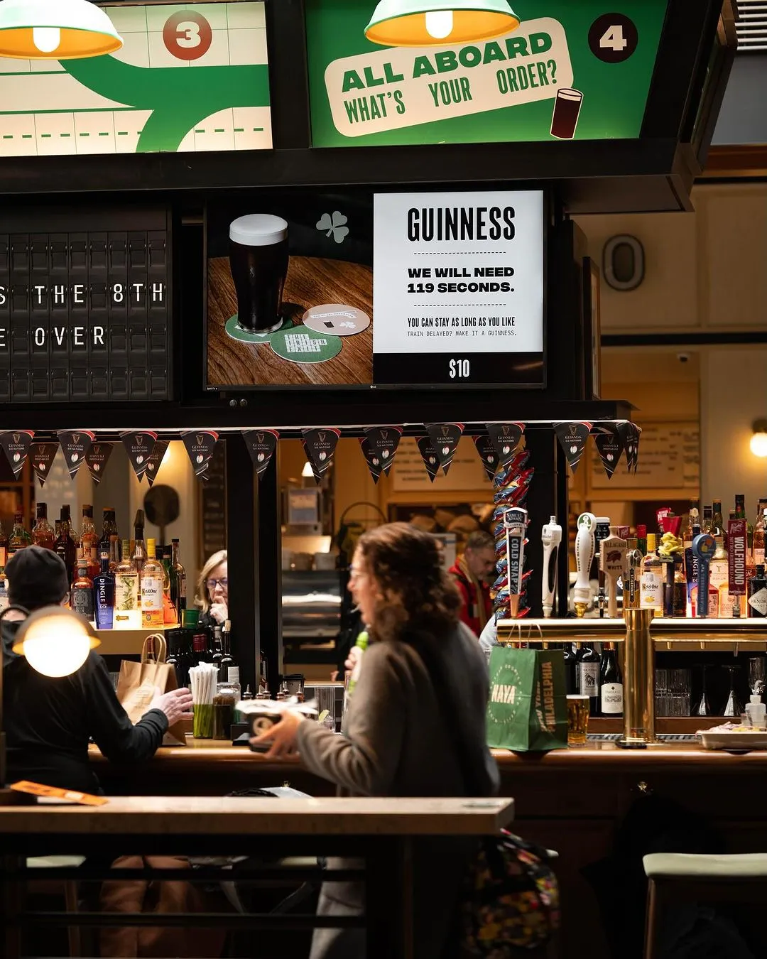
The on-the-go Irish bar, located in the busy transport hub at Moynihan, has a thematic thread of transport running through its brand and interiors.
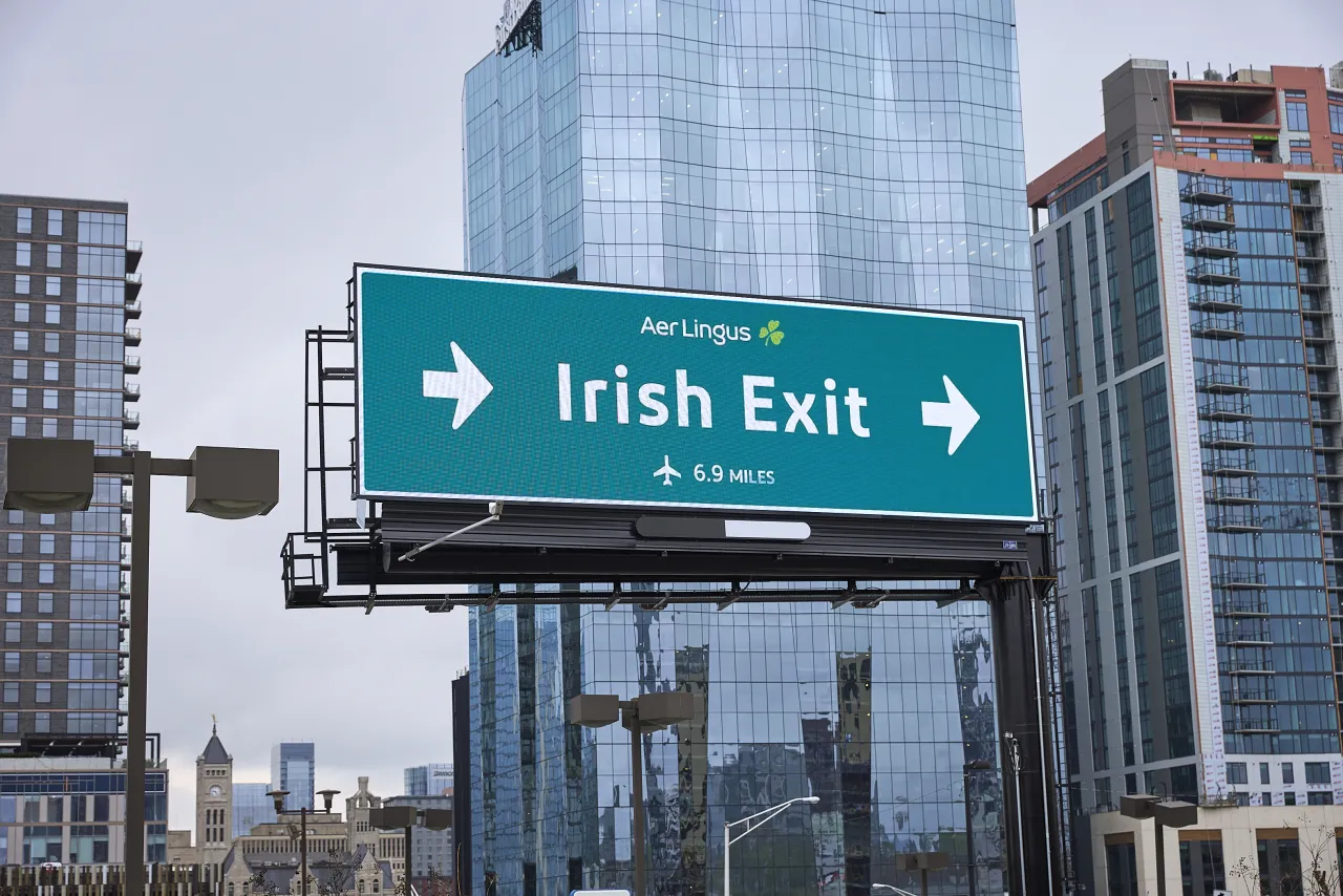
We've all been in those situations where you're at a social event and desperate to leave but can't face the long and tedious ritual of goodbyes. That's where The Irish Exit comes in handy, a term used to describe when a person slips out without lengthy farewells.
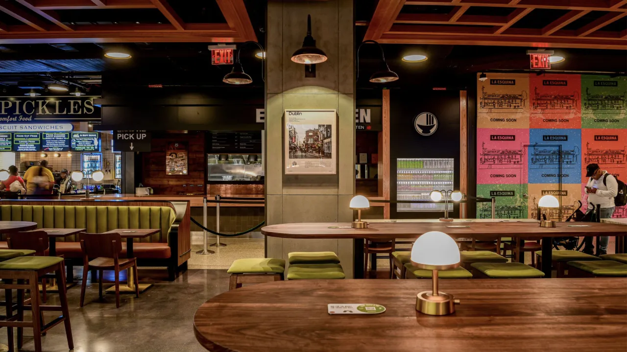
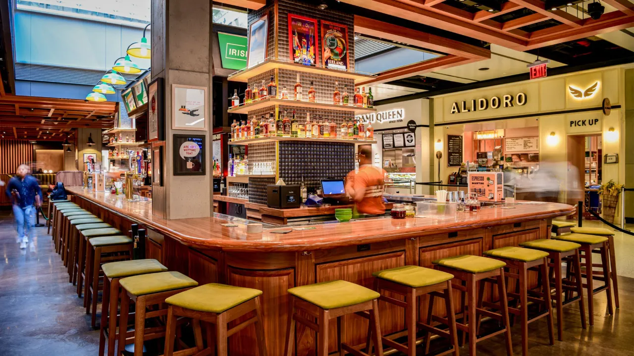
But now, The Irish Exit has literally come to life in the form of a no-nonsense bar in New York's iconic Moynihan Train Hall at Penn Station. Hospitality design studio Crown Creative is behind the bar's new identity (pun intended) and has worked on everything from the strategy and naming to the customised fonts and motion assets.
The studio won the project through its partnership with The Dead Rabbit, known as the world's most-awarded pub with over a decade of excellence in the beverage space. The Irish Exit is essentially a little sibling to The Dead Rabbit and is part of its plans to grow the brand to multiple locations across the US.
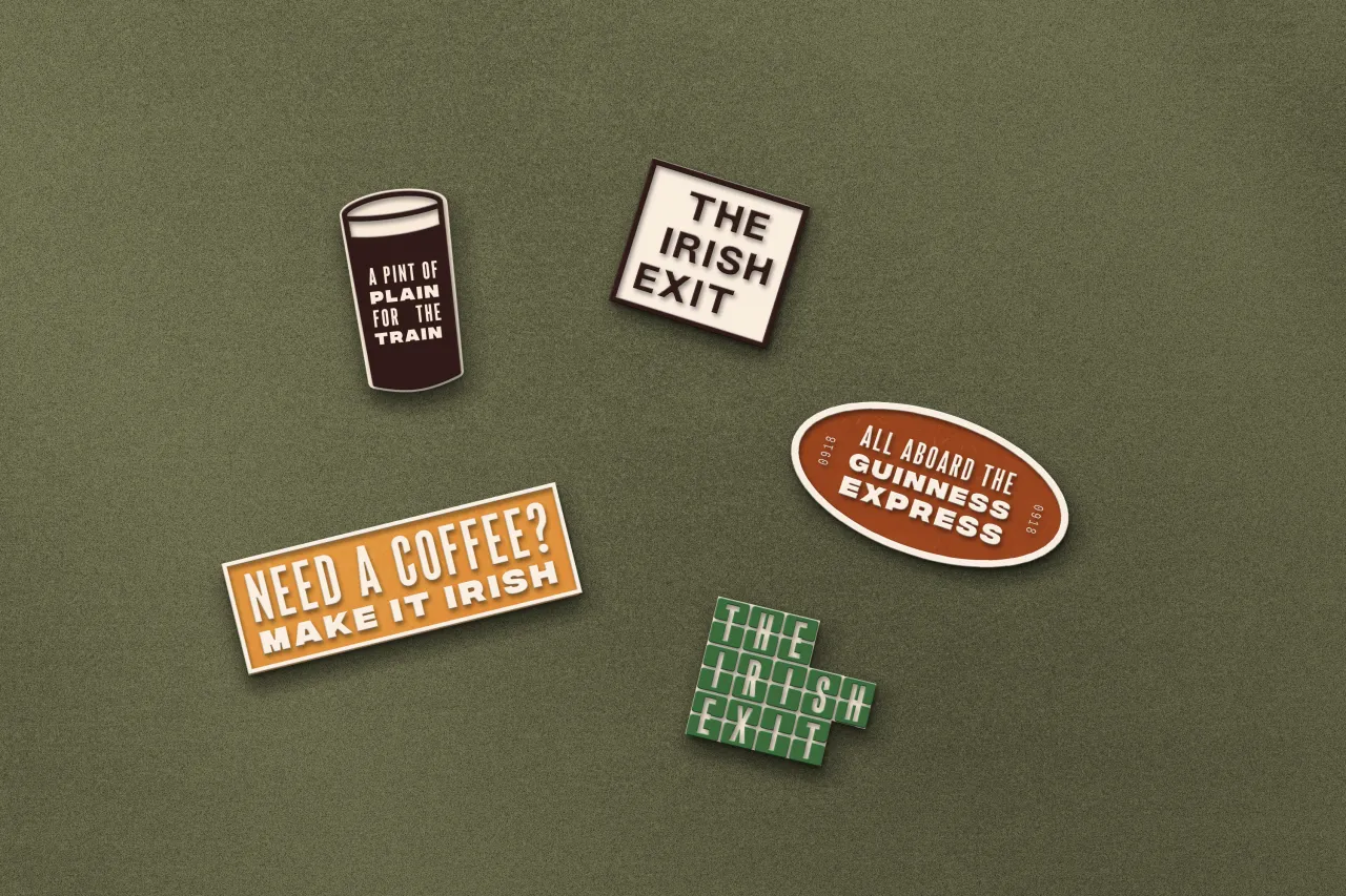
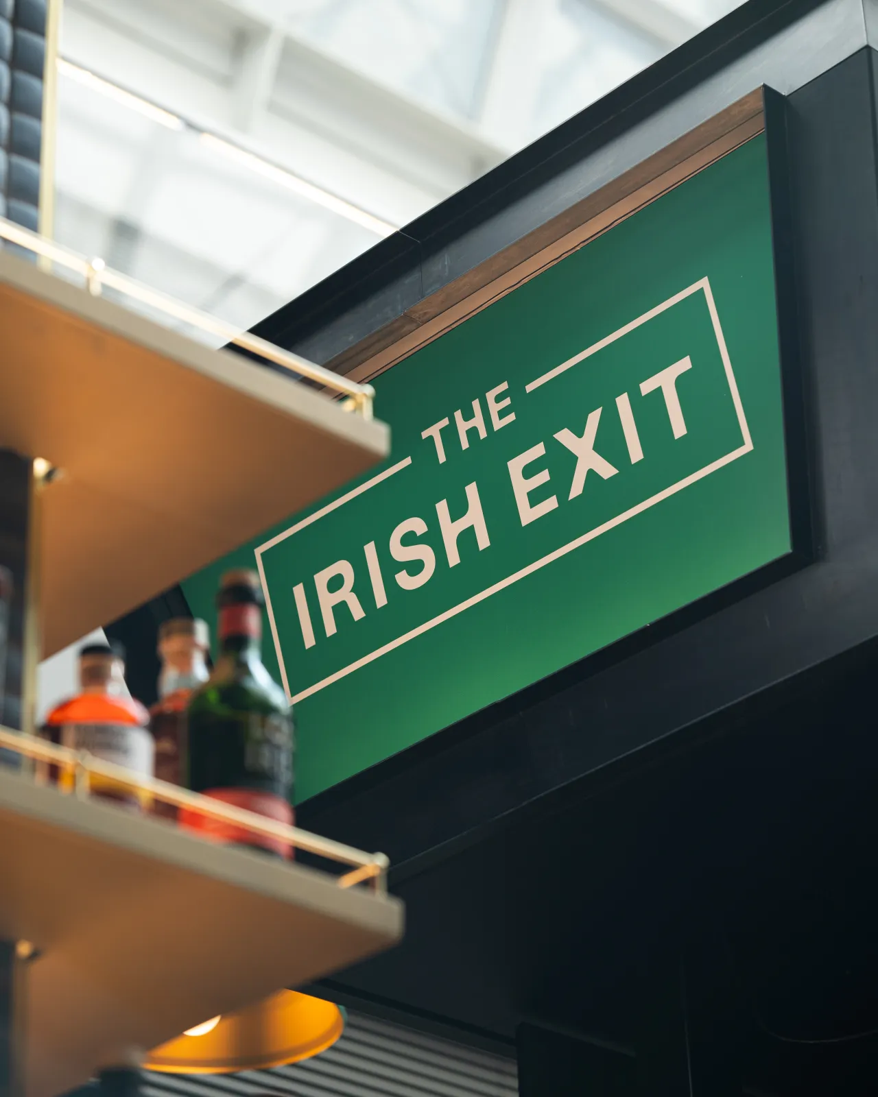
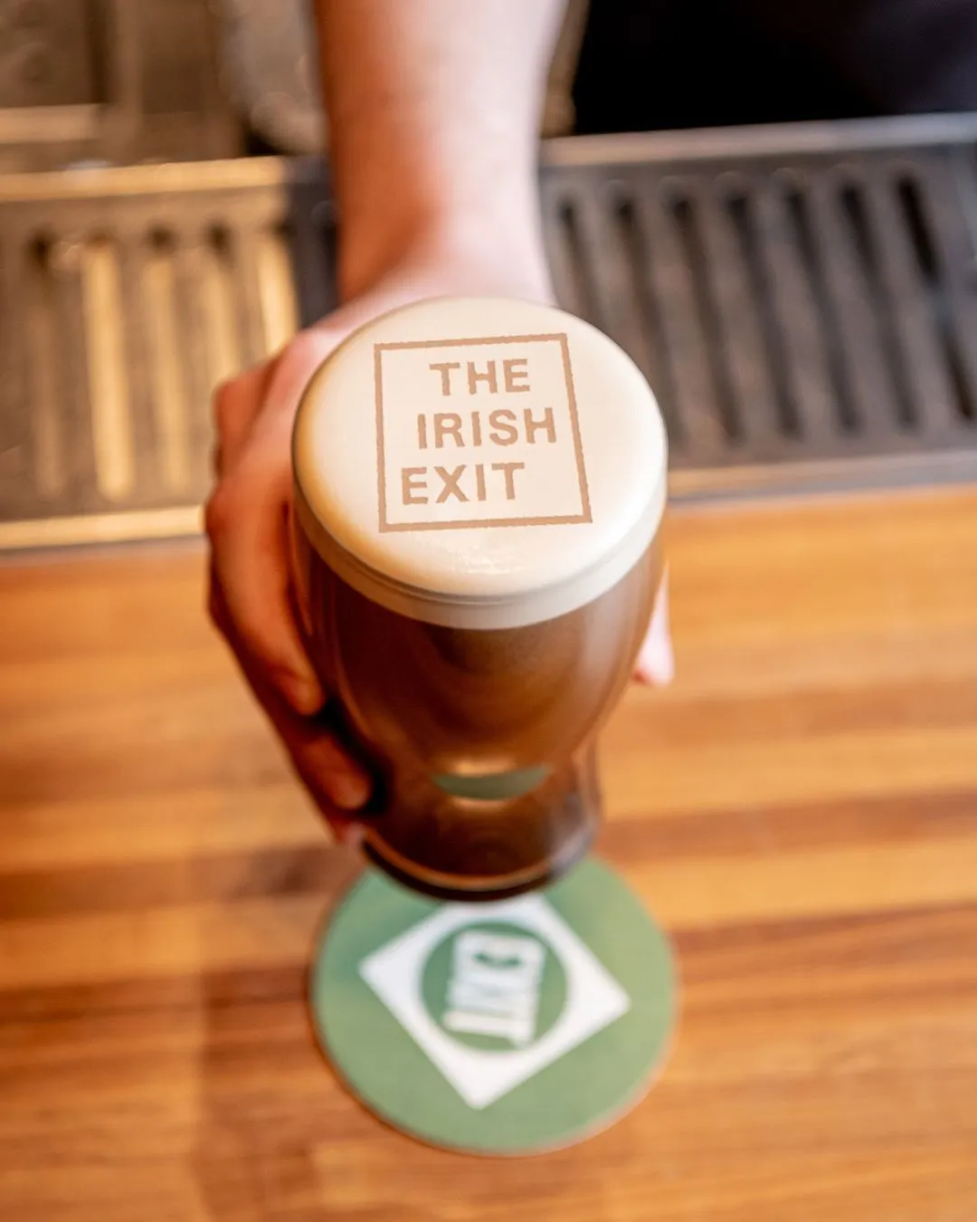
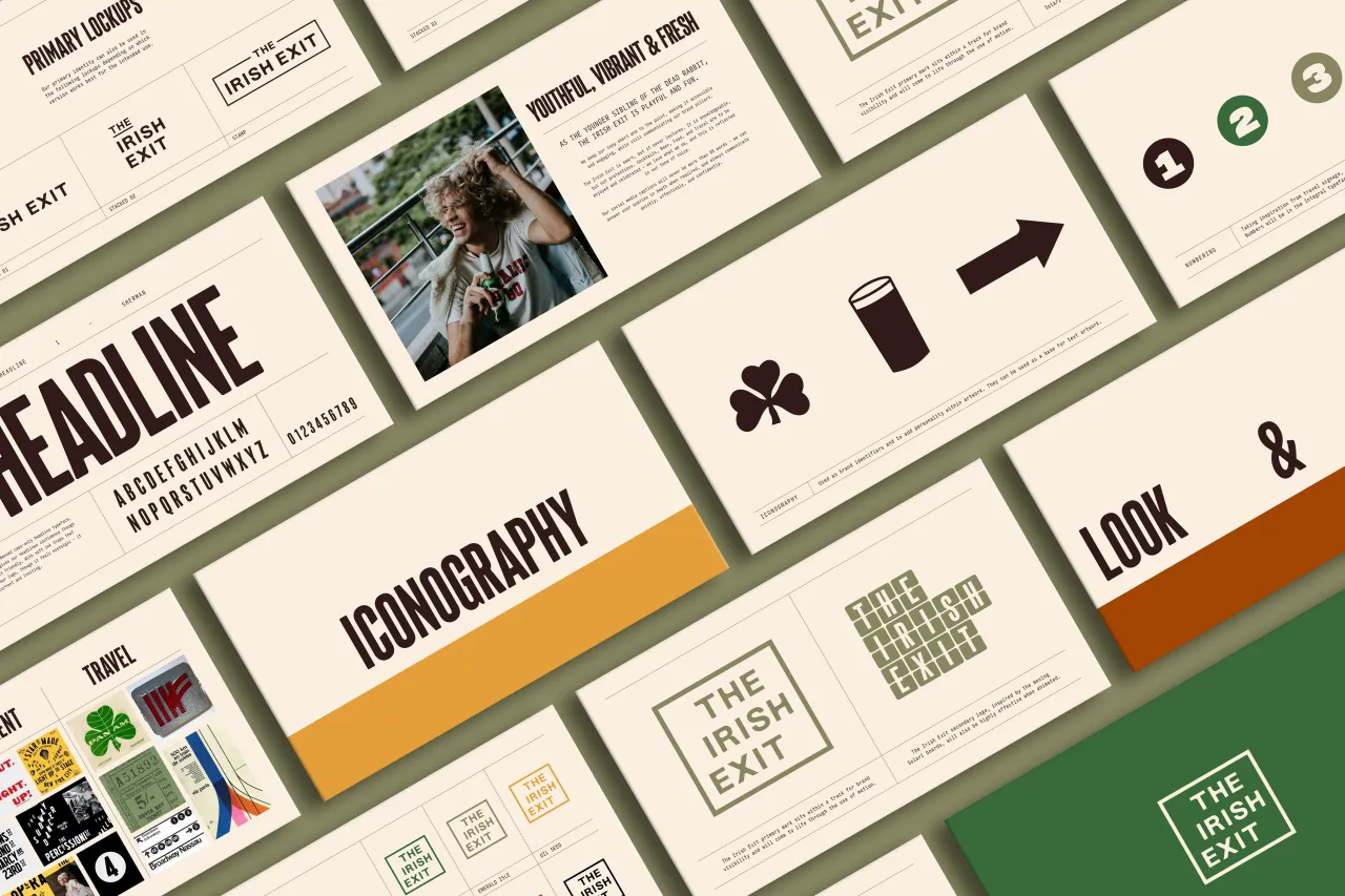
Having recently refreshed the identity for The Dead Rabbit, Crown Creative was well positioned to help launch this new venture. The fact that they have studios in both New York and Ireland was also a huge plus, as the team had a great understanding of the best Irish craft, spirits, design, business, and the existing perceptions of Ireland in the US.
Representing modern Ireland
The studio's creative director, Ryan Crown, reveals that they actually wanted to challenge these perceptions with The Irish Exit by creating a brand identity that "speaks authentically to modern Ireland". He says that the studio was instantly excited about the pub's location, as "it's not every day you come across a project in such an iconic building in New York City, especially one that's just been fully redeveloped and has around 700,000 people walking through it each day".
He describes how the concept centred around the pub being "a beacon for travellers, offering an escapist experience for quick transit with Irish drinks, culture, music, and hospitality". It was also intended to appeal to "a more casual customer market, appealing to guests who seek the same quality and expertise inherent to The Dead Rabbit in a quicker, more accessible format", says Crown.
Leveraging the nostalgia of 1940s and 50s travel
It was clear from the start that keeping the brand's quirky and energetic personality consistent with its Irish heritage and The Dead Rabbit's legacy would be a challenge. However, Crown says this was overcome by balancing "nostalgic travel motifs with contemporary design, ensuring the identity felt fresh but rooted in inspiration".
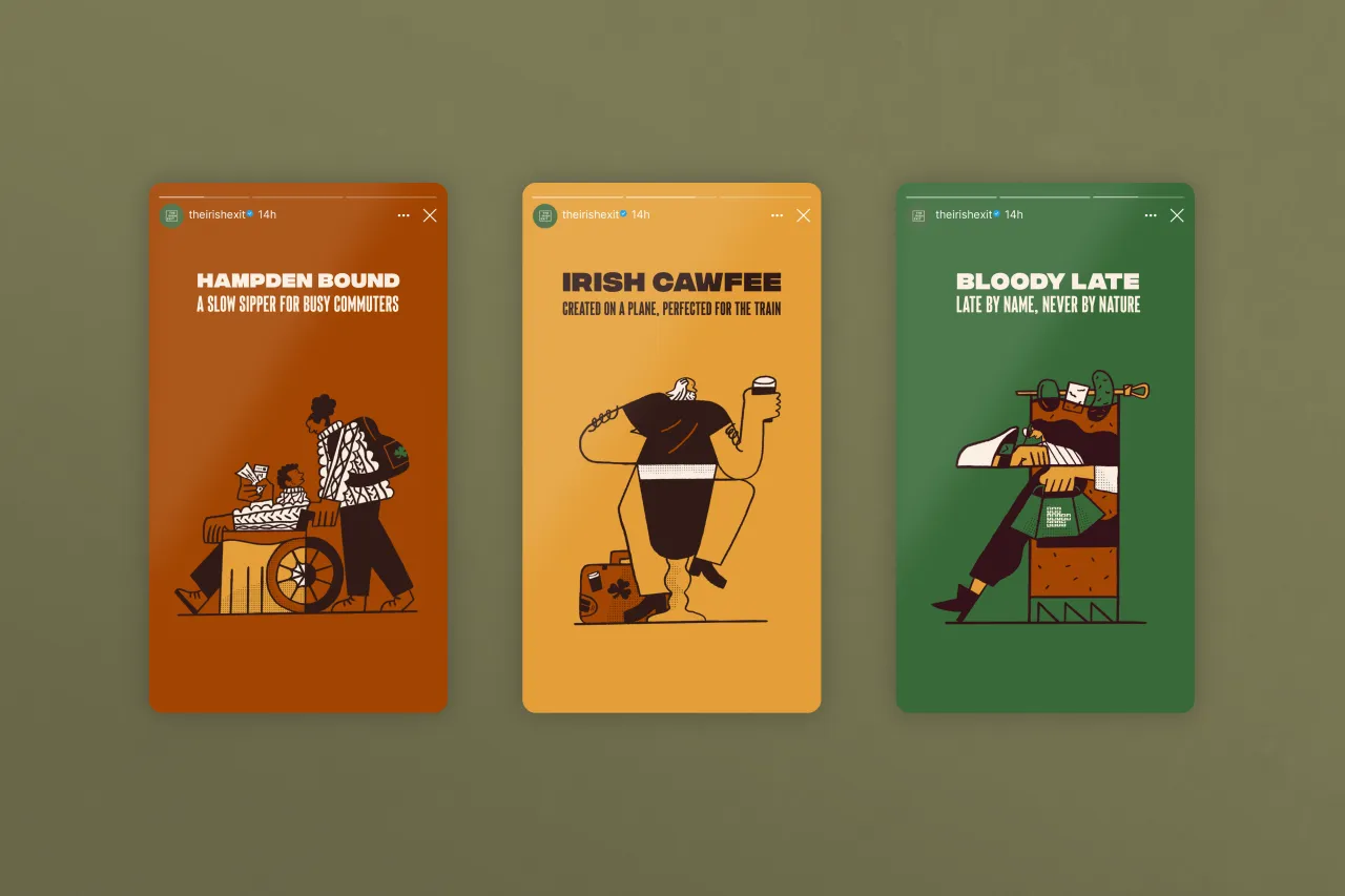
Part of this solution involved commissioning Irish illustrator David McMillan to create a series of brand illustrations about people, travel, and the location in New York. Crown Creative also curated a collection of Irish artworks to be featured on the bar's walls, aiming to give guests a more profound visual connection to Ireland.
The studio sought to evoke "a sense of nostalgia tied to travel in the 1940s and 50s", says Crown, which is a visually rich aspect of Ireland's cultural history. "By drawing from elements like railway signage, airline branding, and road signs, we created a visual identity that speaks to the journey and adventure, a theme that aligns well with the concept of a bar designed for those on the go", he explains.
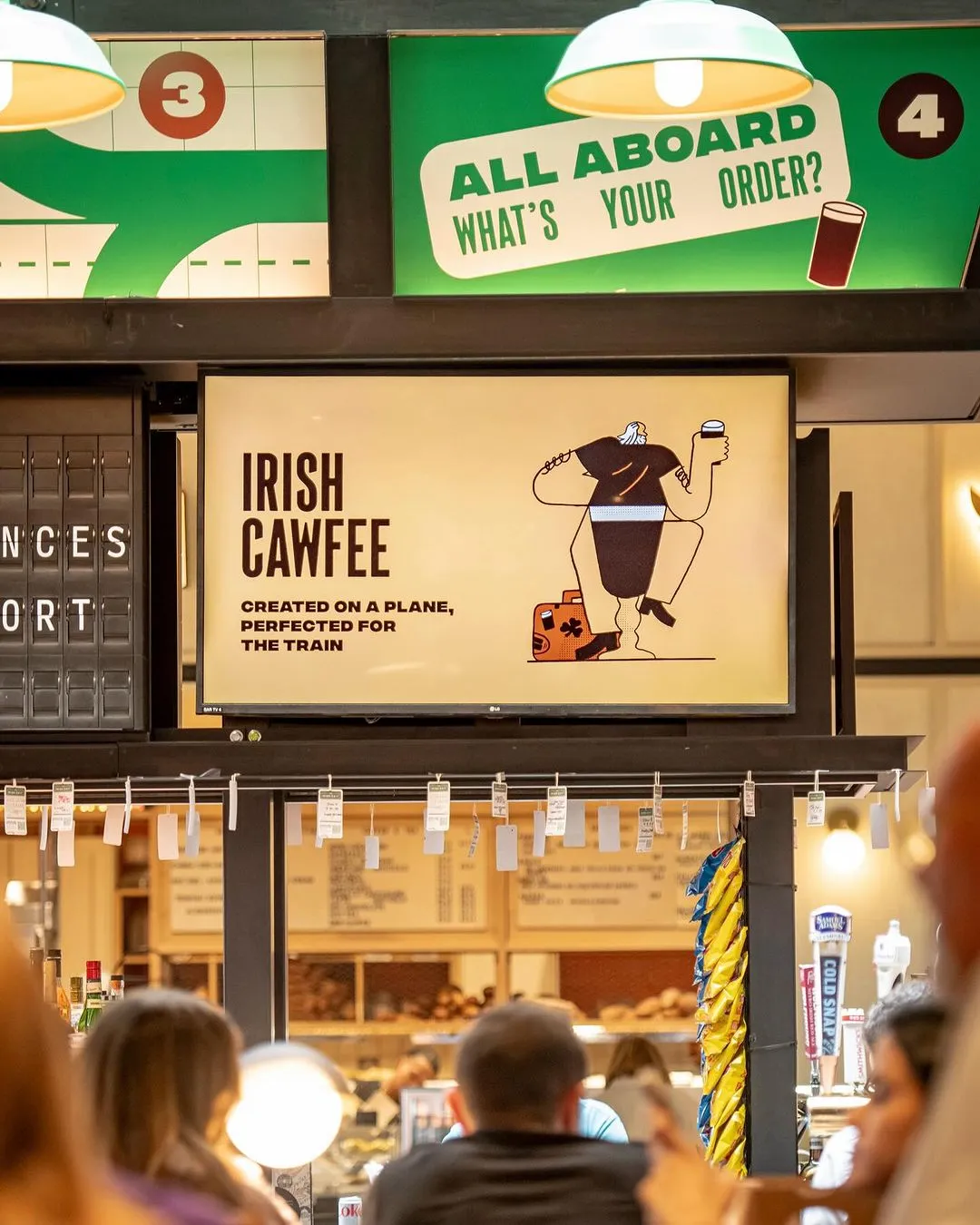
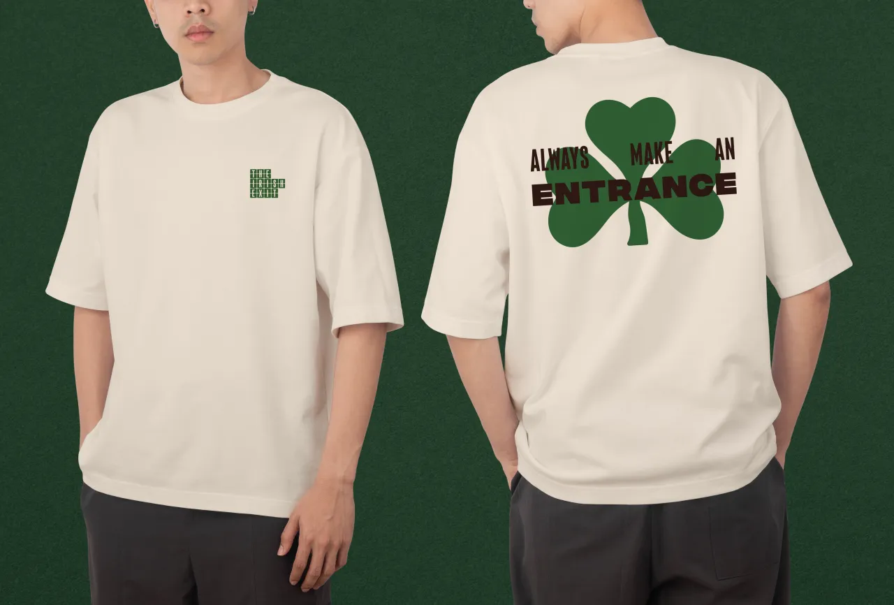
Moynihan Train Hall is also home to many other drinking establishments, and so Crown Creative had to find a way to make The Irish Exit stand out in the busy, fast-paced environment. This involved animating brand marks and messaging across the screens at Penn Station, giving the pub a strong presence among competitors.
An 'aha' moment
When naming the pub, Crown collaborated with The Dead Rabbit's managing partner, Jack McGarry, for almost a month, sharing ideas back and forth. He recalls how McGarry rang one morning with an 'aha' moment and said, "How about Irish Exit?" which nods to the tradition of leaving without saying goodbye and swift pit stops before jumping on the next train.
Crown says: "It is also obviously Irish, making our offering immediately clear, and is also tongue-in-cheek, representing an exit to contemporary Ireland.
"The idea was to place an excellent quality bar somewhere people aren't expecting it, and guests are surprised to find elevated cocktails in a relaxed environment, like the signature Irish coffee borrowed from the world-famous Dead Rabbit recipe."
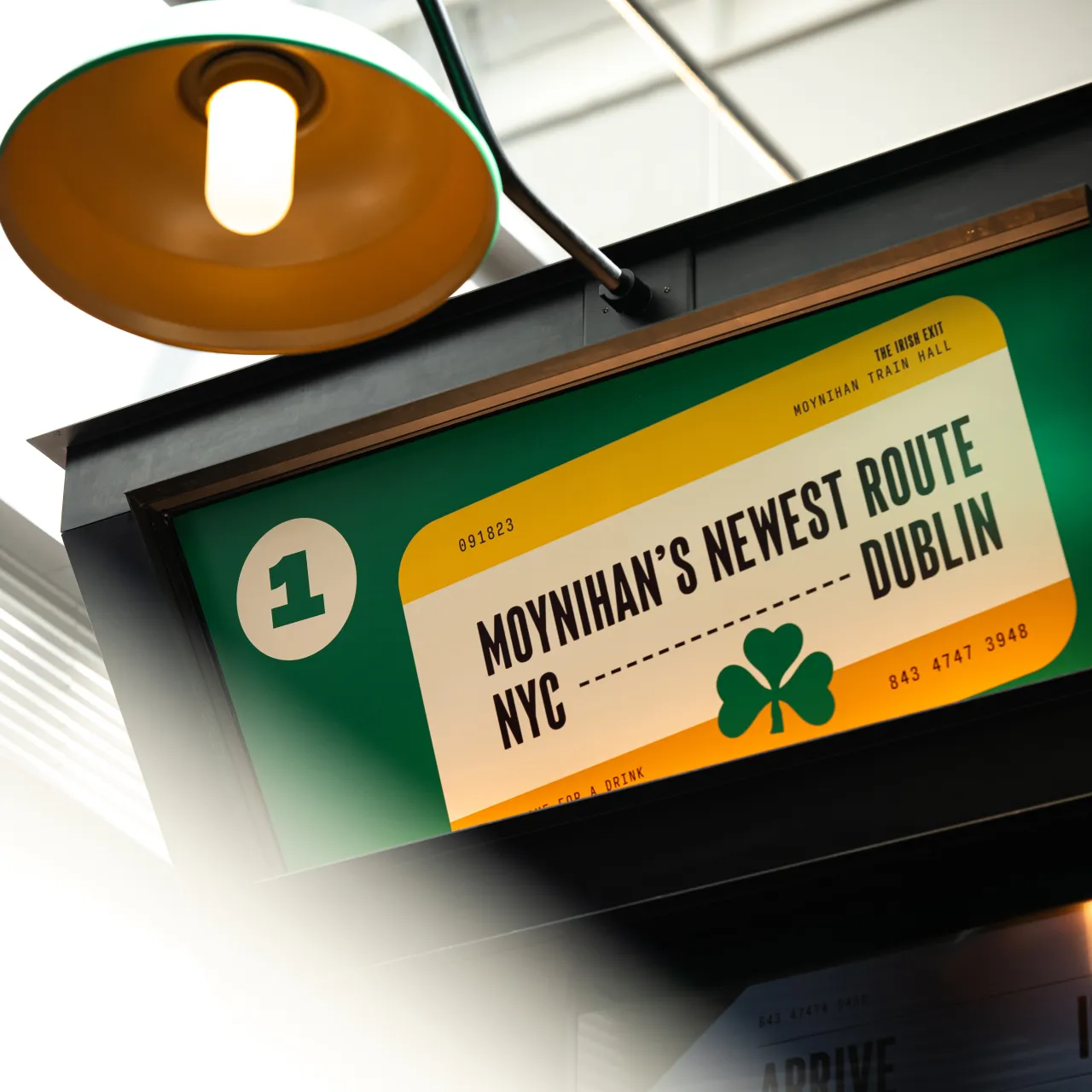
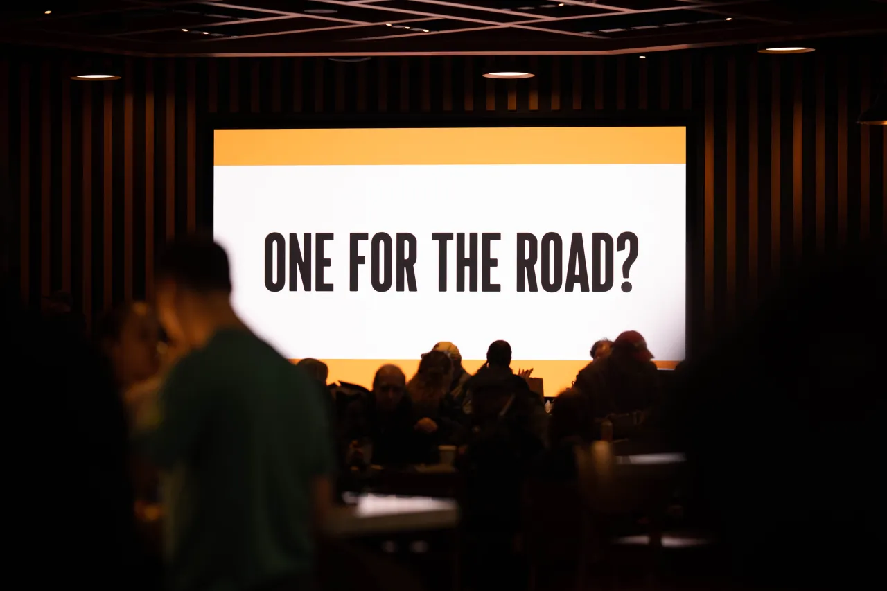
Positioning The Irish Exit as an approachable and streamlined beverage-centric destination was key to the creative strategy, as it had to be perceived as a place that's easy to fall into when on the go. For guests on the go, this comes through in the brand language that Crown Creative developed, using taglines like 'Your local Irish pub, no matter where you're travelling' and 'One for the Road' on signs.
Crown notes how these "clever brand moments" were designed to catch a traveller's eye as they walk through the iconic Moynihan building. The rest of the brand's visual language, from grids and typography to the animation style, is all inspired by the language of travel.
"The charm of letterpress and mid-century travel"
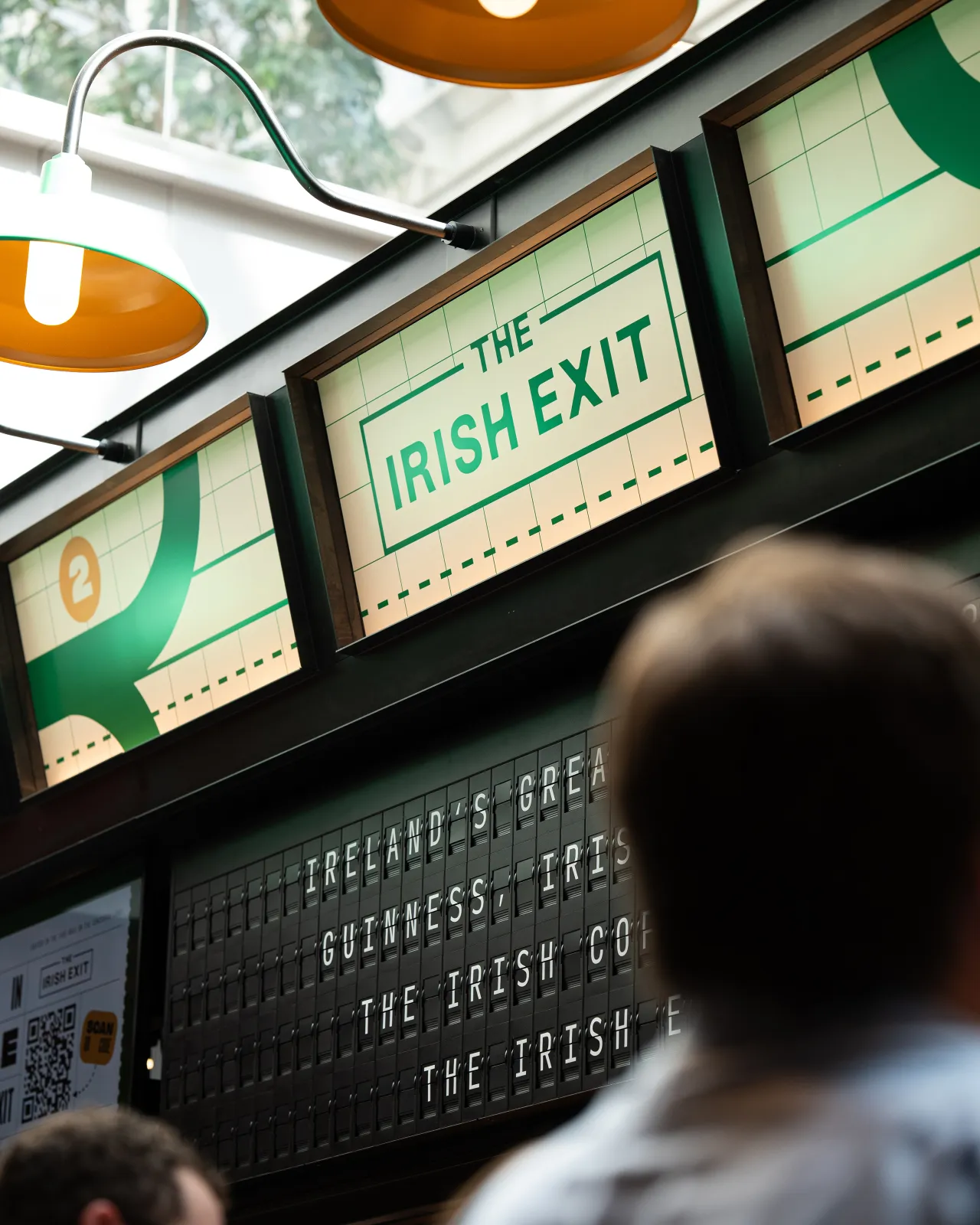
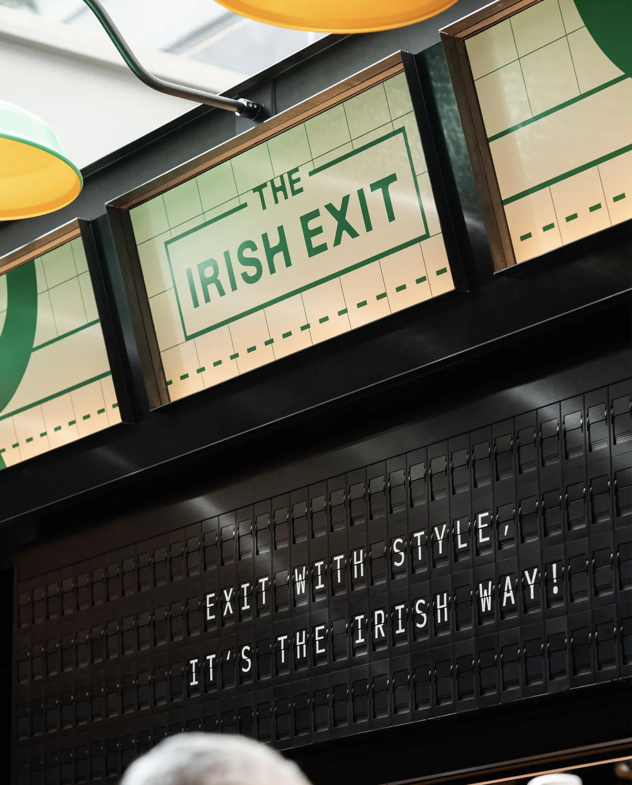
Design cues from travel signage play a huge role in The Irish Exit identity, including elements that nod to flapper boards in train stations and airports of the past. "We found a fantastic company called Oat Foundry that makes modern versions of these boards that can be fully customisable to your brand, and they were able to programme the board to be synced with the station's departures and feature facts about Ireland", says Crown.
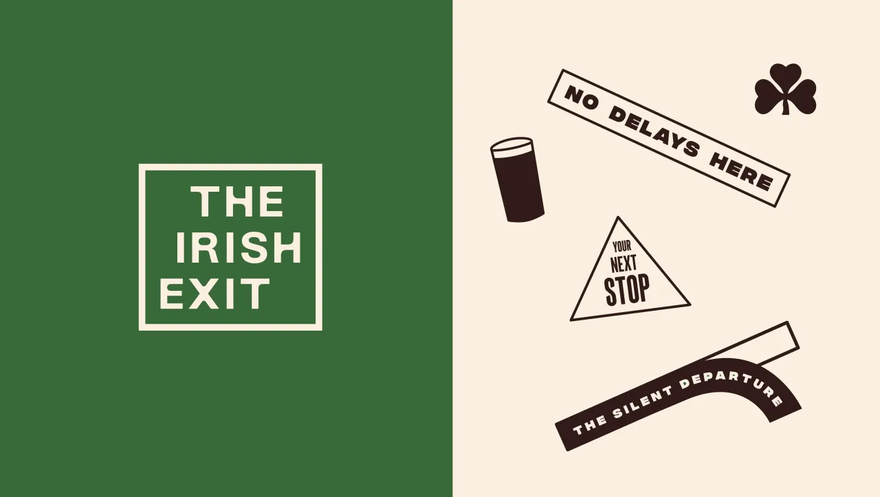
The brand also has a range of logomarks applied to various brand touchpoints. One of the alternate logos was custom-made to sit within a grid that references the curves of a railroad track switch, which, according to Crown, symbolises movement and transition.
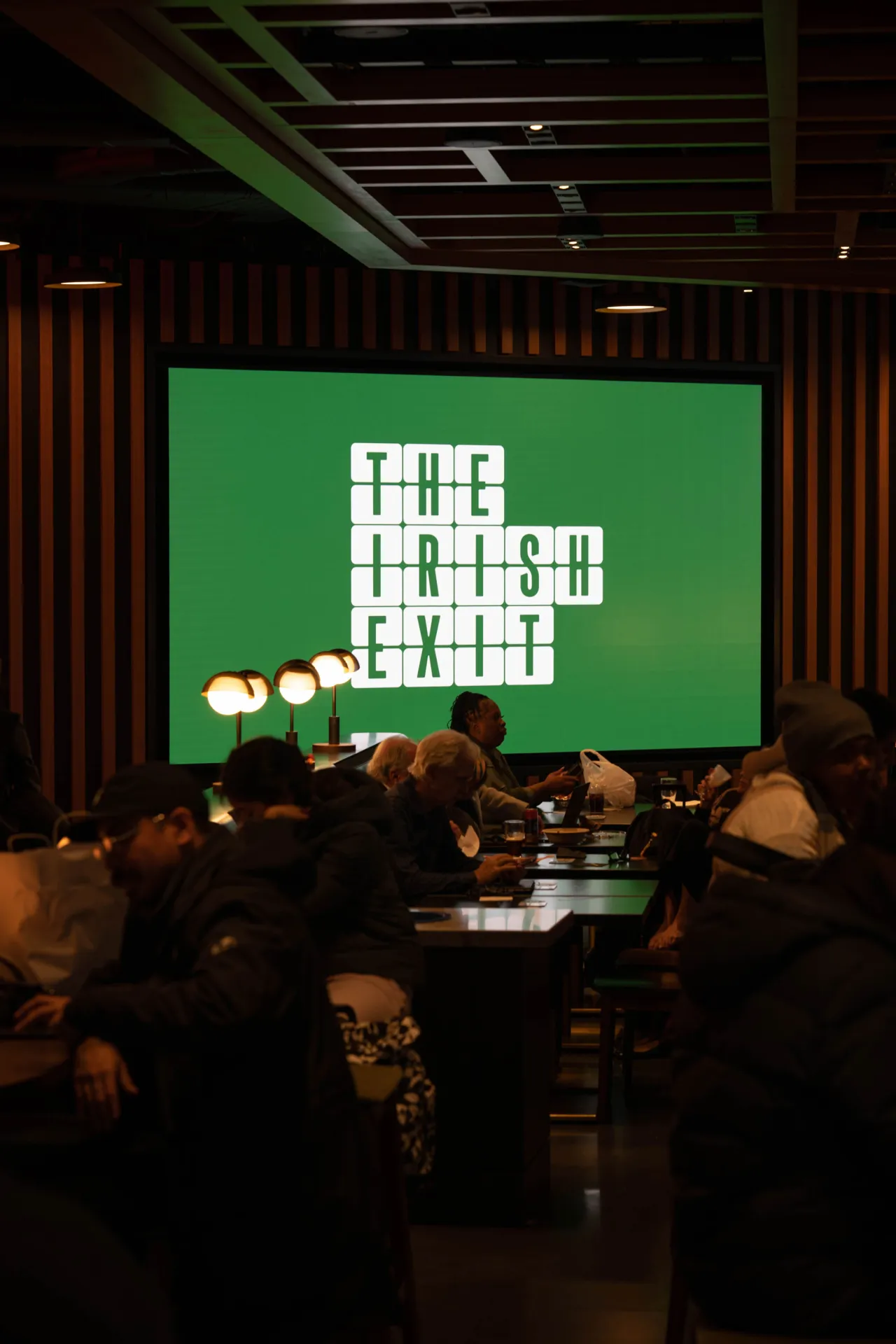
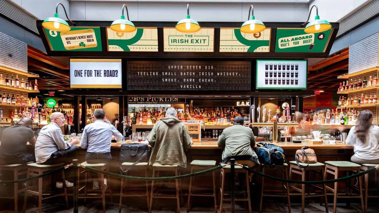
The Irish Exit's type treatment comprises a trio of typefaces: Sherman Display by Ellen Luff Type, Integral CF by Connary Fagen, and Input Mono Compressed by Font Bureau. Sherman Display is a condensed caps-only typeface with rounded corners that communicates friendly confidence, while Integral CF is heavier in contrast.
These typefaces were used for the headline copy, with Input Mono Compressed applied to the body copy, nodding to classic Solari boards and vintage tickets. "The type combination echoes the charm of letterpress and mid-century travel designs like luggage tags, airline tickets, and posters, and the variety in size and weight helps create a playful and recognisable visual identity," says Crown.
"Challenging paddywhackery"
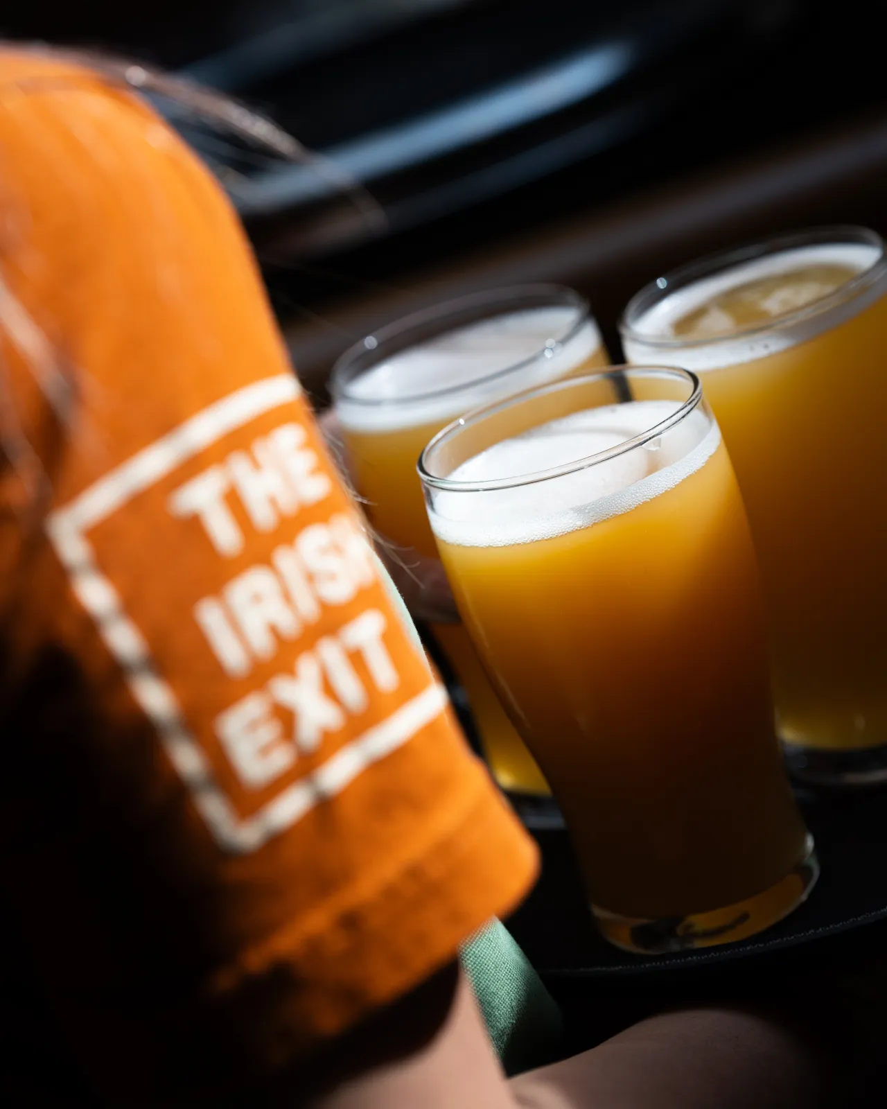
The colour palette was curated to take guests on a journey across Ireland, says Crown, "with rolling green fields of the landscape, oilseed yellow, dark ruby red (the actual colour of Guinness), and a complementary rust that hints at road signage". In alignment with the strategy, these hues were intended to portray Ireland in a modern way, directly opposing "a stereotypical Irish brand and challenging paddywhackery", which is a joint mission with The Dead Rabbit, he adds.
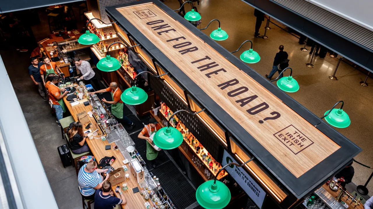
The Irish Exit's playful side comes through in the motion design, positioning it as the more relaxed sibling of The Dead Rabbit. Since there is no shortage of screens in train stations and airports, Crwon Creative thought it made sense to use them well throughout the brand.
"Digital screens above the bar feature animated menus illustrated with travel motifs, helping the brand engage with customers in a busy environment," Crown explains. "Motion is even in the analogue flapper board sign above the bar, with the sound of the board and the anticipation of its changing text building an immersive experience for guests."
Editor's Picks





Trending






Latest Jobs
Talent Agent & Producer at The Jacky Winter Group
Full-time·Los Angeles·$70k-$85k
Brand Designer at Adfin
Full-time·London·£30k–£50k
Account Manager at BUILDHOLLYWOOD
Full-time·London·£34k–£38k
Creative Social Content Producer at Bompas & Parr
Contract·London·£32k–£40k
Brand Designer, Product Launches at Figma
Full-time·New York·$127k–$269k
Art Director at The New York Times
Full-time·New York·$120k–$130k