Jump Jirakaweekul and Tom Elia of COLLINS on their rebrand for CNET, inspired by the 'golden age' of the printing press
COLLINS is behind the brand refresh for CNET, heralding the vintage printing presses and an era when newspapers were king. The new logo and website design mark a new chapter for the tech media firm. We find out more about the work from COLLINS Design Director Jump Jirakaweekul and Creative Director Tom Elia.
In looking to modernise its brand as part of a broader strategy to expand beyond tech, CNET appointed COLLINS in New York to develop a new visual identity, brand strategy and story. It was a challenge the agency relished, given the ongoing impact of the digital revolution on journalism and an increasingly crowded space.
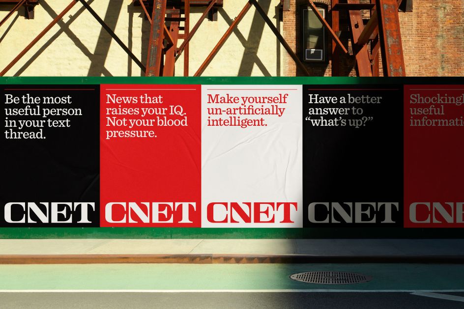
The brief from CNET was to highlight the strength of its quality journalism and its ability to sift through the noise and find the stories that matter to its audience the most. Responding to this approach, COLLINS combined design elements from the non-partisan "golden age" of the printed press, going back to the 1950s-70s for inspiration.
"This was a period before the FCC abolished the Fairness Doctrine, which required news outlets to represent differing viewpoints," says Tom Elia, creative director at COLLINS. "At that time, the news was more broadly respected and viewed as a public if not an imperative good. Fast forward to today – while the news industry can now be deeply divisive and partisan, CNET is a major outlet that's not on any driven, ideological hunt. They pride themselves on providing timely and expert reporting and advice that you can apply to your daily life – regardless of your politics."
"While we looked to the late 1950s through the 1970s for editorial design inspiration, we wanted our key visual elements to live somewhat outside of time," adds Jump Jirakaweekul, design director at COLLINS. "We wanted to bridge the past and the future while evoking both familiarity and surprise – whether it's the strong graphic wordmark or the fantastical nature of the futuristic, almost sci-fi illustrations. Typography plays a key part in this, considering the wide range of headlines, articles, and content CNET delivers daily. That friendly slab serif felt timeless and can speak to a broad range of stories and information."
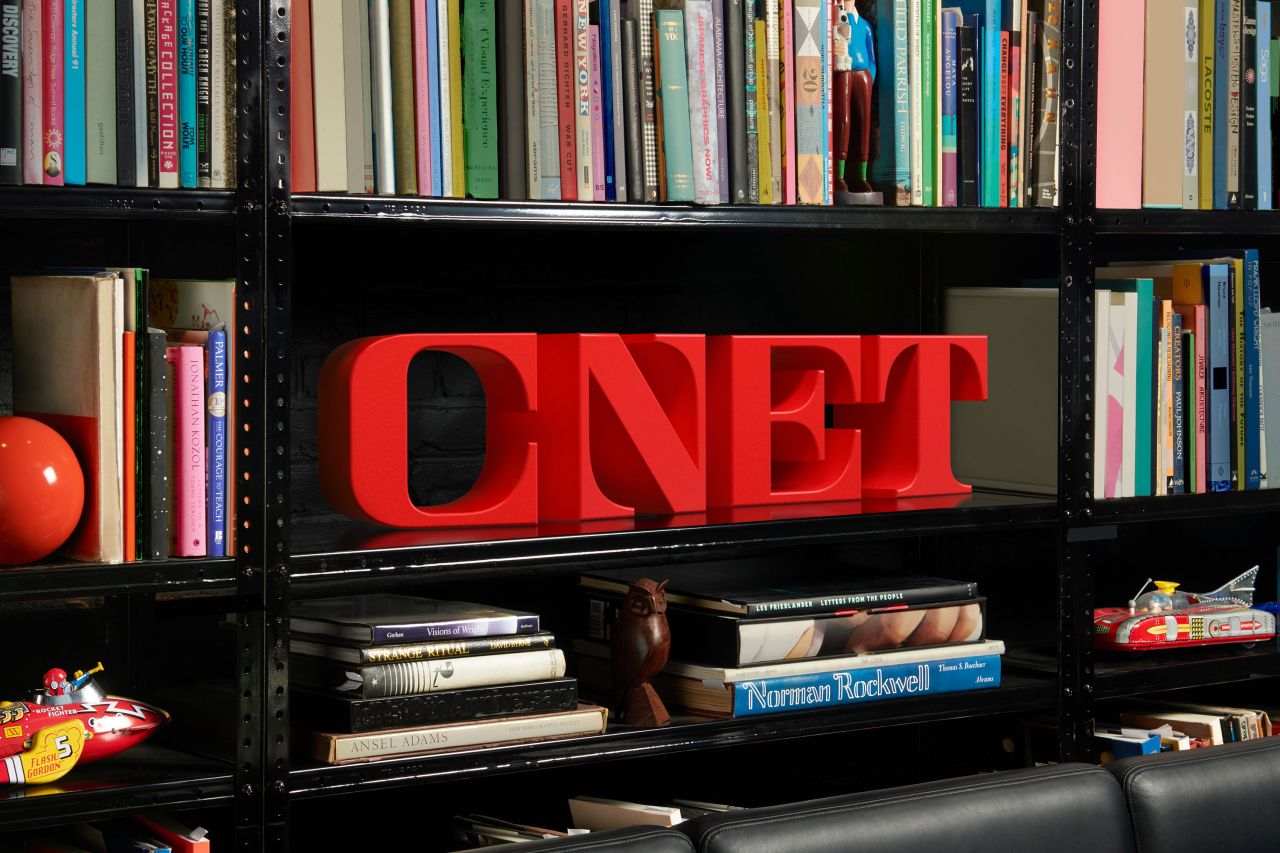
The resulting identity has a bold surrealist feel, emphasising CNET's commitment to good old fashioned reporting, no doubt evoking feelings of familiarity, authority and trust. "If anything, we felt like mid-century news brands from around the world were bold monuments to the freedom and power of the press," says Tom. "This manifested in the form of bold, memorable, and iconic wordmarks. They felt real, solid and trustworthy and nodded to something that felt bigger than any writer or reporter. It was more about capturing that feeling rather than any particular look."
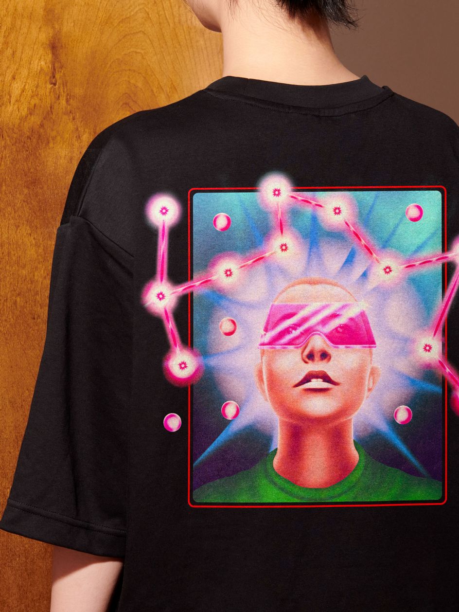
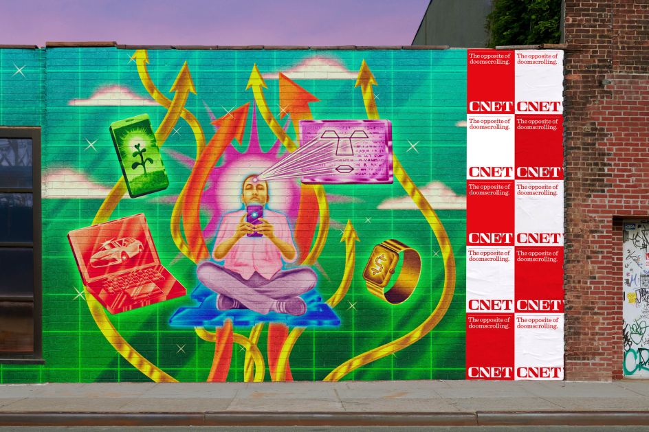
The work by COLLINS includes custom illustration styles, something Jump admits was their biggest challenge: "We knew original illustration could serve a vital role in helping open people's minds to this new CNET. As a daily news outlet, CNET's photo style leaned towards clear, often more traditional editorial images. By contrast, illustration was a vivid way to express CNET's brand and marketing story: Turning change into opportunity."
The team at COLLINS was influenced by late Surrealism and early 1970s science fiction book jacket illustration. "They both provoke more questions than provide answers," explains Jump. "They don't mirror a viewer's life in any way. Instead, these images are open to interpretation, which is also great as CNET's advice is never 'one-size-fits-all'. Whether it's an article or an ad, we want people to see imagery and ideas that, when paired with a headline, spark their imagination about how they might use that information. No more cookie-cutter visualisations, thank you. Robert Beatty's work perfectly captures what we were looking for. It simultaneously looks forward and nods backwards. That feels right for CNET, too. It's a full-circle-reimagination for a community of great news people who've set their sights on the future from the beginning."
Elsewhere, COLLINS created a suite of engaging motion graphics. "Motion presents a prime opportunity to tell more stories and bridge many different design elements," says Jump. "For the wordmark, we wanted movement with a light touch of nostalgia that could highlight the sleekness and features of the new wordmark. We landed on these simple, three-dimensional blocks that rotated the four CNET letterforms, highlighting their cubic forms in an almost hypnotic way. When the wordmark rotation completes, there's a shift in colour, or footage is revealed. It's almost as if the wordmark was already deep within the story, the footage or the image itself. So motion helps tell the story of CNET, revealing unexpected stories with diverse points of view."
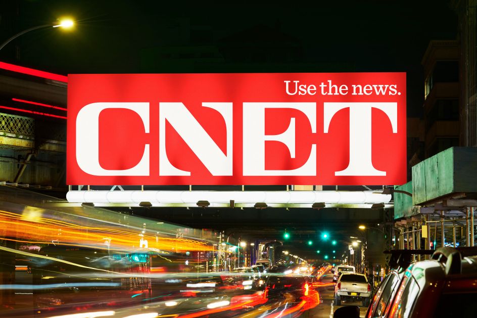
Meanwhile, the fresh logo heralds a new and open editorial experience that allows content and stories in any media channel to have a sense of importance without crowding each other out. "We sought to build a system that could, on one side, carry a strong, objective editorial voice and on the other, deliver an unignorable CNET marketing and advertising voice," explains Jump. "Colour helps. For that, we amplified CNET's iconic red but gave it a higher key, so it felt brighter and more optimistic. For typography, this slab-serif ensured impact when used at display scales, but it doesn't break down or get too noisy when used at very small scales or with editorial imagery."
The same went for the new CNET wordmark. "We wanted to ground its forms in the reassuring familiarity of serifs," adds Jump. "So, by making the letterforms fit into perfect squares and cropping off the outside serifs, we could inject some uniqueness and surprise to it. We wanted to highlight the simplicity of each letter, making each feel uniquely considered, maintaining their idiosyncratic type gestures individually without compromising how they read as a whole. I hope we did that."