'Less is more': Ninki on Riso-inspired colours and illustrating with a simplistic and positive outlook
There are many reasons why a person might turn towards creativity. Not only is the act of putting pen to paper a form of therapy, but it's also an effective way of expressing oneself and a means of putting your personal view out into the world. For Ninki (also known as Qi Ren), it's all of these reasons combined – and then some.
© Ninki
Born in China, Ninki began to draw from a young age and has been practising the medium of illustration ever since. After graduating from the China Academy of Art a few years later, Ninki moved to Japan to commence work as a freelance illustrator. Ninki also chose this artistic pseudonym as it means "welcome" in Japanese, a symbolic marker to the start of what would then become a blossoming career in illustration.
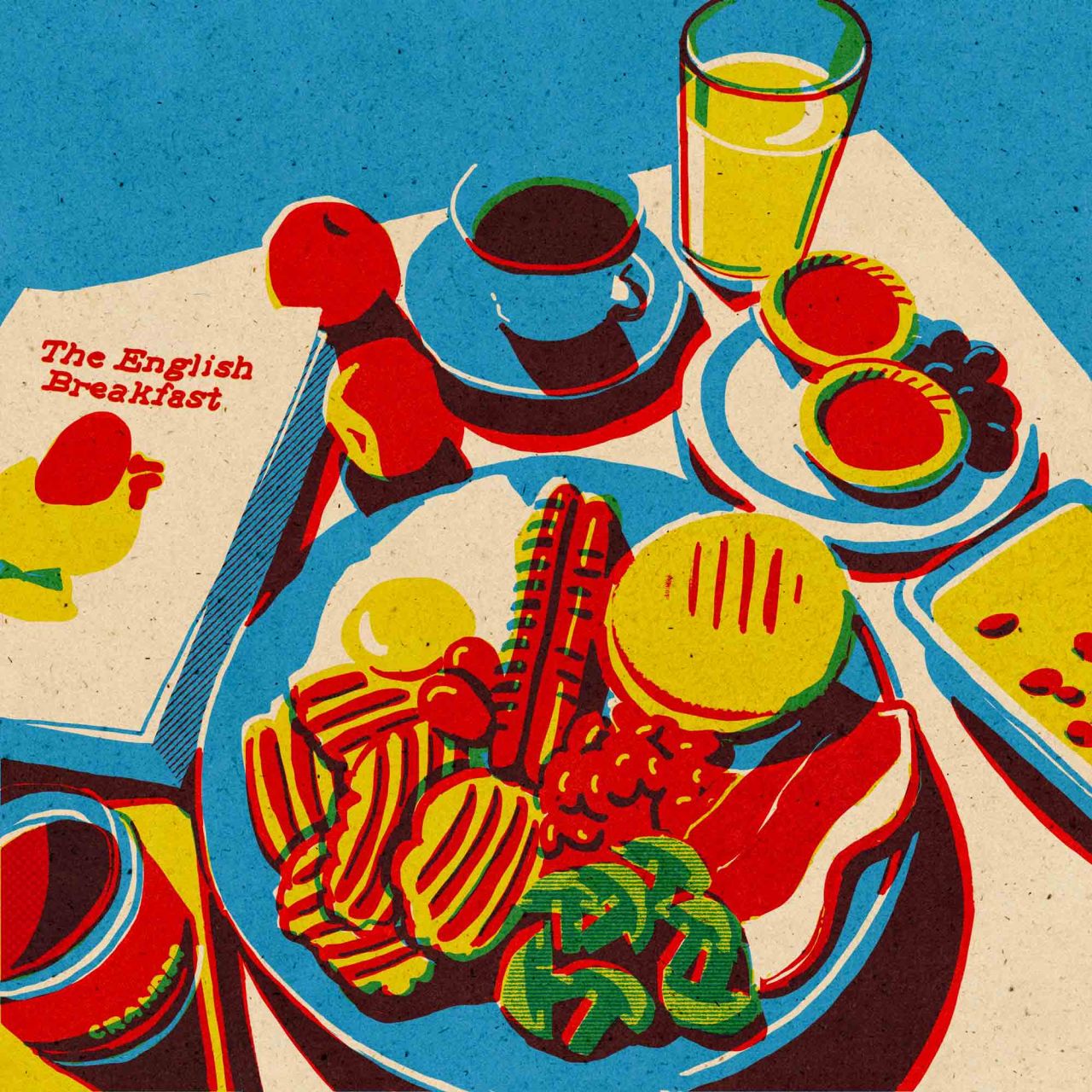
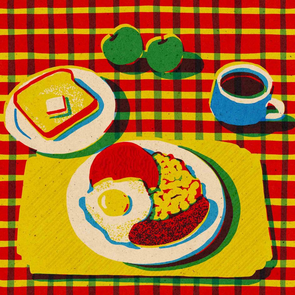
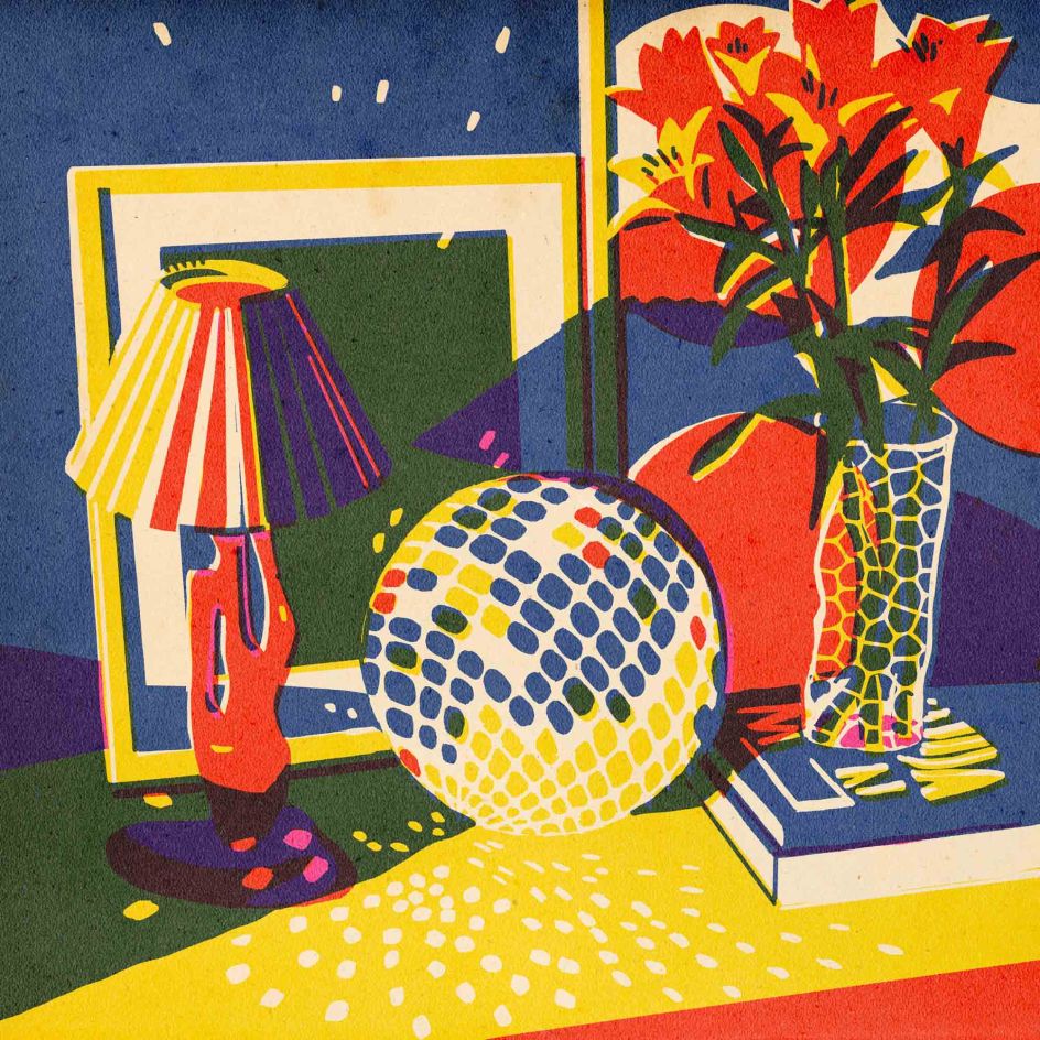
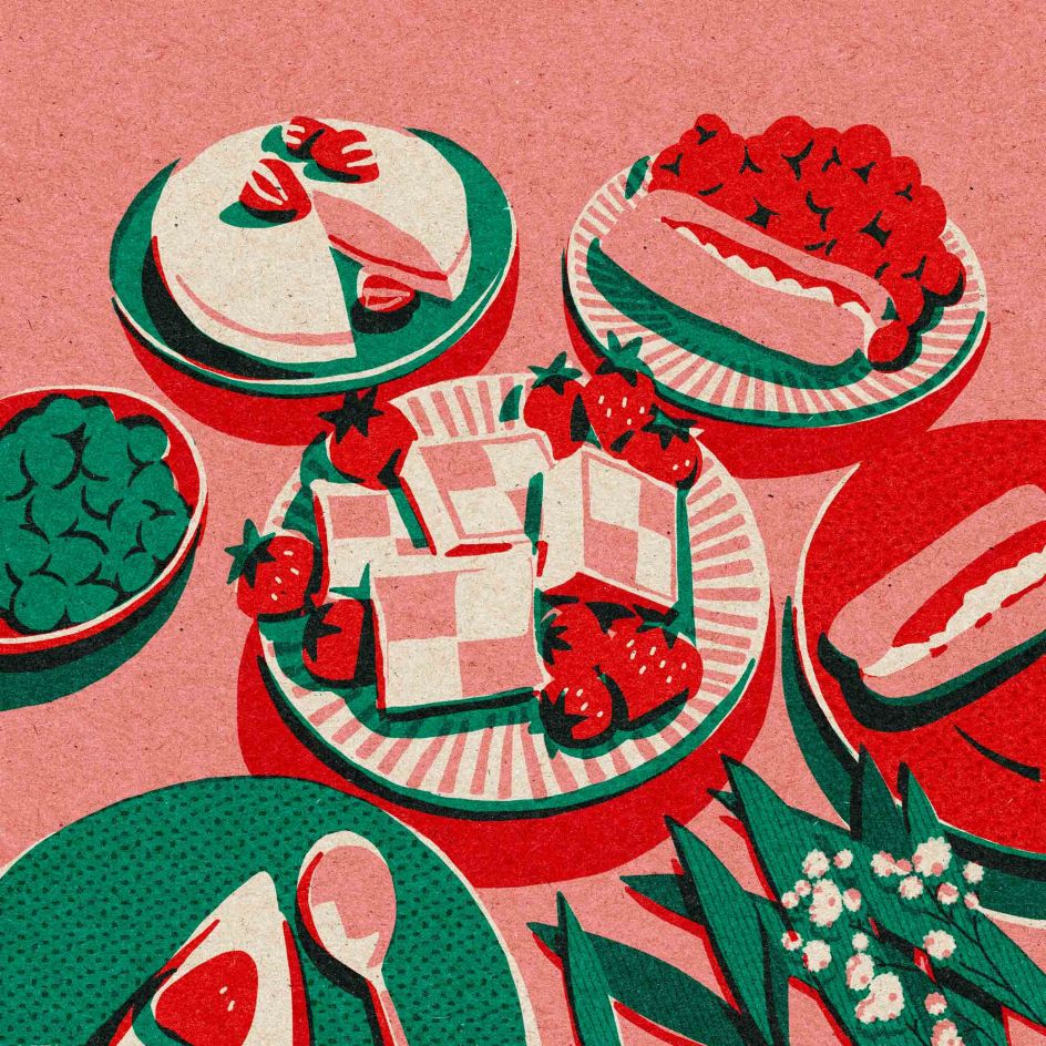
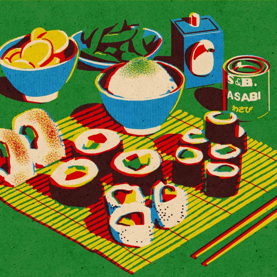
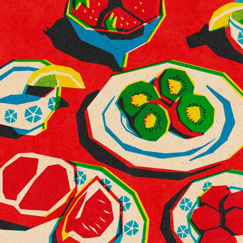
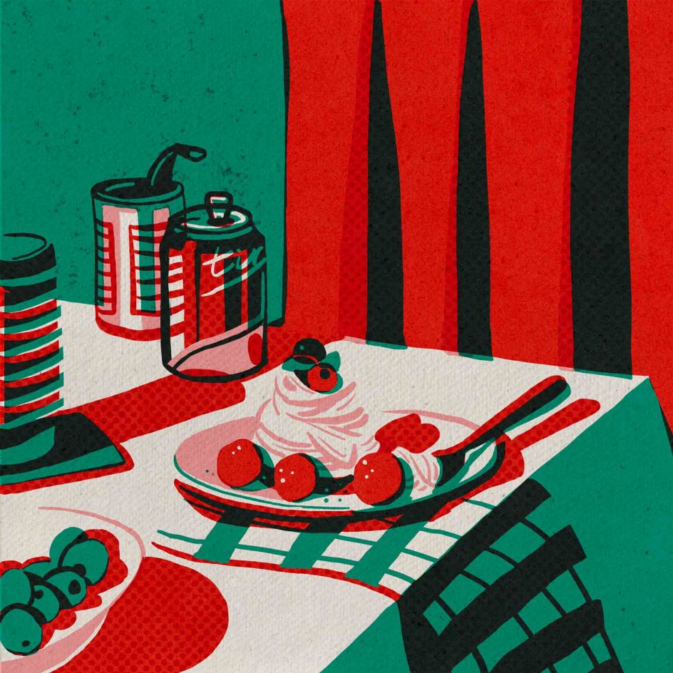
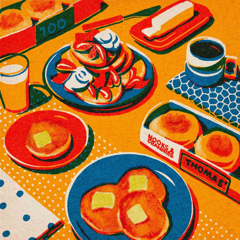
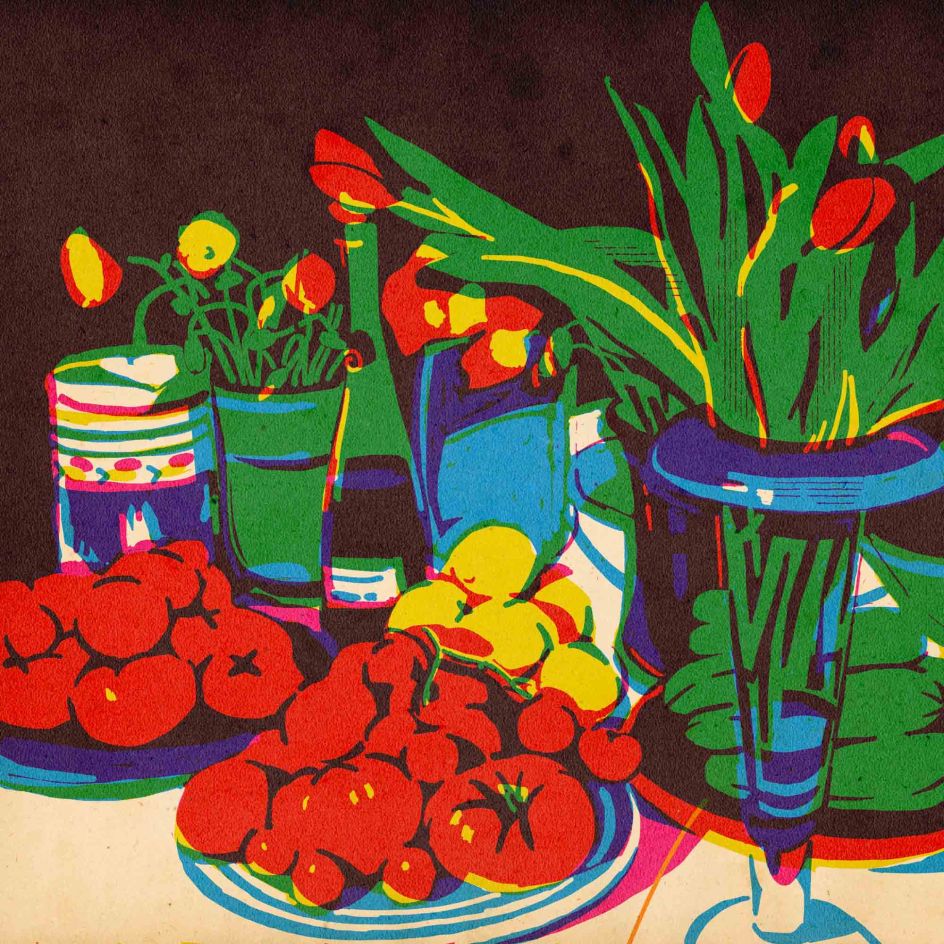
Nowadays, Ninki has carved a recognisable style that presents colour-blocked palettes, primary shades and realistic depictions of food. "I find my inspiration in Risograph, screen printing and patterns," she explains. "They all inspired me to make my own work." Indeed reminiscent of the techniques used in Riso, Ninki's works are simplistically yet cleverly executed. "I focus on displaying retro effects with texture, vintage colour palettes and mid-century brushes." When working on a piece, Ninki will always keep a sketchbook ready in case an idea strikes for an illustration. When this happens, they'll jot down the idea instantly and refer to it later. "The important thing is that I use these notes to see more details and find my own way of looking at the world."
© Ninki
© Ninki
© Ninki
© Ninki
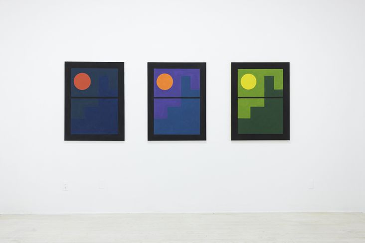
Colour, too, plays a vital role in Ninki's practice. Not only do the chosen shades give the work a vibrant and consistent aesthetic – one that features deep blues, reds and greens – it's also used to express the artist's feelings. "When I make an illustration, I draw them in a few separate colour layers and overlap the colours to get a new hue. I love seeing this process come to life. It's amazing." What's more, Ninki will use shadow play and darker tones to illustrate the depth of a scenario – like the sun peeking through a window and illuminating the food displayed on a kitchen table. "Choosing the colours is always interesting," Ninki adds, "sometimes I can do it for the whole day."
The result is a series of beautifully executed still lifes, where cakes, tomatoes, pancakes and sushi are presented in delicious compositions with bold, Riso-inspired tones. In recent times, Ninki has become part of a weekly challenge to draw a still life, named Still Here Still Life. Ninki says: "It's great to find a community that offers feedback to help me keep painting. I am interested in seeing millions of different styles and finding my own. It's like reading yourself in another language." For instance, in week 82, Ninki used only yellows, pinks and blues to create red, green and purple colours. An interesting challenge indeed, Ninki was able to build complex ideas simply through the use of colour. "It is more powerful than you might think. Through this process, I learn more about how colour works and I build more confidence to make what I want to illustrate uniquely."
© Ninki
© Ninki
© Ninki
© Ninki
Ninki is on the path to a flourishing career as an illustrator. Through these colourful experimentations, Ninki has toyed, played and landed on a style that works. "Being an artist is always my dream," they explain. "I learned so much from finishing a project by doing through the whole process. I also want to express my concept of 'Less is more'. Life is also the same: less stress equals more sleep, less complaining equals more encouraging, less driving equals more walking." And we couldn't agree more.

 for Creative Boom](https://www.creativeboom.com/upload/articles/06/063686a9a3b095b9b1f0e95df917ed4bd342be1b_732.jpg)


 using <a href="https://www.ohnotype.co/fonts/obviously" target="_blank">Obviously</a> by Oh No Type Co., Art Director, Brand & Creative—Spotify](https://www.creativeboom.com/upload/articles/6e/6ed31eddc26fa563f213fc76d6993dab9231ffe4_732.jpg)

 by Tüpokompanii](https://www.creativeboom.com/upload/articles/58/58684538770fb5b428dc1882f7a732f153500153_732.jpg)

 for Creative Boom](https://www.creativeboom.com/upload/articles/6b/6bdcef9e04aaf7aab6f3ceb2ed11fdf8a67b8870_732.jpg)


