Gonzalo Rodríquez combines music with graphics in his dynamic, bouncy design work
One thing we've come to learn over the years is that it's ok to try out different avenues before finding your feet. Gonzalo Rodríguez, an art director and graphic designer specialising in branding, first moved into the world of advertising before realising his passion.
Born in Valladolid in Spain (although he never lived there), the Barcelona-based designer spent the first six years of his career in advertising. His first job was as an illustrator and graphic designer at Croma Studio before switching to become an art director at Mr John Sample/SCPF and later Aftershare TV. "I ended up very frustrated and tired that I decided to take a sabbatical," he explains. "During that period, I took advantage of it to expand my knowledge and techniques as a designer and carried out a series of personal projects to focus on my future as a freelance brand designer."
Having accomplished his dreams, Gonzalo now has firm roots in the art direction and design industries. From the get-go, he pinpoints his "hobbies and failures" as his greatest influences, that which gravitates around the world of music and "lack of musical talent and rhythm". He says, "I try to work with it related to what I know I can do. Music is always surrounded by great graphic, audiovisual, textile and editorial content." As a result, most – if not all – of his work has been created in relation to his passion for music.
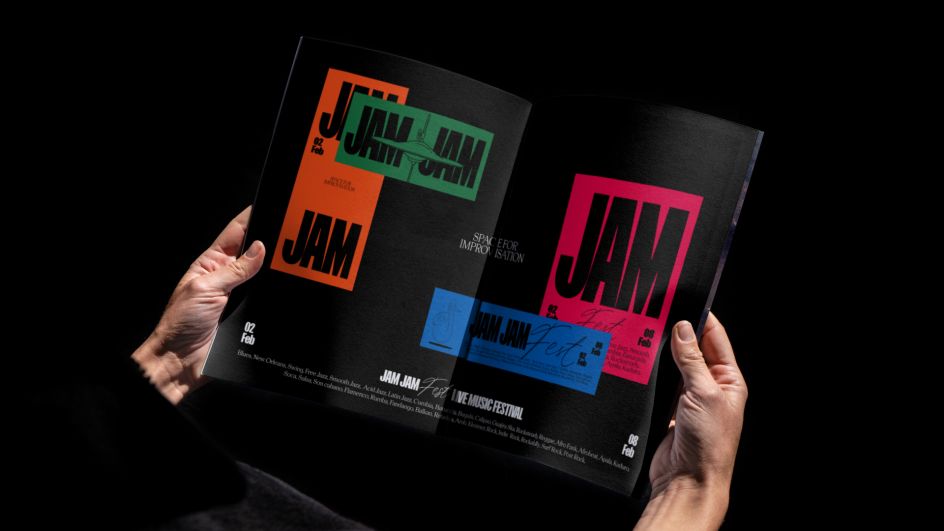
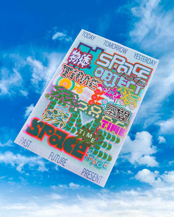
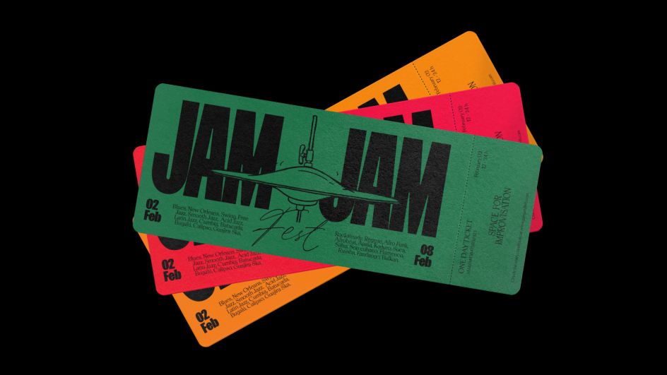
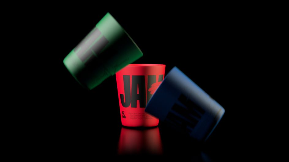
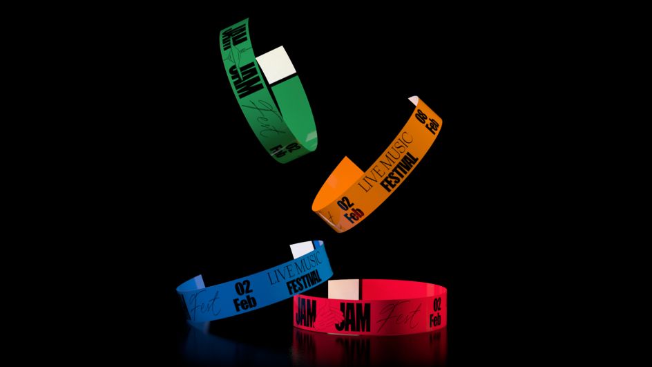
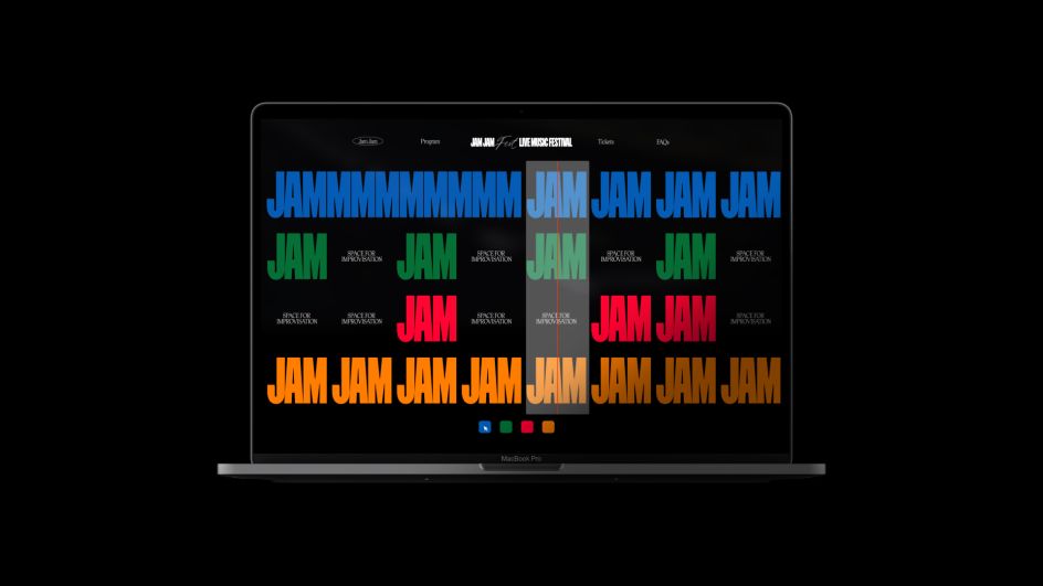
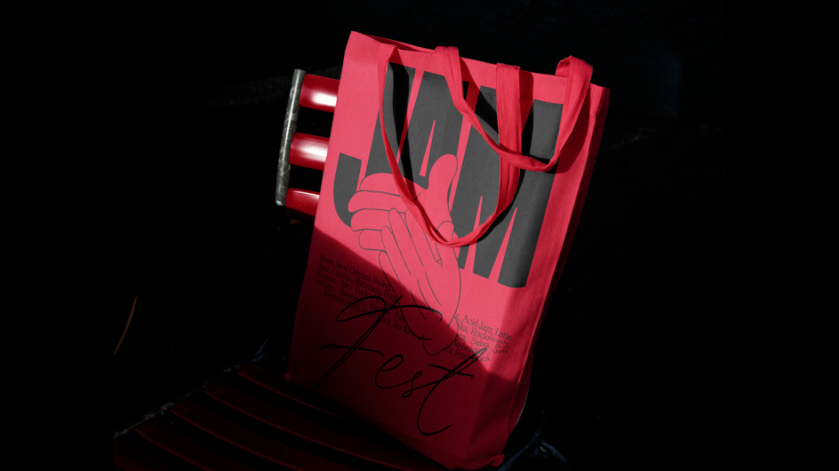
Take his recent project for Jam Jam Fest as a fine example. Punchy and littered in colour, the identity could be deemed the perfect response to creating the visuals for a music festival – especially this one, which supports musicians worldwide and emphasises improvisation. It goes to such lengths that you can instantly imagine the chords and tunes being played through the graphics, featuring simplistic, Disney-esque line drawings, bold and eye-catching typefaces and vibrant-yet-moody colour palettes. The visuals are reminiscent of a dimly lit jazz bar in New York. "[The festival] allowed me to generate a super-simple graphic system that can be adapted to any format, in which all typographical elements (informational content) are set aside to leave room for improvisation (musical content)."
Gonzalo explains how, for the information side of things, he played with two typefaces that could work individually as well as a pair. "When combined, they create a harmony that gives colour to the piece." The lead typeface is a condensed sans-serif used to "support and guide", deemed as the "rhythm" to the identity that allows the rest of the graphics to connect. The second is a script typeface that "represents the improvisation and spontaneity of the piece." He adds: "Regarding the musical content, I was looking for a language that would allow me to represent the spontaneity of the liveliness of a Jam session. And it seemed perfect to appropriate the language, tone and graphic style characteristic of old cartoons. A crafty style with imperfect strokes, frame by frame animations, and inflated and disproportionate shapes that exaggerate reality."
We're glad that Gonzalo took the plunge from his past life in advertising, and we're excited to see where he takes things next on his music-meets-graphics journey. Having mastered the medium with a host of commissions to prove it, Gonzalo says of the future: "The next step is to keep learning, working and improving as a designer."
Editor's Picks


Trending


](https://www.creativeboom.com/upload/articles/90/908fdb6378db1e95d12595416f54e6336d5e80b8_732.jpg)
Podcasts


Editor's Picks
Further Reading