Christopher Doyle & Co's bold and colourful identity for Hay, Australia's latest internet-only bank
Sydney-based creative studio Christopher Doyle & Co has just launched a bold, rainbow-palette identity for Hay, Australia's latest online bank.
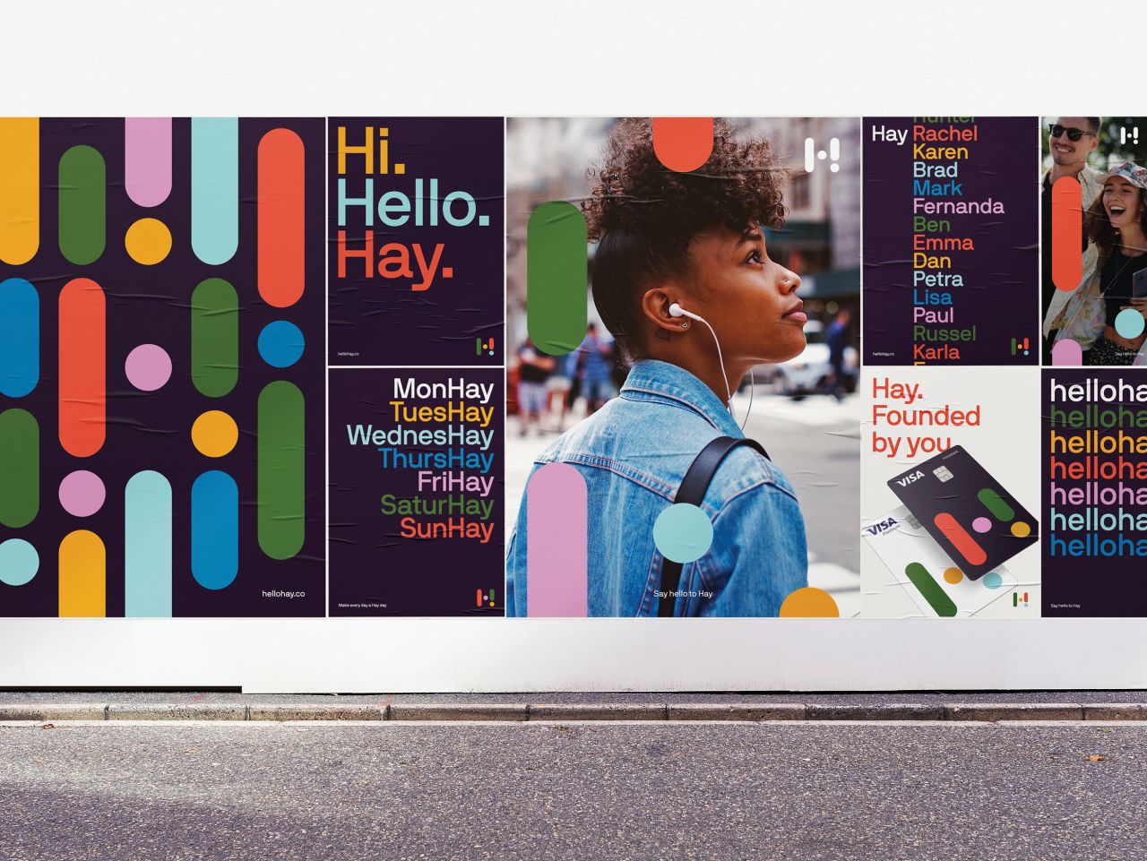
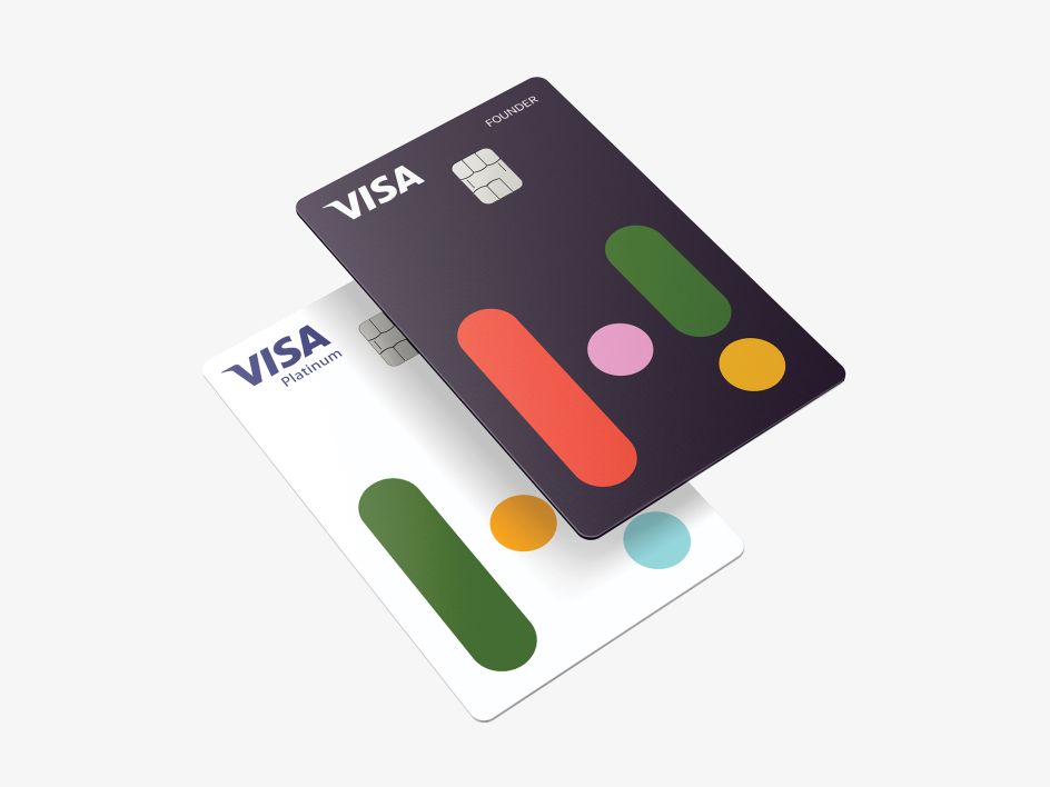
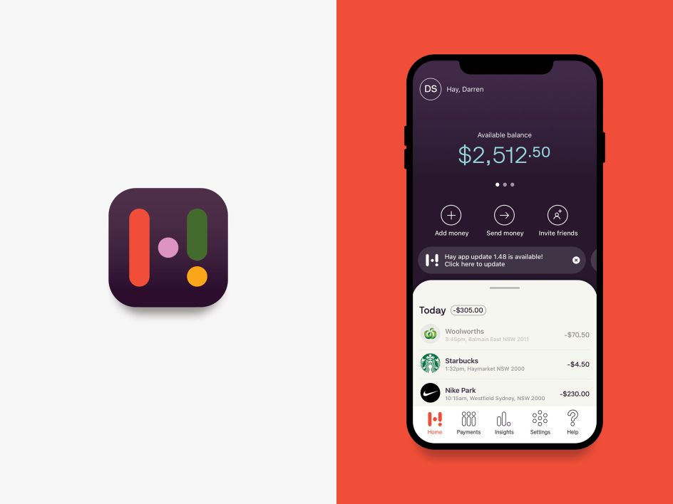
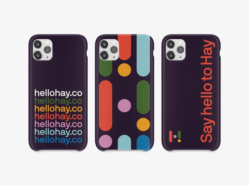
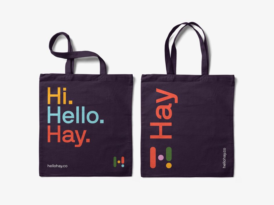
Coming up with the name, positioning and brand, it follows an 18-month collaboration with the company's in-house team. At the centre of the friendly identity is a simple, colourful logomark that incorporates an exclamation mark.
"This nods to the energy of the name and the brand's attitude," explains Christopher Doyle. "We also developed a comprehensive visual, verbal and motion identity system that reveals itself through simple touches of movement that capture the energy and enthusiasm Hay brings to the market."
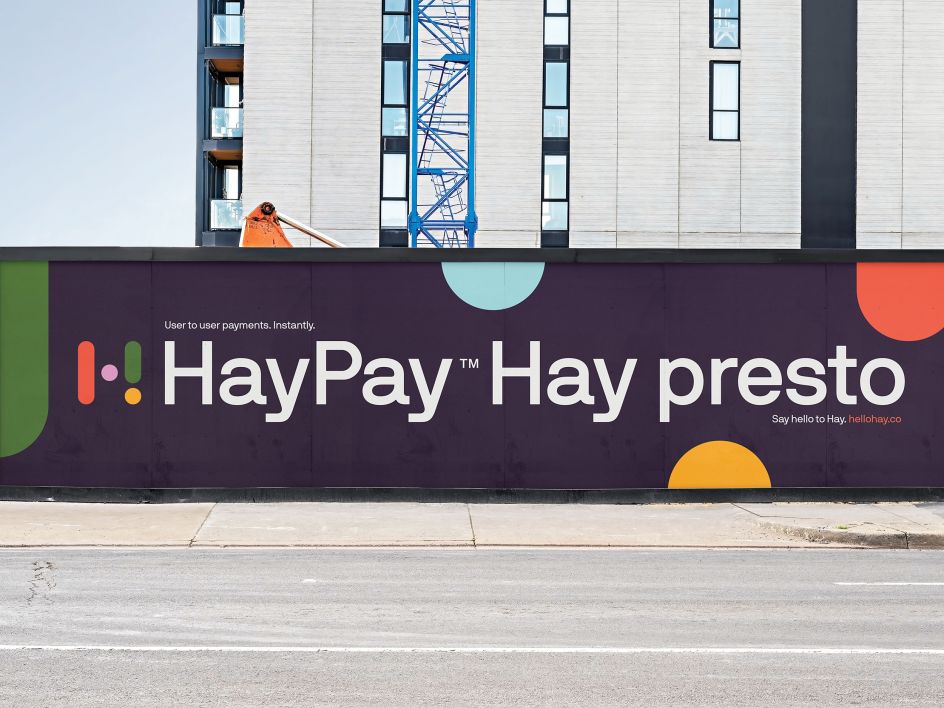
We especially love the simple brand messaging: "Hi. Hello. Hay" and "Hay Pay. Hay Presto!" There's even the nice little touch of saying "Hay" to each customer on the welcome screen of the bank's app.
It's a bold and unique identity for a 'neobank', one that stretches across Hay's app, merchandise, and national campaigns. The project was revealed following the relaunch of Christopher Doyle & Co's new website. Other recent clients include Spotify, Deluca Coffee, and Australian Design Radio.

Editor's Picks


Trending


](https://www.creativeboom.com/upload/articles/90/908fdb6378db1e95d12595416f54e6336d5e80b8_732.jpg)
Podcasts


Editor's Picks
Further Reading