Cheeky branding for whisky disrupter by Glasgow agency Front Page
Friends Andrew Nicolson and Andy Davidson wanted to share their love of a dram with a wider audience. So they started a bespoke whisky blending service, Whisky Blender, on the web. Recently, they asked Glasgow agency Front Page to refresh their branding, and the brief and target audience were clear as a crystal tumbler.
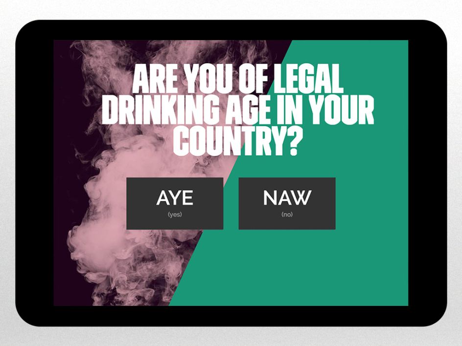
"Some people are a bit scared of whisky," explains Nicolson. "Like it's something you have to know a lot about to enjoy. The idea behind Whisky Blender is that anyone can create a blend, so they get a sense of ownership around something they might have felt was out of their reach.’
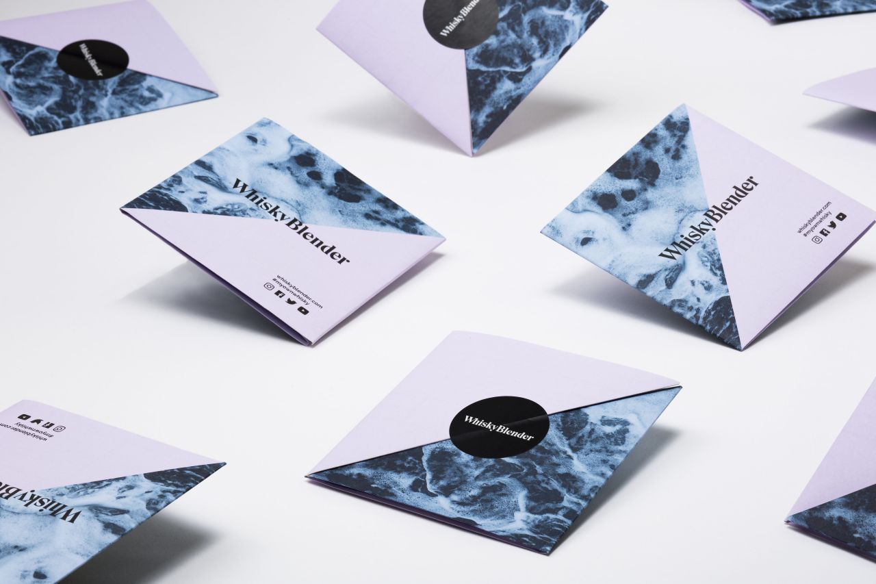
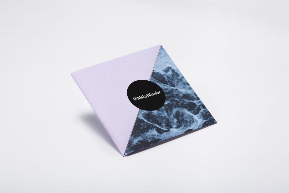
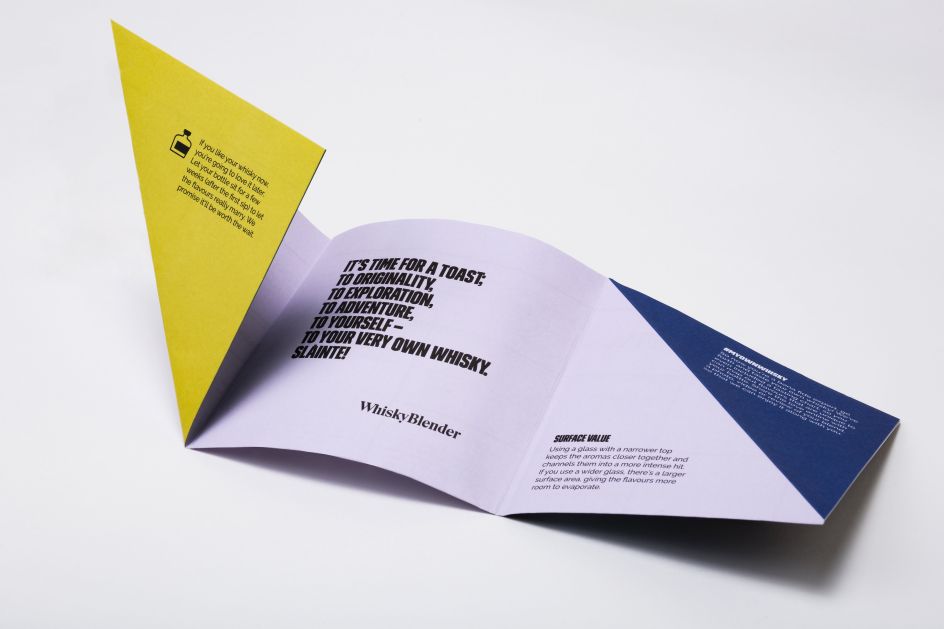
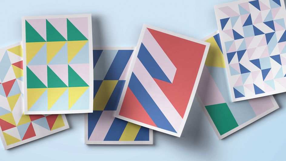
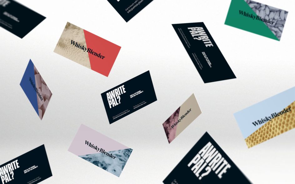
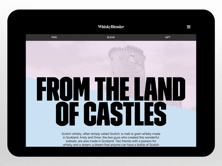
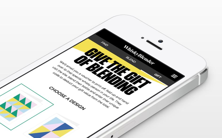
The new branding had to reflect this playful, inclusive outlook. So Front Page swapped the imagery and muted colour palette of traditional whiskies for a vibrant, textured look and feel, and a cheeky tone of voice that makes you feel like you're talking to a friend.
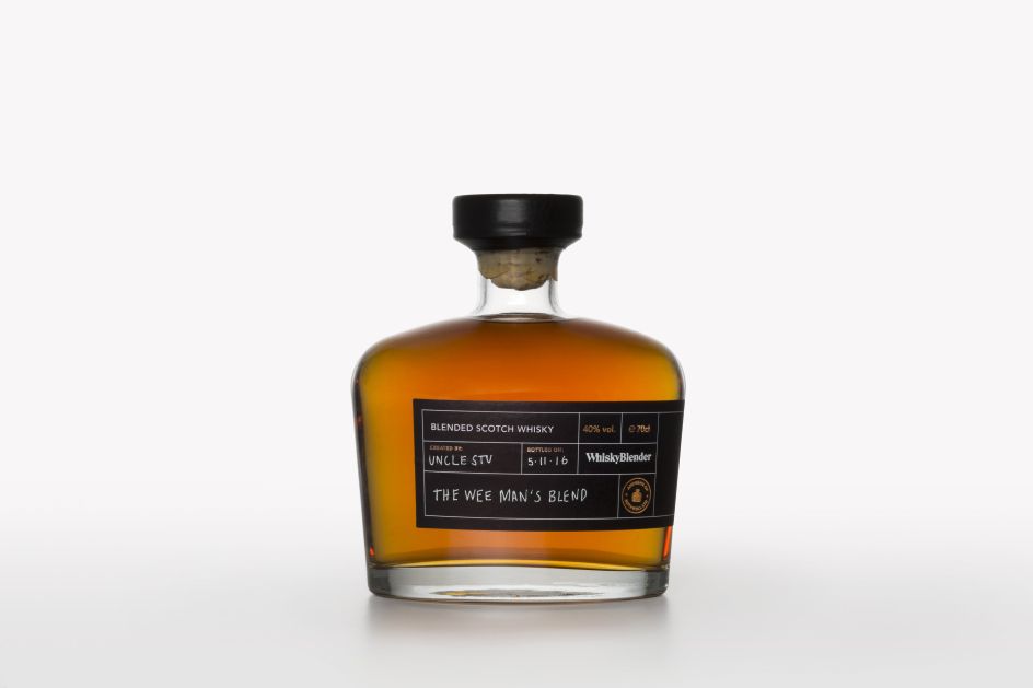
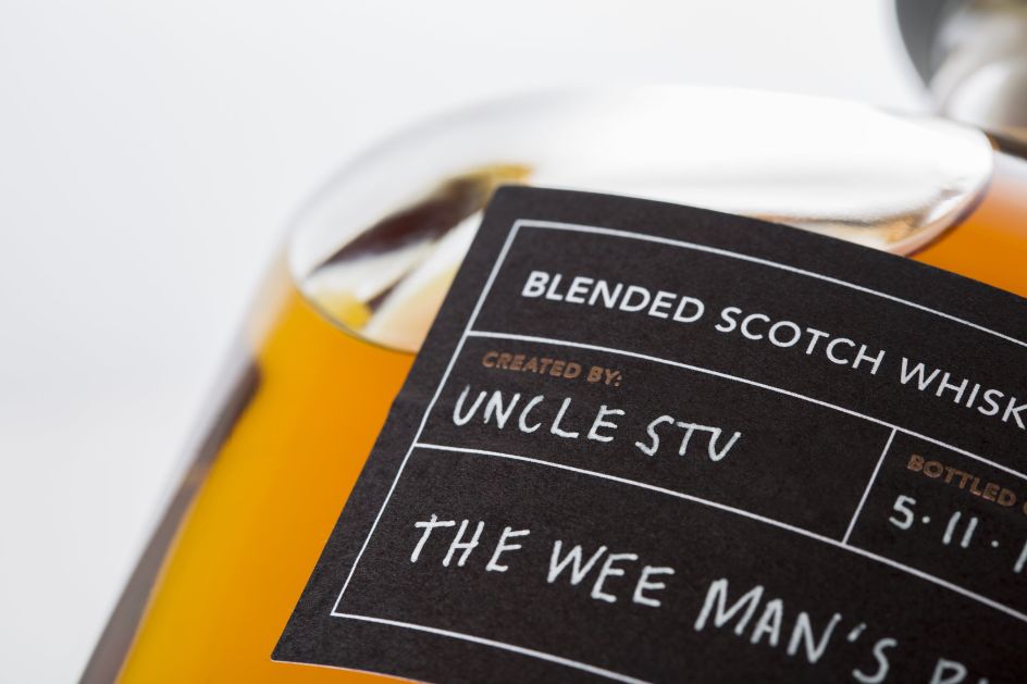
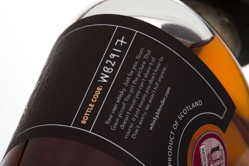
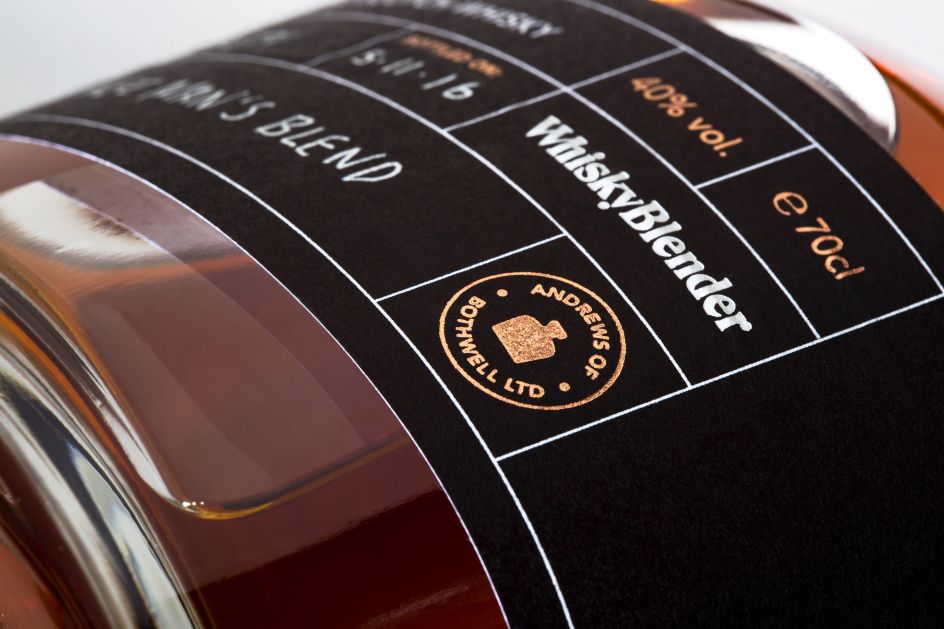
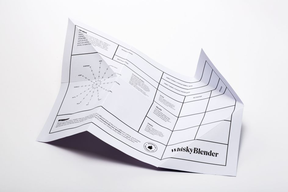
The bottle labels on the bottles are handwritten, each one unique, while the elegant typeface and quality stock pay a modern homage to more traditional whisky branding. Front Page also produced a custom insert to be included with every bottle, and a step-by-step tasting chart.
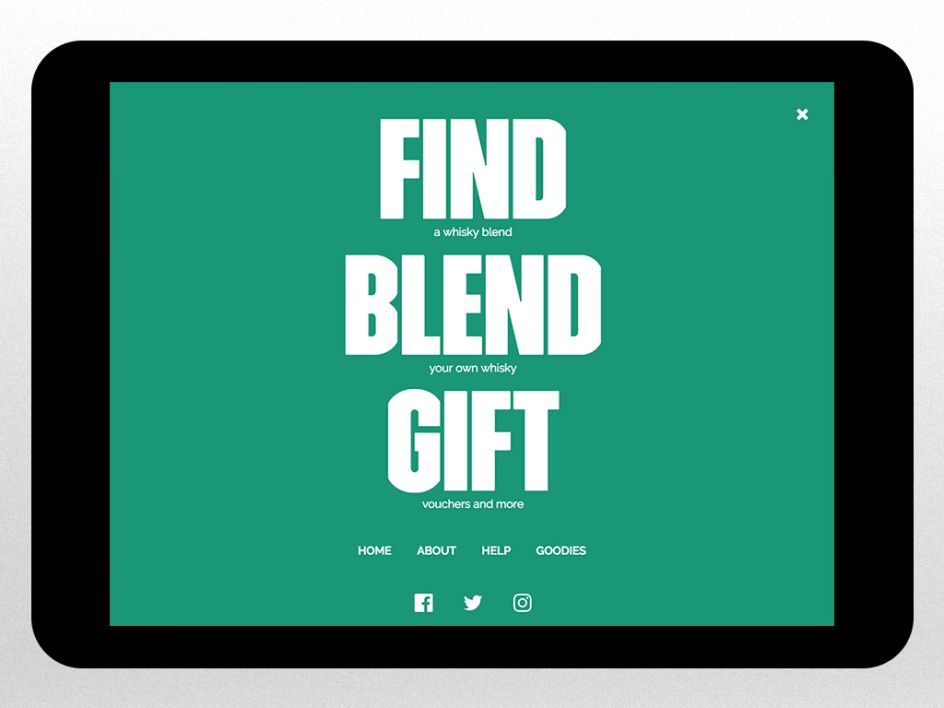
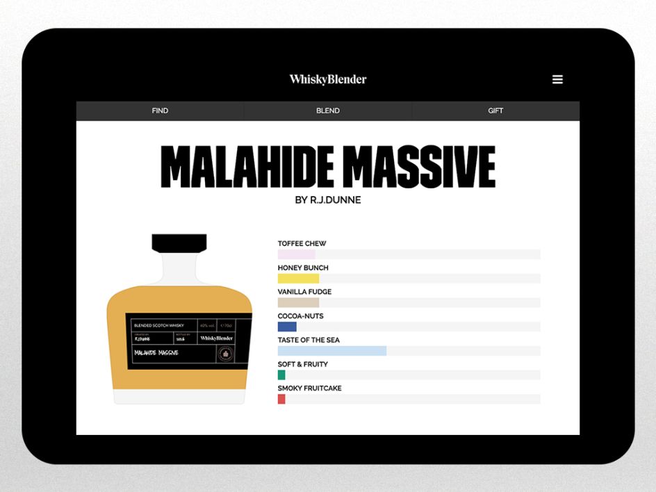
The new website combines a central carousel of blend options with a horizontal bar that shows the percentage makeup of the blend at any given stage. As the blend takes shape, the bottle silhouette fills up, conveying the colour of the final product (as you can see in the animated screenshot below).
Via Creative Boom submission
Editor's Picks


Trending


](https://www.creativeboom.com/upload/articles/90/908fdb6378db1e95d12595416f54e6336d5e80b8_732.jpg)
Podcasts


Editor's Picks
Further Reading