Candy coloured branding for Le Mise oozes femininity with a hint of eccentricity
We're big fans of pastel here at Creative Boom. And we're even bigger fans of a pastel/gold colour palette combo. That's why we had to share this brand identity project by New York-based DIA – a strategic brand consultancy, design studio and production company located in the heart of the city.
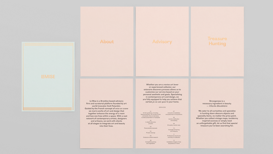
Produced for Le Mise, the Brooklyn-based art and design advisory concept of Andi Potamkin – New York’s modern day art gallerist, DIA created a concept that offers a personalised experience for the collection and enjoyment of art.
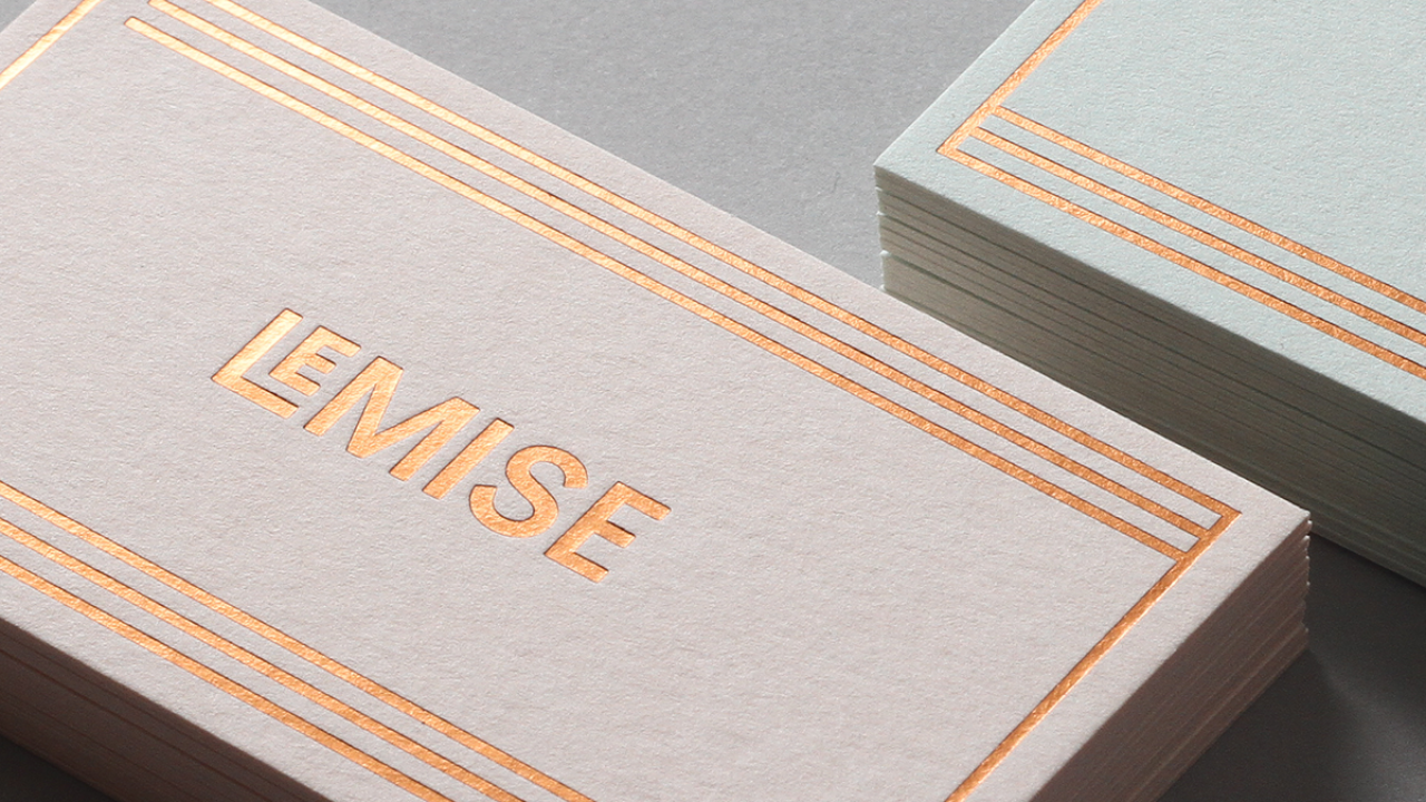
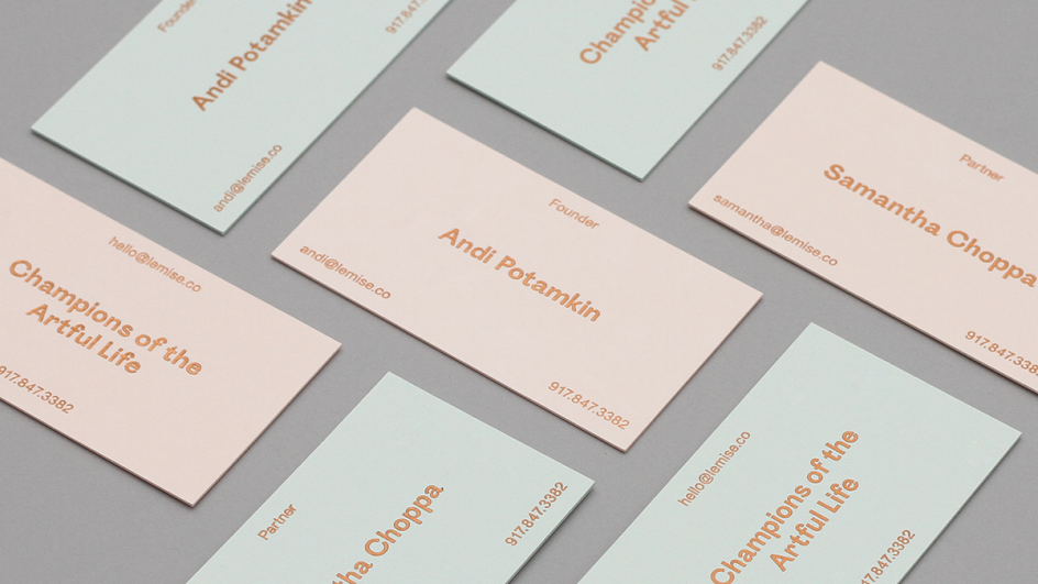
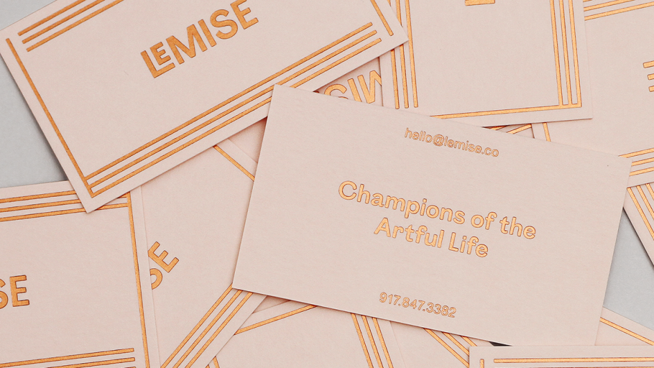
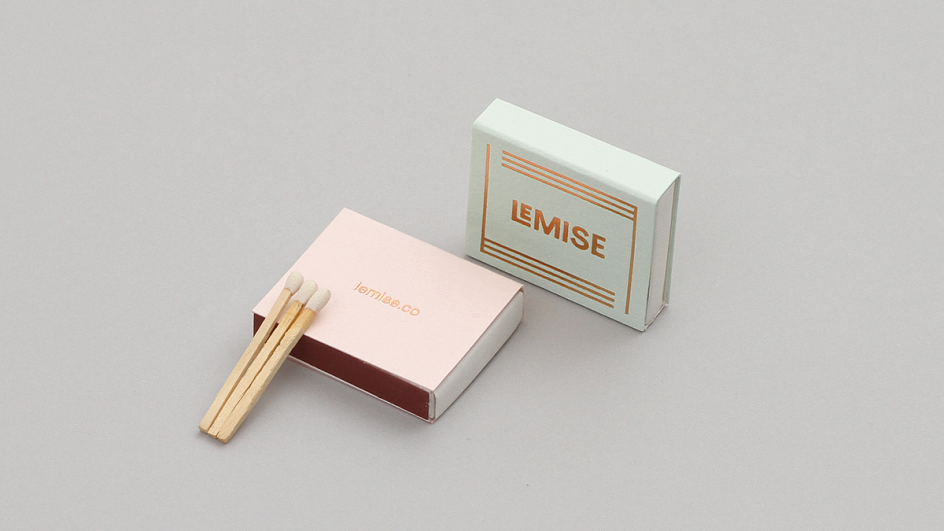
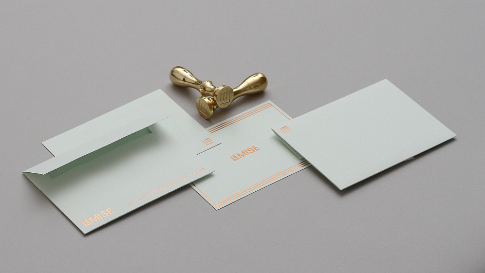
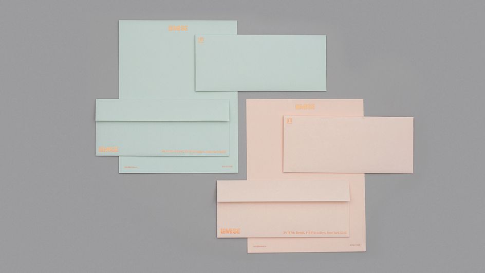
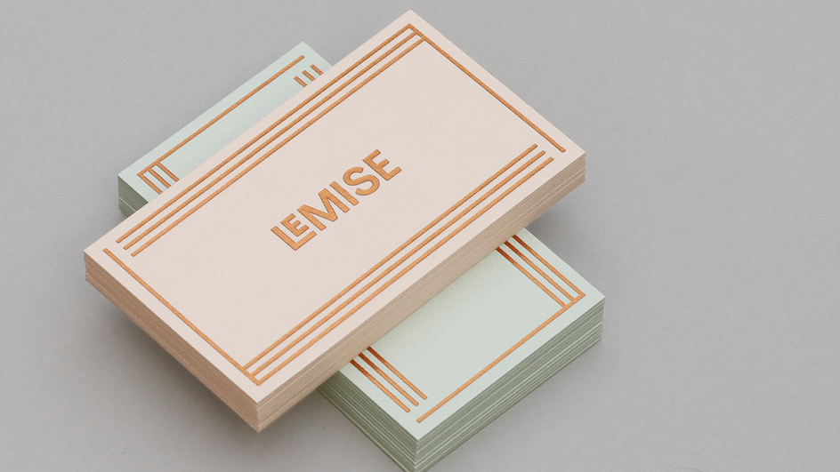
The team explains: "We created an identity that is both feminine and eccentric, which embodies Andi’s personality and eclectic taste. Beyond the subtly eccentric typography we created a framing device out of the LM initials.
"The frames are used as branded motif throughout the collateral. It was important the brand and its stationary set felt artful and premium to reflect the care and curation style Andi and her team provide.
"Additionally, we created a digital experience that embodies the Le Mise brand and offers a warm and inviting alternative to the dull nature of traditional gallery websites."
To see more by DIA, visit the website: dia.tv.
Via Behance
Editor's Picks


Trending


Podcasts


Editor's Picks
Further Reading
](https://www.creativeboom.com/upload/articles/90/908fdb6378db1e95d12595416f54e6336d5e80b8_732.jpg)