Bedow spills the tea on its colourful, ingredients-led rebrand for Swee
Stockholm-based design studio Bedow has created a refreshing new look for drinks company Swee. By letting Swee's natural ingredients take the lead, Bedow has used them as the basis of an invigorating, one of a kind design system.
When designing the packaging for a bottled drink, all too often, the ingredients are relegated to a block of small, uninspiring text that you have to go out of your way to read. Usually, it's the brand name or a flashy logo which tends to take centre stage to catch the customer's eye.
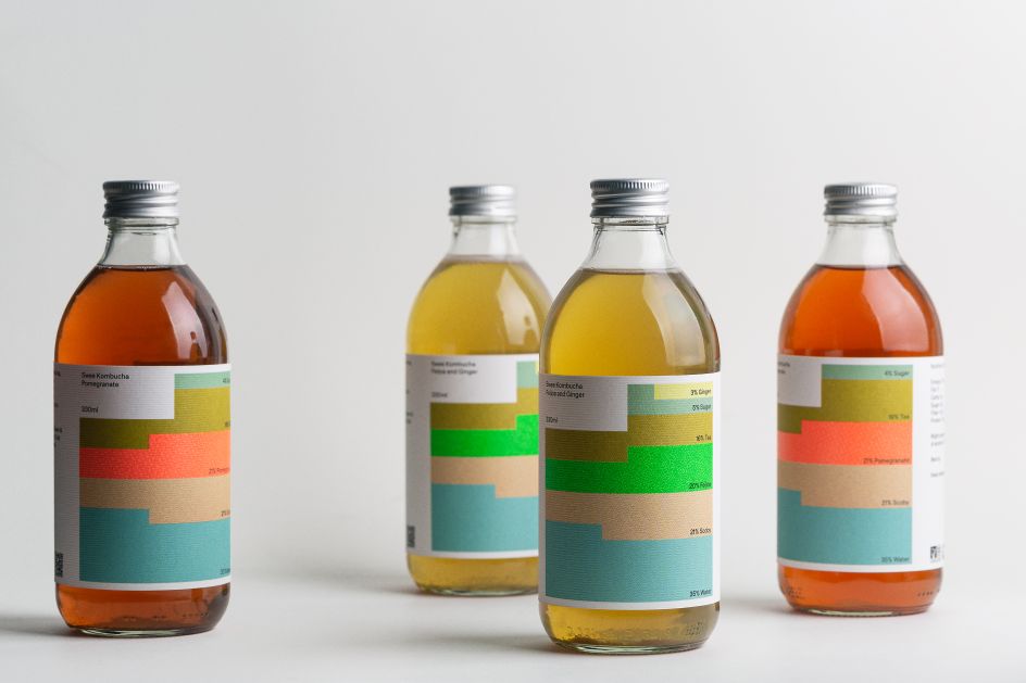
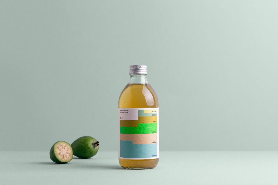
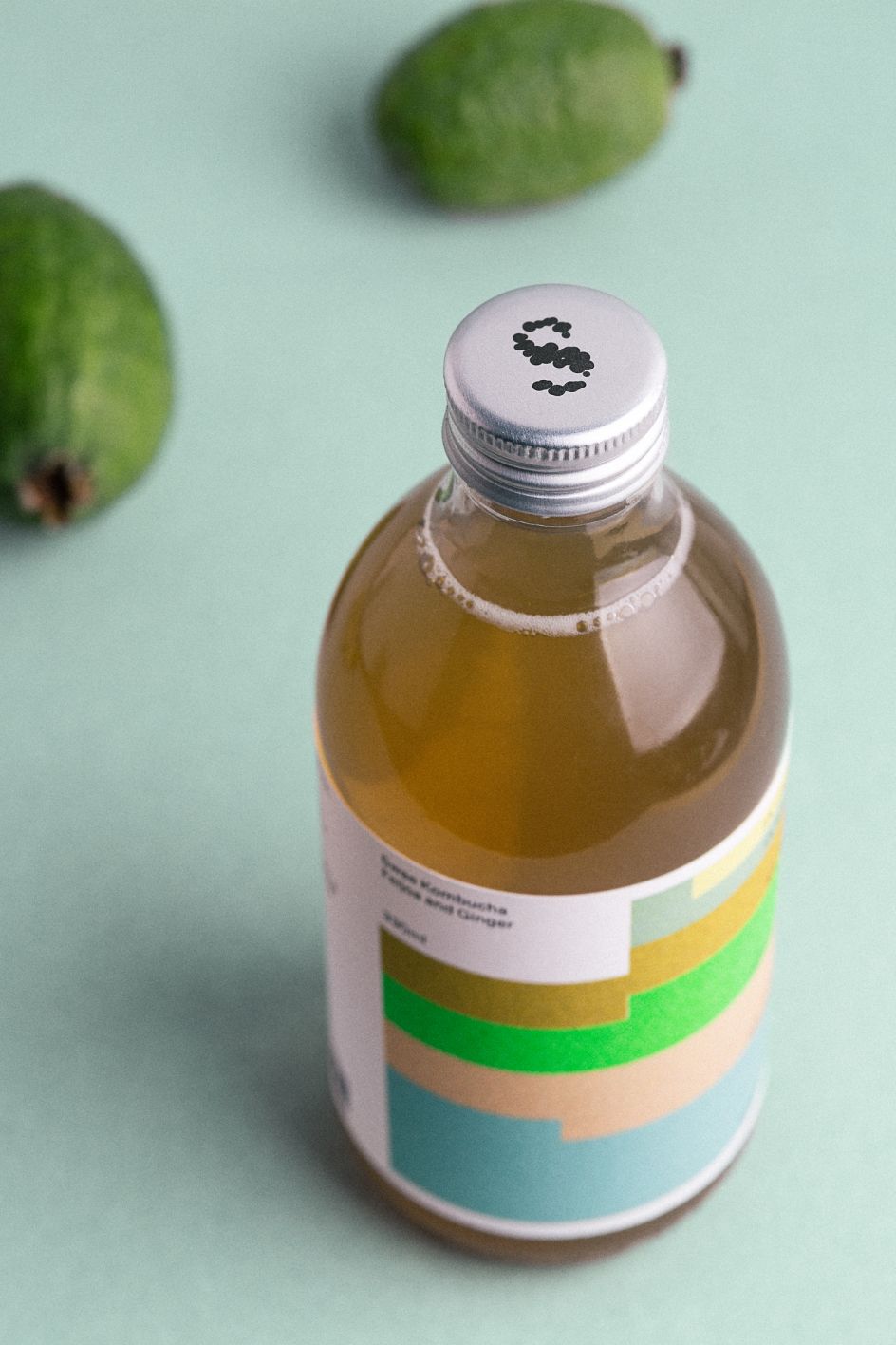
Enter studio Bedow, who have turned packaging conventions on their head as part of a rebrand for Swee, a Georgian brewery which produces a range of refreshing kombucha drinks. Rather than relegating Swee's 100% natural ingredients to the back of the bottle, Bedow has built a lively, colourful design system around the tastes and sensations associated with them.
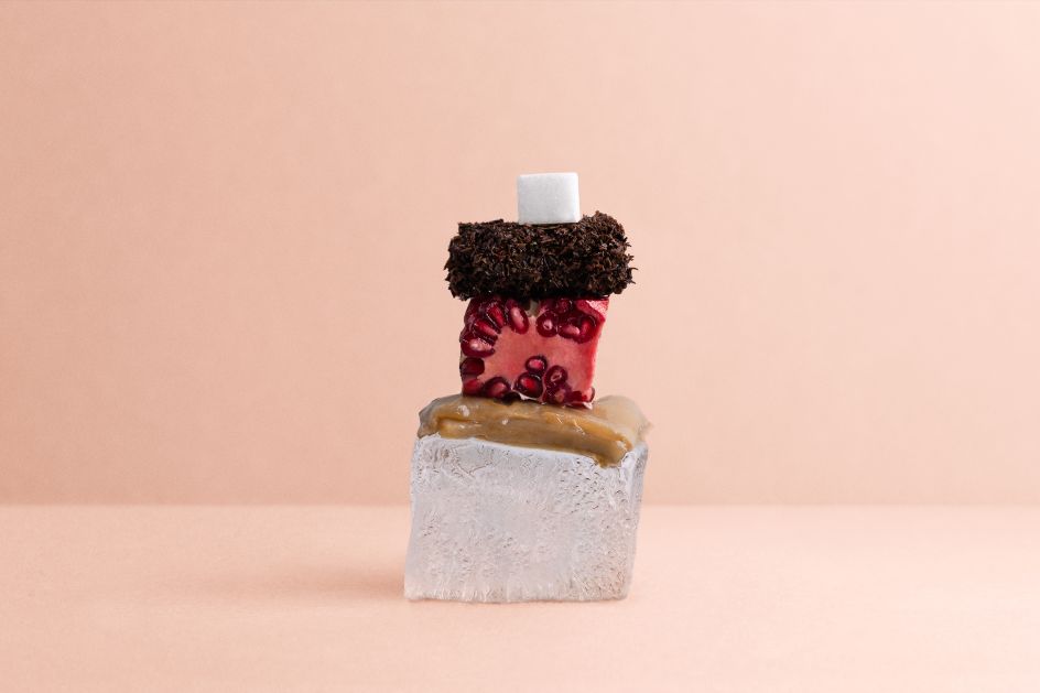
Based in the Georgian capital of Tbilisi, Swee capitalises on the region's rich culinary and cultural heritage. And it's these origins which Swee wanted to embrace, as well as the use of fresh, home-grown ingredients when it came to creating a new identity for their brand.
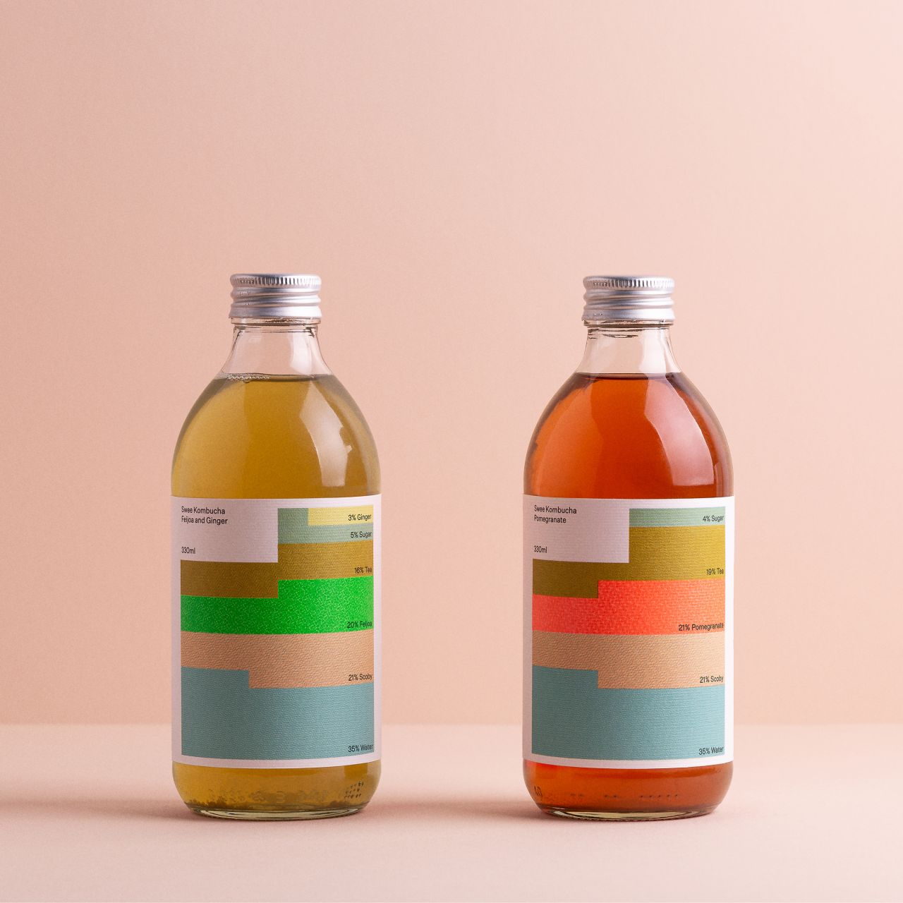
"We saw the possibility to turn what is typically functional information into a visually playful infographic system," says Perniclas Bedow, Creative Director at Bedow. "Swee's commitment to using local, all-natural ingredients sets them apart. Instead of hiding the list of ingredients tiny on the back, we flipped it around – making the content a prominent tool for creating a flexible and distinct design system."
Simplicity was the key to creating this distinct design system. A bold yet straightforward approach reflected the purity of Swee's ingredients while also giving the brand enough room and flexibility to scale up should they wish to increase the products they offered.
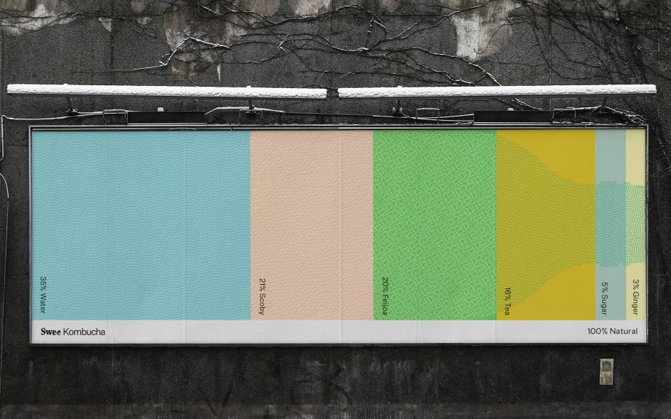
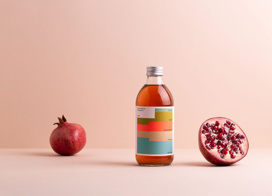
To bring this concept to life, each ingredient is represented by a bespoke colour and pattern. When combined, these colours create "distinctive chromatic graphics", which represent the percentage of each ingredient. Think of the labels as a sort of a design-lead bar graph – one that instantly communicates what's inside the bottle.
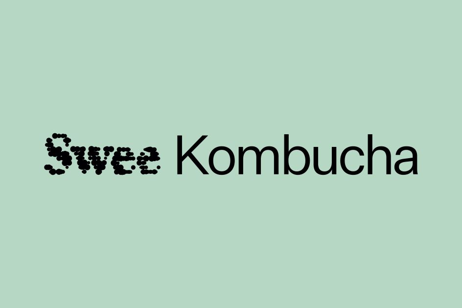
As well as focusing on the ingredients, a different modular system informs shoppers about the nature of the drink itself. Meanwhile, the Swee wordmark is cleverly made up of hundreds of oscillating shapes which resemble yeast and bacteria forming in a petri dish. Capped off by the concept "100% Natural", Bedow has managed to successfully draw all of Swee's key selling points into an appealing design which reflects their core values.
The design system isn't limited to the packaging either. The colourful bars can be applied to all sorts of platforms such as websites and social media. Even the still life photography found throughout the Swee brand can build on these infographic foundations. And by stacking them according to their percentage values, shoppers know what they're going to get and how good it will taste. And that's the tea.
Editor's Picks


Trending


](https://www.creativeboom.com/upload/articles/90/908fdb6378db1e95d12595416f54e6336d5e80b8_732.jpg)
Podcasts


Editor's Picks
Further Reading