Barry Tranter taps into a 'sense of place' for a small property developer with big ideas
How does a small property developer with big ideas and a passion for doing things differently compete with the more prominent players in the UK housing market? For Our Place, designer Barry Tranter crafted an identity that focuses on its core mission: to create places that are prosperous for the community, economy and the environment.
The Norwich-based property firm, Our Place, puts "purpose, places and people" at the heart of everything it does, taking a "long-term and responsible view" of all of its developments, whether large or small. Earlier this year, it approached Barry Tranter's studio, bBelief, asking for a way to communicate these ideas to the wider market. "They needed to find clarity and consistency internally so they could put forward a simple narrative and avoid tripping up over themselves with industry waffle," explains Barry. "They had even begun to dislike their own name because they couldn't explain what it meant. And they needed to be able to compete with and stand out from the bigger players in the market."
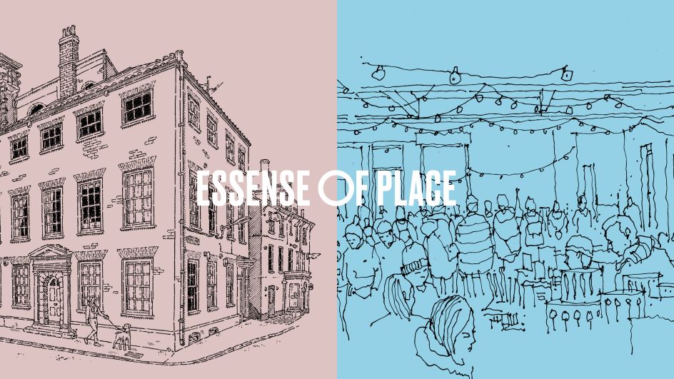
After taking a deep dive into the UK housing marketing – all the larger developers, red tape, planning applications, permissions and underwhelming, poorly-planned housing schemes that currently dominate the sector – Barry encouraged Our Place to consider its core belief of developing places for the prosperity of the community, economy and the environment. As a result of this strategic process, the new brand identity was built around the idea of creating a 'sense of place'.
bBelief stepped away from the usual jargon of the industry, words and phrases like 'mixed-use development' and 'placemaking' because "they don't mean anything to the majority of the audience involved," says Barry. "We also removed all the intangible emotional words that the sector regularly uses to describe what a place will be like, a beautiful place, with happier communities, a place where people and communities can thrive because rather than making what's to come feel more real, we felt these descriptions actually do the opposite, and make the audience feel they are being sold to and not listened to or included."
With this in mind, Barry and his team created an inviting and conversational tone that brings audiences into the debate about what a place should and could be. "An Our Place proposal for a new place is created through understanding – socially, environmentally, and economically," says Barry. And that's from understanding the local architecture, the needs of the community, and local infrastructure to the latest global environmental goals, uses of materials, and new technologies.
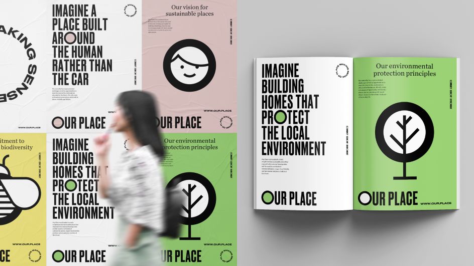
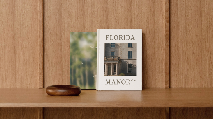
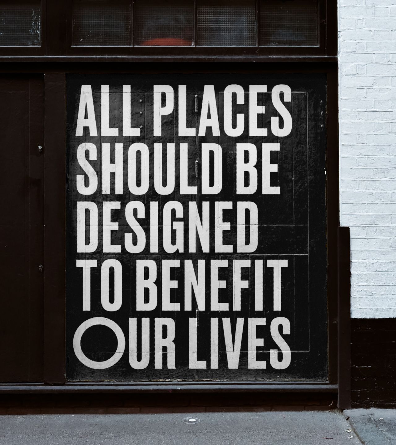
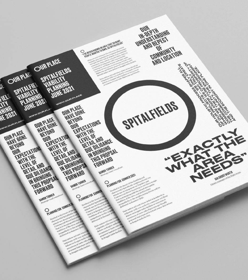
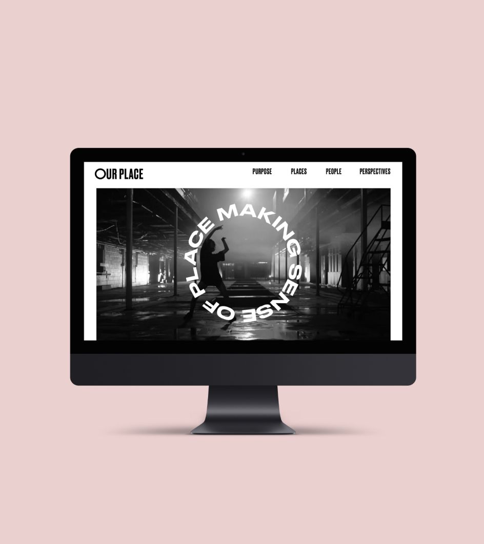
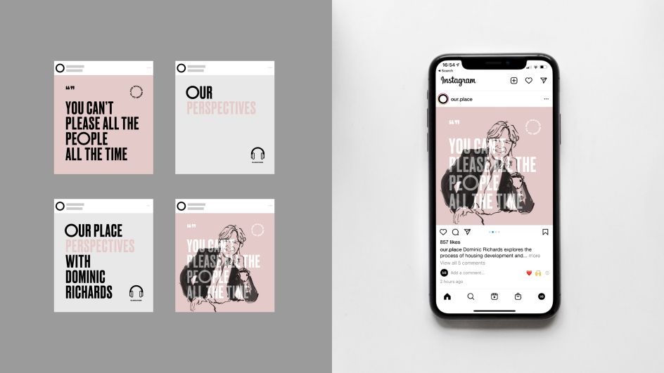
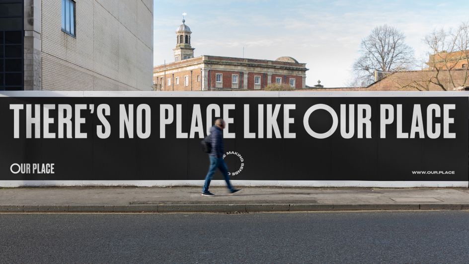
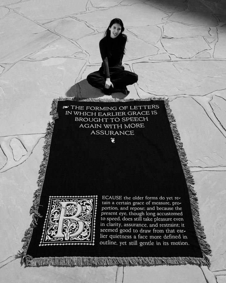
Stylistically the brand follows the idea that 'making sense of place' is part-manifesto and part-permanent sense check for the business. Bold headlines in Druk Medium and Druk Medium Wide are used with circular iconography to carry "strong opinionated statements" and an inviting, inclusive tone brings the audience into the process. "Both help to cut through and stand out from competitors," Barry says. While body copy is set in Chronicle Text allowing for easy reading of long documents and proposals and for contrast against the typographic extremes of Druk.
The brand is primarily black and white which follows the simplicity and strength of the tone of voice. A series of bright pastels help soften the edges of the visual style and can be used for different subjects and communication needs.
"The new brand has created a fresh internal strength and drive for Our Place," adds Barry. "This was, in my opinion, a huge part of why they really needed this new brand: internal solidarity and direction. The new belief and brand serve them well when they are communicating to multiple stakeholders and audiences over multiple channels over long periods of time, saving time, money, and internal debate about how to approach the next hurdle. Making sense of place and their brand senses inform and guide their decisions and behaviour daily."
Editor's Picks


Trending


Podcasts


Editor's Picks
Further Reading