How studio Tangent created a defiantly positive brand for the Edinburgh International Book Festival
What do you do if you need to create a brand identity for an event centred around the various crises that threaten humanity? If you're branding studio Tangent, then the answer is obvious: you lean into existential anxiety with a relentlessly positive attitude.
The Glasgow-based studio has an impressive track record for working with worthy clients, with notable collaborators including Sustainable Glasgow, Tonic Arts, and Remade Network. But when it came to designing the identity for the 2021 Edinburgh International Book Festival, they were faced with a somewhat daunting task.
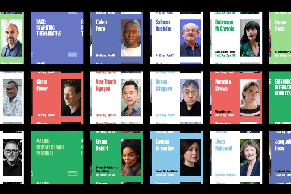
That's because the festival, which is the world's largest public celebration of the written word, deals with stories and ideas about the changing world around us. These stories, which were told over 750 events, debates and workshops during 17 days, inevitably touched upon the impact of the pandemic. Still, they also discussed climate change, poverty, inequality and the varied effects of technology.
While being extremely important subjects, turning these subjects into a piece of branding that will entice visitors to attend is no small feat. However, Tangent rose to the challenge admirably by looking to the authors, politicians and leading world thinkers who discussed the overlapping crises that face humanity, all of whom explored how we can move forward past them.
Tangent director David Whyte explains: "This year's festival was focused on sharing ideas and stories about how we can all best adapt to a rapidly changing world and recover from the pandemic. We wanted to create something joyful and optimistic that embraced the best parts of the last year and a half: community, optimism, a chance to rebuild."
He adds: "Scotland is also looking to the future at the moment with the COP 26 climate change conference being hosted in Glasgow, so we wanted to strike as positive a tone as possible."
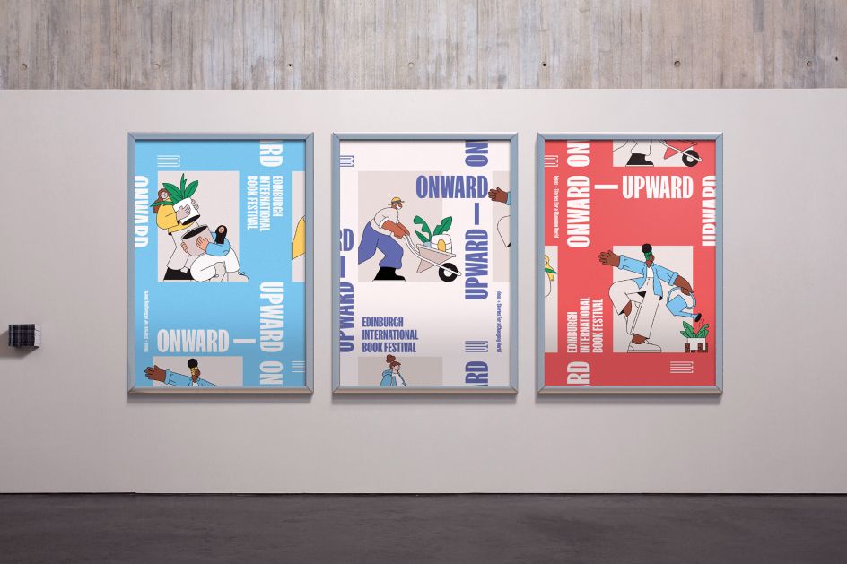
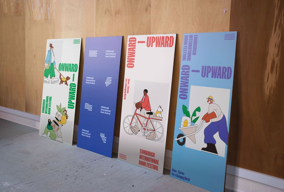
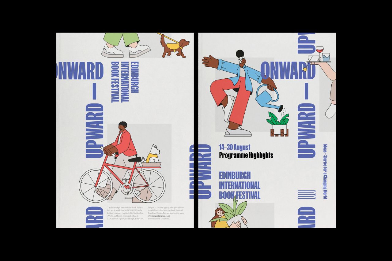
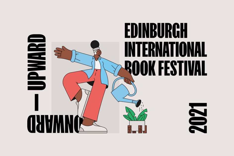
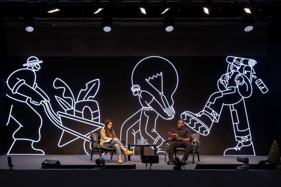
To achieve this tone, Tangent developed a campaign that suggests that local communities working together have the power to achieve widespread, positive change. The quirky style of illustrator Linn Fritz was used to perfectly capture and humanise the campaign's sentiment, and a dynamic, impactful typographic framework further drove the message home.
Appearing across all areas of branding, including posters and digital displays, the separate elements of Tangent's branding look forward without ignoring the gravity of the situation that the festival is discussing. With its cartoon-like characters bravely stepping forwards, and its dynamic typography swishing around in purposeful motion, it's a campaign that inspires constructive change through purposeful positivity.