Marlon Tate echoes Microsoft Paint in new tongue-in-cheek album cover
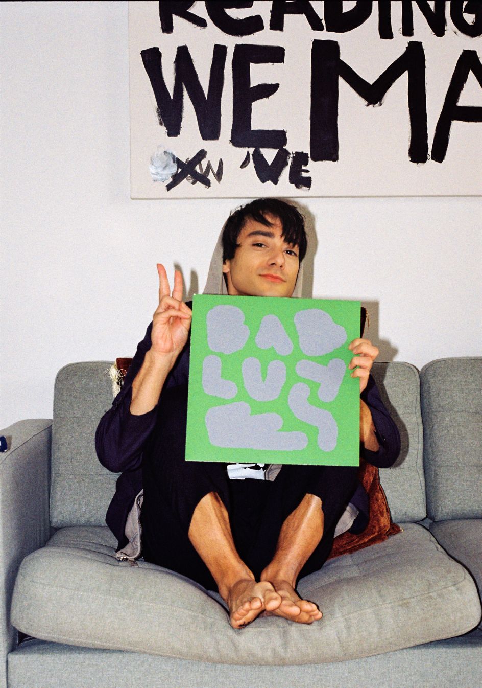
Creative agency Marlon Tate has channelled the aesthetics of Microsoft Paint in its bright and deliberately clumsy album cover for the latest EP by Athens-based producer Konstantinos Gkoumas.
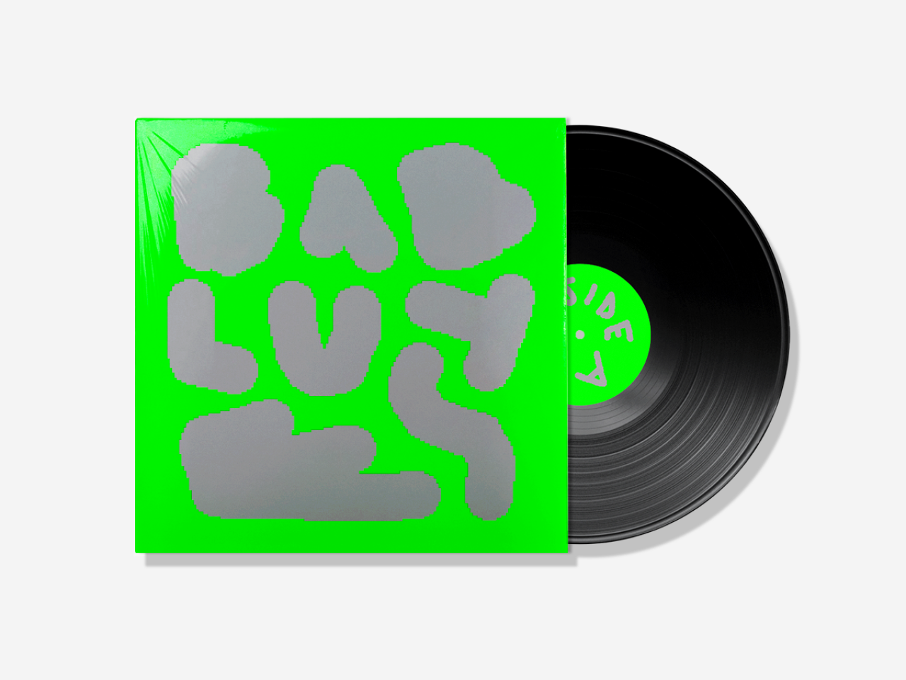
Do you remember dabbling in Microsoft Paint? This simple creative tool was many people's first introduction to digital art, and for a certain age group, it brings back fond memories of creating bright, chaotic masterpieces with the help of the paint bucket tool and the click of a mouse.
And while it's become vastly overtaken by the likes of Photoshop and Procreate, there's still a unique, inherent charm to the aesthetics of MS Paint. It's this very vibe that experimental creative agency Marlon Tate has tapped into with its new cover for Baby Blues, the latest EP by Konstantinos Gkoumas.
As we saw in our recent interview with Marlon Tate creative director Nikos Georgópoulos, the agency is not afraid to break the rules and create original, striking projects. And its work for Baby Blues is no exception.
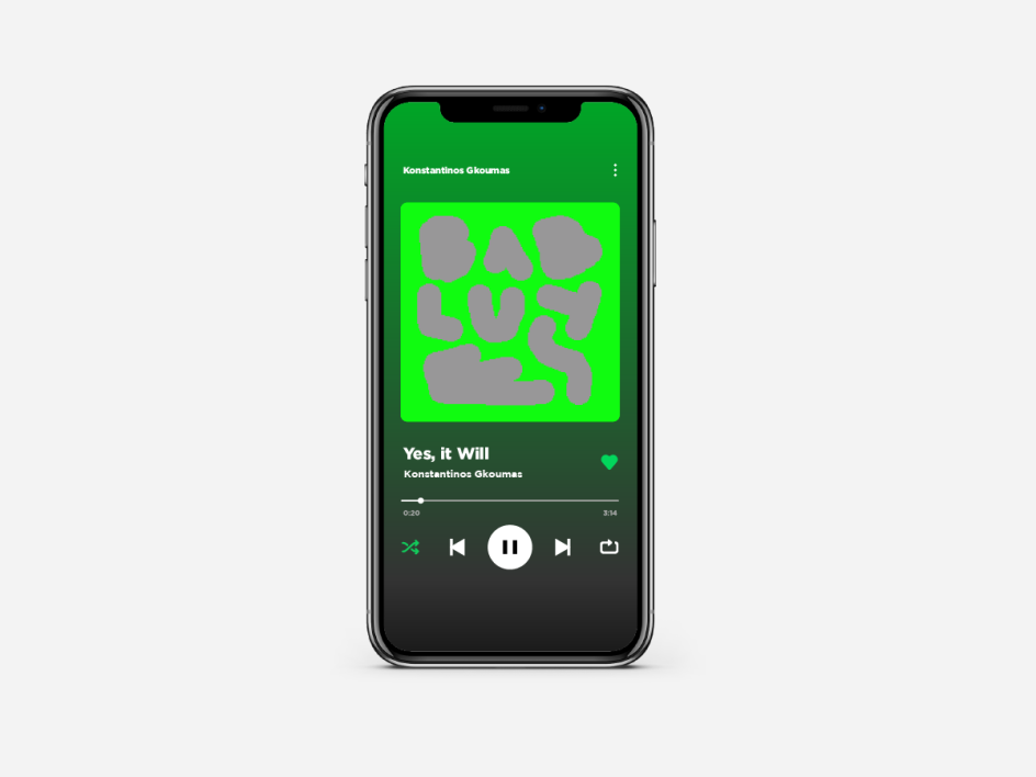
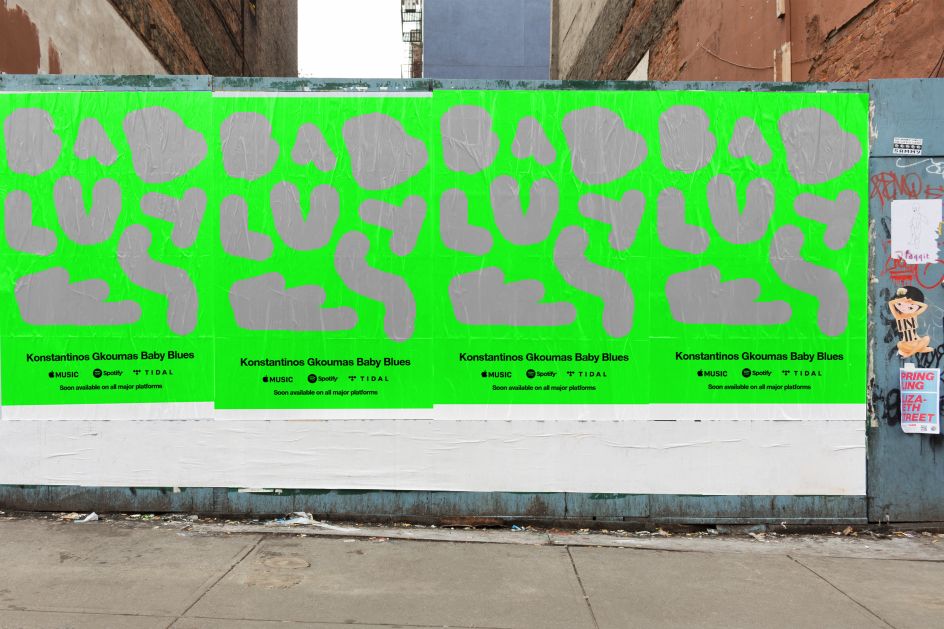
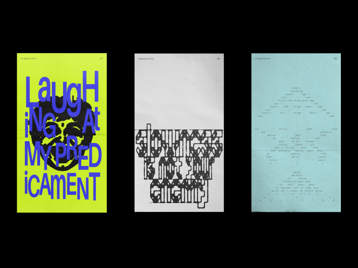
Featuring silver text that looks like it's been drawn with the thickest and most pixellated brush that MS Paint has to offer, the album cover and accompanying ad campaign effectively stand out thanks to their goofy roughness. Paired with a garish green background that works just as well on a phone screen as it does on a record sleeve, it's a campaign that's impossible to miss.
This isn't just quirkiness for the sake of impact, though. The design work also ties into the music on the EP, which itself redefines the aesthetics of the already experimental blues genre. "Through a blend of buzzing oscillations, blue-collar rhythms, and backwoods synth progressions, the artist's original intention was to create a Blues record," says Marlon Tate.
The studio goes on to say: "Instead, he managed to create an EP that redefines the aesthetics of the experimental genre with an amalgam of puzzling downtempo and dark ambient transforming reckless cowboys into knights in shining armour."
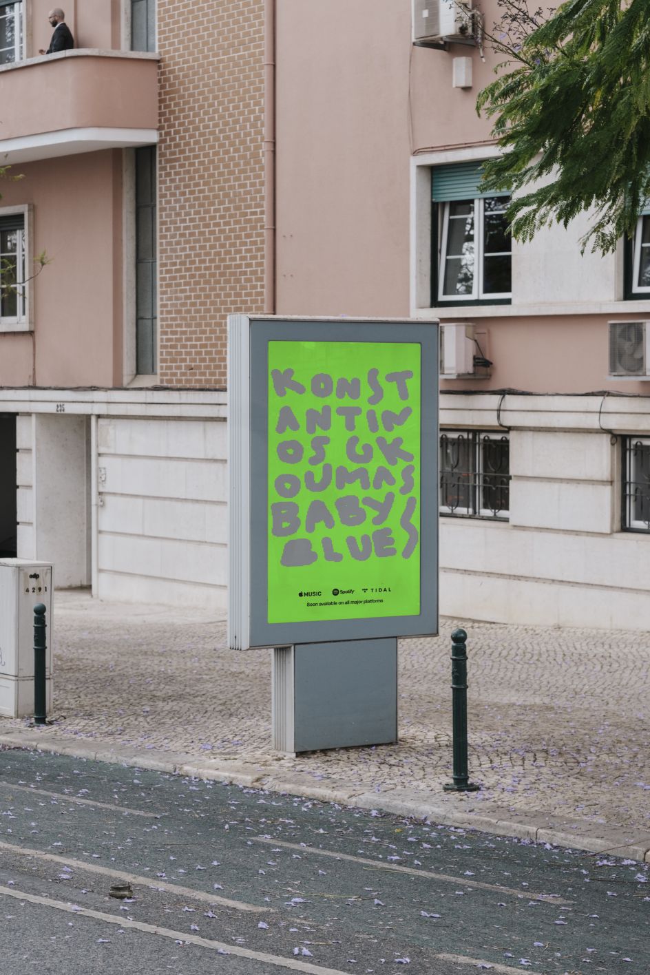
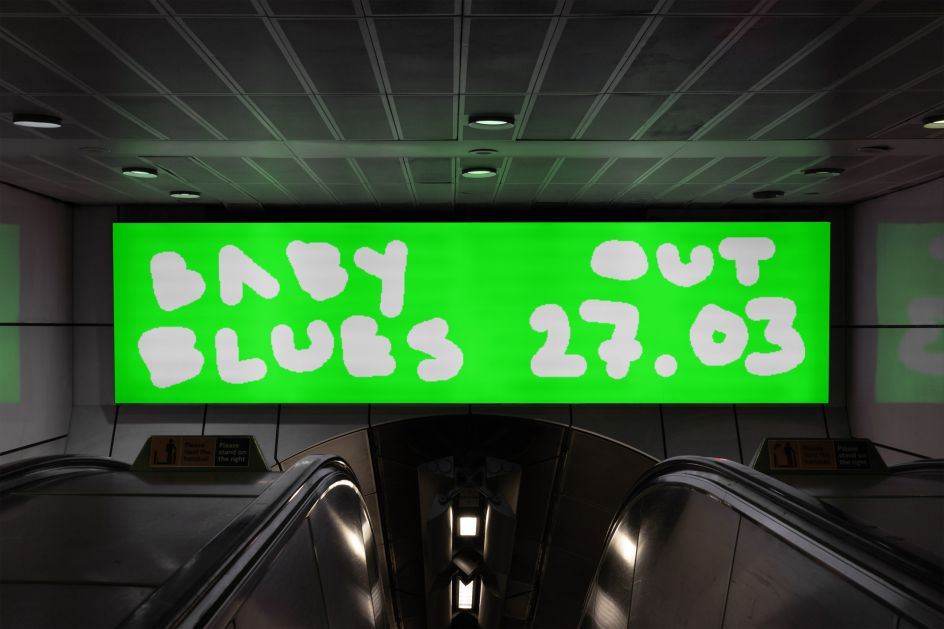
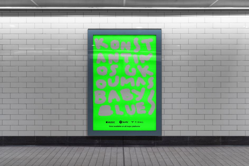
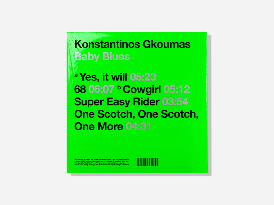
The eye-catching aesthetic has appeared on posters and billboards to promote the EP further. Its deliberate crudeness is unlike anything else around it, further helping it stand out to both old-timers who remember MS Paint and hip young audiences who were born well after its time. Marlon Tate has the good sense to keep things practical, though, as the reverse of the record sleeve spells everything out much more clearly.
"We really wanted to reference the album's unapologetic creative recklessness by creating something that's really off," concludes Marlon Tate's creative director, Nikos Georgópoulos. "So, we created artwork that literally looks like it was made in Paint by a 5-year-old echoing old internet energy."
Editor's Picks


Trending


Podcasts


Editor's Picks
Further Reading