Middle Boop works with Blanck Mass on a rather fruity, very smart guerilla design campaign
Middle Boop, the London-based studio of Gordon Reid, has worked on a striking, smart and pretty different campaign for the new album from Blanck Mass, titled Animated Violence Mild.
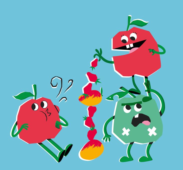
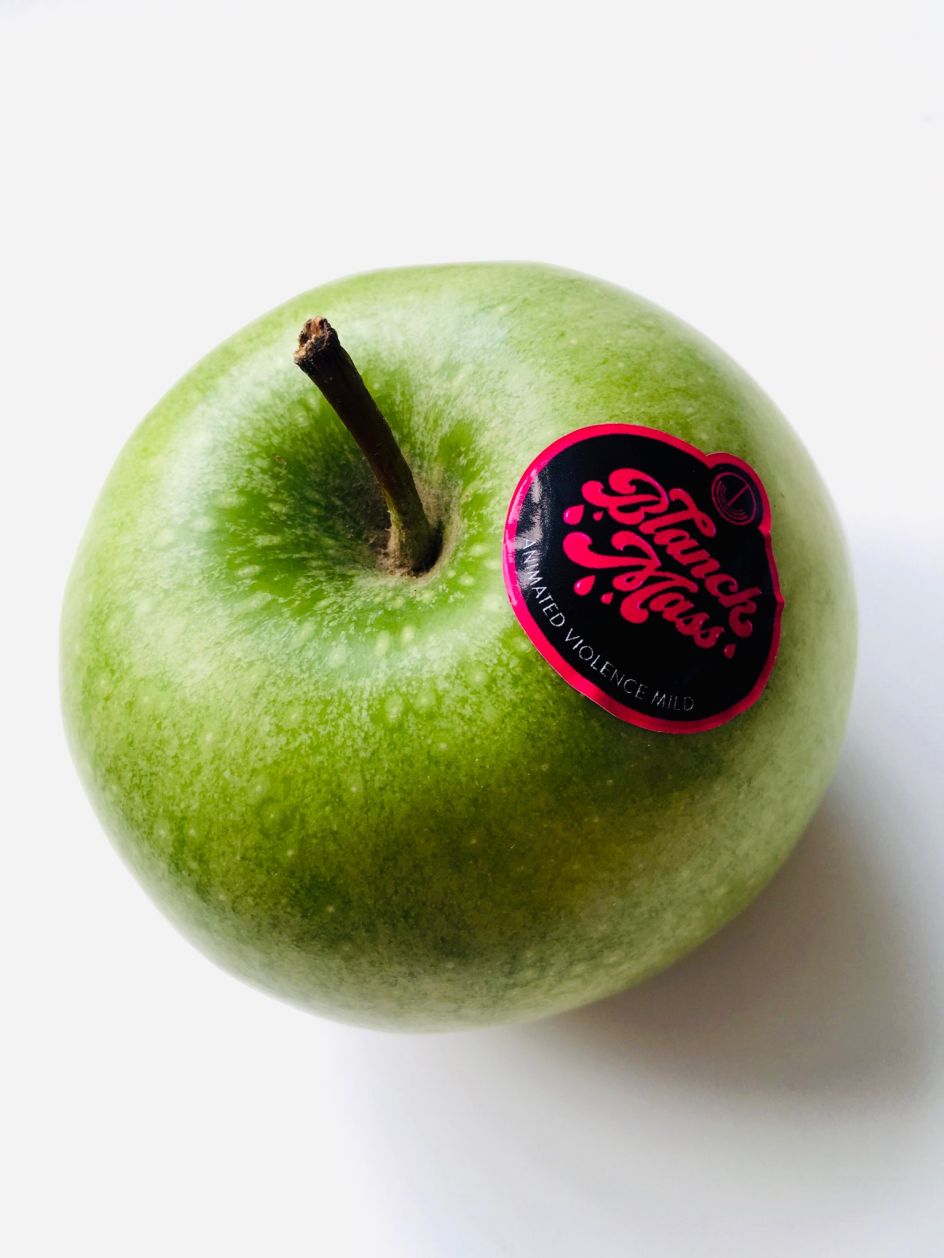
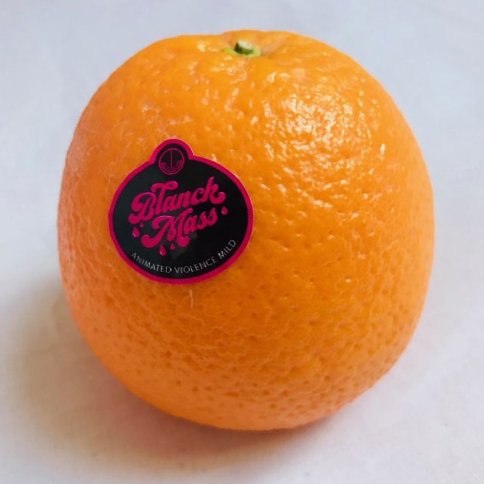
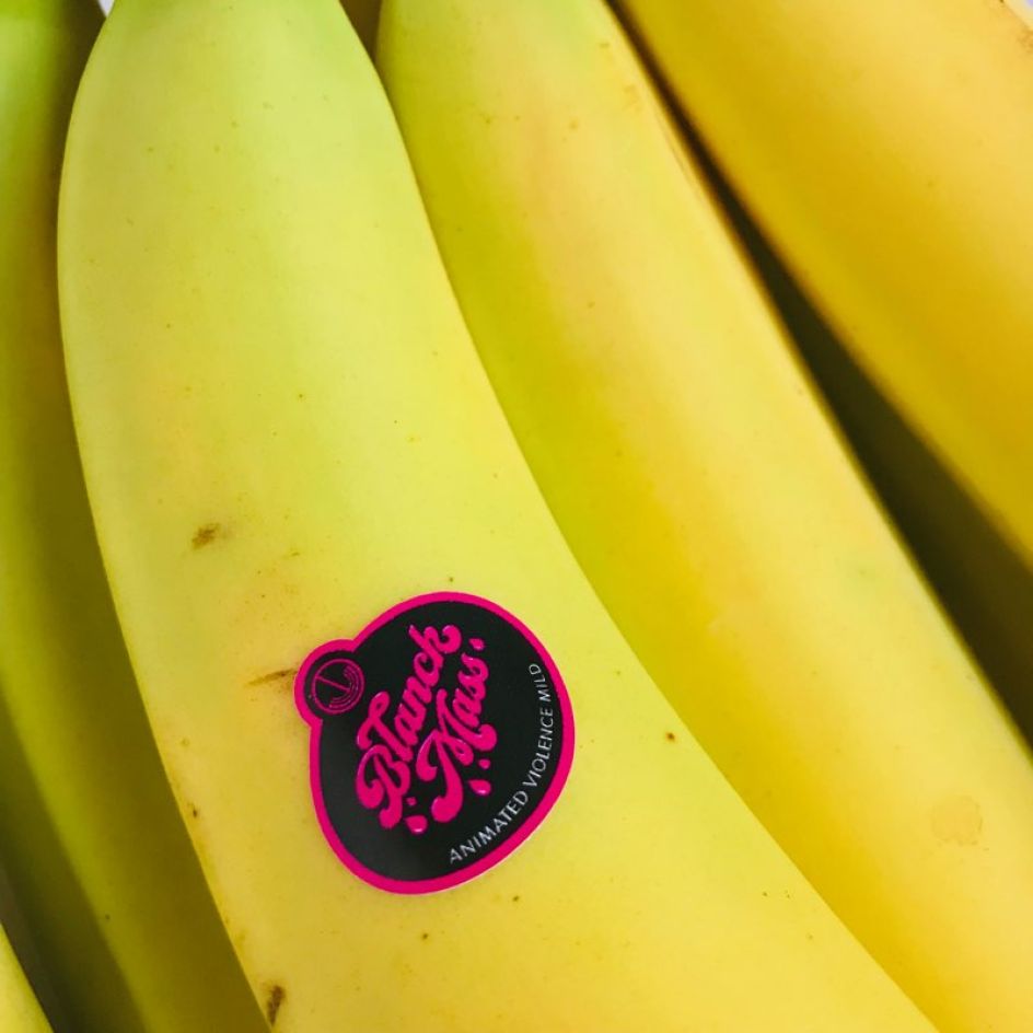
In an innovative take on guerrilla marketing; the team created a teaser campaign based around fruit stickers, taking '60s-style typography and RuPaul-inspired colour palettes and sending said stickers out to fans and influencers, who duly daubed them overproduce in greengrocers, supermarkets and the like across the country.
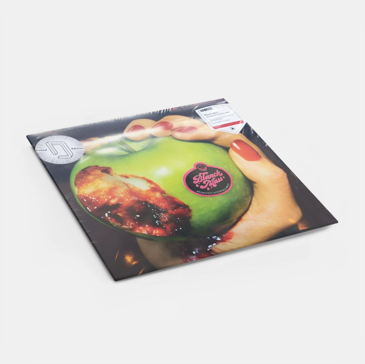
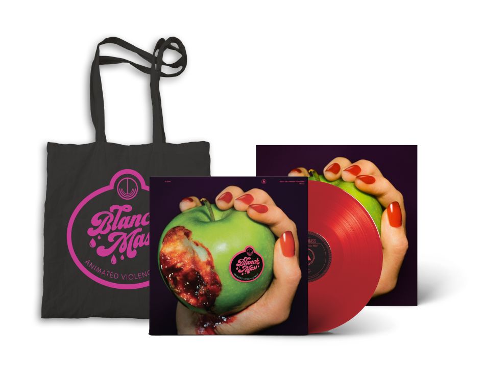
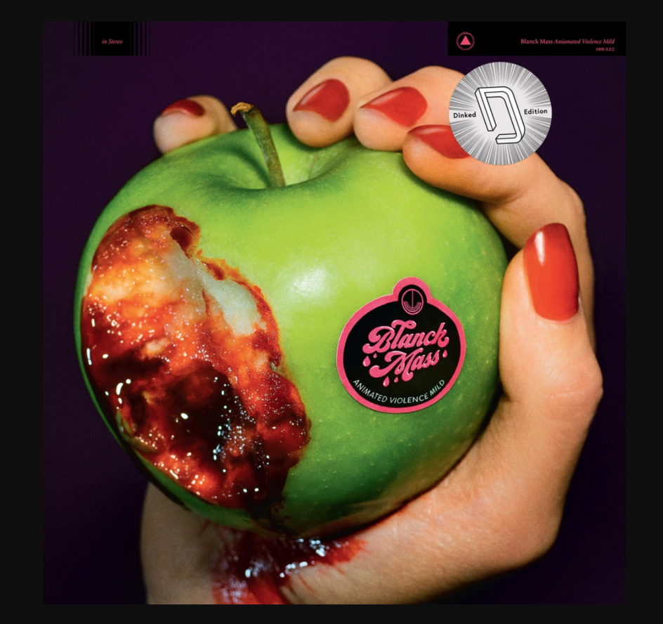
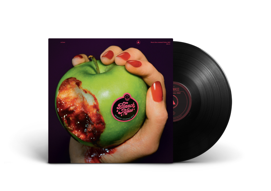
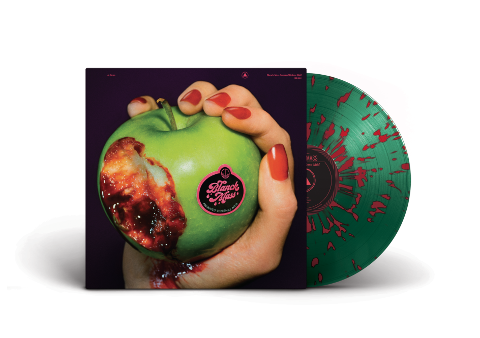
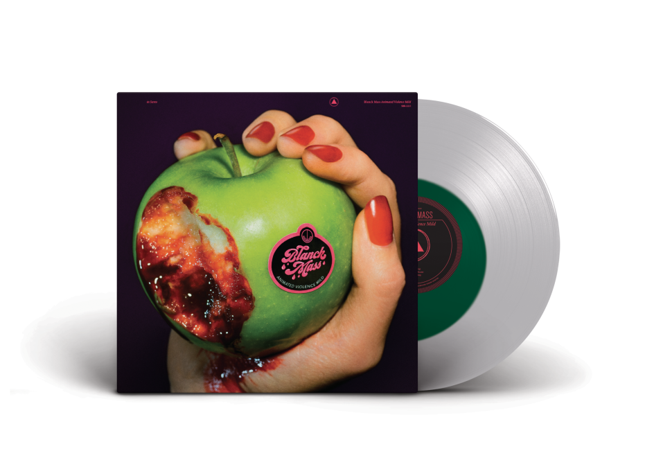
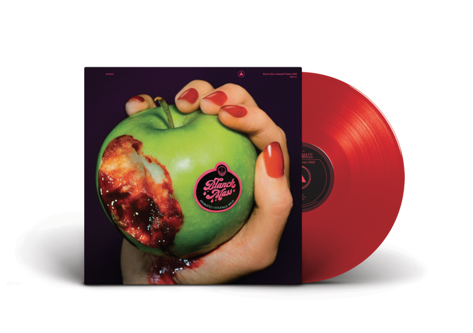
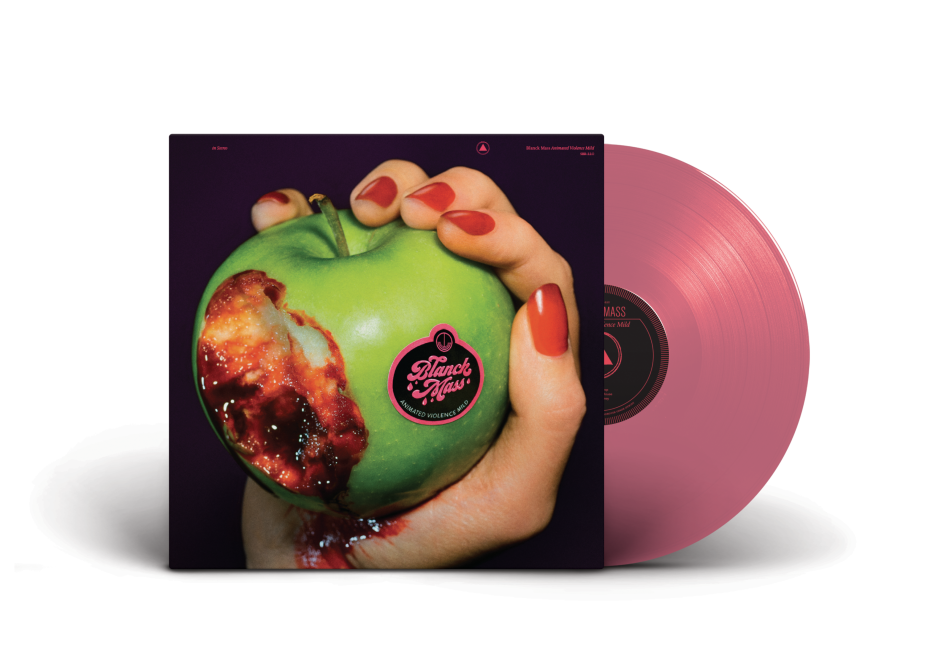
The album design concept was created by Benjamin John Power (the real name of Blanck Mass, formerly one-half of Fuck Buttons); and uses photography by Alex De Mora for the final treatment.
Reid had initially met Power at a Field Day festival about a decade ago; and for a while, found himself driving and selling merch for Fuck Buttons, before moving on to create designs for the other half of the former duo, Andrew Hung, and now, working on creative projects with Blanck Mass.
Briefed to create a custom typeface for the record cover and sticker designs, Reid, under the art direction of Power, looked to retro fruit sticker designs for inspiration. "Sometimes it can be really hard to work with musicians; but not with Ben as he’s got a background studying design," says Reid. "It’s a small team, and Alex De Mora has such a distinctive photography style which brought it all together."
After that initial concept was born, the pair began exchanging a tonne of photos of fruit stickers they liked before landing on the final type style that would fit. "I think it’s a pretty classic, '60s-style typefaces with the big swooshes and swirls," says Reid. "It has that essence of something ‘juicy’, but still a bit different from the sort of thing you might see in the shops."
He adds: "Ben was the one who had the idea for the apple. What’s beautiful about Blanck Mass is it’s always tongue in cheek: its heavy electronic music with usually pretty dour miserable people watching, but Ben’s a big fan of Ru Paul so wanted this really vibrant colour palette, sort of '80s drag-style."
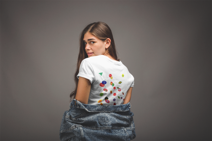
The designs are used across the aforementioned sticker marketing campaign, which reached fans, friends and record shops – basically, anyone who was likely to be up for sneakily sticking them onto unsuspecting produce – as well as on merch such as tote bags and t-shirts, the record inlay and its single covers.
Editor's Picks


Trending


Podcasts


Editor's Picks
Further Reading