Astrid Stavro's identity for 'next-generation' cereal that has flavours to match your mood
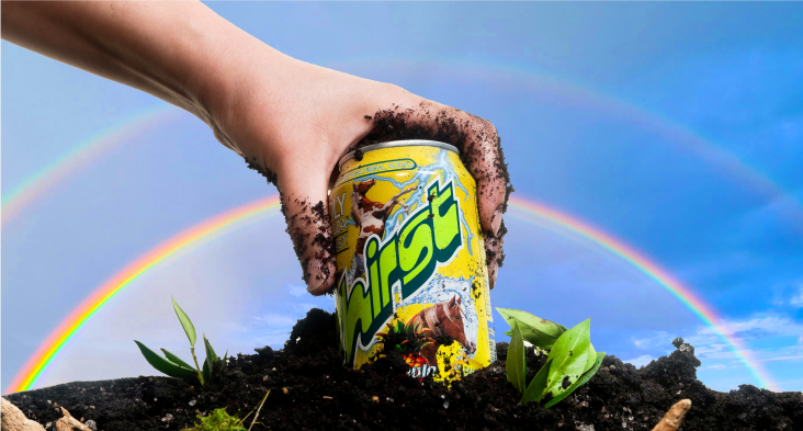
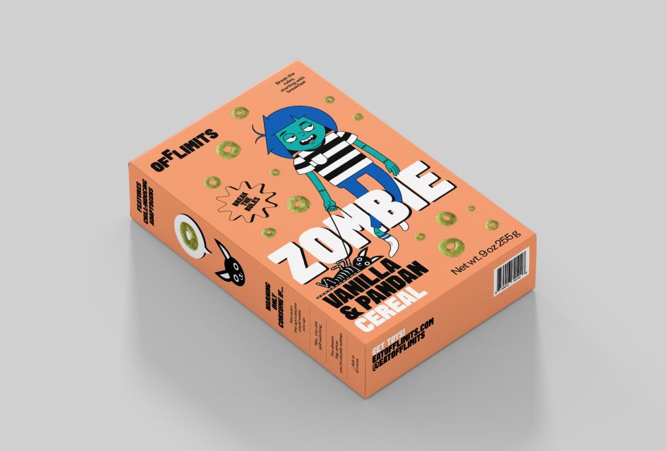
Pentagram's Astrid Stavro is behind the identity for OffLimits, a new cereal designed to be eaten at any time of day with different flavours designed to match your mood, that's whether you feel "wired" or "tired".
Its creator Emily Elyse Miller approached Astrid to create both the packaging and a distinctive brand to "perfectly embody the brand's energetic and high-spirited attitude". The resulting identity comprises of two unique characters which take centre stage on the packaging, and a brand language featuring bold typography, saturated colours and an expressive tone of voice.
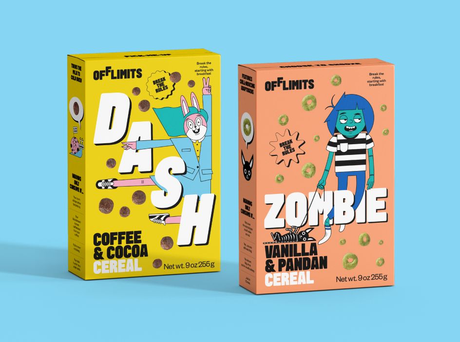
Each cereal flavour is represented by a different character, drawn by Shepard Fairey's Studio Number One. The characters form a key part of the identity, interacting with each other, keeping pets and joining together to create an extended OffLimits family.
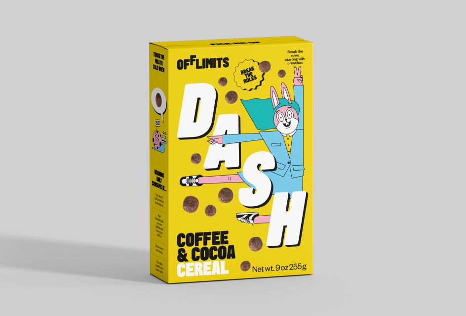
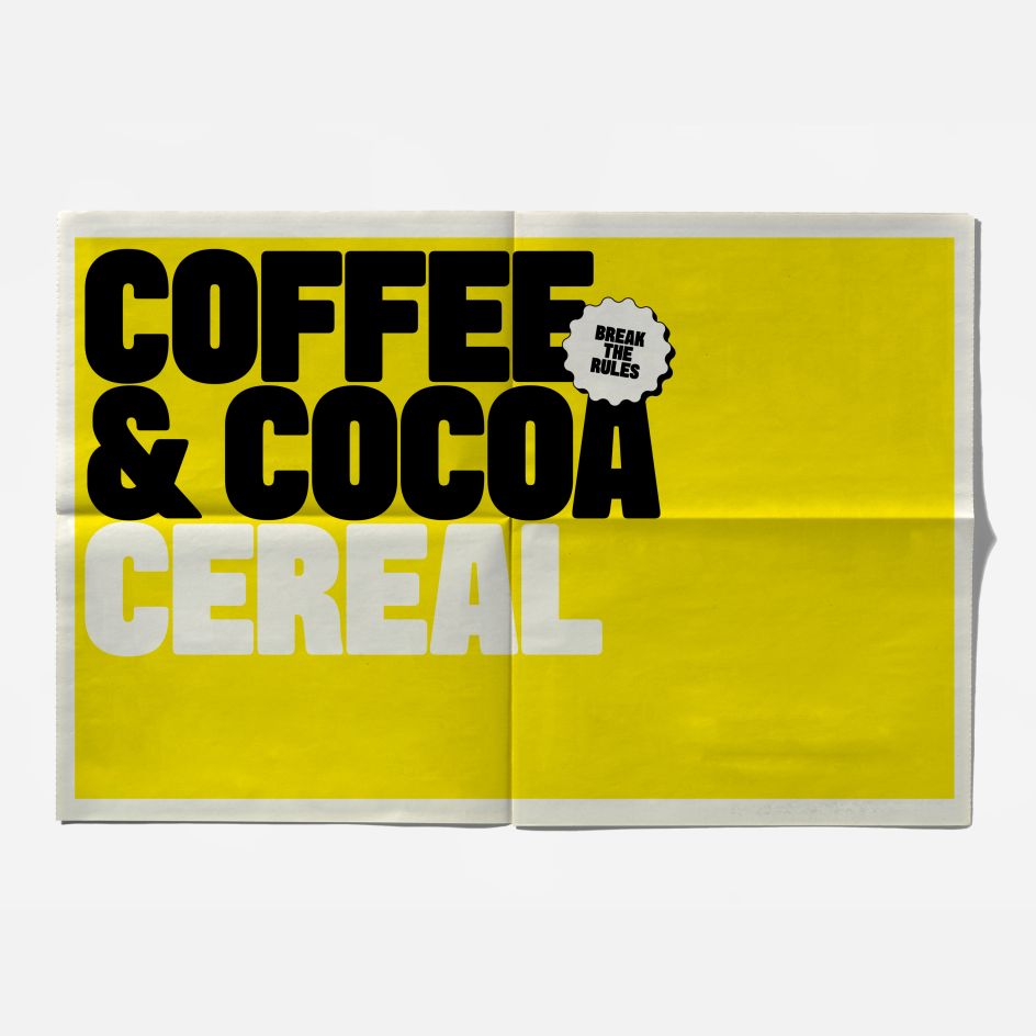
'Dash' appears on the caffeine-infused coffee and cocoa flavour while 'Zombie' features on the more mellow vanilla and pandan flavour, and both characters pop up in the various pieces of cereal-related ephemera. "Through these characters and their contrasting personalities, OffLimits is also on a mission to destigmatise difficult conversations about mental health," says Pentagram. As such, each order contains a carefully constructed activity sheet with different stress and anxiety-relieving activities for people to work through while eating their cereal.
"The name OffLimits serves a dual purpose," explains Emily Elyse Miller. "It's a playful take on the sugary treats that always seem to be out of reach when we're young and also represents the element of defiance that's ingrained in the brand's DNA. Right now, the system is broken, and we're rebuilding the world we want to live in. Nothing is off-limits!"
Astrid and her team created a bold logo with the second 'F' just out of reach (or "off-limits"), which is accompanied by a bespoke typeface designed in collaboration with Emma Williams, and a saturated colour palette.
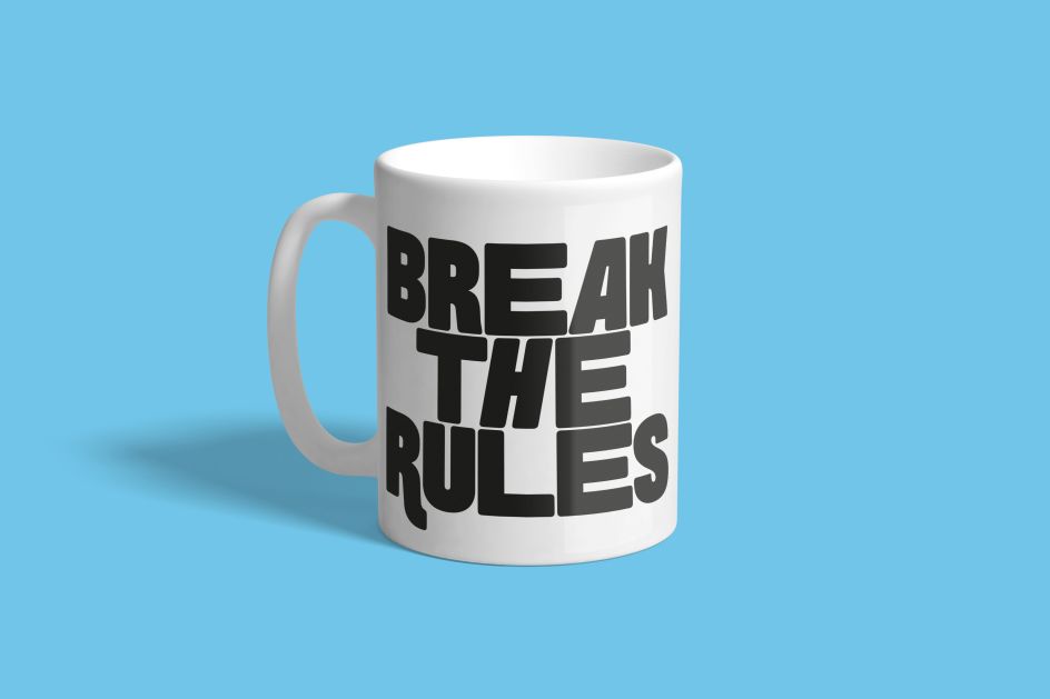
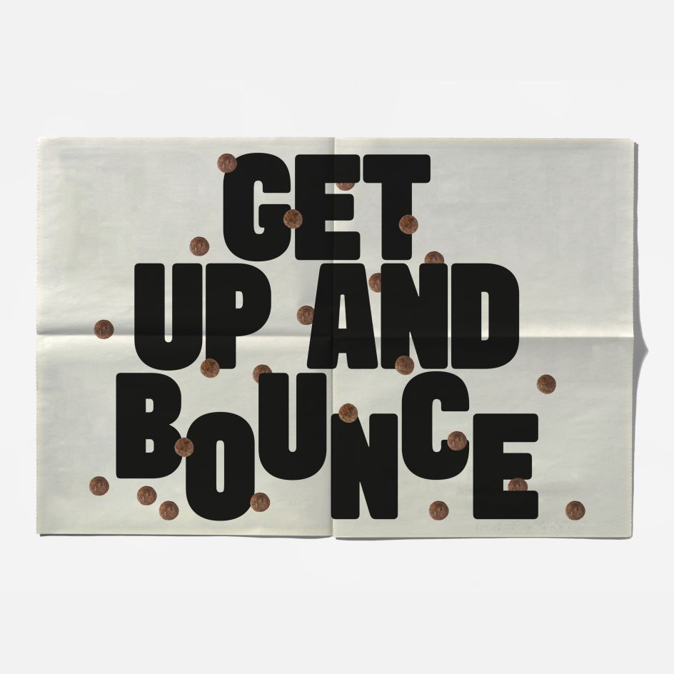
All of these work together to create a vibrant visual language which brings the high energy brand to life. Encouraging us to "break the rules, starting from breakfast", the brand language is irreverent and fun, reinforcing the cereal's playful attitude. The packaging is colourful and bold, and very different from existing "adult-orientated" cereal brands.
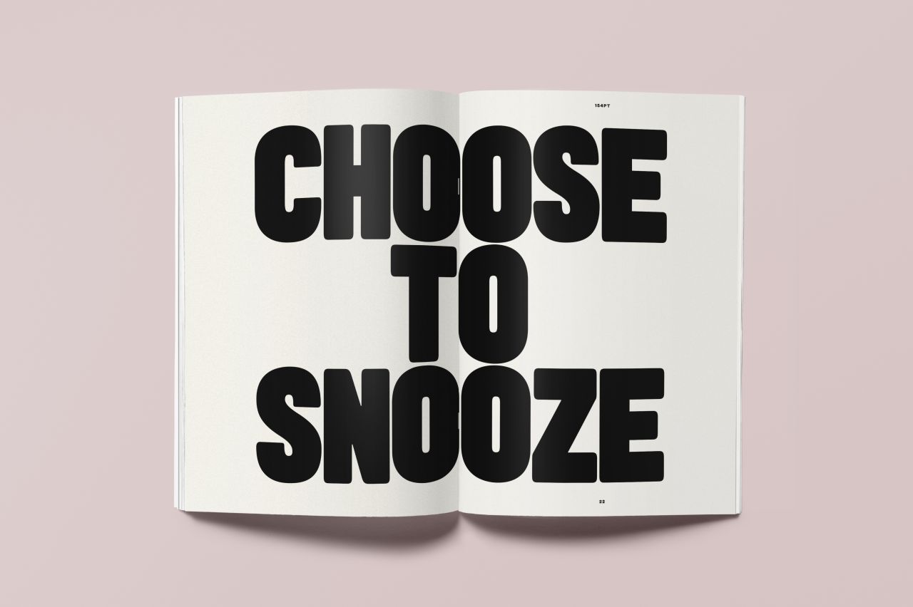
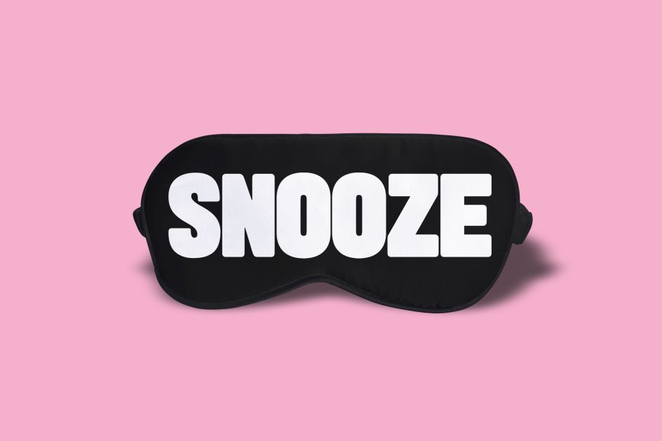
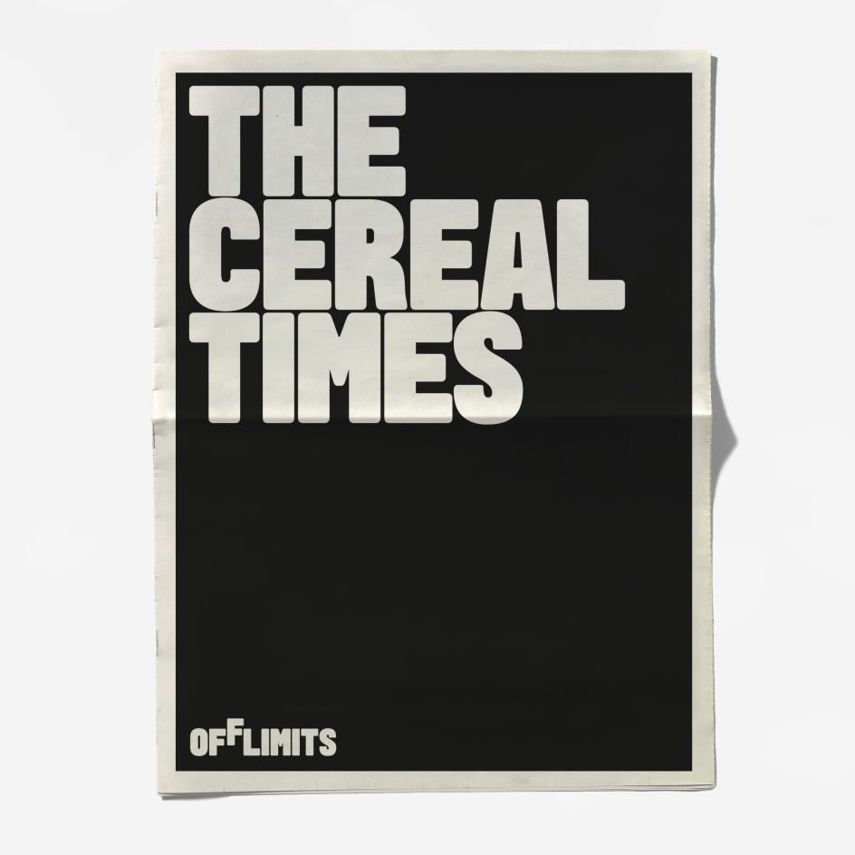
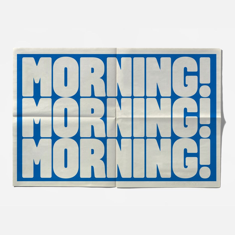
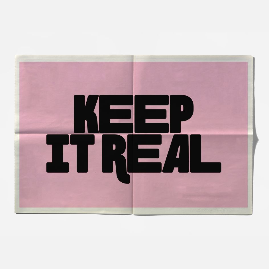
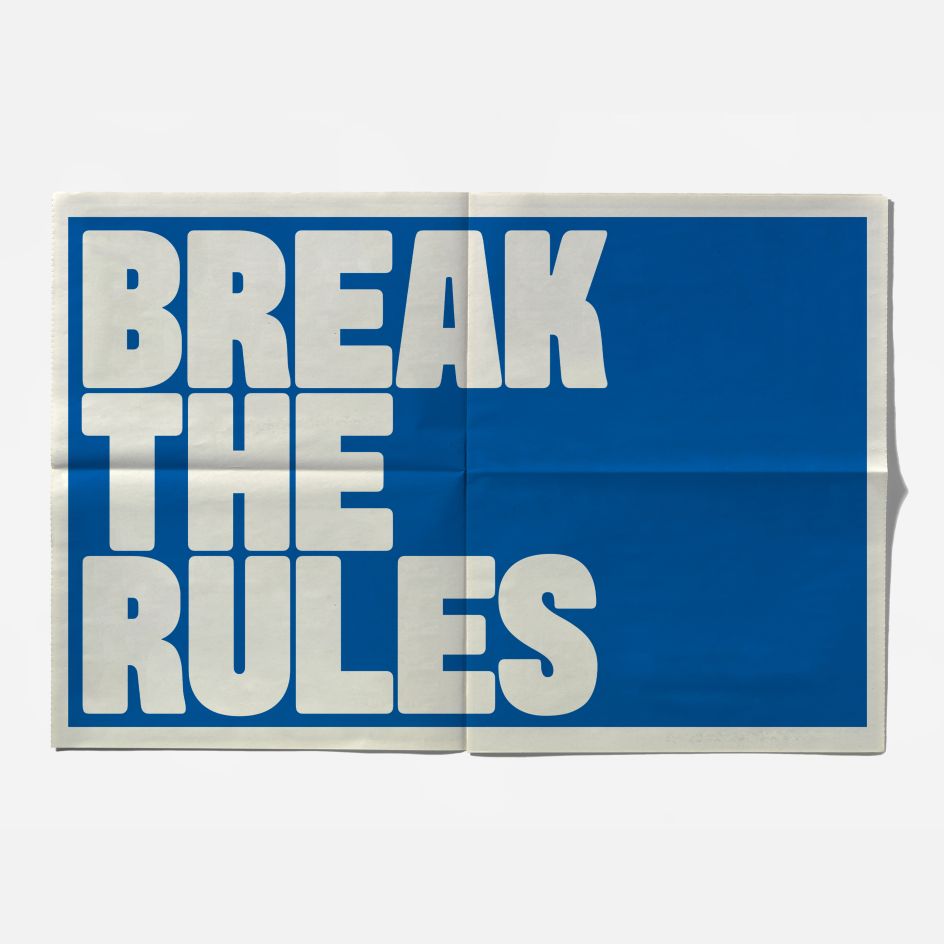
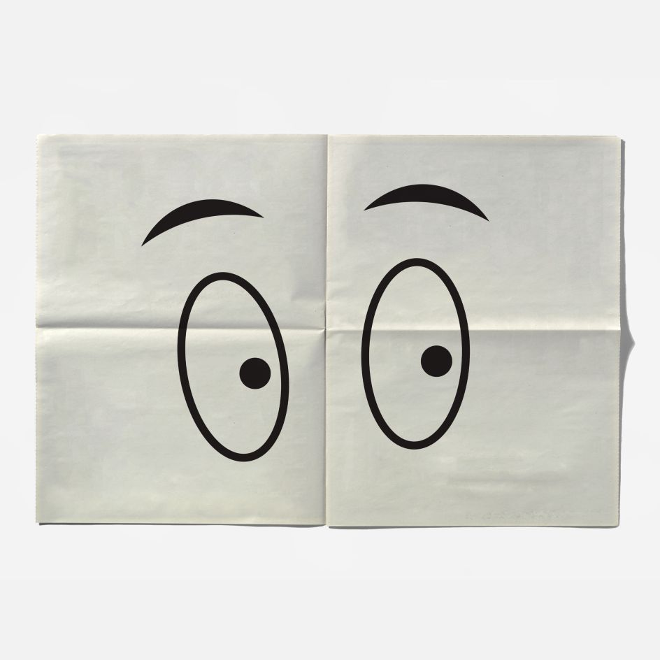
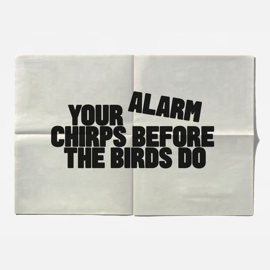
The proposed brand assets (such as sleeping masks featuring the word 'Snooze') were carefully selected to help bring OffLimits to life. Other sleep- and breakfast-inspired items include mugs suggesting that we 'Break the Rules', and t-shirts with playful slogans such as 'Keep it Real'. The newspaper-format teaser 'Cereal Times' also features the brand's signature bold typography, bright colours and playful copy.


Editor's Picks


Trending


Podcasts


Editor's Picks
Further Reading