Anak's visual identity for coffee brand Bettr is purposely flawed, and all the better for it
Branding needn't be about conveying a sense of innate perfection. People prefer flawed reality to corporate blandness, and here's a great example of how to design for that level of authenticity.
Bettr isn't just any old coffee brand. Founded in 2011 and based in Singapore, it's Southeast Asia's first certified B Corporation and is committed to bettering our planet through providing holistic vocational programs to educate and empower marginalised communities.
Today, the firm provides professional beverage education, speciality coffee products for retail and wholesale, and large-scale event services for companies. It also operates retail coffee bars island-wide, using its presence to amplify positive social impact in the community.
Now brand practice Anak has unveiled new branding for Bettr. This identity heralds a transformative shift in conscious branding, resulting in a fresh approach to sustainability. It aims to forge a genuine, honest connection with a jaded, disillusioned audience, making complex problems relatable and entertaining.
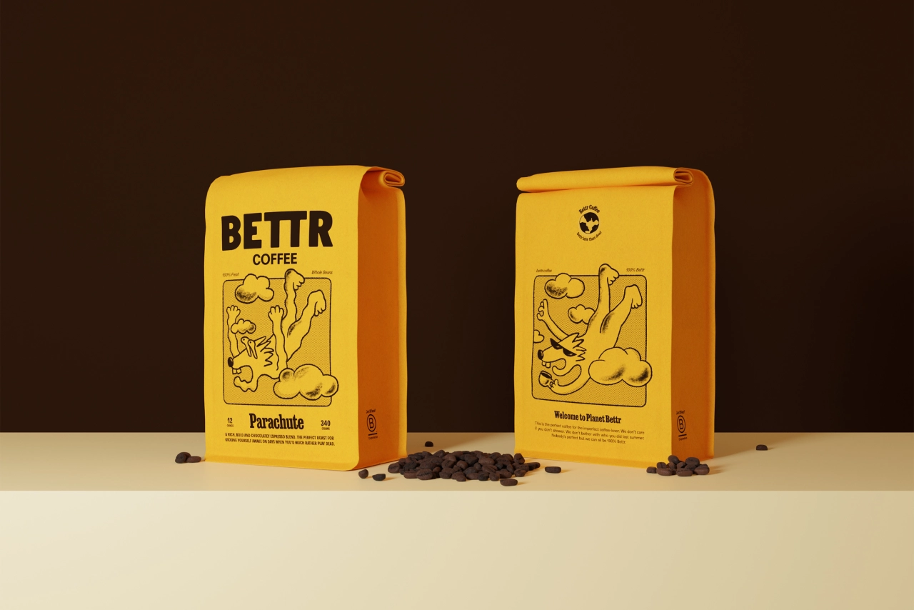
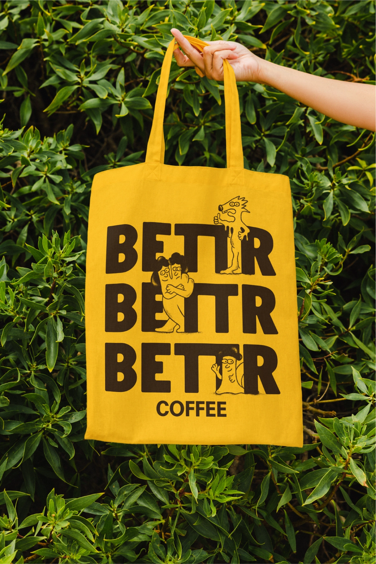
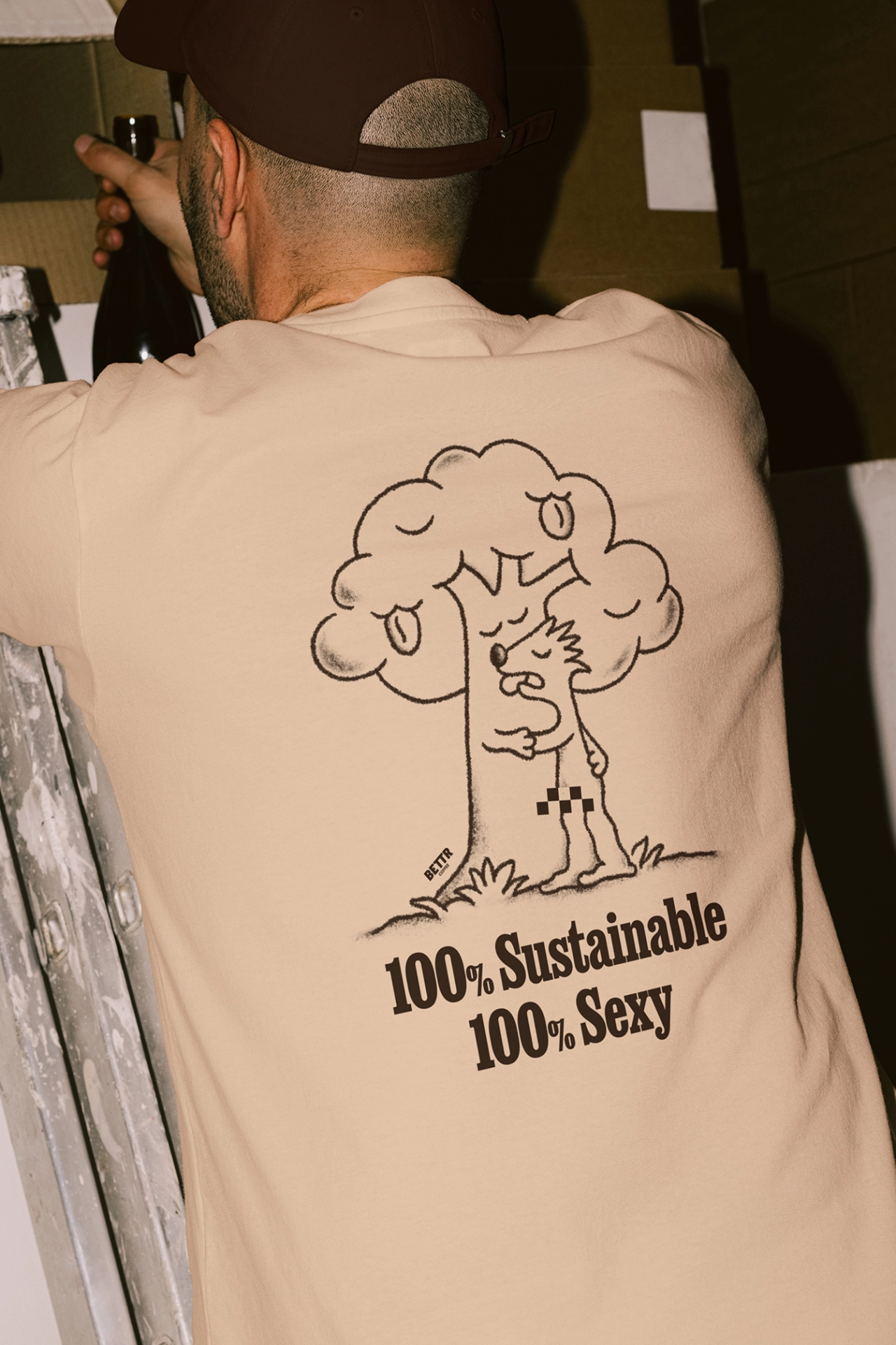
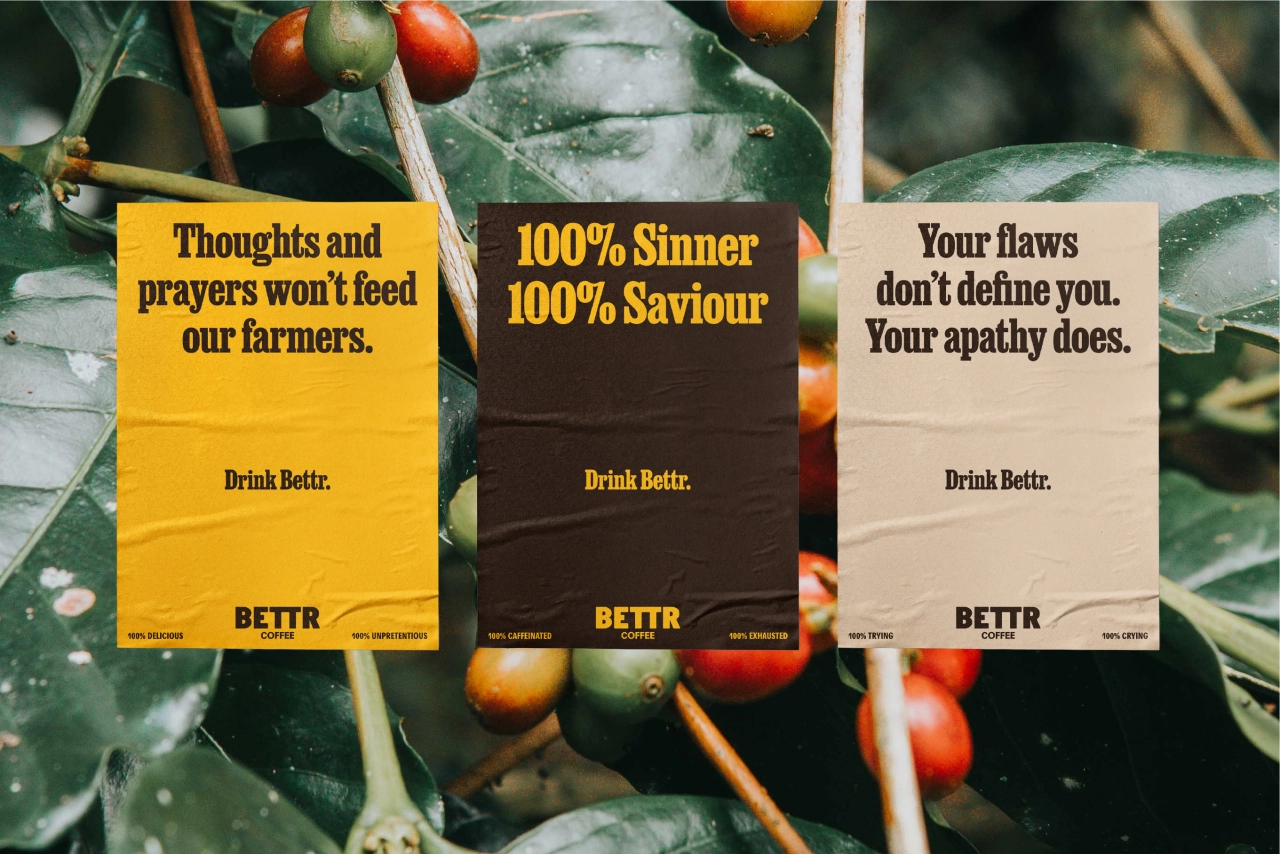
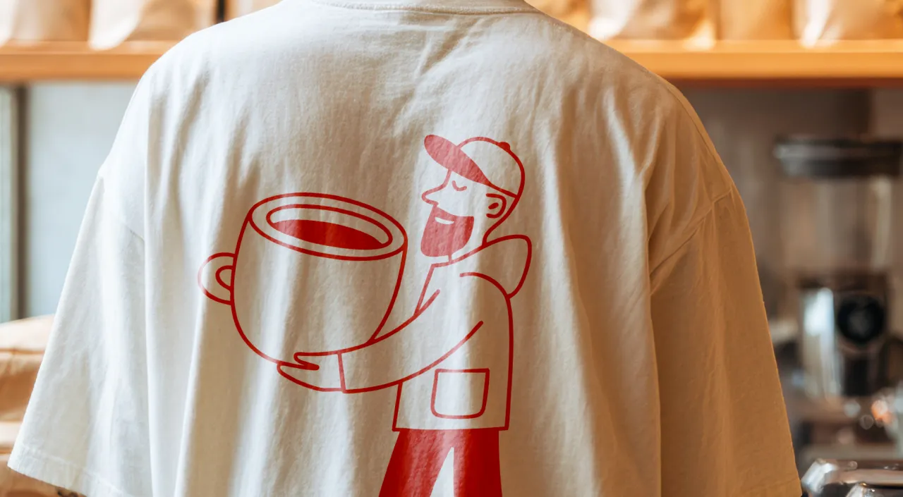
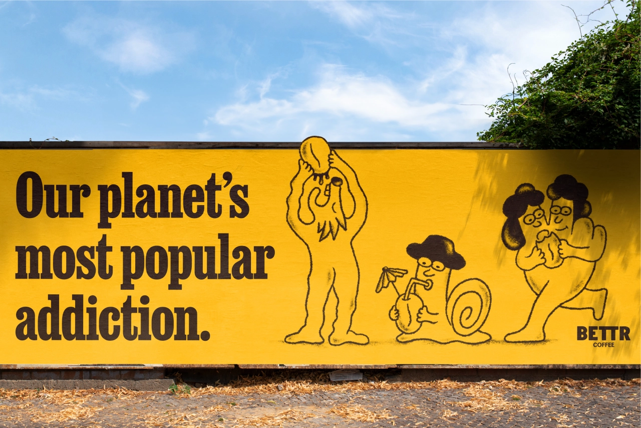
The approach to the new identity is somewhat unusual. The cornerstone of the brand is a fully realised world that is more akin to world-building for a fictional TV show than elements of a typical brand guide. In other words, Anak has crafted not mere illustrated mascots but fully dimensional character personalities.
The world they inhabit is known as Planet Bettr, and it's 100% flawed, just like a certain planet closer to home. The planet is inhabited by three heroes who are also 100% flawed yet 100% relatable. They continue to strive for change and impact despite constant setbacks. It's an ethos inspired by Bettr's own journey as a B-corp company trying to create positive and lasting change for the community.
"The world of social impact and sustainability are typically fronted by happy mascots, saccharine do-gooders and utopian futures," explains Lee Hanyi, creative partner at Anak. "This results in a huge gap between the brand and the truth of real life. Helping the planet is a dirty, messy and complicated job. The new Bettr brand celebrates the world of social enterprises in all its imperfect glory, encouraging everyone to 'Scr*w perfect, make an impact'."
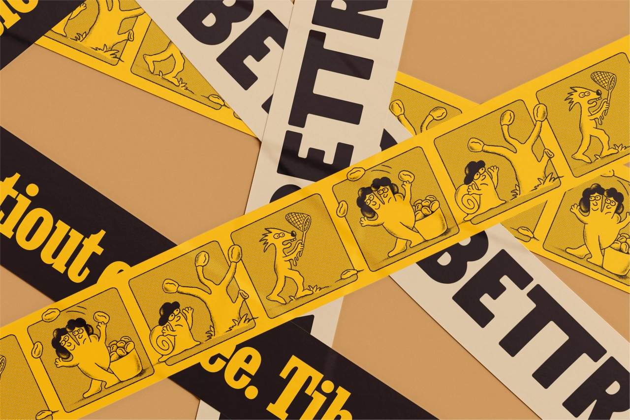
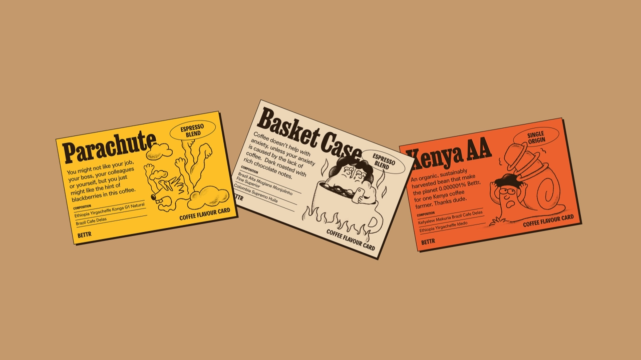
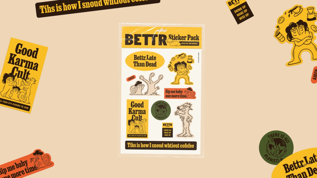
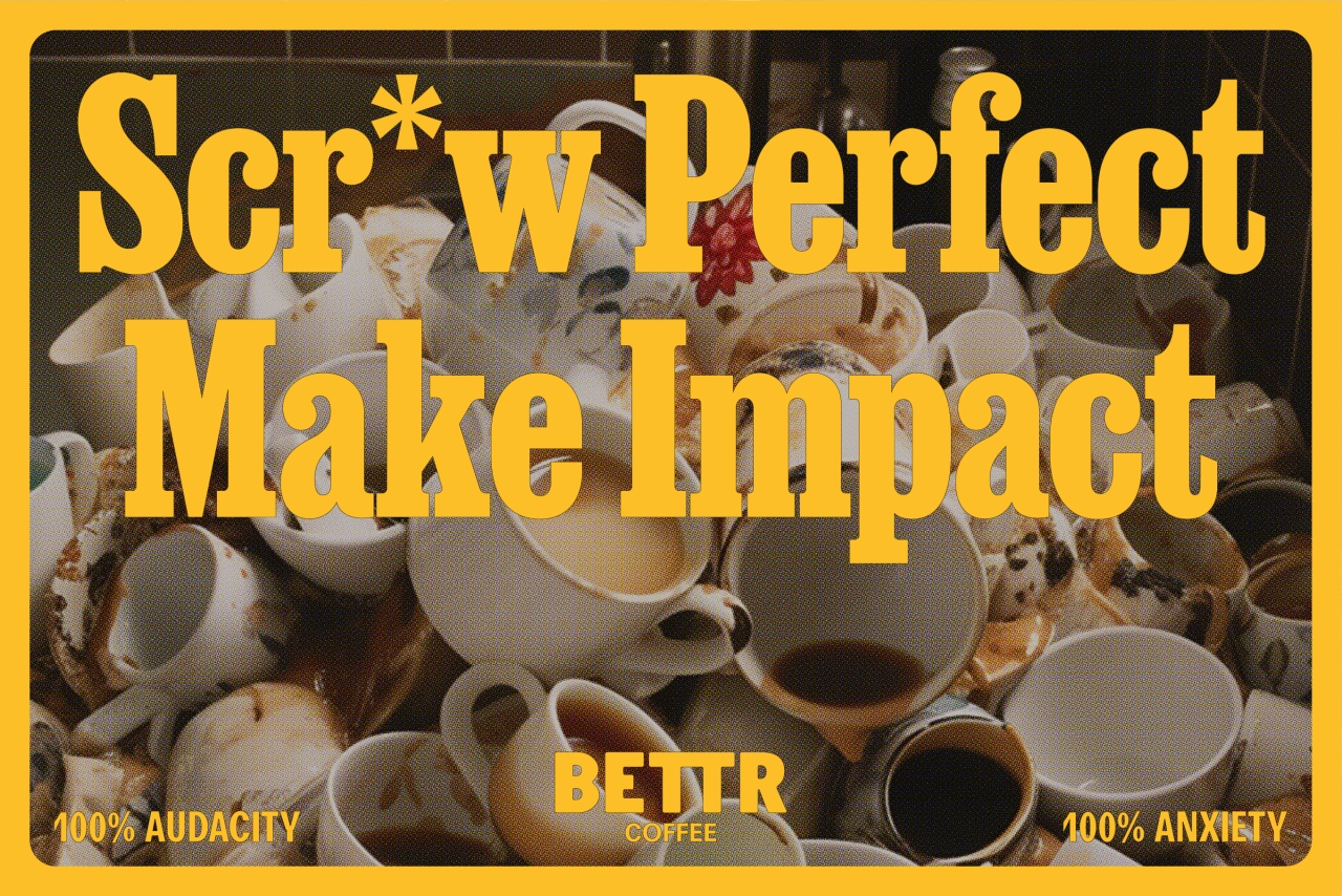
Overall, we're a little bit in love with these designs. Because ultimately, when your company is doing good, you don't have to beat people over the head with it. In fact, the more "worthy" you come across as the more likely you are to bore people or even rub them up the wrong way.
When people are buying coffee (which is, let's face it, a powerful recreational drug), they'd prefer you to make it a fun experience. And that's exactly what Anak have delivered here while still allowing the message to come over loud and clear.
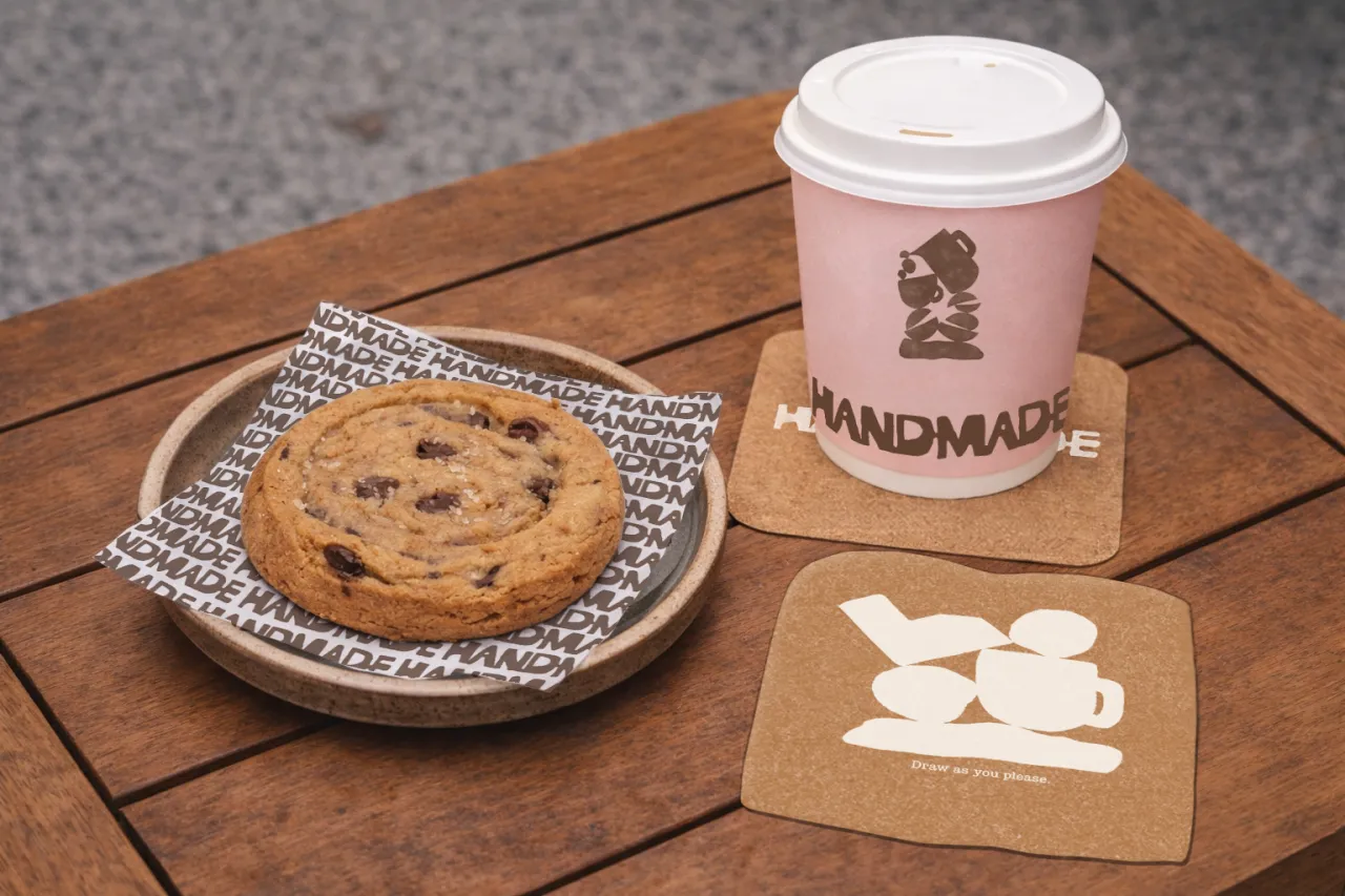
The typography hits that sweet spot between welcoming and readable, the colour palette is confident and distinct, the characters are quirky and engaging, and the copywriting is direct and to the point. So, much like a strong coffee on a bleary morning, what's not to like?
Editor's Picks





Trending


Latest Jobs
Senior Digital Designer at 3800
Full-time·Sheffield·£40k-60k
Design Director, Opinion at The New York Times
Full-time·New York·$160k–$180k
Client Partner at Halo
Full-time·Bristol·£30k–£36k
Senior Brand Designer at Analogue
Full-time·Leeds·£38k-£45k
Creative Content Executive at Cognition
Full-time·Birmingham·£28k–£35k
Growth Strategist (Ecommerce) at Tribe
Full-time·Exeter / London·£50k + Bonuses