20 of the best packaging designs by students that we wish were real
As any respectful designer knows, there's an art and science behind every single piece of packaging.
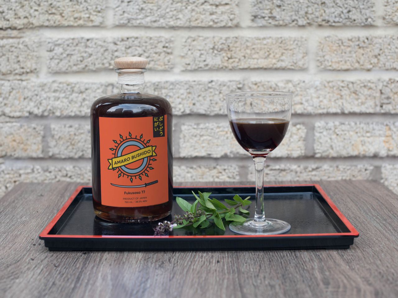
Amaro Bushido by Megan Dweck. All images courtesy of Shillington and its students.
From wine bottles and tins to jars and boxes, the chosen colour palette, the typography, the choice of materials and what's written and conveyed on every label – they all play an incredibly important role in informing and persuading the customer to choose the product above anything else.
At Shillington, we regularly set our students the challenge of coming up with their own fictional product to design and package. Here, we share some of our graduates' recent creations; packaging that we wish was real and not just a figment of their imagination.
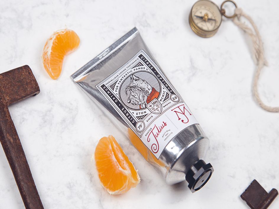
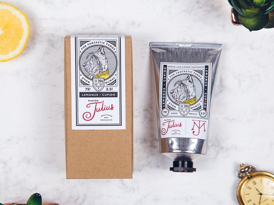
1. Master Julius by Anastasiia Vinnichenko
Check out this identity and packaging for a boutique pet product brand targeting a high-end male demographic. "The concept is based on a fictional public school pet dog named Julius," explains Anastasiia Vinnichenko, a recent graduate of our Manchester campus.
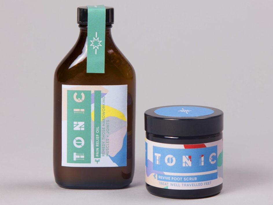
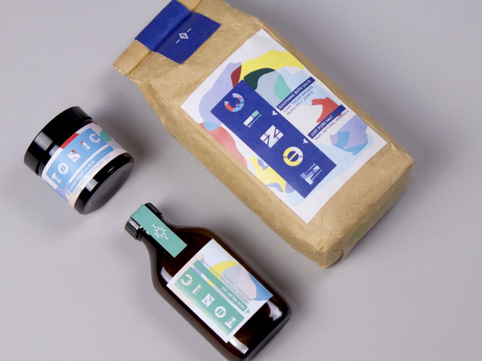
2. Tonic by Caitlin Clancy
Caitlin Clancy decided to dream up a beauty product called Tonic, something that would help people feel better. We love the Pain Relief Oil, designed to "remedy those hardworking muscles and joints". Colourful and vibrant.
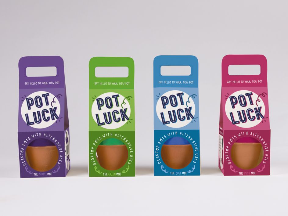
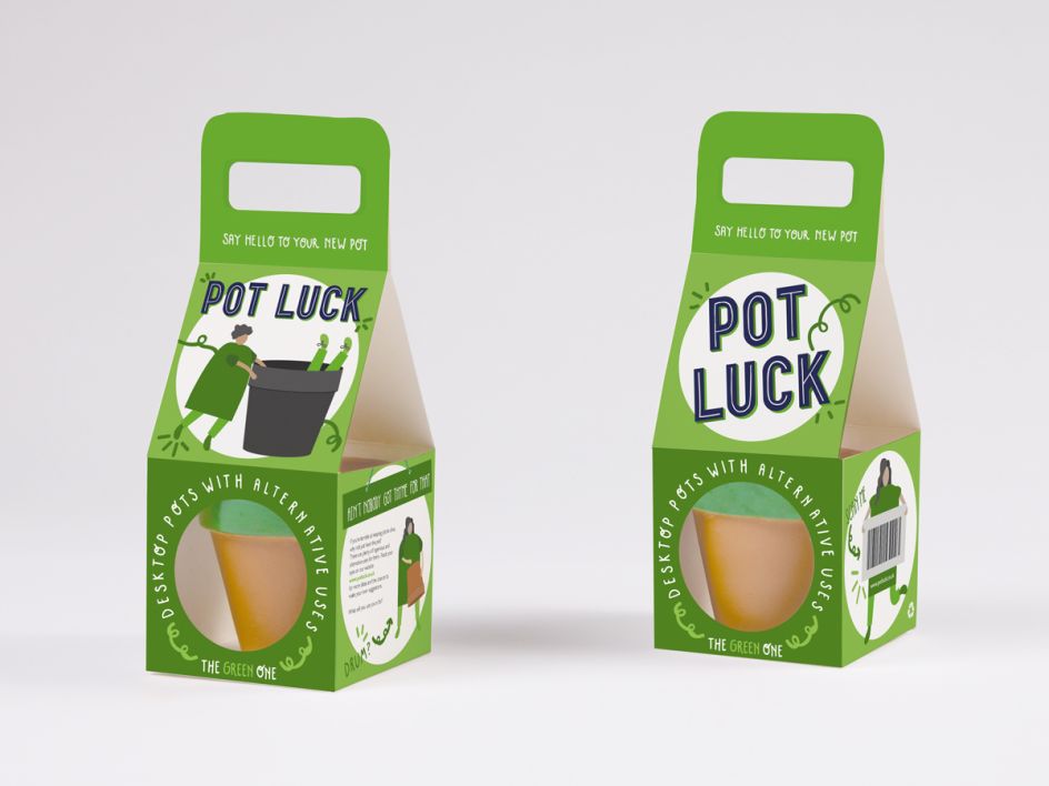
3. Pot Luck by Charlotte Clowes
Charlotte Clowes created packaging for plant pots. The theme? She aimed for a "whimsical and lighthearted approach, tackling people's common inability to keep plant pots alive". Her identity rolled out to four packaging designs, packaging inserts displaying comical alternative uses for pots and a website.
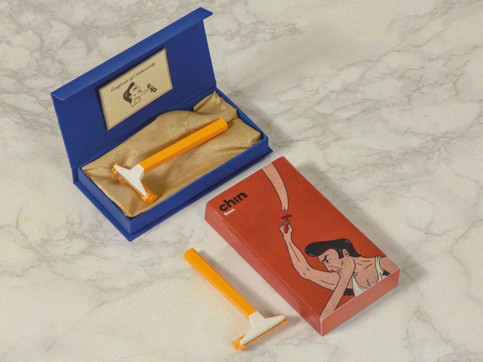
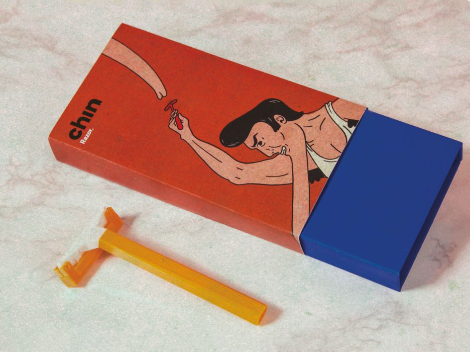
4. Razers by Christian Schubert
It was a close shave for Christian Schubert who decided to create an identity and packaging for a pretend razer brand. Naming the product "Chin" (which we love), his quirky packaging included the strapline "smooth chin, practical chin" along with illustrations of a male character with an unusually long chin. Brilliant.
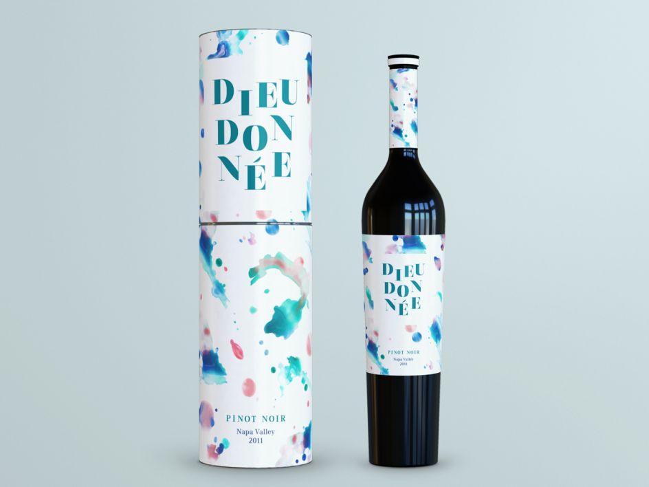
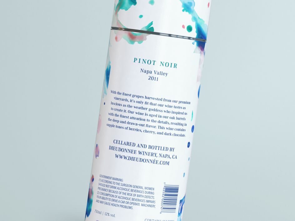
5. Dieudonnée by Amber Kim
Our New York graduate, Amber Kim created beautiful packaging for a non-existent wine brand named Dieudonnée. Using a large paintbrush and gentle hues of blue, green, red and white, she splashed the colour onto paper to create the backdrop for her labels for the Napa Valley Pinot Noir.
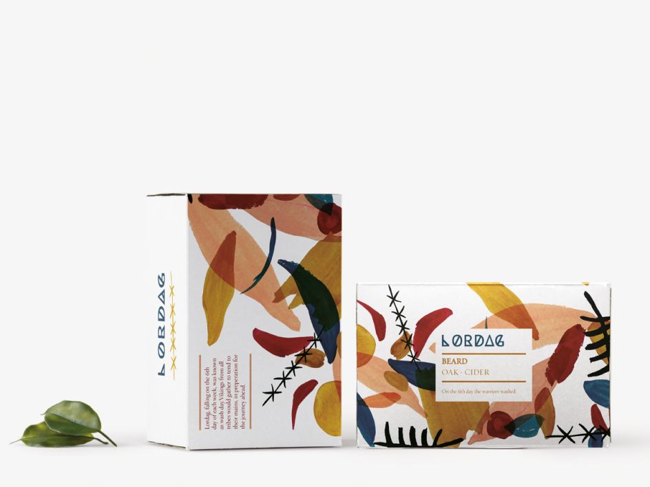
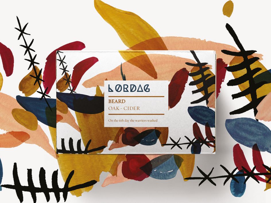
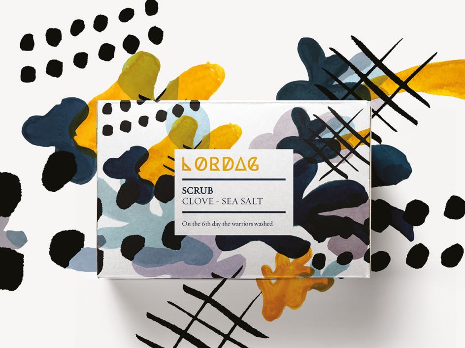
6. Beard by Jacqueline Daniel
Sydney's Jacqueline Daniel was inspired by both Vikings and the Scandinavian landscape when she came up with this pretend soap brand, Beard. Alongside the nature illustrations and pleasing colour palette, the strapline reads "On the sixth day, the warriors washed."
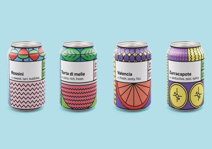
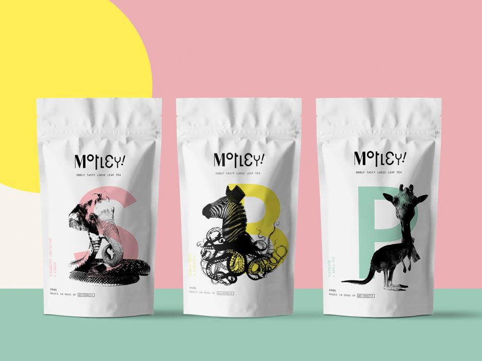
7. Motley by Jade Peyton
This fun and vibrant packaging by Jade Peyton is for an "oddly tasty loose leaf tea" brand. The Manchester designer added illustrations of animal hybrids for the different flavours, such as a giraffe/kangeroo for her pistachio and apple pie tea. We wish this tea was real!
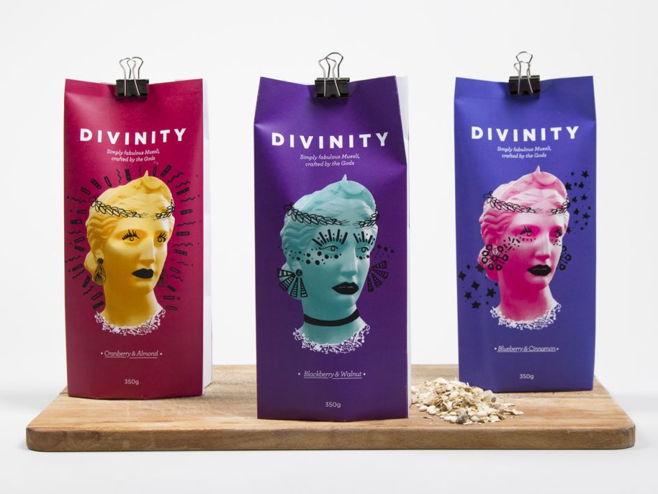
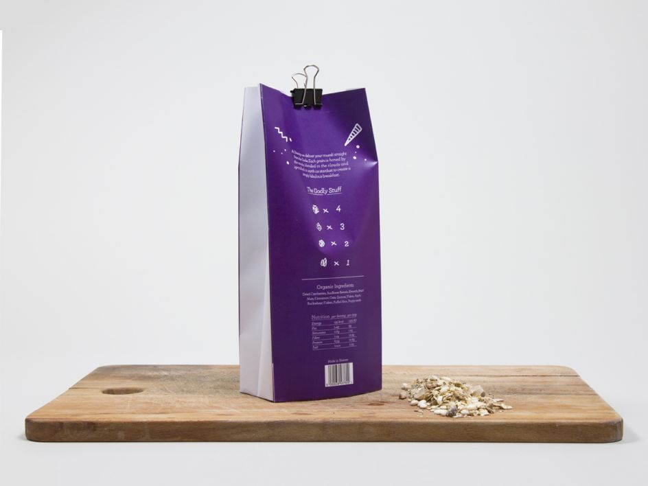
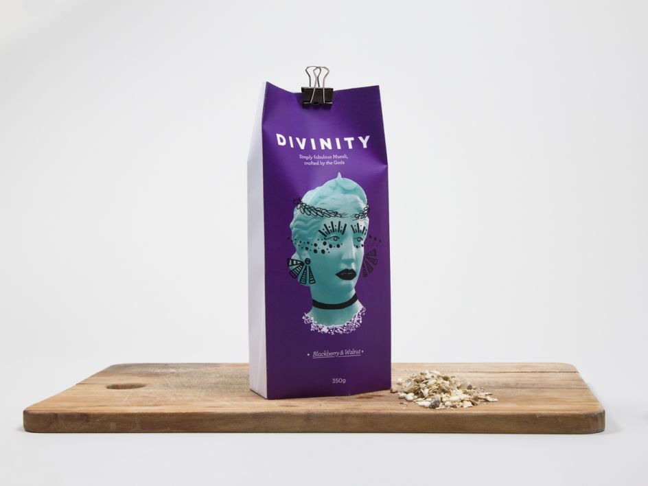
8. Divinity by Jenny Crawford
We love Jenny Crawford's response to the brief: "Create authentic muesli packaging that would appeal to a nail technician". Her neon-coloured quirky illustrations were combined with images of Greek goddesses to create a fun, boutique look that was then rolled out into different flavours.
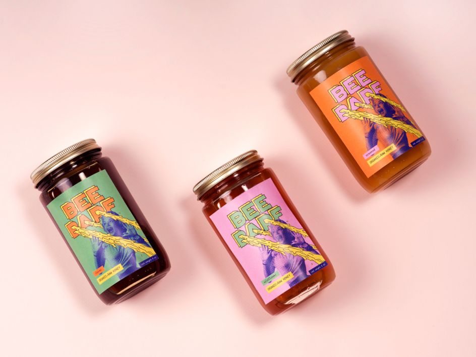
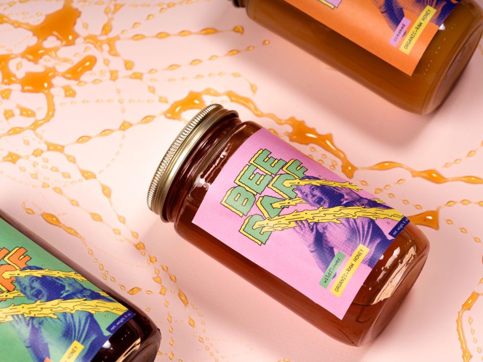
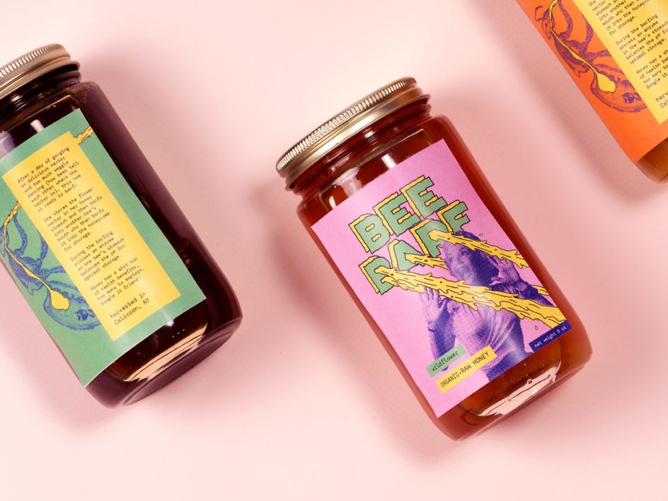
9. Bee Barf by Kathleen Crosby
Bee Barf might seem like an unusual choice of words for a honey brand, but it works well for Kathleen Crosby. "I got honey as my product and punks as my demographic. No punk was ever going to go for some quaint, boutique honey, but they might go for a little shock and humour," explains Kathleen. "Looking to the anti-establishment, raw horror-punk of The Cramps, I arrived at vomit as my inspiration."
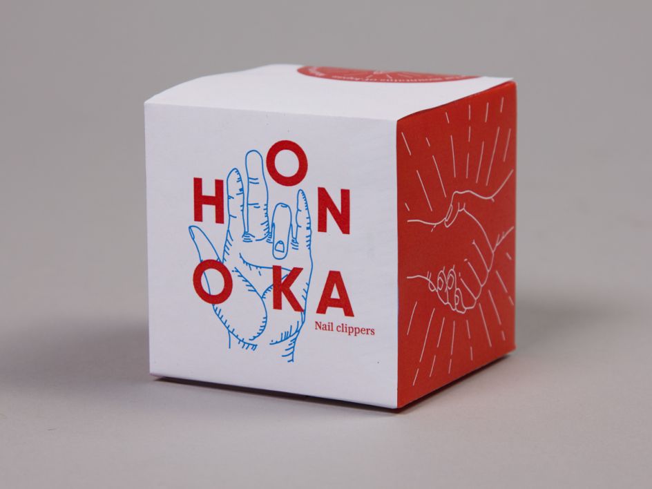
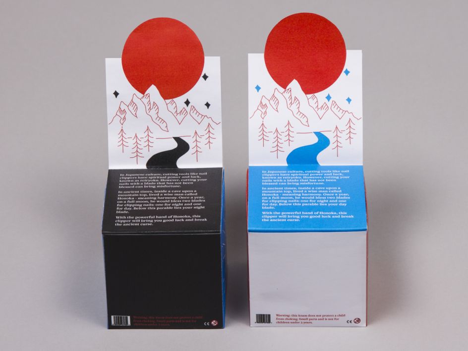
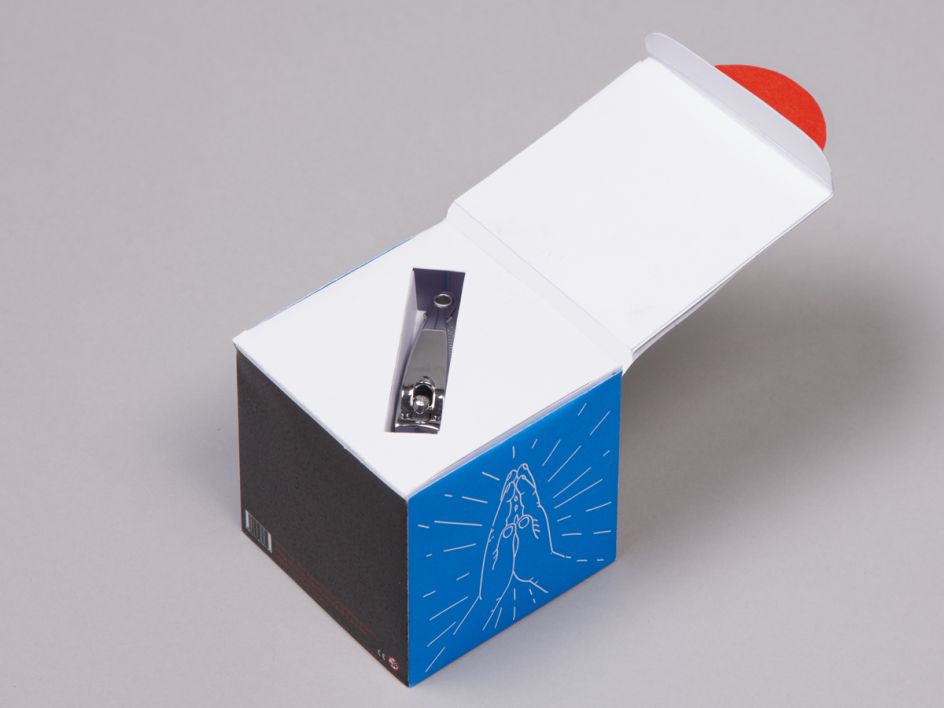
10. Honoka by Laura Ross-Tomlin
Is it possible to make creative packaging for nail clippers? Laura Ross-Tomlin has certainly done so. Her make-believe Honoka nail clipper set is aimed at a young market and inspired by the Japanese superstition of clipping nails at night and the good luck surrounding blades.
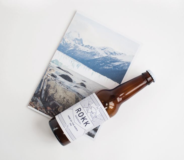
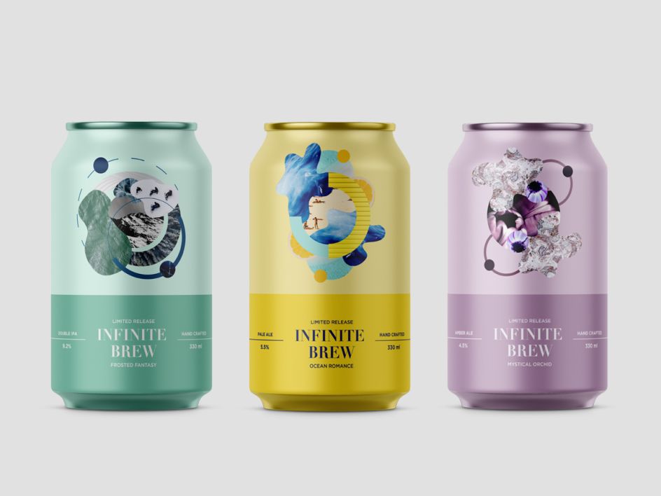
11. Infinite Brew by Marusa Rimc
This beautiful beer brand has been created by designer Marusa Rimc, a graduate of our New York campus. Each Infinite Brew is meant to evoke emotions associated with each season; the Pale Ale, for instance, pays homage to summer while the Double IPA represents winter.
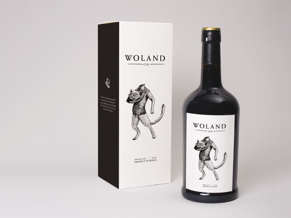
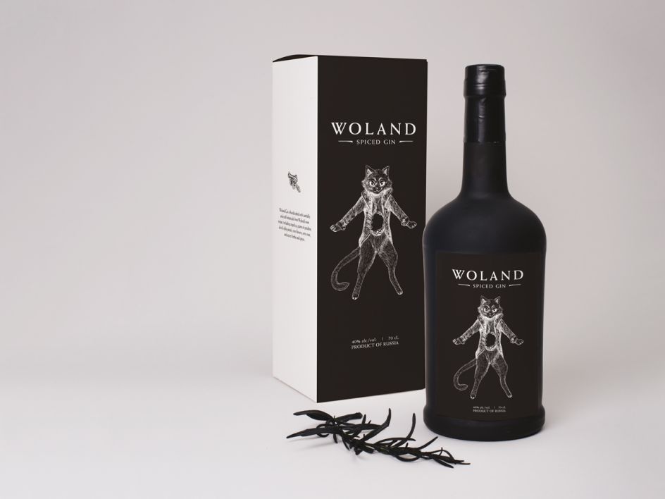
12. Woland Gin by Melinda Harvey
Melinda Harvey was set the task of creating packaging for gin that appeals to magicians. "After finding that modern magicians are fans of the goth and fantasy aesthetic and that many of their illusions involve defying death or appearing immortal in some way, I crafted a story and visual language that appeals to both of these interests," explains Melinda.
"Woland Gin honours a fictional professor of black magic (his name borrowed one of my favourite Russian novels) who brews his gin. One day, Professor Woland's latest batch of gin transforms him into a giant cat with the ability to never die. He tests his immortality repeatedly in public displays of self-execution and becomes a creature of legend. Woland Gin is said to be made with the same recipe as that which turned him into a giant cat."
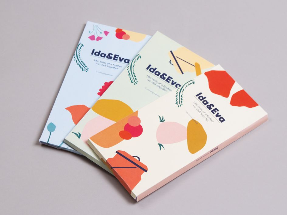
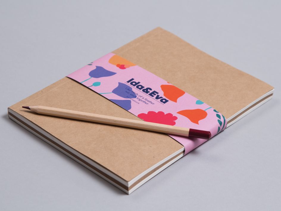
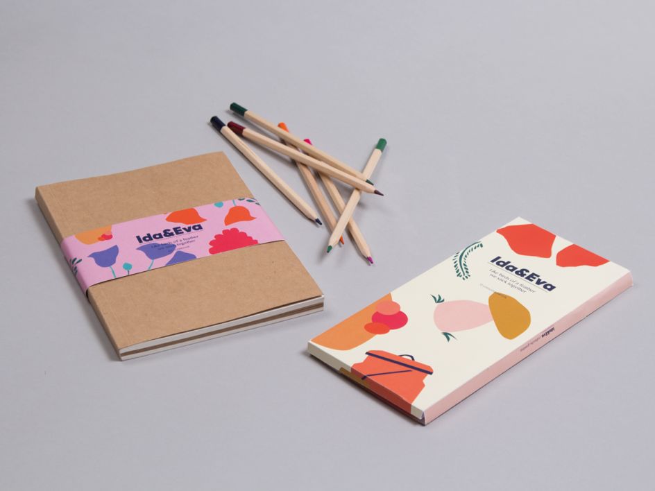
13. Ida&Eva by Natalia Bagniewska
This beautiful stationery brand, Ida&Eva, was developed by Natalia Bagniewska, one of our London graduates. We love the nature theme behind these notepads and pencils and the cute strapline "Like birds of a feather we stick together".
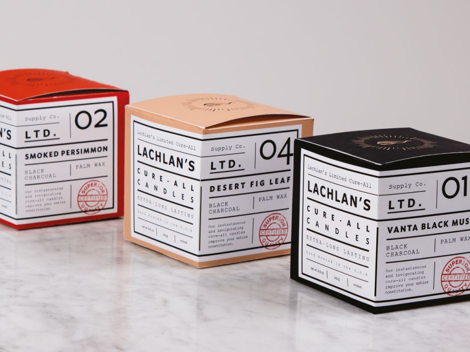
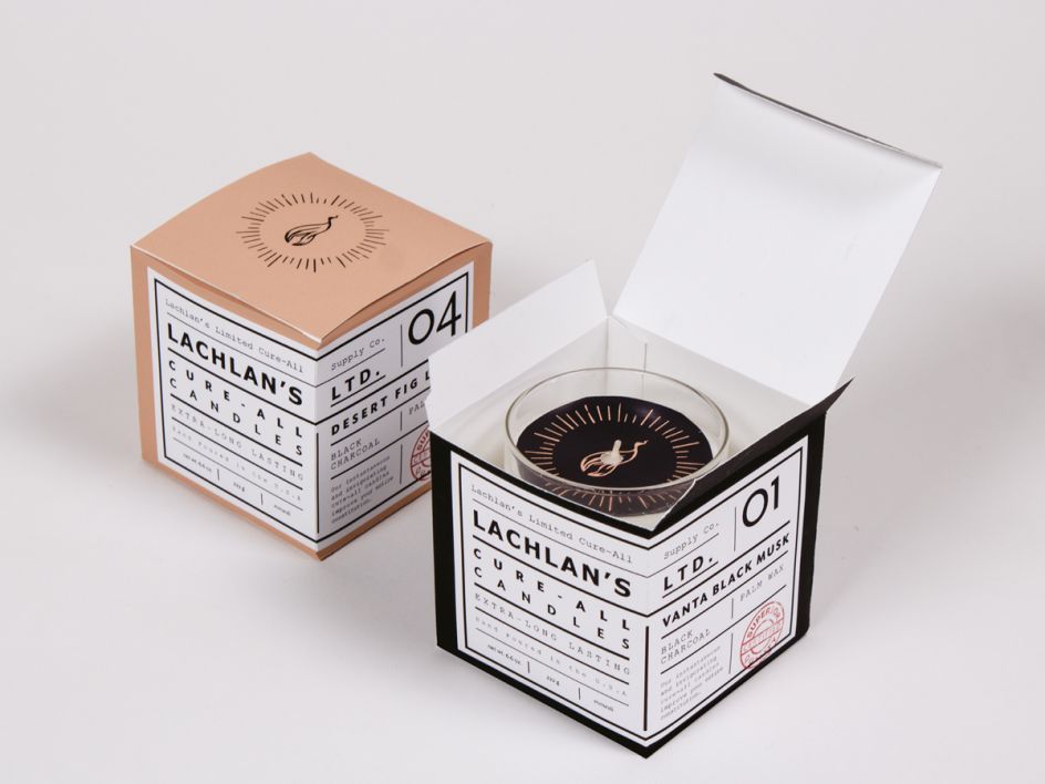
14. Lachlan's by Nick Jacobs
For his packaging project, Nick Jacobs came up with Lachlan's, a long-lasting candle brand that is designed to invigorate and refresh. Available in different scents, such as Desert Fig Leaf and Smoked Persimmon, the clean typography and mature palette gives a luxurious feel.
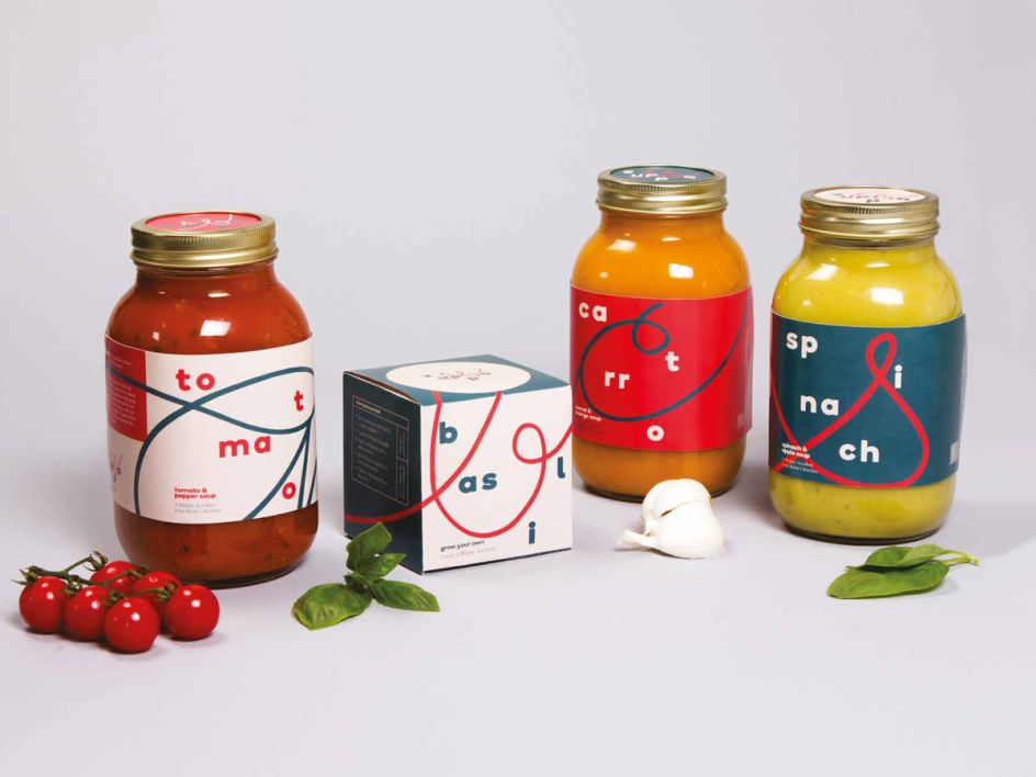
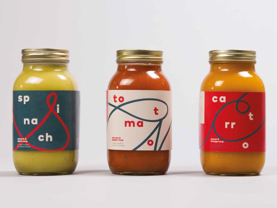
15. Zuppa by Nicole Delaporto
Nicole Delaporto cooked up Zuppa, a soup brand that gets its name from the Italian word for, you guessed it, soup. With a fun and playful typography and tasty palette, the product includes beautifully designed recipe books.
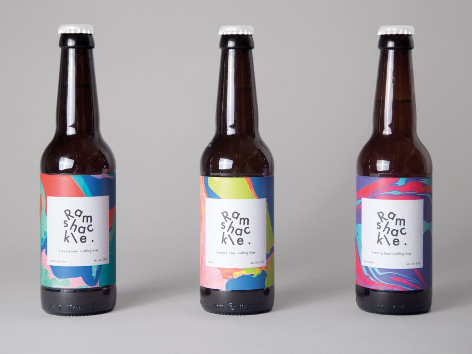
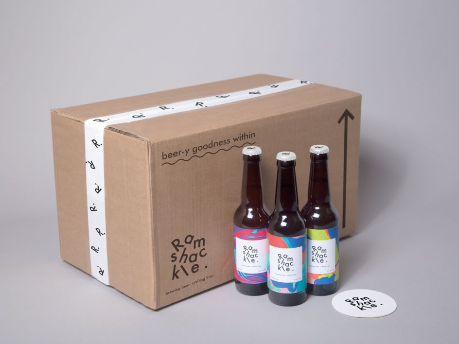
16. Ramshackle by Noe Baba
Manchester Shillington graduate and designer Noe Baba came up with some gorgeous packaging for a fictional craft beer called Ramshackle. "The identity is for a craft brewery with a social purpose that offers opportunity to disadvantaged young people," says Noe. "The concept is born out of the idea of making something positive from a mixed-up situation."
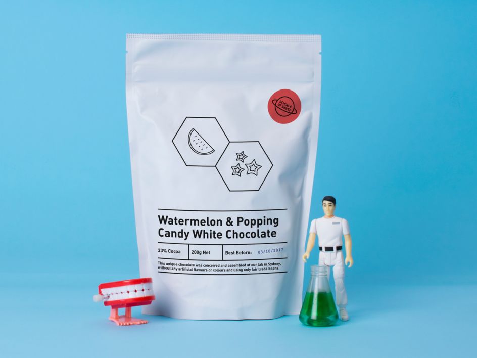
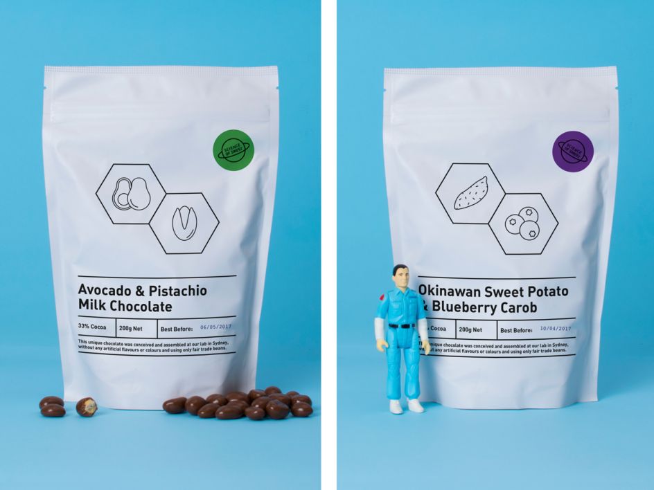
17. Science of Sweet by Robert Mead
"If Willy Wonka were real, he wouldn’t be a whimsical character, he’d be an incredible chemist," says Robert Mead, the Sydney-based designer who came up with Science of Sweet, a fictional sweets brand for his student project at Shillington.
Based around a fictitious institution dedicated to "pushing the boundaries of what chocolate can be for the good of mankind", Robert's product takes inspiration from the Periodic Table and uses a simple monochrome identity with line drawings to represent the different ingredients.
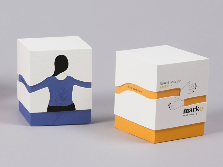
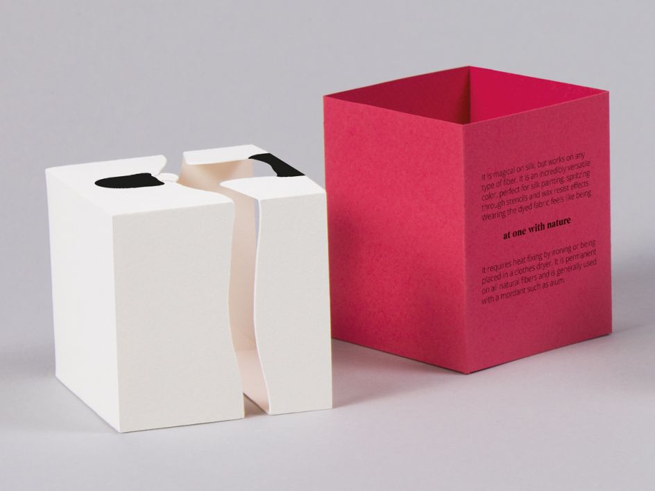
18. Marko by Sepideh Meskoob
Marko is a pretend brand that sells natural fabric dyes, dreamt up by Sepideh Meskoob, one of our recent London graduates. She created its identity and packaging, highlighting the "natural" aspect of the product.
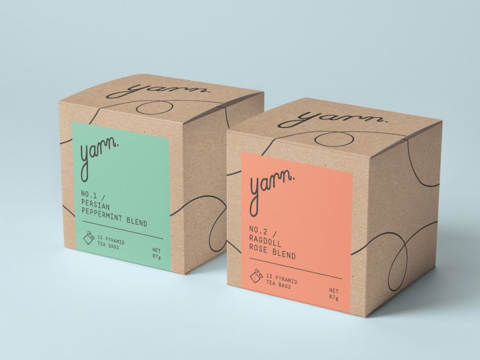
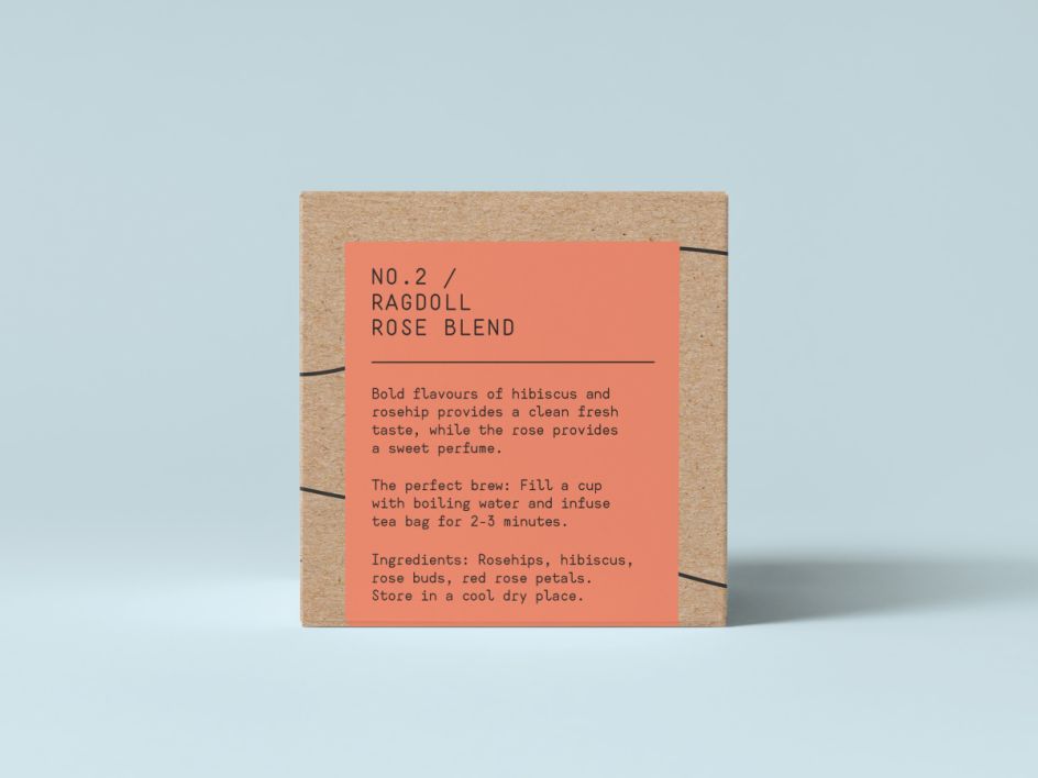
19. Yarn by Tahlia Moloney
This lovely tea packaging by Brisbane graduate Tahlia Moloney, is aimed towards "cat ladies", hence the name Yarn. We love how she's made use of the natural cardboard material in her design and added a handwritten element throughout, with a thread weaving its way across each box.
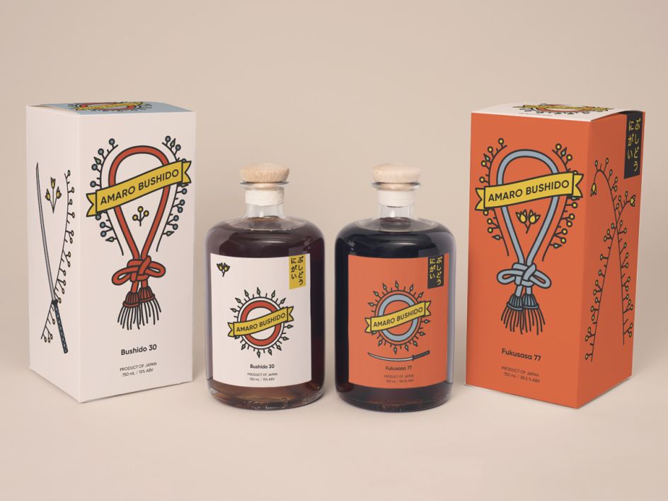
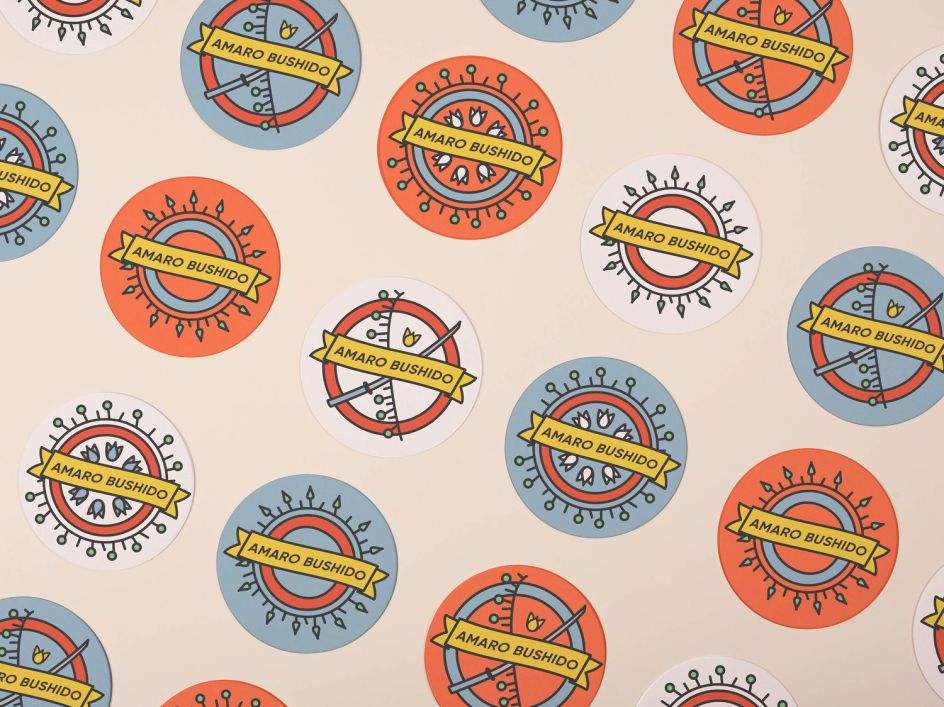
20. Amaro Bushido by Megan Dweck
New York designer Megan Dweck opted for a pretend whiskey brand for her student project at Shillington. Calling the drink Amaro Bushido, this project scooped the 2017 American Graphic Design Award for Student Packaging Design from Graphic Design USA.
"Amaro Bushido is a bitter herbal liqueur with its origins in samurai culture," explains Megan. "The design harmonises classical Japanese visual language with vintage Italian amaro packaging in a modern way."
Further Information
This article was written by Sarah McHugh, who is the Director of Shillington, United Kingdom. An award-winning graphic designer, she has worked in both large and small design studios over the last 14 years. Sarah has extensive experience in book design and has a particular interest in print and material processes.
Editor's Picks


Trending


Podcasts


Editor's Picks
Further Reading