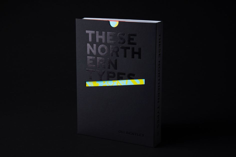
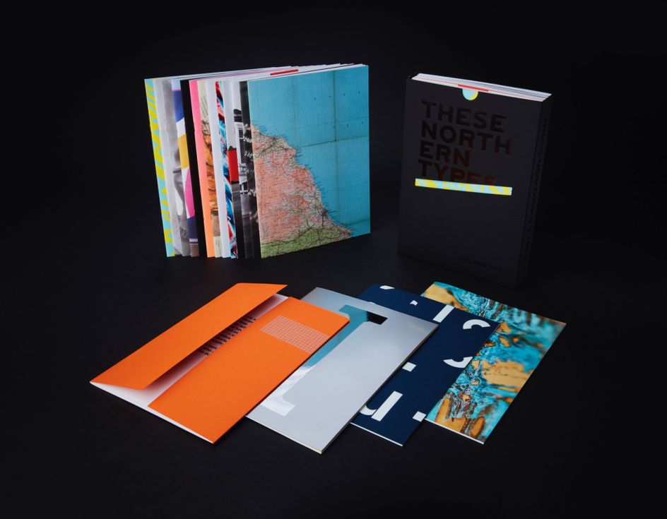
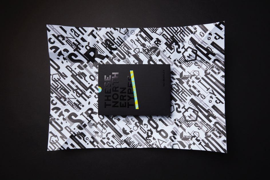
These Northern Types: a typographic exploration of Northern identity
What does it mean to be from the North? Has the St George’s Cross become a symbol of racism? Is "making do and mending" consigned to the history books? Do you want gravy on your chips? Or curry sauce?
These are the questions posed by These Northern Types, a new publication by Leeds-based design studio, Split.
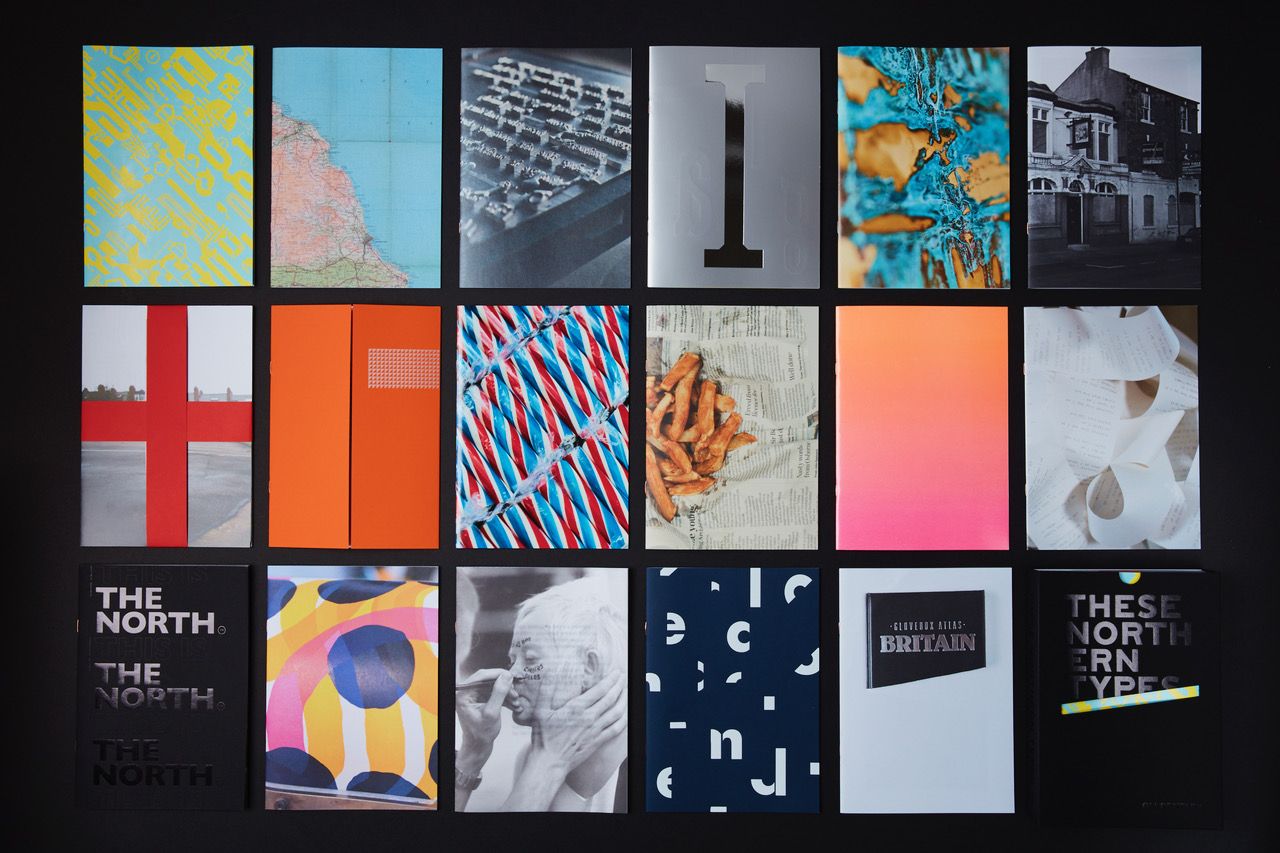
Bringing together type design, experimental production methods, public engagement, and written work, the book considers what it means to be ‘from’ a place, in a globalised age of easier-than-ever access to travel, communication, culture, migration and information to and from all over the world.
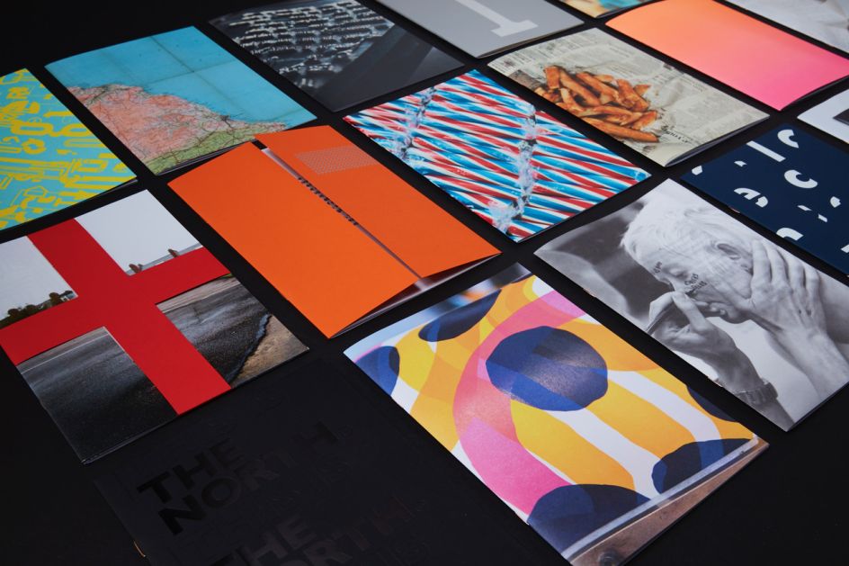
Working with a team of writers, engineers, printers and members of the public, projects range from the fun (making screen prints with chip shop gravy and curry sauce, building possibly the world’s largest letterpress printing press) to thought-provoking (attempting to trademark ‘The North’, printing on lifejackets used by migrants crossing from Africa to Greece), with typography running through the heart of it all.
The publication is made up of 17 small books plus a fold out poster, featuring a wide range of foils and finishes, as well as over 10 beautiful different paper stocks. Accompanying essays come from authors, academics and poets including multi-award winning author Benjamin Myers and writer and musician Boff Whalley.
The book is available to purchase from Split, and you can view a short film about the project here.
Editor's Picks


Trending


Podcasts


Editor's Picks
Further Reading