Carl Rylatt of UnitedUs on how to use symbols in graphic design
Symbols are a powerful asset in your graphic design toolkit, but you must know how to use them correctly. Carl Rylatt offers some pointers with reference to a recent client project at UnitedUs.
Cambridge Healthcare Research
Cutting across cultural, linguistic and national boundaries, there's nothing more powerful than a symbol. Just ask Apple, Shell, Pepsi and others how powerful it is to have one global logo that instantly communicates their brand and values wherever you are in the world.
Carl Rylatt, design director at brand agency UnitedUs, has been putting this principle into practice recently in a major client project for Cambridge Healthcare Research.
Here he chats to us about the benefits of using symbols in brand activation in a world characterised by ever-changing tech platforms, information overload and our dwindling attention spans, and how he puts these principles into action in daily client work.
What is a symbol?
We start with the obvious: what exactly do we mean by a symbol within the context of branding? "Simply put, a logo is a word, and a symbol is a picture," Carl explains. "Symbols differ from signs, though, in that signs tend to be more literal and informative. In contrast, symbols contain meaning, sometimes ambiguously, which can be sensed by the observer.
"This, in turn, creates an interactive relationship between the symbol and the viewer in that one's mind tries to interpret the symbols, thus embedding them in memory and making associations with the brands they represent."
In other words, whether a symbol works is very much a product of the context and broader society in which they appear. "Symbols are conversations between themselves and the observer, which, if resonant enough, can become cultural collateral, universally acknowledged and identified with."
Cambridge Healthcare Research
Cambridge Healthcare Research
Cambridge Healthcare Research
Again, this highlights how symbols differ from signs and icons. "The latter are intended to be informational tools which are more literal depictions of the things they represent or the instructions they wish to communicate," says Carl. "Symbols have more mystery to them and therefore ignite a relationship between the symbol and its audience, leading ultimately to stronger associations with the symbol, and what it represents for the brand it's been created for."
A simple visual cue
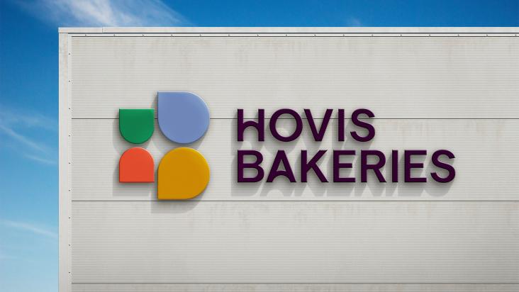
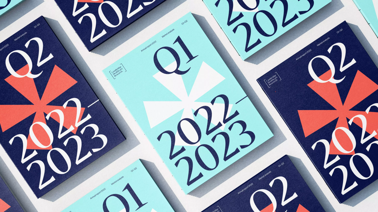
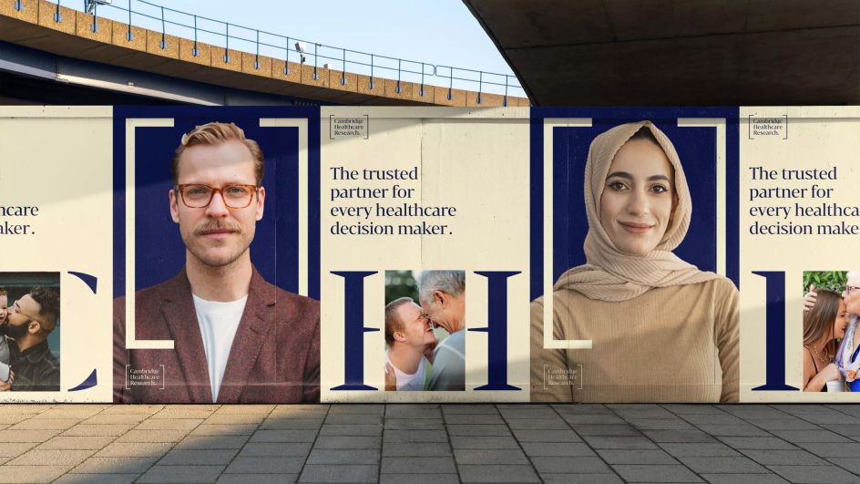
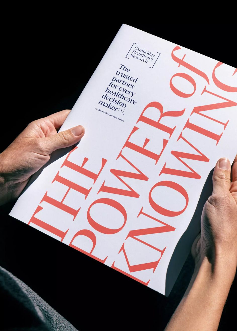
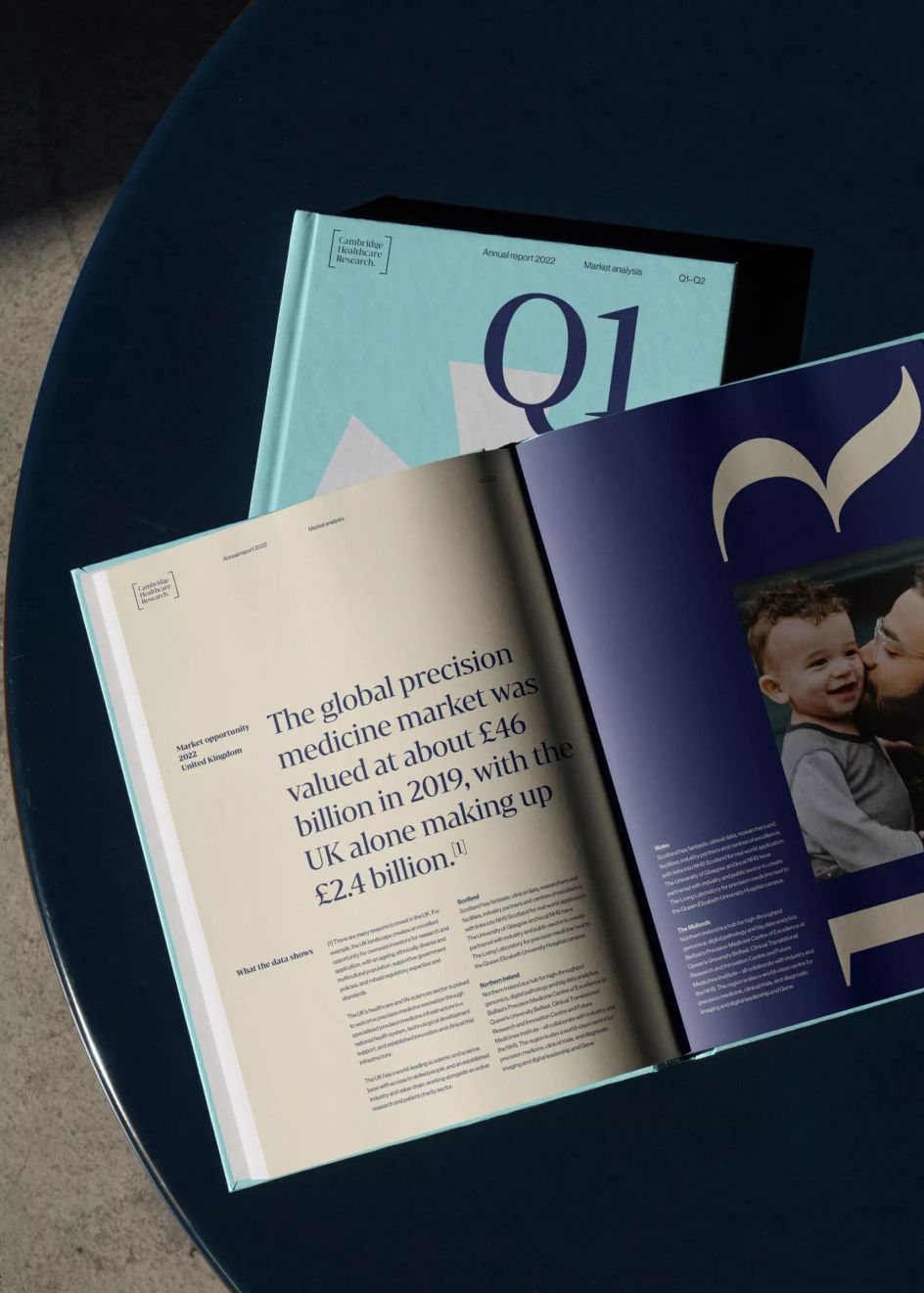
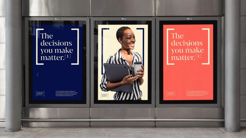
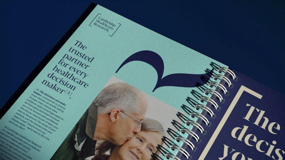
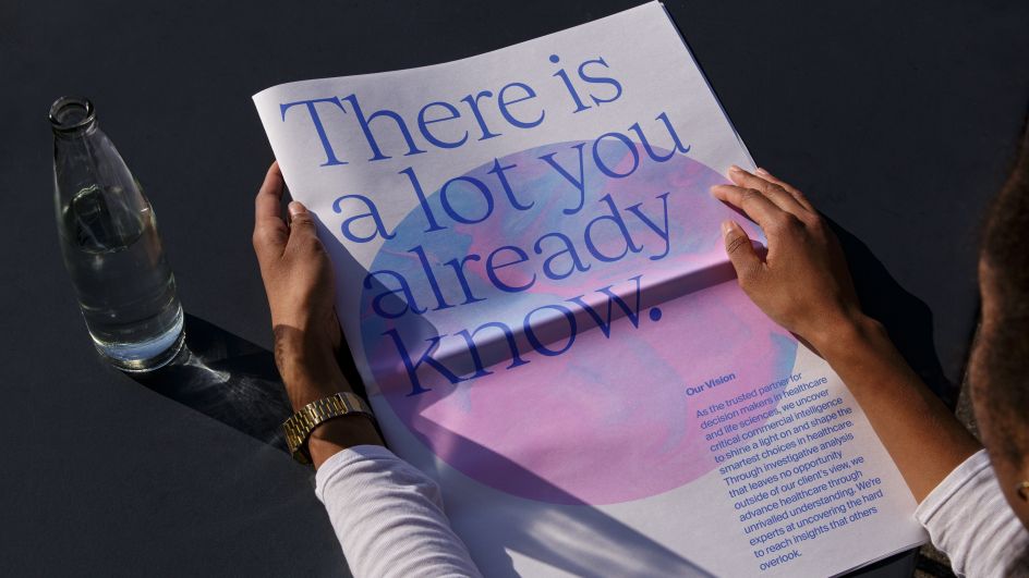
To highlight how all this works in practice, Carl points to a recent client project for Cambridge Healthcare Research, a leading healthcare and life science research body in the UK and the US. The organisation is known for its rigour and academic excellence. UnitedUs wanted to convey this message with a simple visual cue that could be utilised efficiently across various media.
Cambridge Healthcare Research
Cambridge Healthcare Research
Cambridge Healthcare Research
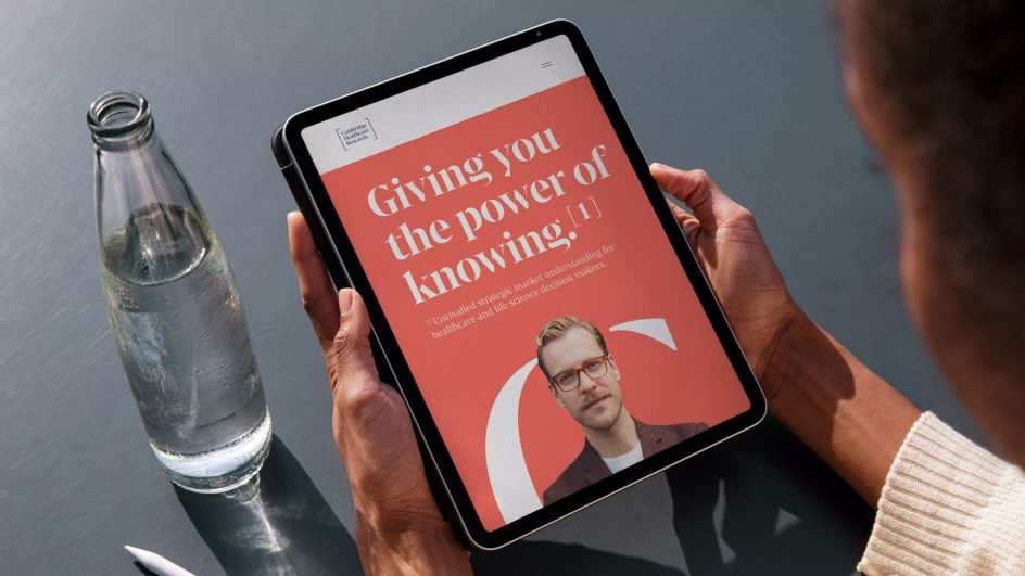
"For this, we used the square bracket citation device used in academic paper writing, which shows the rigorous approach and in-depth verifiable knowledge that academic writing demands," explains Carl. "This device perfectly encapsulated the tagline of 'the power of knowing' for CHR. It provides a simple, recognisable symbol that continuously signifies to the observer that everything CHR do is thoroughly researched."
They also employed a secondary asterisk device in the designs. "This again shows that with CHR, there is always more detail to be found behind the language, more insight and more value," says Carl. "These devices position CHR as an organisation to trust as the device which shows thoroughness in academia is deeply embedded in their identity."
Abstracting the 'O' in Solci
Carl adds that the two partner brands to CHR also use symbols to communicate their brand messages, although at different levels of abstraction.
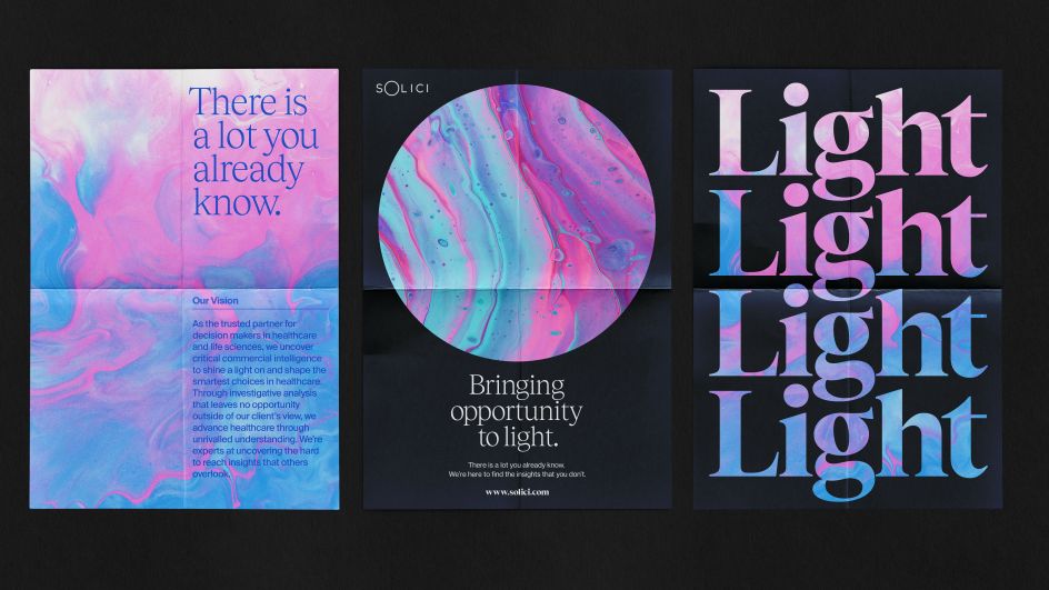
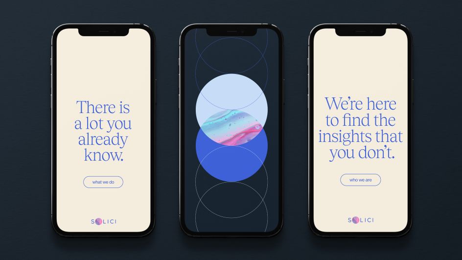
First up comes Solici. "This is CHR's strategic competitive intelligence division, so it still operates under the unifying theme of 'The power of knowing'," explains Carl. "In this case, however, we added the tagline 'bringing opportunity to light', which both references the sun motif in the name and suggests that Solici's strategic insight will find the opportunities to give their clients the competitive edge that others cannot.
Solici
Solici
Solici
Solici
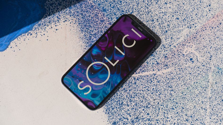
By abstracting the 'O' in Solici, UnitedUs created a device that can be viewed as a literal representation of the sun but also as a point of focus or interrogation, a microscopic lens or a window through which opportunity is brought to light.
"We then abstracted this simple device further," says Carl, "by making it a container that could contain a three-tier system of imagery. The first being the 'light' that Solici shines on their subject, represented by spectrums of light. The second being the surface that has been revealed by that 'light'; the detail uncovered by microscopic imagery. And the third: a more abstract, mystical representation of 'the beyond', suggesting that it is here that Solici's insight penetrates beyond what is already known and into the realms of the undiscovered and unique."
Vox.Bio
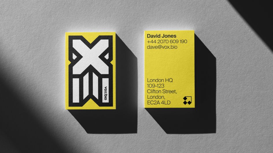
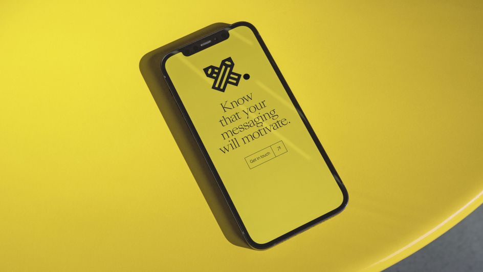
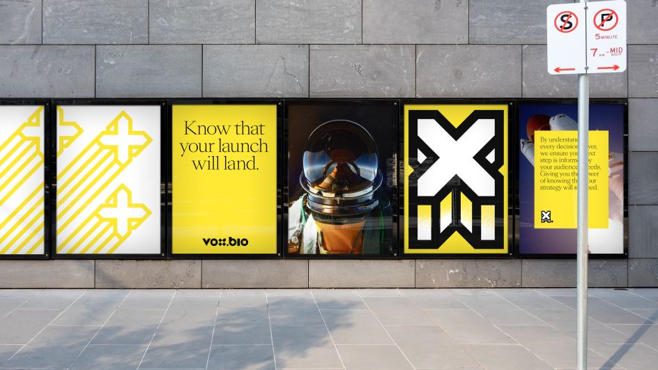
The other partner brand in this project was Vox.Bio, CHR's market research division. "Vox.Bio also uses symbols, but in this case, ones aligned to a particular brand message," explains Carl.
This involved "creating a suite of interchangeable symbols based on the idea of the 'X' in Vox.Bio being an 'x marks the spot' motif," he adds. "With the multiple iterations of this motif, coupled with the flexible strap-lines, the symbols can convey a wide range of meaning and form a flexible system to communicate a range of ideas."
Vox
Vox
Vox
Symbols in graphic design
UnitedUs' work for Cambridge Healthcare Research highlights how useful symbols are to graphic designers and why they have played an important role in so many great projects.
"I'm a big fan of the work Wim Crouwel did at Total Design," says Carl. "His logo and symbol work pretty much established the modern method; he was similarly successful like Kubrick was with 2001: A Space Odyssey, in that he managed to create a graphic language of typographic and symbolic language that was ultramodern but not 'futuristic'. As a result, in both examples, the work hasn't dated.
The influence of Wim Crouwel's grid-based, ultra-minimal, single-colour approach to the mark is still evident today. "And still, for me, it represents a gold standard of how to approach symbol design," says Carl. "After all, with new tech enabling us to create more complex, more colourful, more detailed work, isn't it simplicity that will stand out?
"I'm just as happy working in a maximalist mindset as I think some of the studio's output shows, but when it comes to the symbol, something that can be easily recognised, understood, adopted, and in the end, loved by its audience, I think the old principles still hold sway. You could do a lot worse than starting here."