Team's packaging for new cocktail harnesses the joyous energy of jazz
Blue Note Jazz Club's new signature drink, created in partnership with Wandering Barman, needed to convey the spirit of jazz in visual form. Team explains how it met the brief with a fun and innovative solution.
Graphic design is typically about grids, order and visual organisation. Jazz, especially freeform jazz, is the opposite: full of energy and life but purposely all over the place.
So when the legendary Blue Note Jazz Club teamed up with a craft cocktail brand and tasting room, Wandering Barman, to create a new signature drink, that threw up an interesting design challenge. One that Team, an independent strategy and design studio based in Brooklyn, were keen to take on.
Team, a longtime collaborator of Wandering Barman, worked across the project to create a custom label and packaging design that embraced the latter's eccentric spirit and the nightclub's renowned legacy.
Chaos with intention
Since 1981, Blue Note has been a cultural destination in New York City and remains one of the premiere jazz clubs in the world. In the run-up to the club's 2023 summer jazz festival, Blue Note joined forces with Wandering Barman to bring their signature quality and craftsmanship to an improved, bottled version of their Blue Note cocktail.
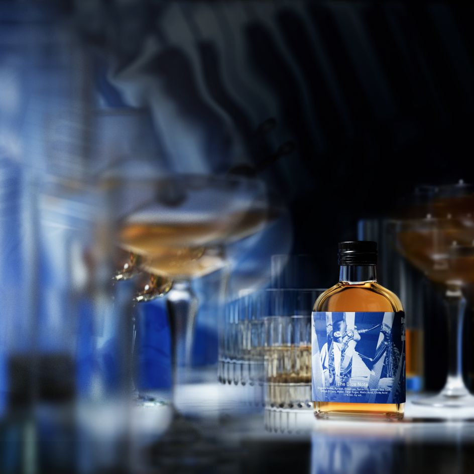
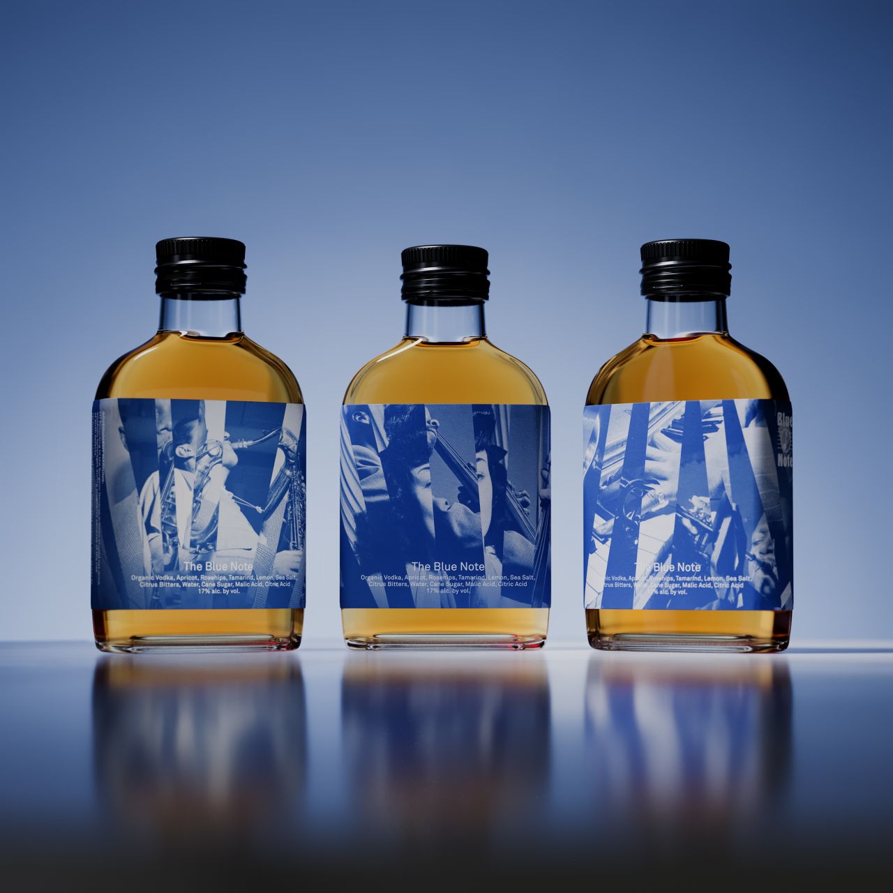
Team's visual direction embraces the out-of-the-box spirit of jazz with hand-built collages composed primarily of archival photographs of jazz legends performing on Blue Note's storied Greenwich Village stage.
This collage element also nods to the musical element that gave the bar and the drink its name; a 'blue note' is an imperfect note between the cracks of conventional pitches. "Just as a blue note is played with purpose, the Blue Note design practises chaos with intention," explains Stephanie Zabala, associate design director at Team.
Authenticity and balance
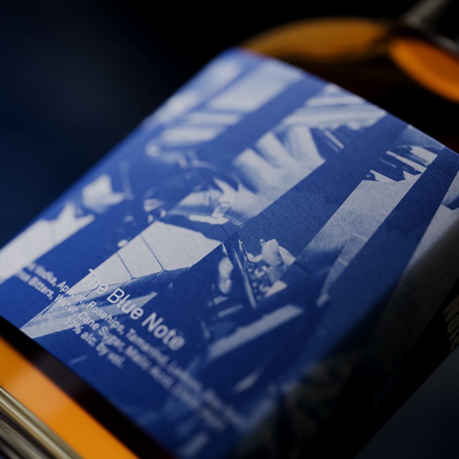
It was crucial that the packaging reflected both brands in the collaboration authentically, nodding to elements of the other while remaining balanced as a single identity. Incorporating Wandering Barman's collage style, each of the three labels is created from two images interlaced to create an unexpected optical illusion and brand-new composition.
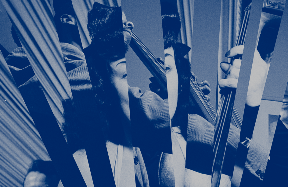
Team's designers physically hand-cut and arranged Blue Note's archival photography to create the collages, putting a real spotlight on the artistry at the heart of this product.
The result is a bottle that captures the distinct Wandering Barman experience, fuelled by the joyous energy of jazz music and serves as a keepsake of Blue Note's prestigious history as a cultural institution.
Experimental ethos
"The concept really resonates with both the Blue Note and Wandering Barman ethos: experimentation, unexpectedness, and artistry," says Stephanie. "Each collage artwork is created by combining two distinct images into one abstract yet melodic composition.
"Together, the set of three labels features an ensemble of instruments to capture the collaborative nature of music. As a result, the concept evokes the energy and spirit of jazz and the ephemeral nature of each performance."
"In flavour and aesthetic, the new bottled version of The Blue Note is designed to celebrate the bar's incredible contribution to jazz history and its ongoing future as a cultural cornerstone for New Yorkers and jazz lovers around the world," adds John Clark, co-founder and creative director at Team.
The Blue Note bottled cocktail will be available for purchase at Blue Note's summer jazz festival and all Blue Note locations worldwide.
Editor's Picks


Trending


Podcasts


Editor's Picks
Further Reading