Standards Manual pays homage to the ham radio era, by resurfacing the art of QSL cards
The latest Standards Manual project unearths another treasure trove of forgotten graphic design goodness. We learn more from the founders of Order in New York and share why we think their new book deserves a space on your bookshelf.
Well-known amongst the graphic design profession, Standards Manual is an independent publishing imprint founded by Brooklyn-based designers Jesse Reed and Hamish Smyth in 2014. They're on a mission to archive and preserve artefacts of design history and make them available to future generations.
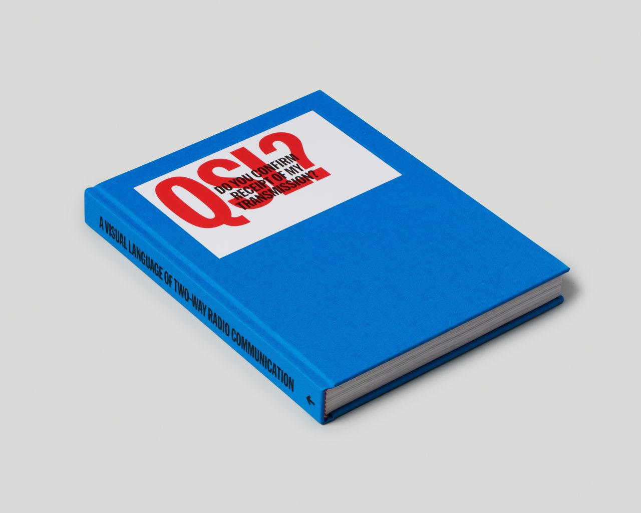
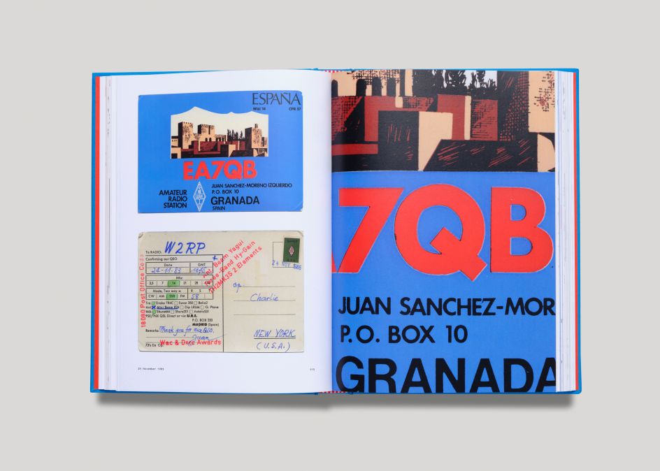
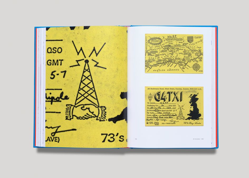
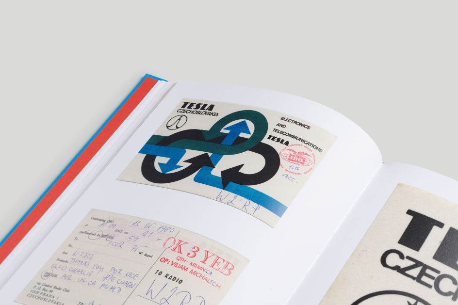
They've found much acclaim by resurfacing the style guides of the New York City Subway, NASA and EPA. But their latest project, their 10th to date, is by far their most esoteric yet. QSL? (Do You Confirm Receipt of My Transmission?) is a collection of over 150 'QSL cards', showcasing the often overlooked visual history of amateur (aka 'ham') radio.
We chatted with Jesse to find out how they went about curating it, and what the project has taught them about design in general.
What is a QSL card?
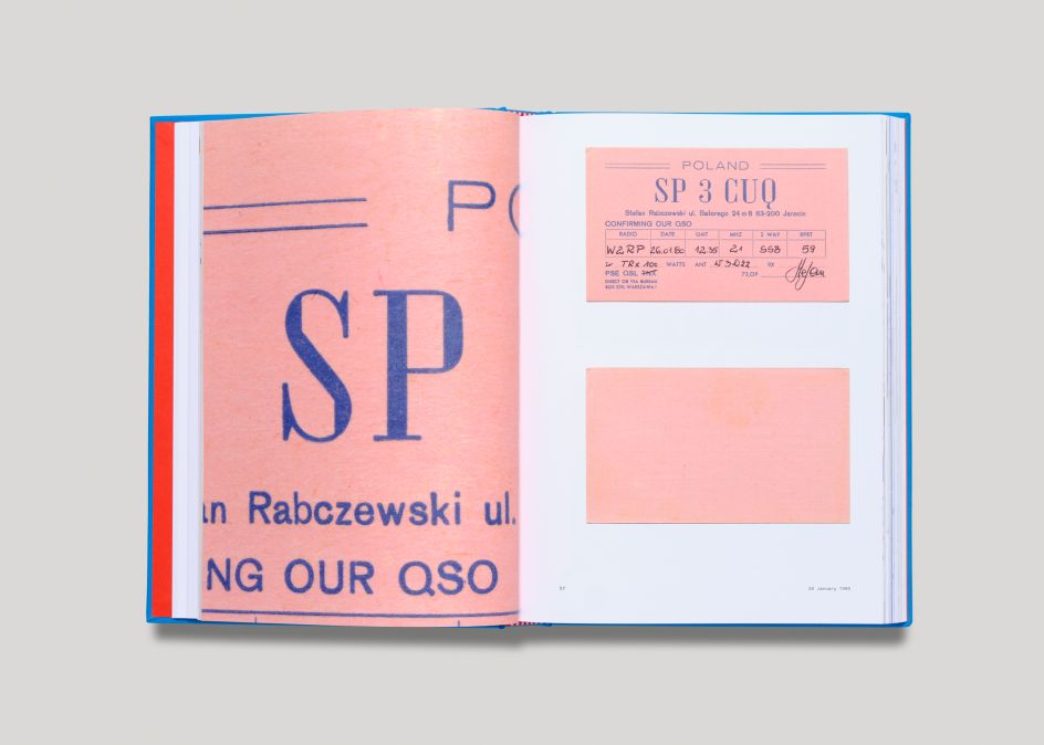
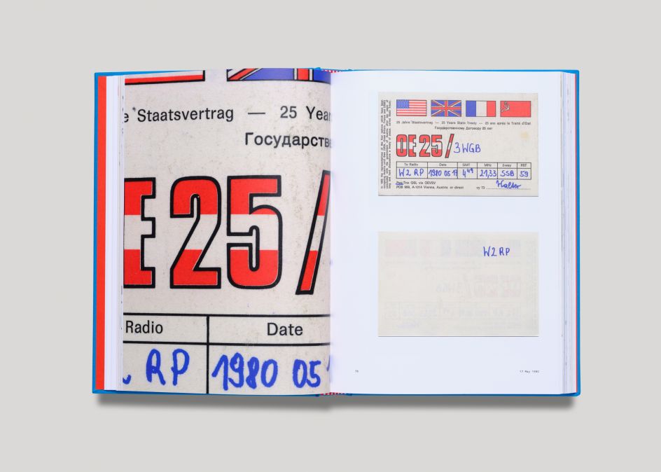
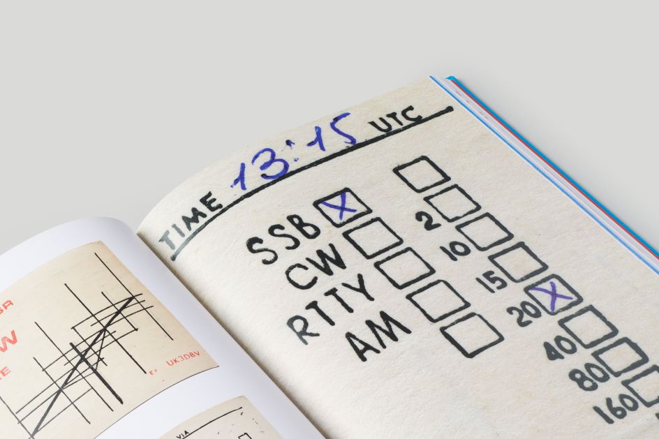
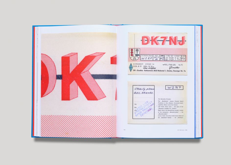
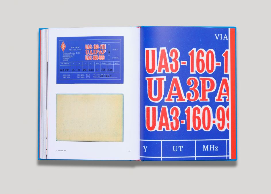
Around the same size as a postcard, a QSL card is a written confirmation of either a two-way radio communication between two amateur radio or citizens band stations; a one-way reception of a signal from an AM radio, FM radio, television or shortwave broadcasting station; or the reception of a two-way radiocommunication by a third party listener.
Archived from the collection of designer Roger Bova, the cards reveal a rich typographic expression that is rare in their authenticity — each card a personal reflection of the station’s operator.
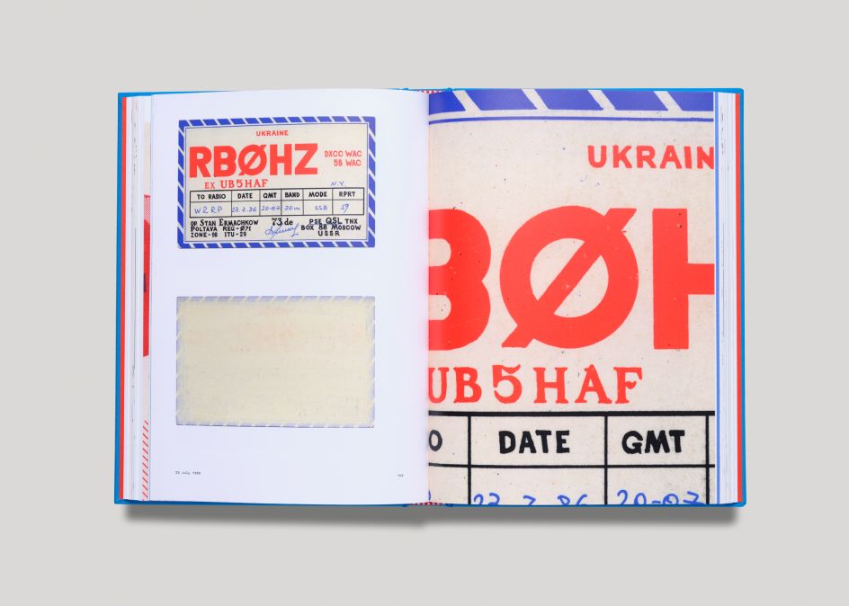
"One of my favourites is from Station RBØHZ; we use it as the 'QSL card anatomy' example in the book's introduction," says Jesse. "What I love most is that the entire card is completely hand-drawn, yet with stunning precision and just enough personality that it doesn’t look forced. This 'amateur' approach exemplifies why the cards are so interesting. They’re crafted by each operator, who are presumably "non-designers", yet their decisions are so keenly astute.
"This one in particular displays three different typographic styles: a Geometric Sans, Condensed Sans, and a Transitional Serif. That's not easy to pull off! Even down to the hand-drawn border, the balance of precision and personality is charmingly perfect."
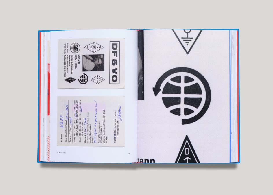
He adds: "It’s hard to choose favourites, but if I had to make another selection, it would be the backside of Station HA5KAG, specifically for its 'ORION' logo. I remember seeing this symbol during our initial review of the cards, and I thought, 'This is what makes each card so special'; which is the small icons and marks that likely go unnoticed.
"But when you enlarge them to see the detail, boy are they juicy! This phenomenon reoccurs throughout the collection, and it’s what we tried to amplify as much as possible."
Echoes in the present
A topic mostly unknown to those outside of the amateur radio community, QSL cards represent a time in global communication before the internet age, yet are surprisingly similar to the social media handles of today.
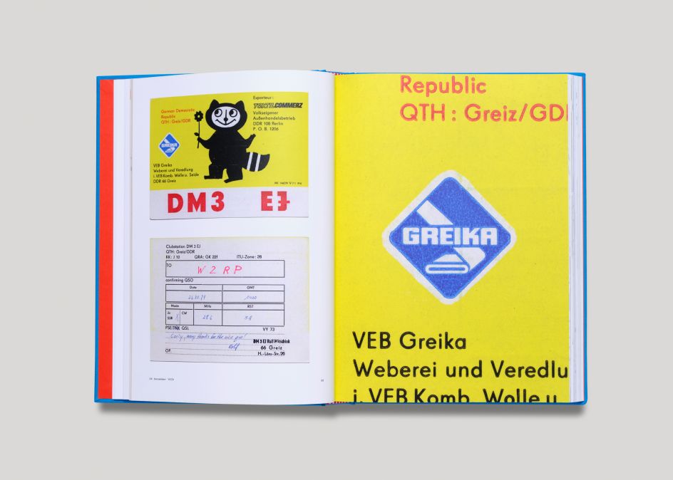
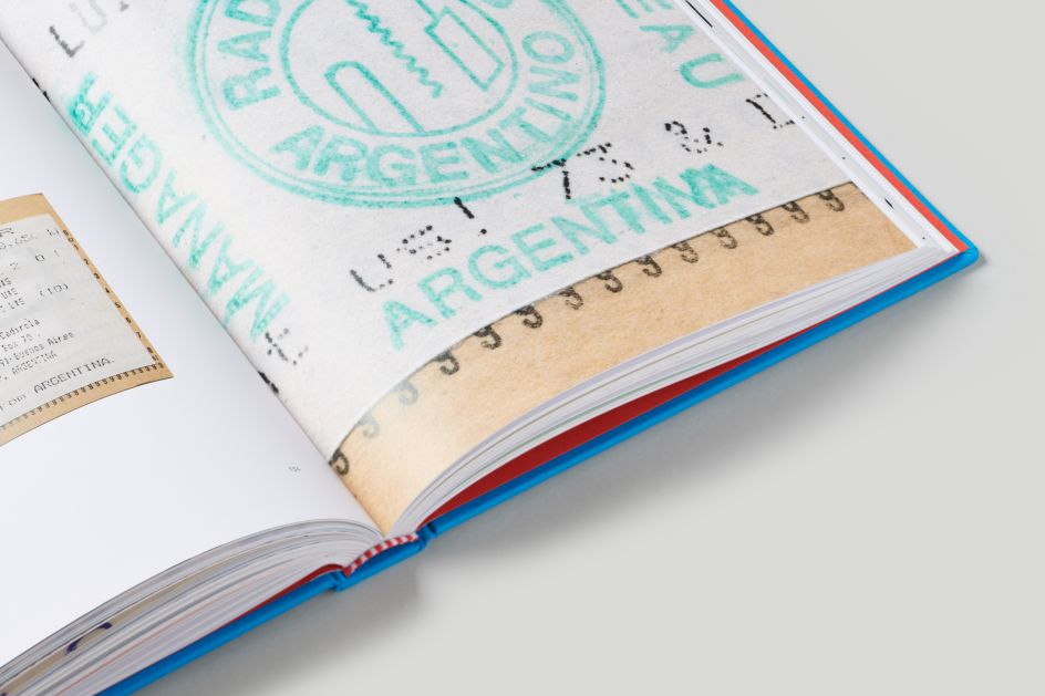
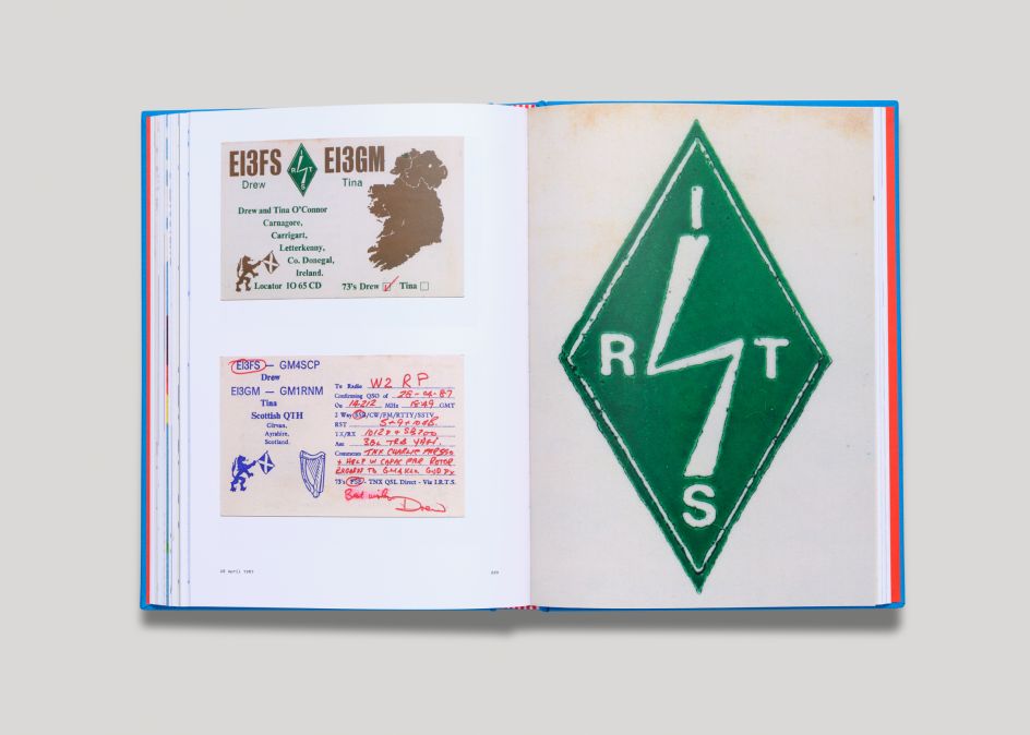
Each card prominently displays a typographic call sign on the front, often followed by technical contact data on the reverse. They were typically produced by either the radio operators themselves or a local print shop. And the results are broad in approach: some minimal, others maximal, hand-drawn, photographic, or a hybrid of media.
This collection, however, is somewhat special.
After discovering the stack of cards at an antique store in upstate New York, Bova began to research the repeating call sign he noticed as the receiver of each card: station W2RP. It turned out to be that of the late Charles Hellman of Hastings-on-Hudson, New York.
As reported by the ARRL (National Association for Amateur Radio), Hellman "may have not only been the oldest surviving radio amateur in The United States but, at 92 years, also may have been the longest licensed." He passed away in 2017 at the age of 106, and this book is a window into the community he and thousands of others were a part of.
Typographical themes
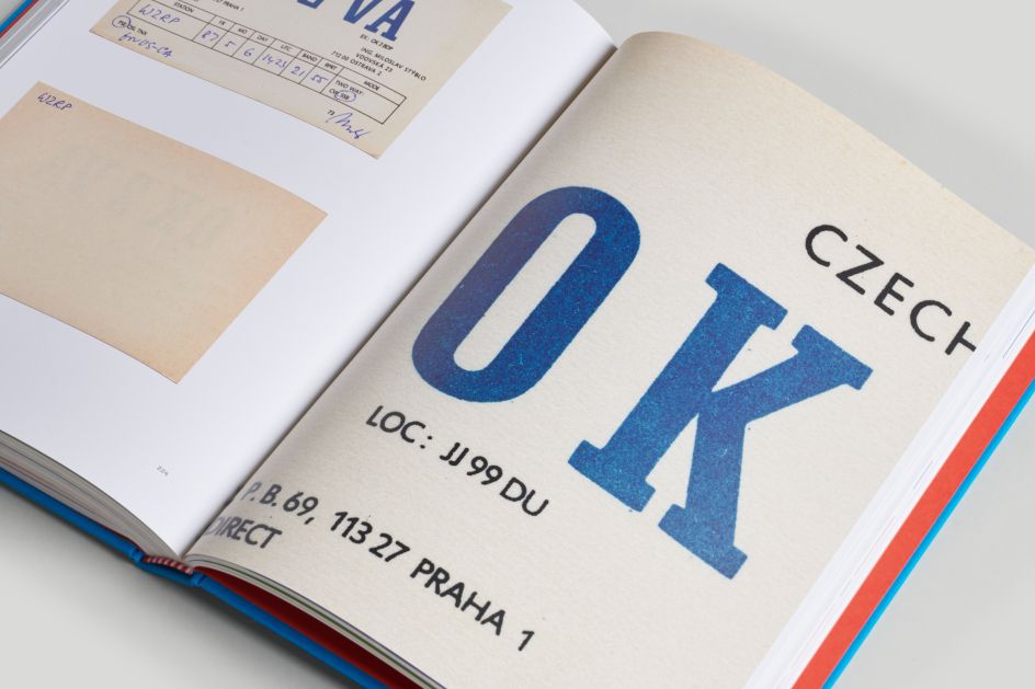
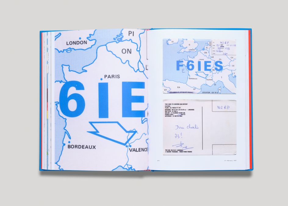
The cards in the book are displayed chronologically, starting in the late 1970s through to 1989. Each is shown at a 1:1 scale without any modifications to its original design, including both the front and back sides. Throughout the book, details are included alongside particular cards, enlarging various elements at 500–600% scale. This decision was made during the early planning stages of the book, something the publishers thought designers, archivists, and radio enthusiasts would appreciate.
"Typographically, there's not necessarily a standardised visual theme," says Jessie. "But I'd say most cards display their call sign in all uppercase. Because of this, I think a lot of operators go for bolder weights of type, but again, it’s not a universal truth. I will say, in terms of colour choice, red, blue, and black seem to be the most common, hence our choices for the book's cover design."
That said, another piece of background material included in the introduction – written by scholar Marc Da Costa, who also sourced the supporting imagery – is a spread from CQ magazine, which suggests how to design your own QSL card. The text goes into surprisingly poignant detail about best practices for approaching design. As one passage reads: "Type face [sic], or the style of lettering, can also have a subtle but noticeable influence in delivering the printed message. Obviously, a solid, blocky, bold-face type would be much more suitable for the use of a contractor or blacksmith than it would be for a jeweller, the latter deriving better representation from a graceful style of type or script."
Project origins
So how did the project come about? "When we were shown each QSL card, less than 30 seconds passed before we knew we needed to archive them for a book," explains Jesse. "Ham radio was a familiar topic to us as a hobby but had never seen this side of the practice. As graphic designers ourselves, producing work with this much care, freedom, and character is almost impossible to do in the corporate world — we all need this reminder that design can be personal and fun!"
As Marc Da Costa notes in the book’s introduction, “The sending of physical QSL cards has been on the decline recently, but the ARRL bureau still handles hundreds of thousands of them each year." The publishers hope this book can inspire a new generation of hams, designers, or collectors of visual culture, to appreciate the slower methods of communication from days gone by.
Jesse adds: "Honestly, some of the cards from the '70s and '80s, in this book, at least, are just as contemporary as a Nike or Starbucks campaign today. Of course, there are examples that some designers would consider poor, but that’s subjective and for you to decide. Like our other 2019 title Parks, there’s something for everyone, which is precisely the beauty of a diverse, 'inconsistent' body of community-generated work."
Contemporary relevance
And it's not just an exercise in nostalgia, he continues. "If there’s one major takeaway from QSL cards, it’s their precedent to what social media is today," says Jesse. "The call signs are our modern-day social handle, and their design is no different than your profile avatar. This was Twitter before Twitter, and instead of a follower, you got a QSL; much more satisfying if you ask me."
And he hopes readers enjoy learning about QSL cards as much as he did himself. "Before our collaborator – Roger Bova, who owns the collection – exposed us to his discovery, we knew nothing about this particular aspect of the ham radio community," he explains. "After digging further and learning more through the fantastic research of Da Costa, we were enamoured with the QSL card component: their creativity, role, and representation of the act of 'making contact'.
"As practising designers, it’s so refreshing to learn about a design practice that has existed for so long, yet is only familiar to a group of people actively participating in the practice. It goes to show that there are always new communities, art forms, and expressions out in the world. Never stop searching!"
Editor's Picks


Trending


Podcasts


Editor's Picks
Further Reading