Posters by Formist that champion 'inventive' typography
Letters are kind of a big deal for Formist – the renowned publisher, type foundry and design studio based in Sydney, Australia. And now it's bringing a whole load of new letters to your walls with the launch of some fresh type posters this month.
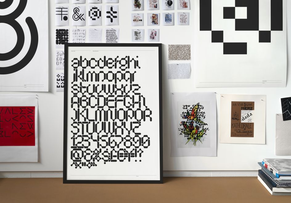
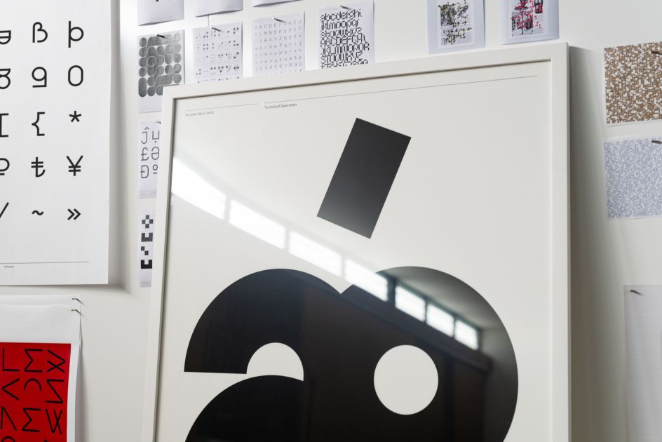
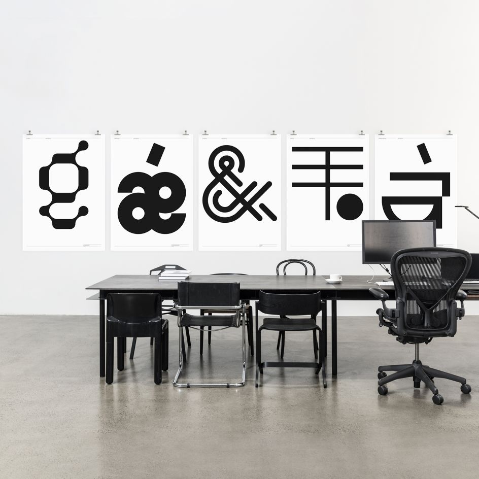
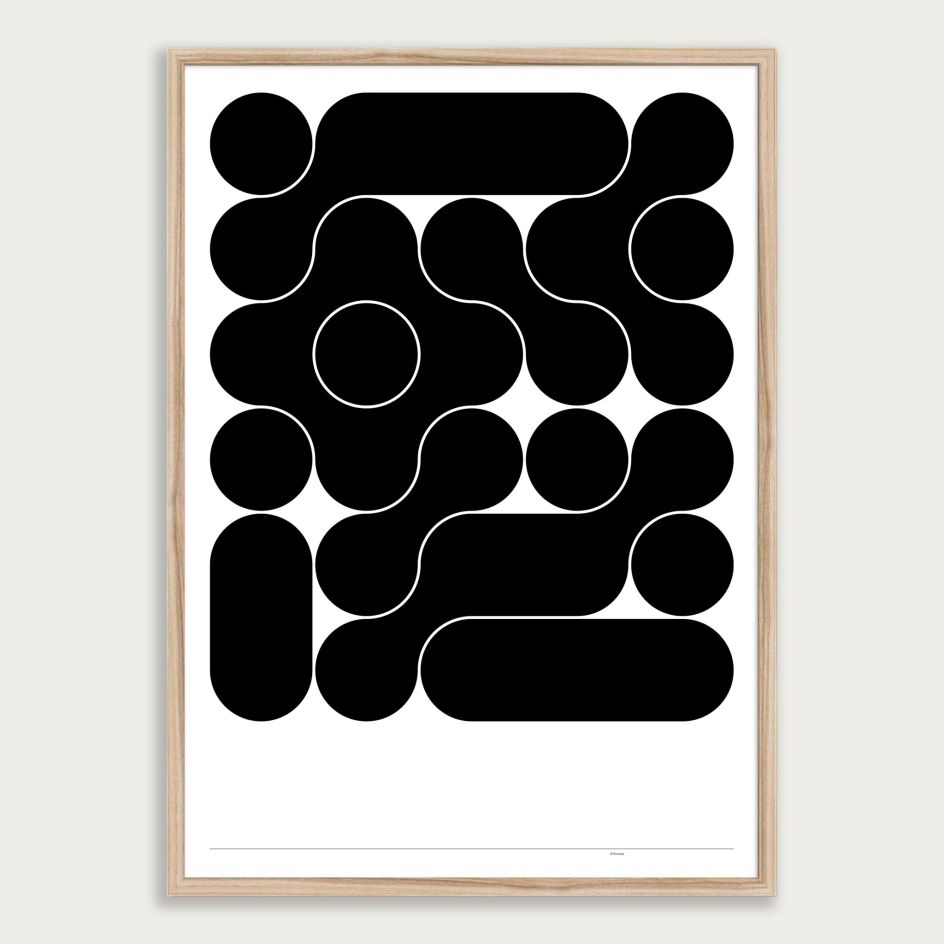
It's part of an ongoing series featuring letters chosen from bold and expressive typefaces published by its own foundry and is designed to act as a "striking reminder of the beauty of language and the graphic resilience of the Latin alphabet". The typefaces in question include Serous, Boulder Mono, One & Two, Black and NON Dit-Dah.
And as the type is exclusively designed by Formist founder Mark Gowing, you won't find anything similar elsewhere. The collection features 34 different posters, available in striking black and white, and is a mix of single letters, numbers and more detailed character sets. Available in A0, A1 and A2 sizes; and framed in A1 and A2 sizes.
"When I design a typeface, I find there are always characters that stand out and become key forms in the overall scheme, so they inevitably make great posters," says Gowing. "Some of these posters feature strong or creative letterforms, while others seem like graphic abstractions, but I assure you they are all type, and most of the posters include detailed typographic specifications to provide some clarity."
The posters are giclée printed with water-based inks on FSC approved 200gsm fine art paper and ship globally at low rates. All are available unframed or framed. You can see the collection at formisteditions.co.
Editor's Picks


Trending


Podcasts


Editor's Picks
Further Reading