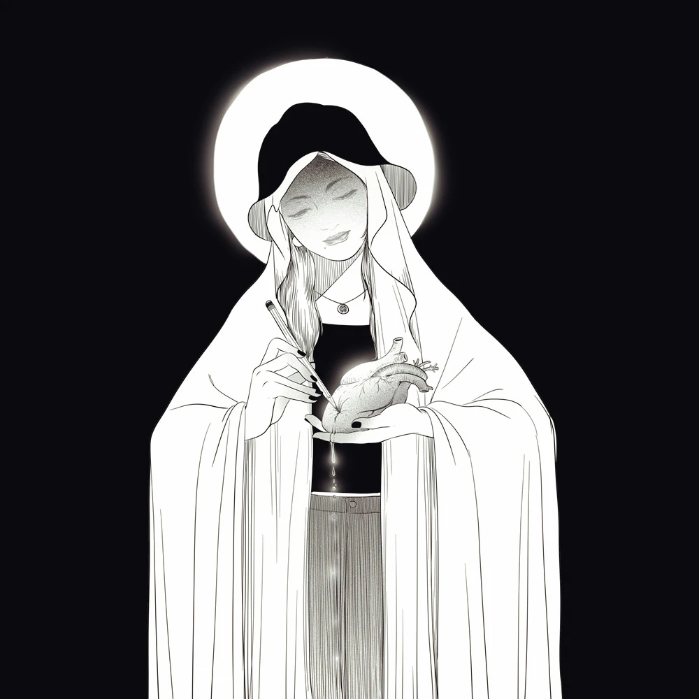
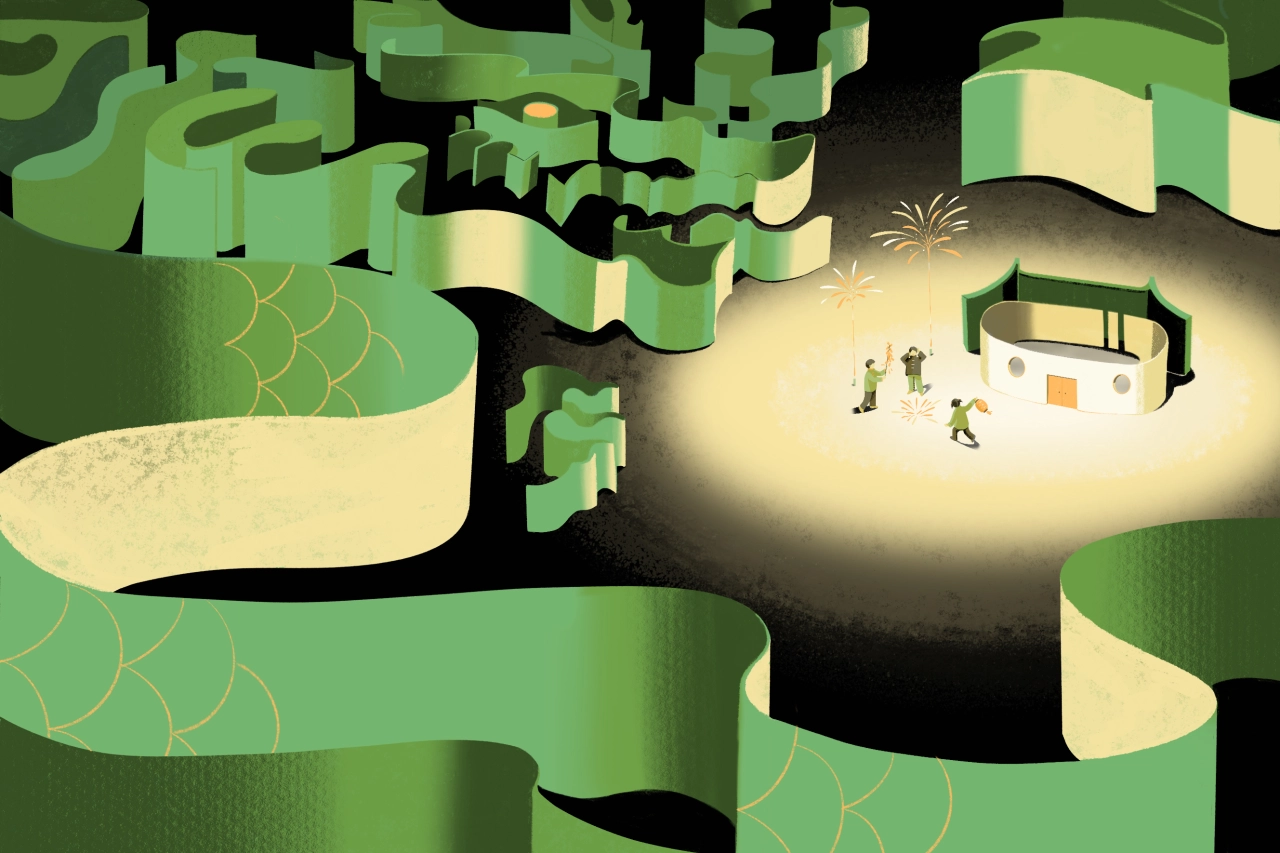
Illustrations by An Chen draw inspiration from old matchboxes and typography
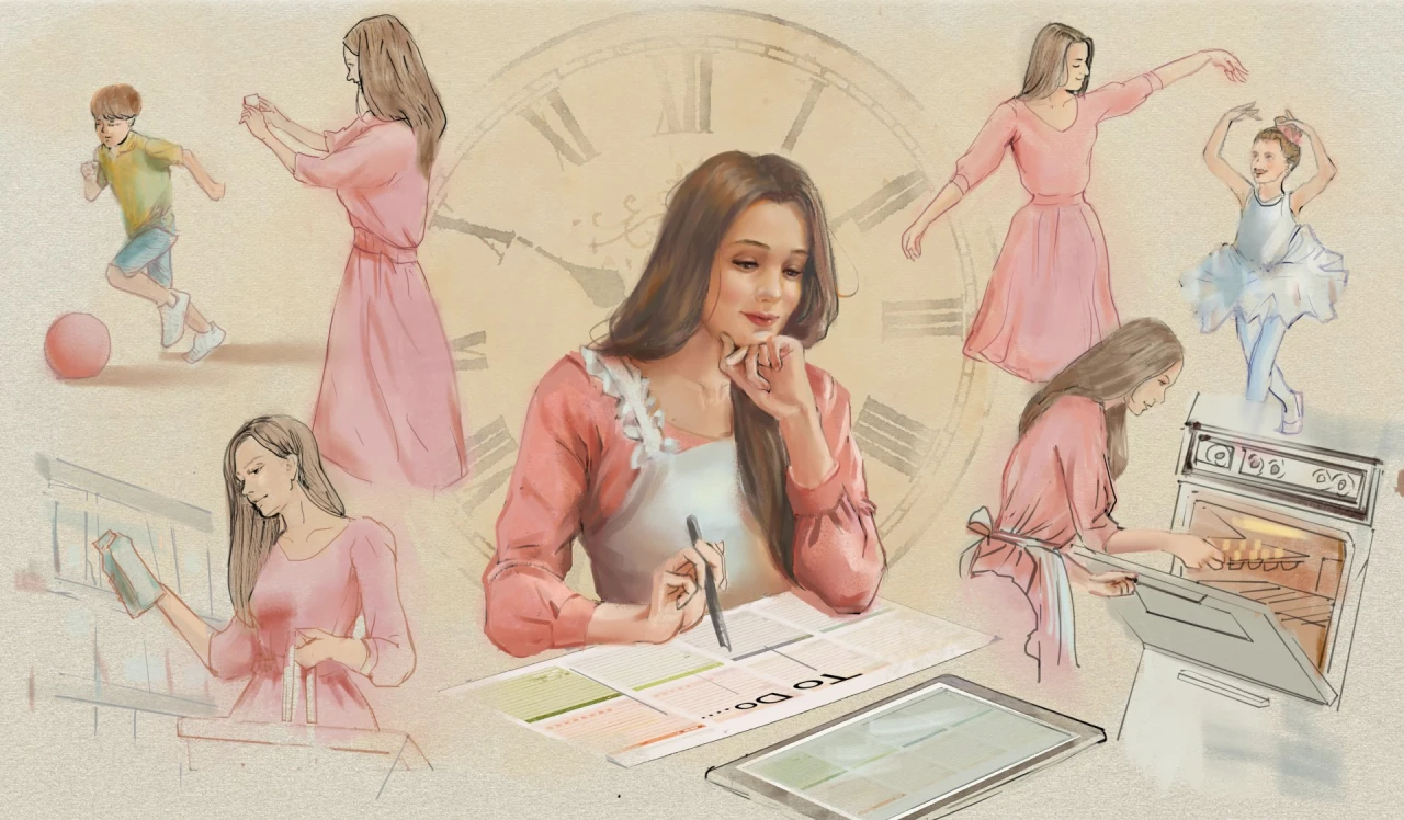
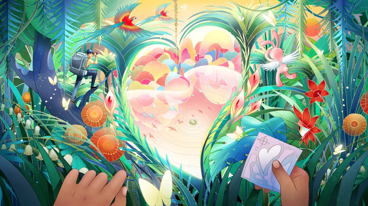
Taiwanese illustrator An Chen has created editorial art for The Wall Street Journal and The Boston Globe and self-published her own zines and pop-up books. But what unites all of her work is an art style that's influenced by old matchboxes, shapes, and even typography.
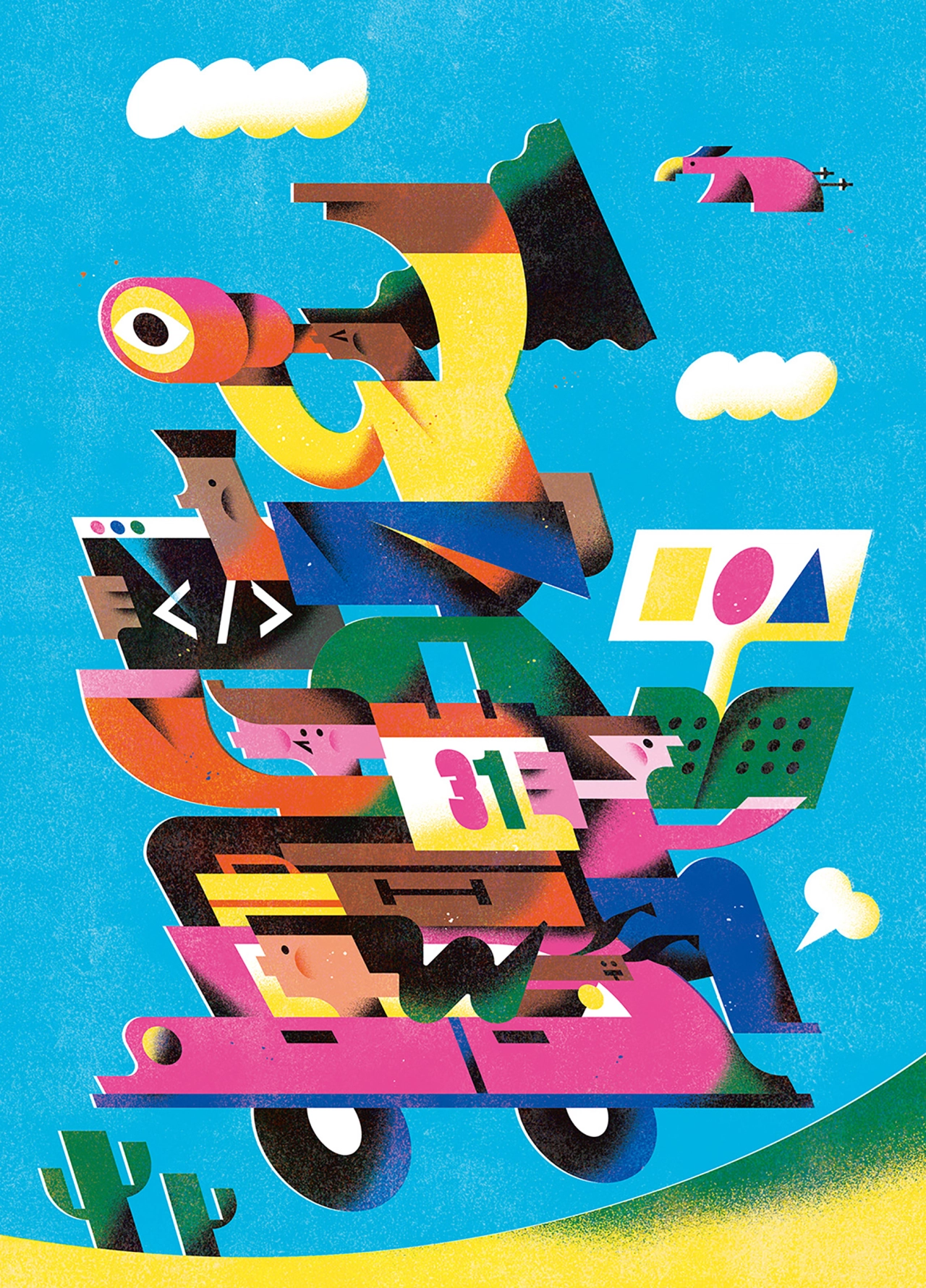
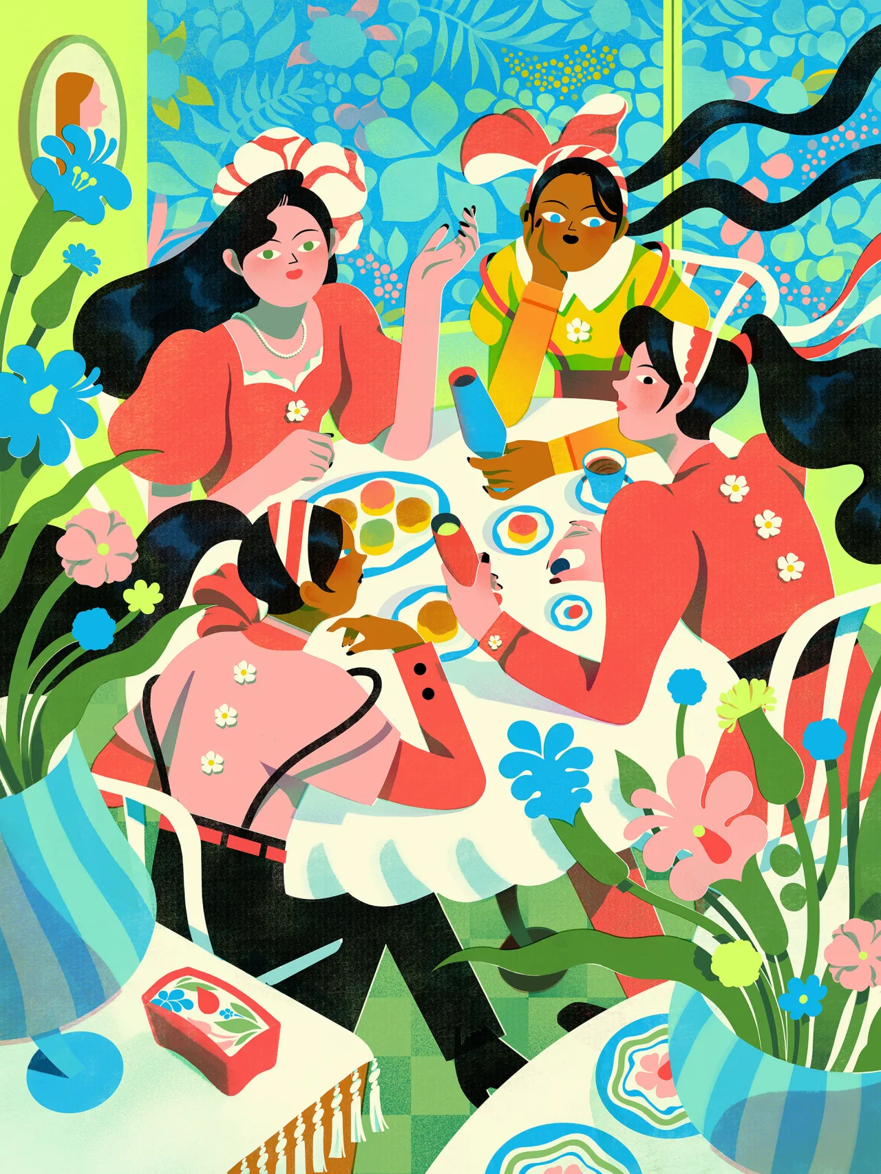
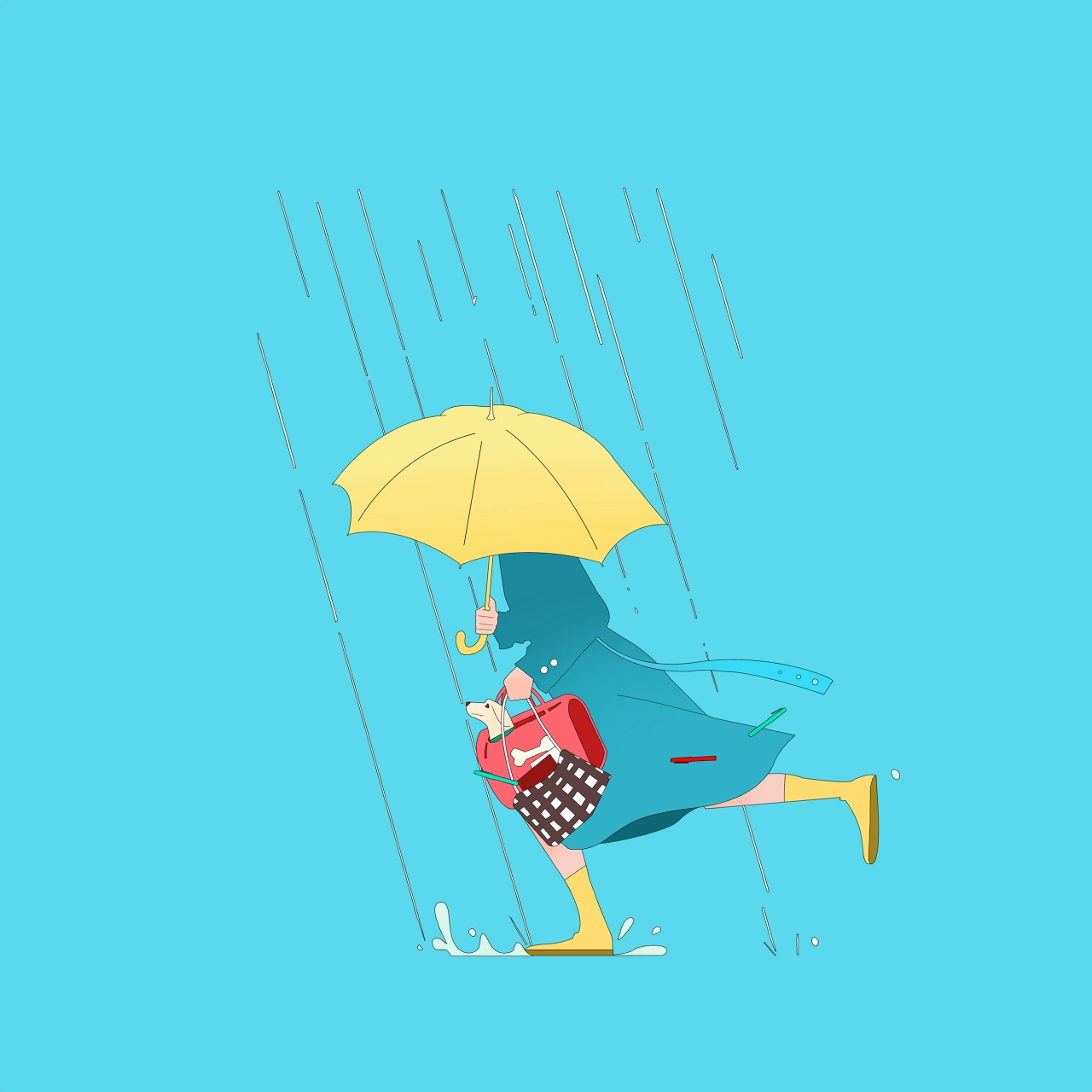
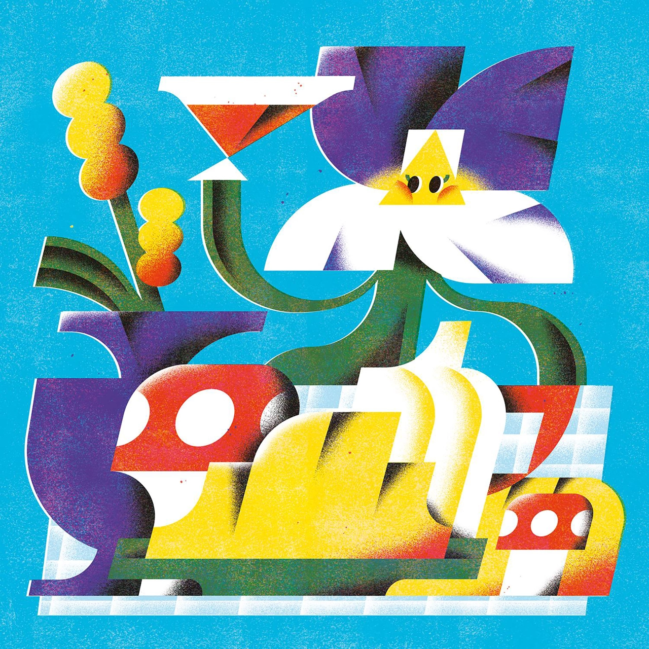
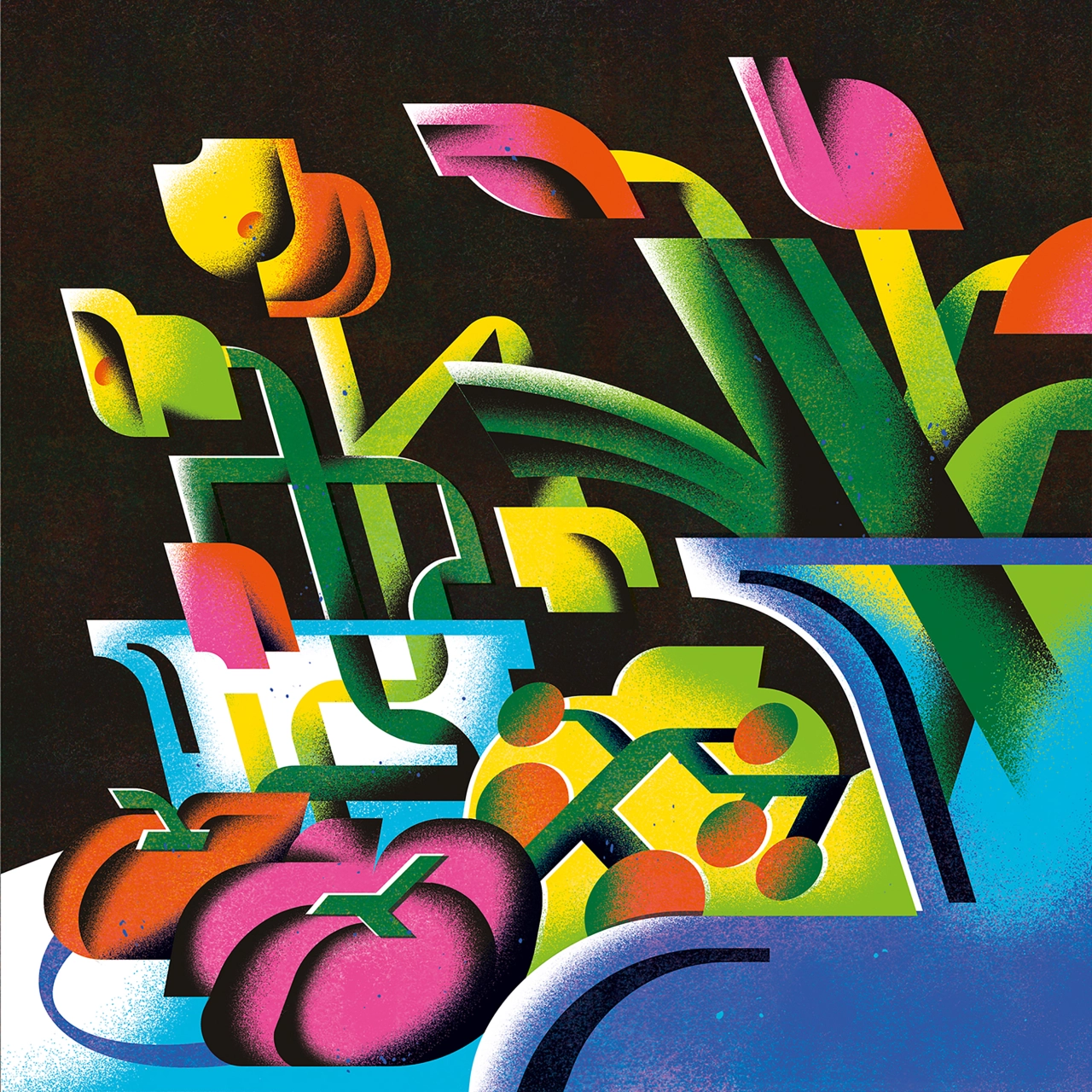
Olympic athletes, office workers, and flowers are recurring images in An Chen's portfolio, whose contents have graced publications worldwide. Instantly recognisable thanks to their distinctive shapes and grainy, faded colours, An's art makes a strong impression by being both modern yet reminiscent of an image you've seen before but now forgotten.
Perhaps the secret to this feeling of misplaced nostalgia is due to the fact that her art is strongly influenced by matchbox designs from the '50s and '60s. There's a touch of Soviet-era space race aesthetics going on here, which, when realised digitally, create a compelling duality and tension with viewers.
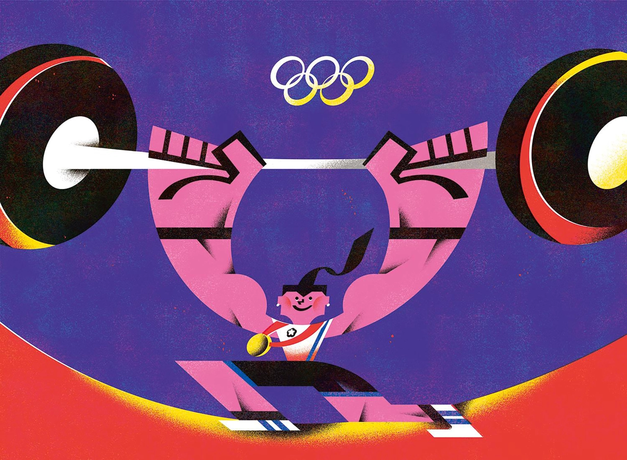
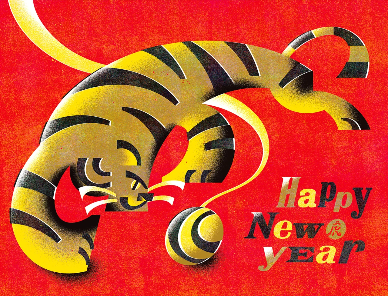
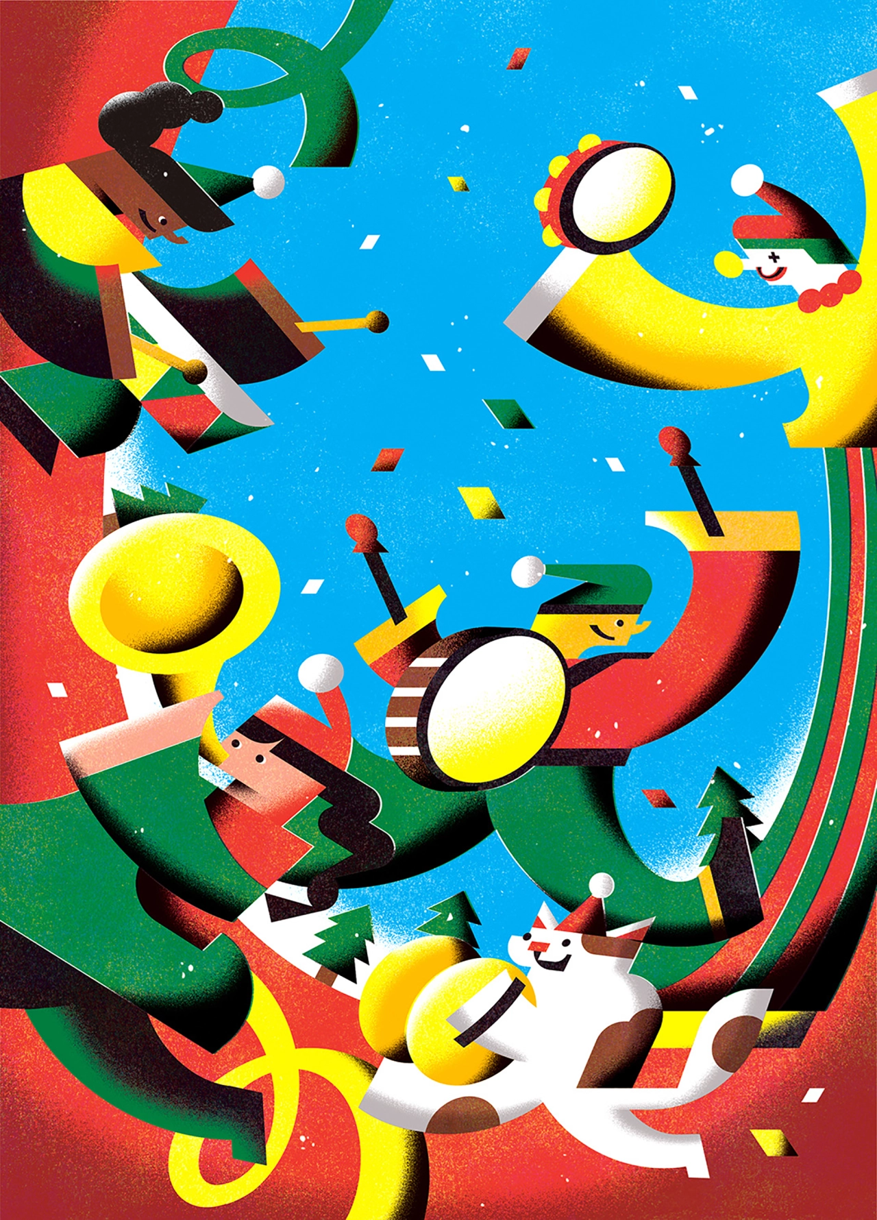
Having graduated from Cambridge School of Art with a Master's degree in Children's Book illustration, An has used her background in graphic design to refine a style that plays into her strength of using vector shapes to create art. She also tells Creative Boom: "My illustration creating methods are hugely influenced by typography. You can observe in my work that I often shape my illustrations with bracket serif or make them "italic". For the textured side, I love 1950-60s matchbox designs, especially those from the Soho Lipnik factory. I use monoprint to reproduce the old printing texture they have."
As for her course, while An's studies trained her to create books for a young audience, they were also broad enough to allow her to explore her own artistic interests. "We didn't learn how to create beautiful illustrations. The main instruction of the course was to observe things surrounding you and depict them through sketches," she reveals.
"After a period of observational drawing, our interests would reveal themselves, which we would then pursue further with narrative imagery. I think that's the main essence when creating art. It should be genuine to yourself."
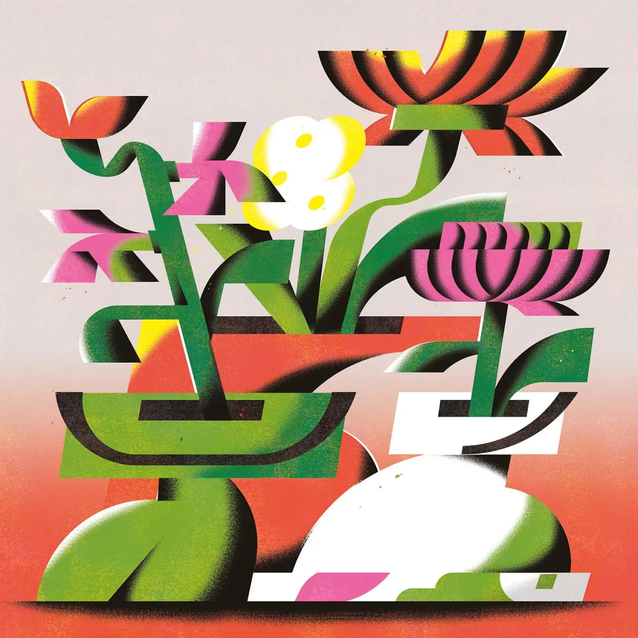
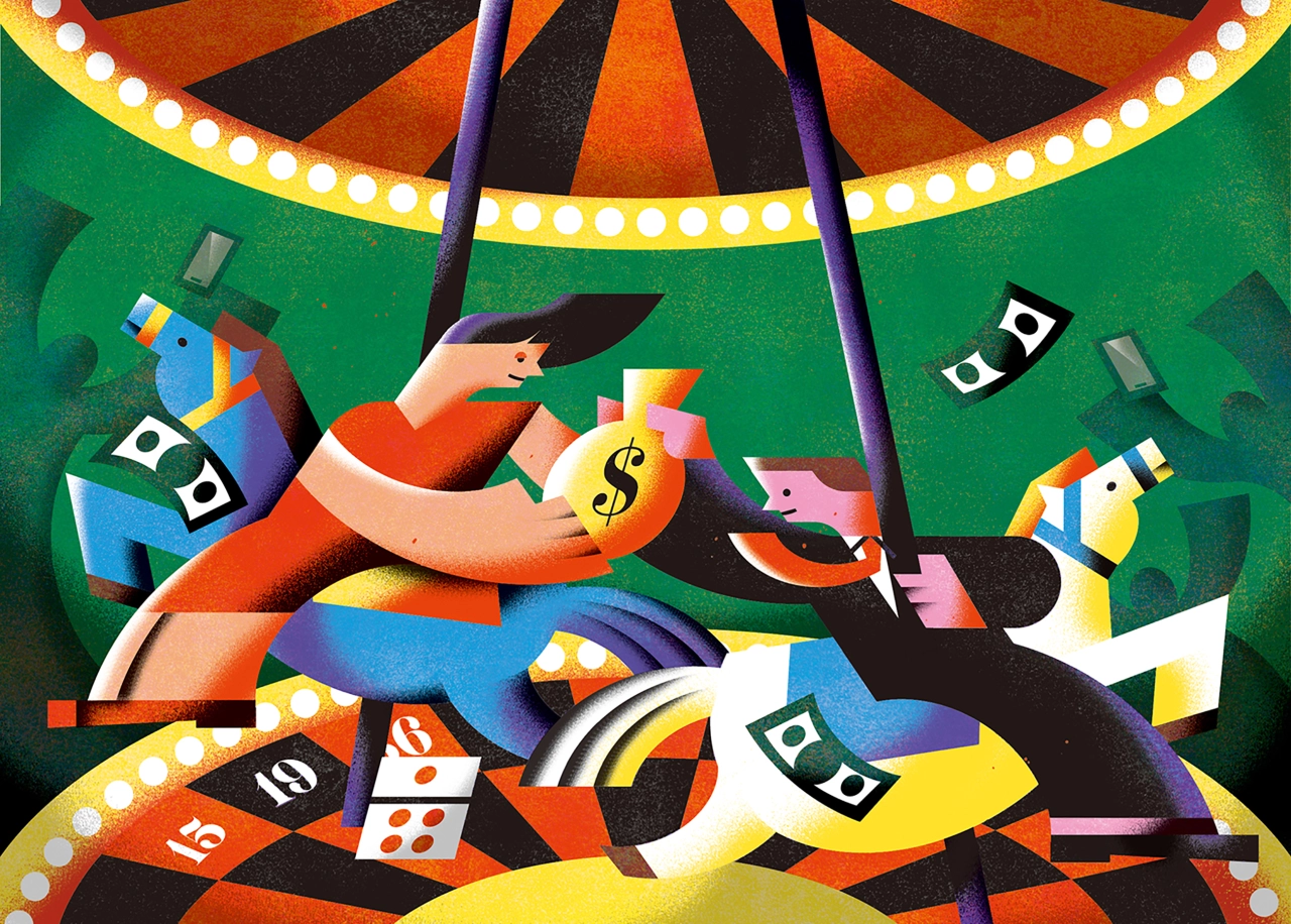
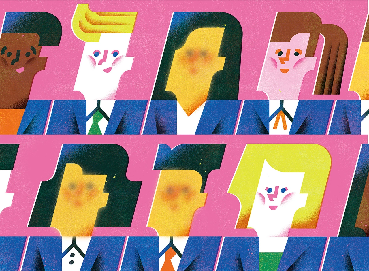
To bring her genuine artistic essence to life, An uses Adobe Illustrator to create the main illustration, then uses Photoshop to apply texture. Two types of mask layers are applied to create these textures, including a monoprint one that she made with a rubber block. Meanwhile, the other one consists of a dotted texture that she made from an image of a concrete wall with super high contrast.
"I also use a spray brush I made to copy the shading effect I like from Cubist and Futurist paintings," An adds. "I love the high contrast between dark shades and bright colours. It gives me a mysterious feeling."
Since graduating, An has moved back to Taiwan, where the illustration industry is thriving. And it's not just due to book fairs and illustration markets. "I would say we have a strong influence from Japanese culture, so our illustration industry is more product-oriented, like Hello Kitty and Kawaii culture. Illustrations are more to be seen on stationery products rather than publications. I think that's why editorial illustrations aren't paid very well here."
Editor's Picks





Trending






Latest Jobs
Senior Brand Designer at Analogue
Full-time·Leeds·£38k-£45k
Senior Digital Designer at Red Antler
Full-time·New York·$95k-$130k
Account Manager at Moxie and Mettle
Full-time·Cheltenham·Up to £35k
Digital Marketing Executive at Arise
Full-time·Sheffield·From £23,750
Paid Media Executive at Munro Agency
Full-time·Glasgow·From £27,000
Midweight Editor at Earworm
Full-time·Bristol·£28k-£32k