Top 10 fonts that will be popular with designers in 2018
While Brandon Grotesque, Museo Sans and Playfair Display continue to be solid choices for designers, there is a whole host of fonts making headlines of late, some that we predict will become big contenders throughout 2018.
Image courtesy of Shillington
Based on recent trends, our students' work at Shillington and what the world's leading foundries are fast-selling, we've pulled together a list of what we predict will be popular this year. From serif to display, our top 10 hot fonts will cover all bases, whether you're designing a logo or laying out type for a publication.
1. Harriet
Available from OkayType, Harriet is nothing new, having scooped a Certificate of Type Design Awesomeness from the Type Director's Club in 2012. But we've seen quite a lot of it in recent months. So much so that we think it's making a comeback.
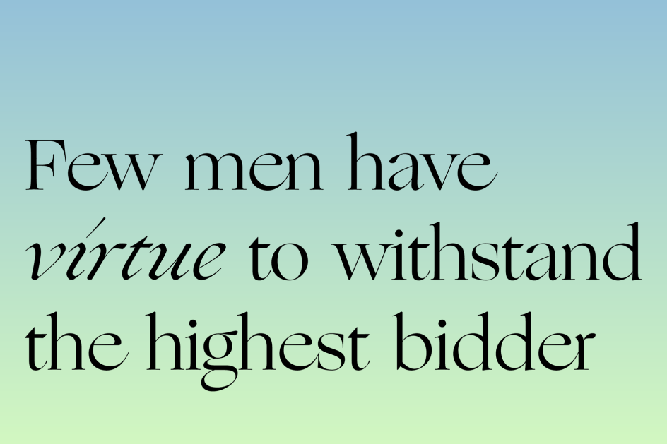
A rational serif typeface — inspired by design popular in the mid-20th-century, Harriet draws from both transitional faces, such as Baskerville, and modern faces, like Century. However, unlike these historic models, it adopts more contemporary features and finishes. Harriet also includes a set of Display styles for potential logos as well as a set of diligent and sturdy Text styles suitable for body copy.
Harriet
2. Larish Neue
RP Digital Type Foundry sells its ever-popular Larish Neue typeface, which is apparently a by-product of its Larish Alte. This version resulted from an attempt to create a contemporary looking typeface with the DNA of the original. Well, we're glad it made the cut.
Larish Neue
3. Ogg
New York City-based digital type foundry, Sharp, are the people behind Ogg, a font inspired by the hand lettering of the 20th-century book designer and calligrapher Oscar Ogg. It captures the unique mix of calligraphic and typographic form he achieved through his use of hand-carved pen nibs, brushes, and white-out. This is something we can see splashed over book covers, magazine spreads and posters.
Ogg
4. Domaine Display
The Domaine typeface family descends directly from a Hardy's logotype and typeface, which New Zealand type designer Kris Sowersby designed under direction from Adelaide-based design consultancy Parallax.
It's the largest family he's made to date, comprising 46 styles. "I learned a great deal through the development of this typeface. I realised that it’s important never to dismiss a genre. If I had ignored what I was unfamiliar with, or considered not to my taste, I might have missed out on the hidden magic in those old Latin series. Experience has shown me that often there is much to draw from a typeface or style I don’t initially find endearing. With Domaine, I wanted to design outside of my usual style and comfort zone, and to create full and elegant curves. To sum up Domaine’s style: contemporary, curvaceous Latin detailing on a Scotch skeleton."
](https://www.creativeboom.com/upload/articles/3d/3db9c1508e09ebef4a9441adf3347b1708f79e37_944.jpg)
Domaine Display in action with The Book of the Cat
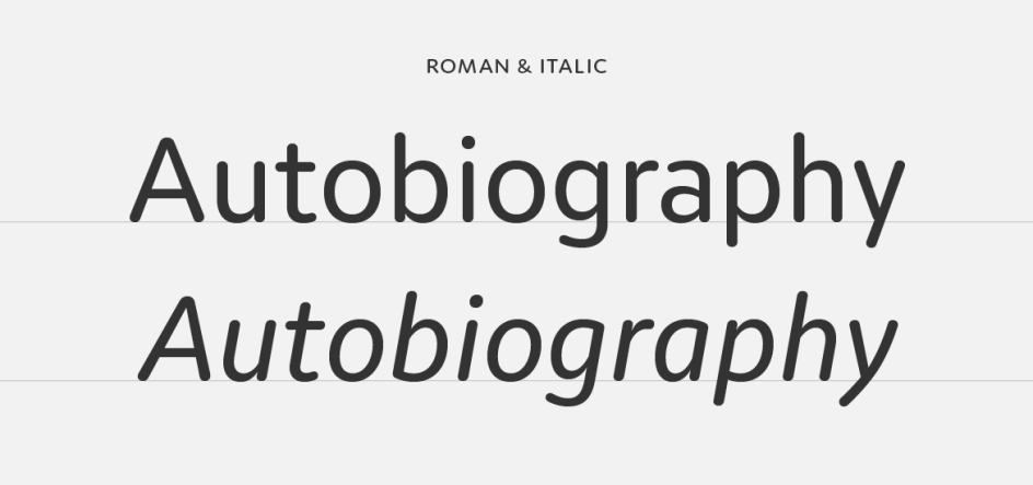
5. Transcript
In the summer of 2010 Colophon was commissioned by Daniel Baer of Studio Baer to develop a typeface for Centrefold Magazine No. 6. "The aim was to produce a headline typeface with enough distinction and strength to carry through the issue," explains the Foundry.
In early 2011 Colophon decided to re-visit this bespoke typeface and extend it into a single weight commercial release: "Whilst still maintaining the essence of the initial intention we re-purposed the single cut into a more refined commercial release. Fast-forward to 2017, and as our overall commercial library is both simultaneously expanded and re-mastered, Transcript moves with it."
Transcript now has a further five weights, 14 styles in both a proportional and monospaced families, as well as extra language support, to include both Cyrillic and Greek scripts. We think it's going to be super popular in 2018.
Transcript
6. Opposit
Opposit by the Good Type Foundry is popping up everywhere and it's easy to see why. The high contrast sans serif typeface has opposite contrasts from your average font. Designed by Kenneth Knutsen, the typeface ranges from light to heavy, making it a versatile font for your 2018 projects.
Opposit
7. Moniker
Taking inspiration from the rounded sans serifs of the last five decades, Moniker is a friendly sans by Process Type Foundry that captures the "informal tone of the genre while building on the typographic possibilities left under-explored". It's a full family with five weights, lively matching italics and small caps, making it an ideal contender for a range of design projects from wayfinding to identity work.
Moniker
8. Trade Gothic Display
If you really can't limit yourself to black and white typefaces, then we've got the solution just for you. Designed by Lynne Yun at Monotype and available via MyFonts, Trade Gothic Display is full of colour, character and charm. Perfect for display posters, advertising campaigns or publications, it's based on the Trade Gothic Condensed Heavy typeface and can really stand its own ground.
](https://www.creativeboom.com/upload/articles/f0/f0d81a4f233257589c1158372c98b7af4d5bf5fb_944.png)
Trade Gothic | Image courtesy of MyFonts
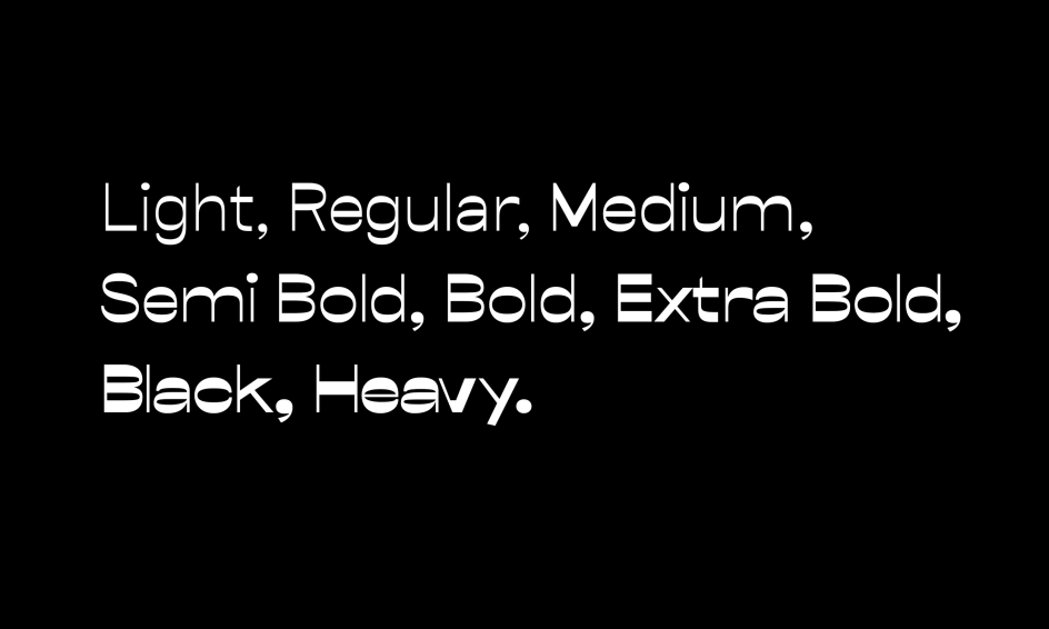
9. Mont
Mont is a new geometric sans serif by Fontfabric consisting of 10 weights from Hairline to Black. Perfect for headlines or logos, it has a prominent x-height, distinctive pointed triangular bracketed "t" and coverage of multipe OpenType features. We think this is going to be huge in 2018.
](https://www.creativeboom.com/upload/articles/8c/8cb49668eb05b1802c9bd5f68353e8a52ddbdb7d_944.png)
Mont | Image courtesy of MyFonts
10. Noe Display
Brought to you by Schick Toikka, one of our favourite foundries, Noe Display is an expressive serif display type bursting with personality. "It speaks with clarity and confidence," says Schick Toikka, "But the point isn’t simply to shout. Its strong will is tempered by a graceful discipline."
Noe Display
Further Information
This article was written by Anthony Wood, who is the Managing Director of Shillington. With 15 years of experience in design and a long stint of freelancing in Sydney and London, he relished the challenge of joining the international design school in New York City. He likes to write about design, entrepreneurship and learning.


](https://www.creativeboom.com/upload/articles/7a/7a527d53fefe4f354e8489365e89db422567f281_732.jpg)
. In use by [Garbett](https://garbett.com.au/) for Career Trackers](https://www.creativeboom.com/upload/articles/0f/0f4e193ba9164073646e67421eb37b4b26986c67_732.png)
 using <a href="https://www.ohnotype.co/fonts/obviously" target="_blank">Obviously</a> by Oh No Type Co., Art Director, Brand & Creative—Spotify](https://www.creativeboom.com/upload/articles/6e/6ed31eddc26fa563f213fc76d6993dab9231ffe4_732.jpg)