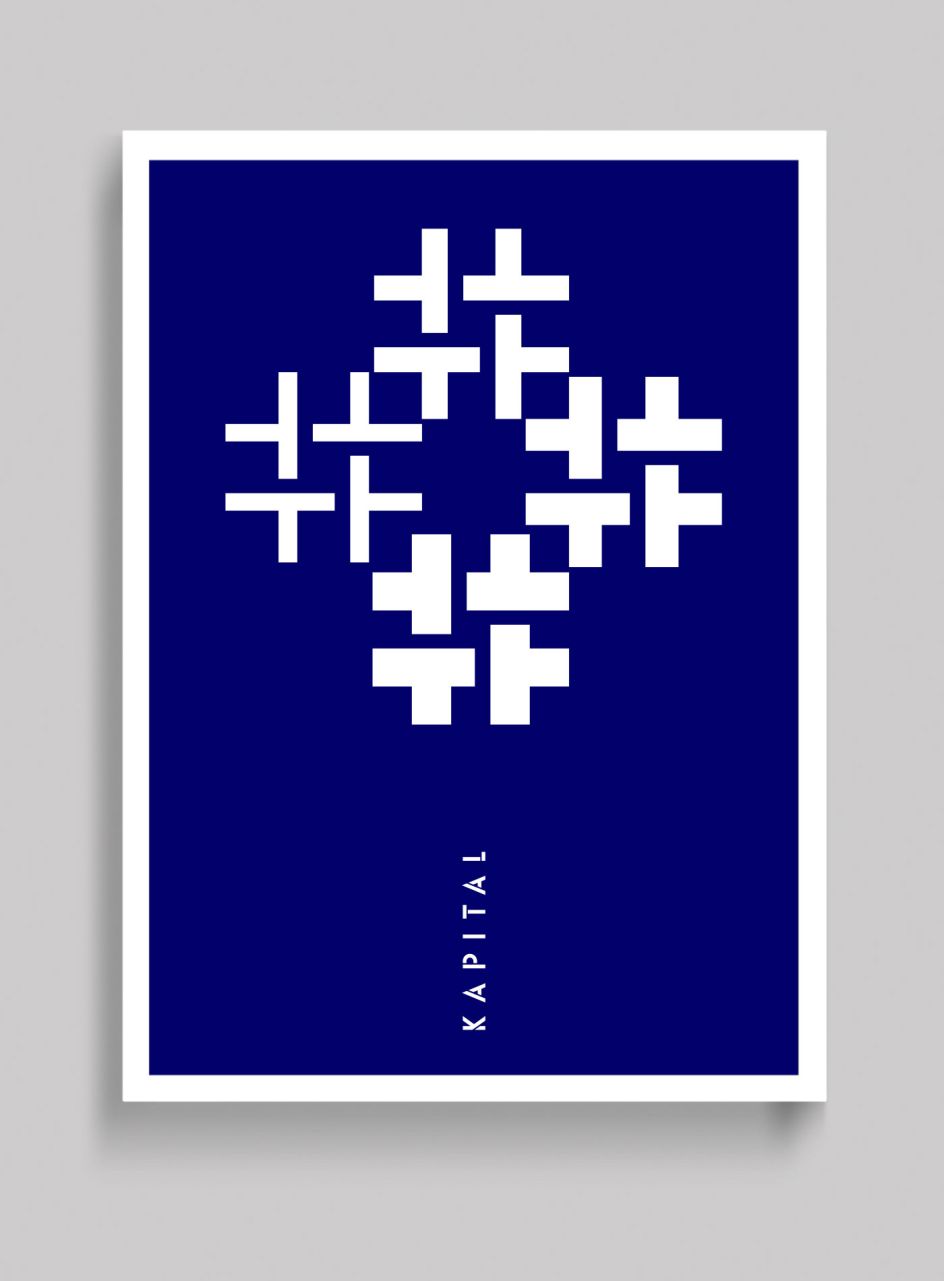
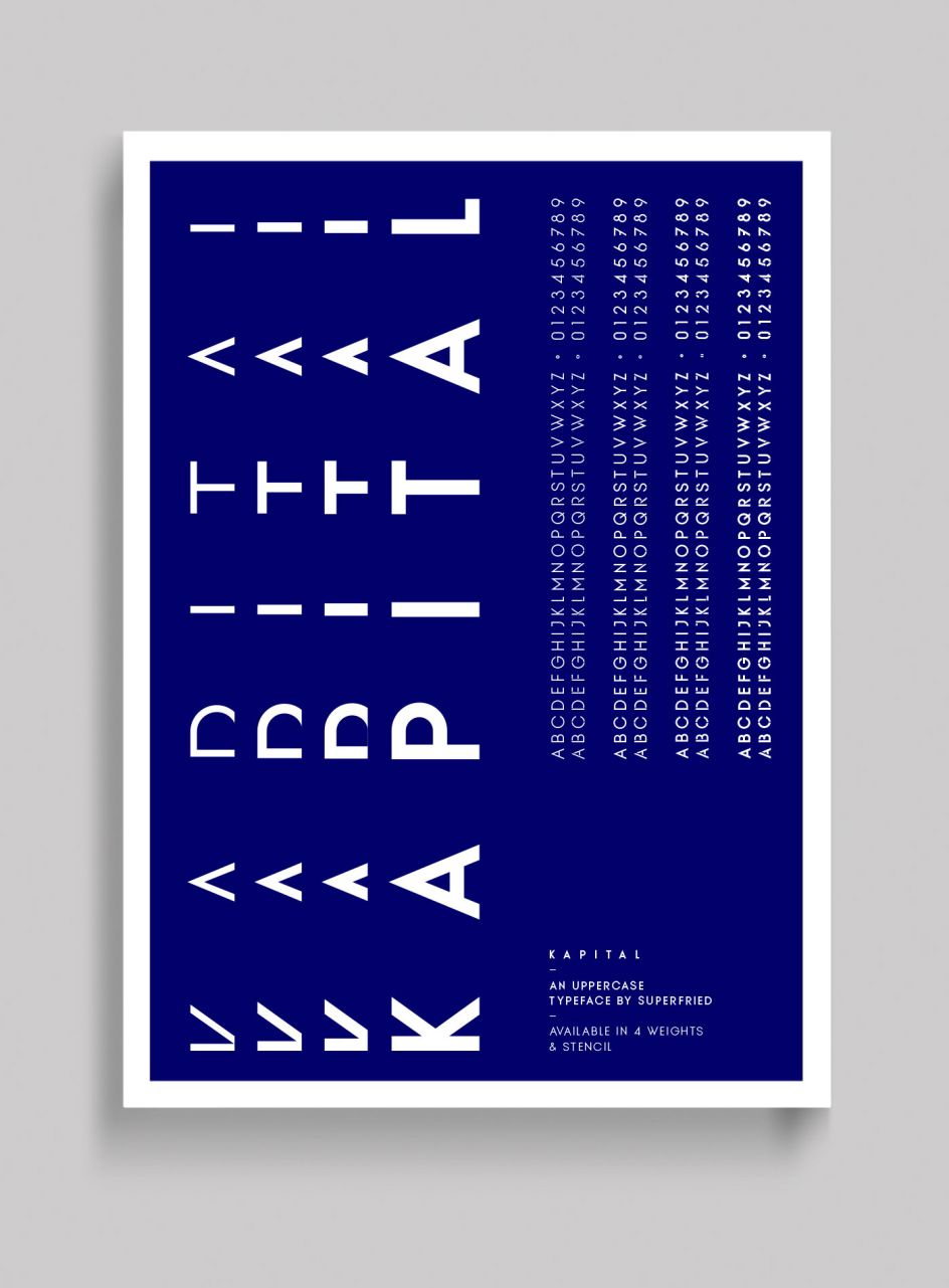
Kapital: A new elegant, geometric uppercase typeface in four weights courtesy of Superfried
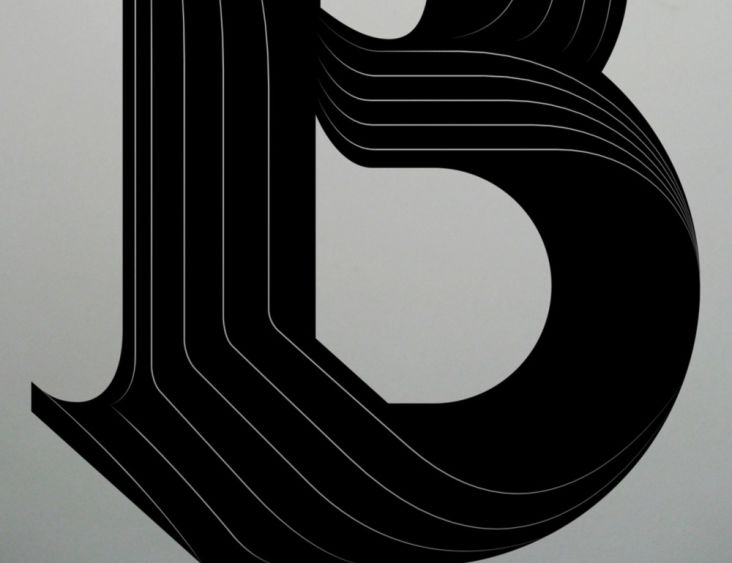
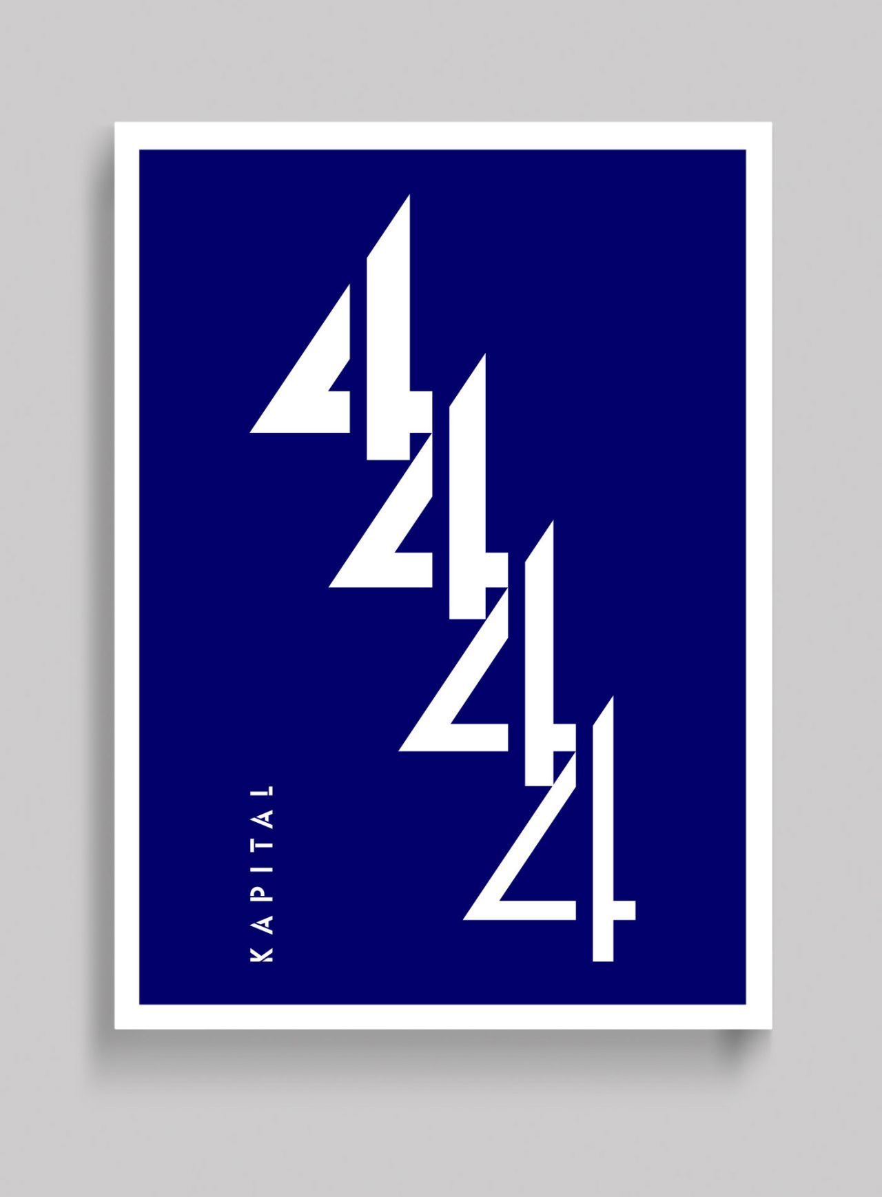
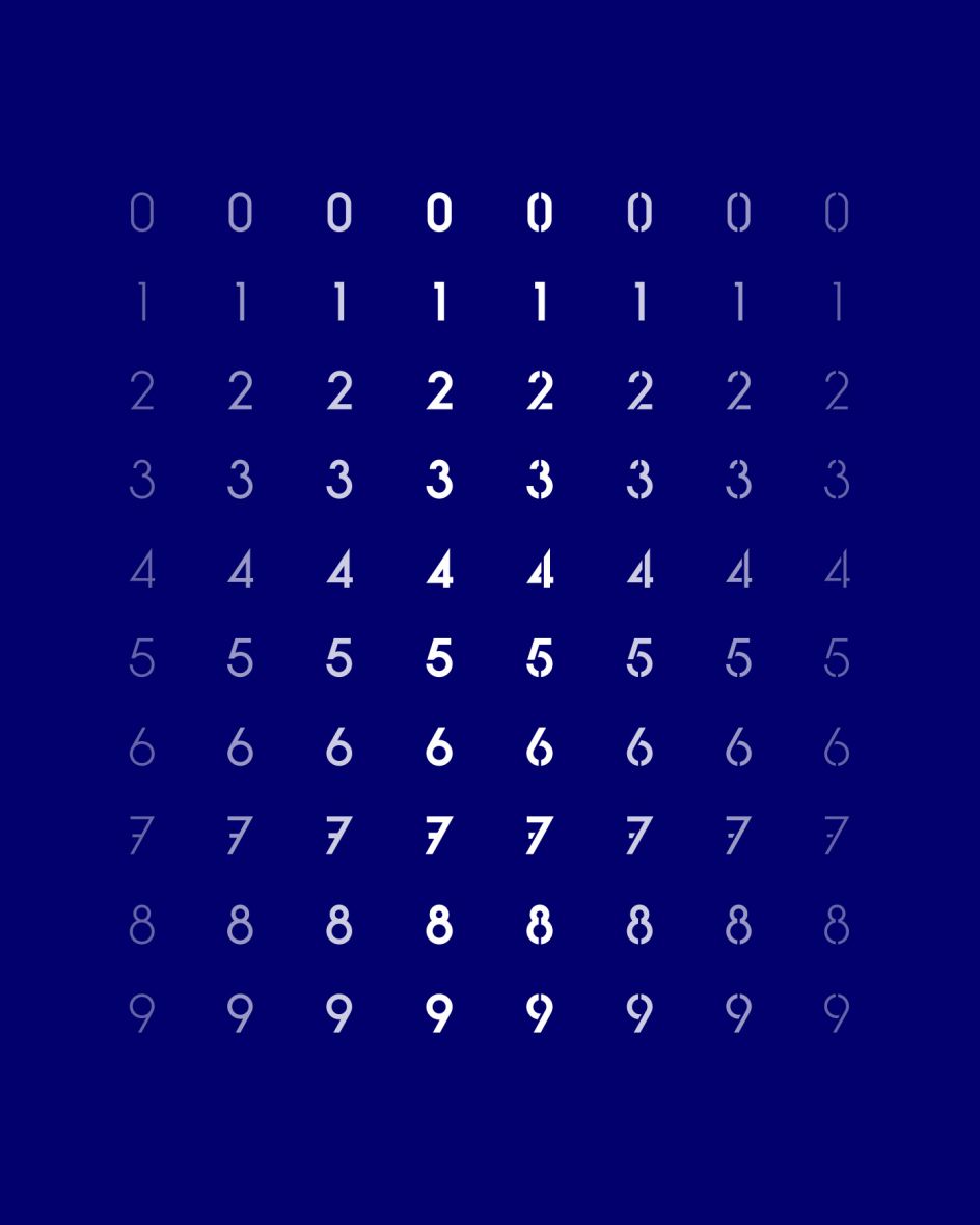
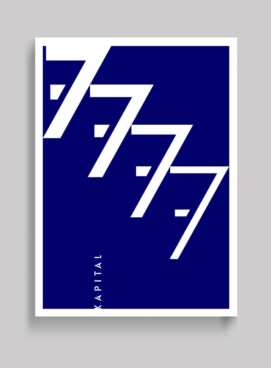
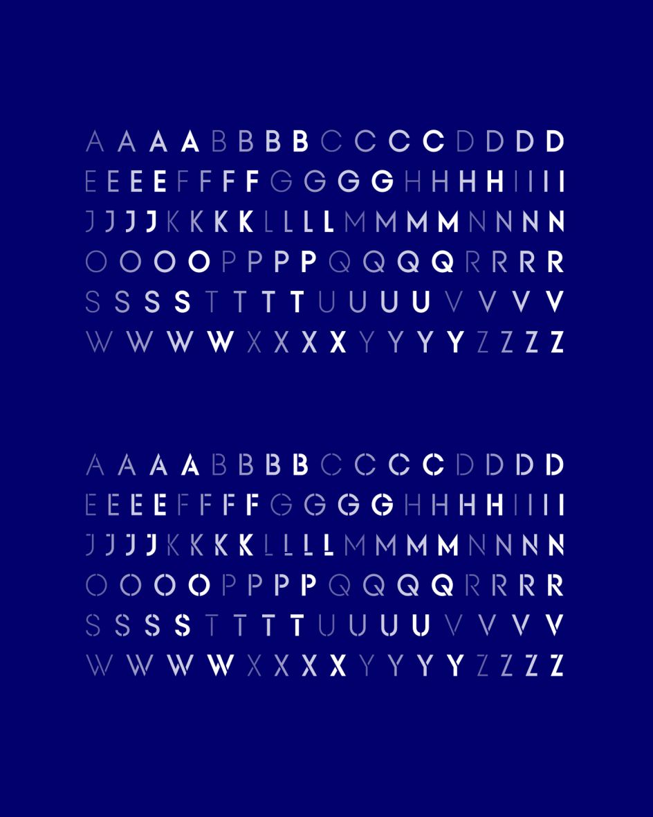
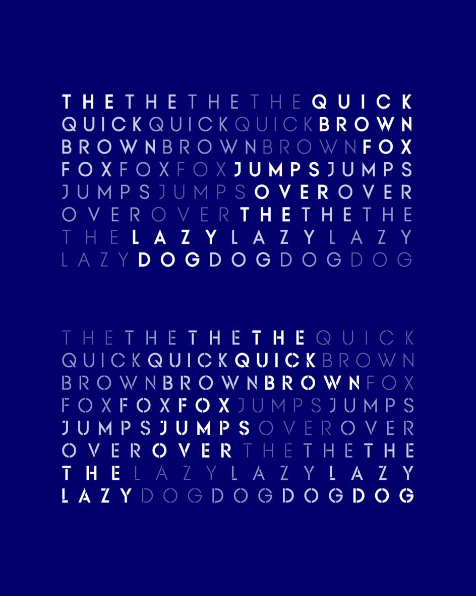
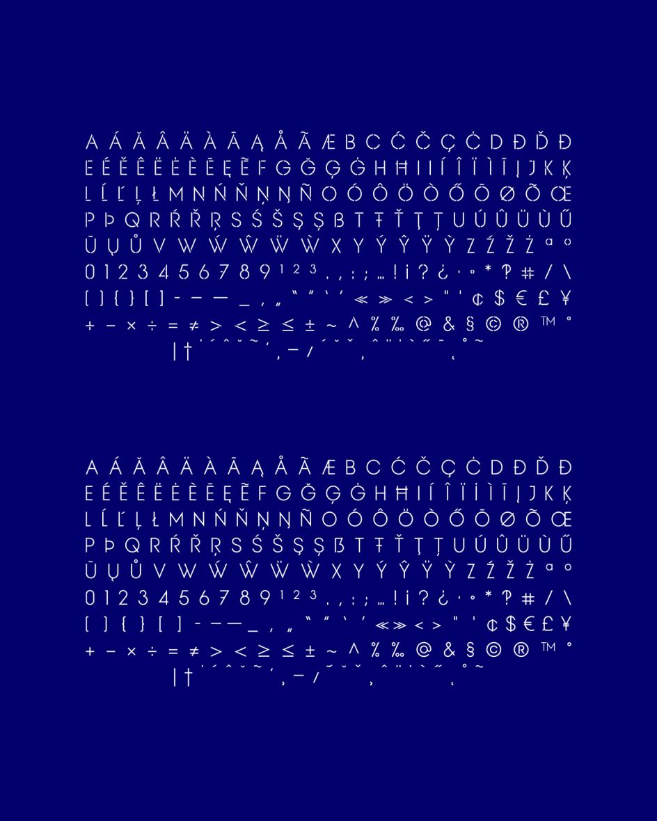
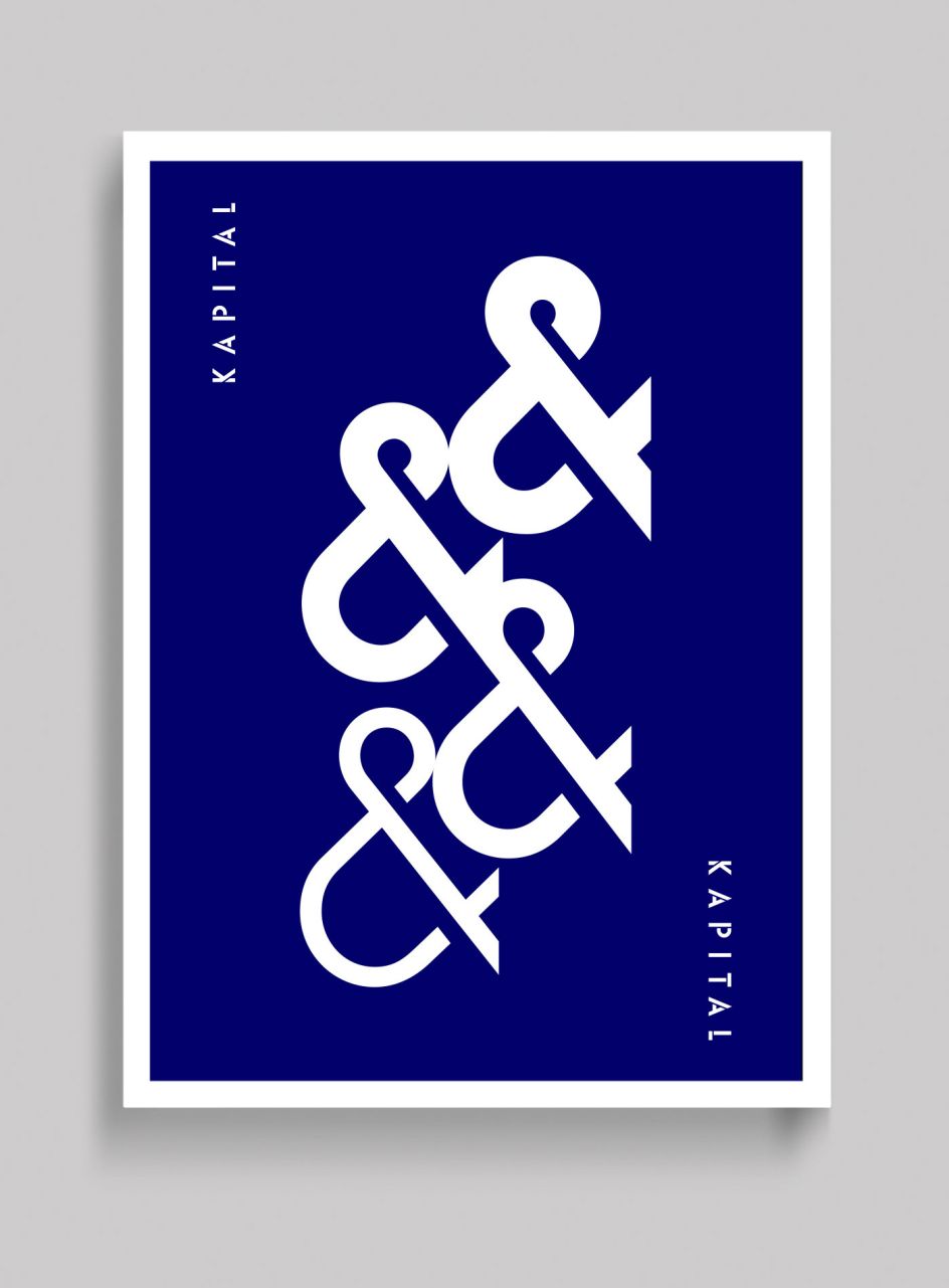
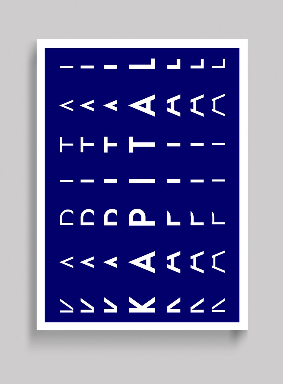
Mark Richardson, aka Superfried, has created Kapital, an elegant geometric uppercase sans, available in standard and stencil style across four weights – light, regular, medium and demi – covering 346 glyphs.
All images courtesy of Superfried
Based on the capital character set from a previous release – Basik, it continues the clean, geometric aesthetics but has been refined further to create a more minimal style. "This enabled the characters to discreetly perform their role," explains Mark, "to simply convey the message of the writer without distraction."
"To achieve this," Mark adds, "special attention was applied to the form consistency of the glyphs across the weights and negative space throughout. In many typefaces, as the weight is increased the form and style can deviate significantly from the original design. With regards to negative space – although inevitable – wherever possible key letterforms were adjusted to alleviate this."
Available at YouWorkForThem and MyFonts. Or visit superfried.com.
Editor's Picks


Trending


Podcasts


Editor's Picks
Further Reading