BLK LTR Series: Typographic experiment with Type Travel – Century 12 to 21
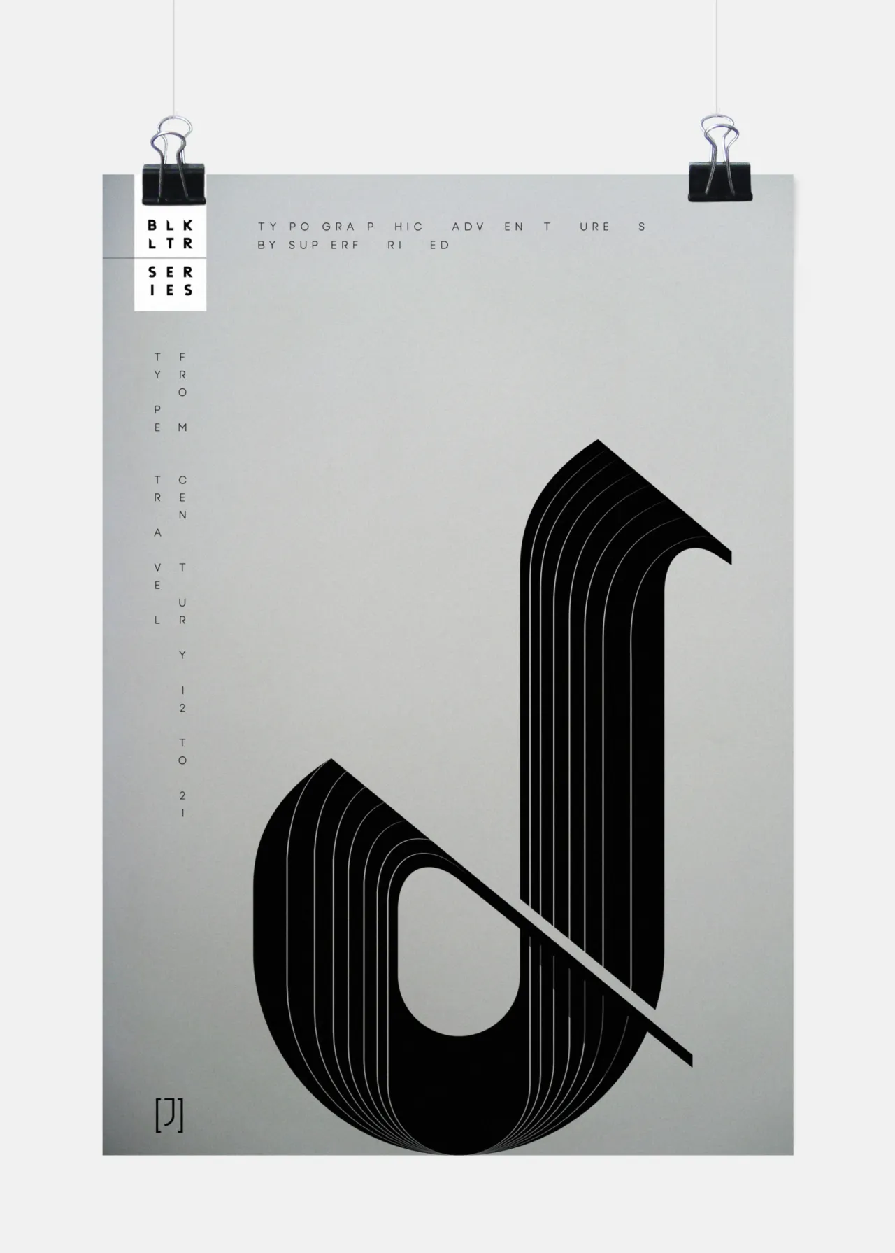
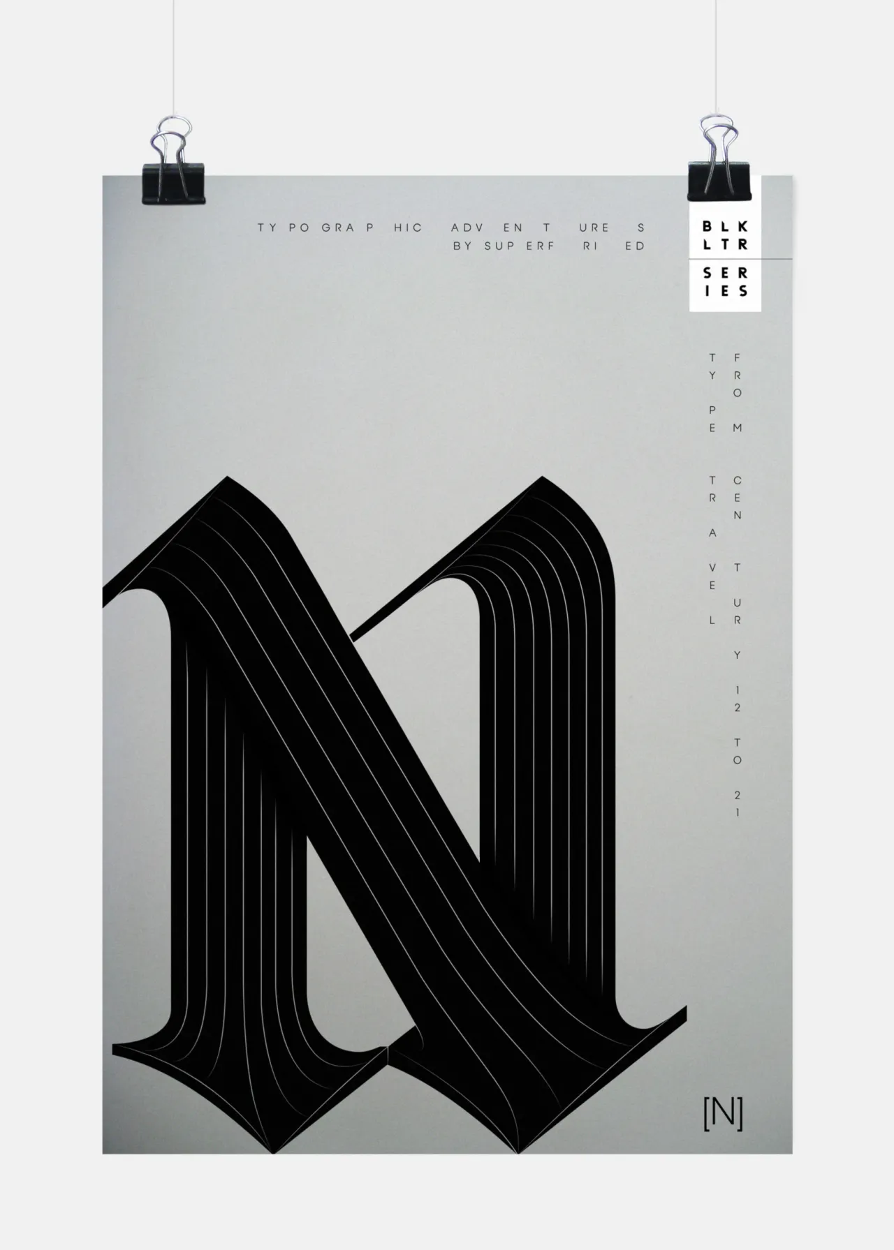
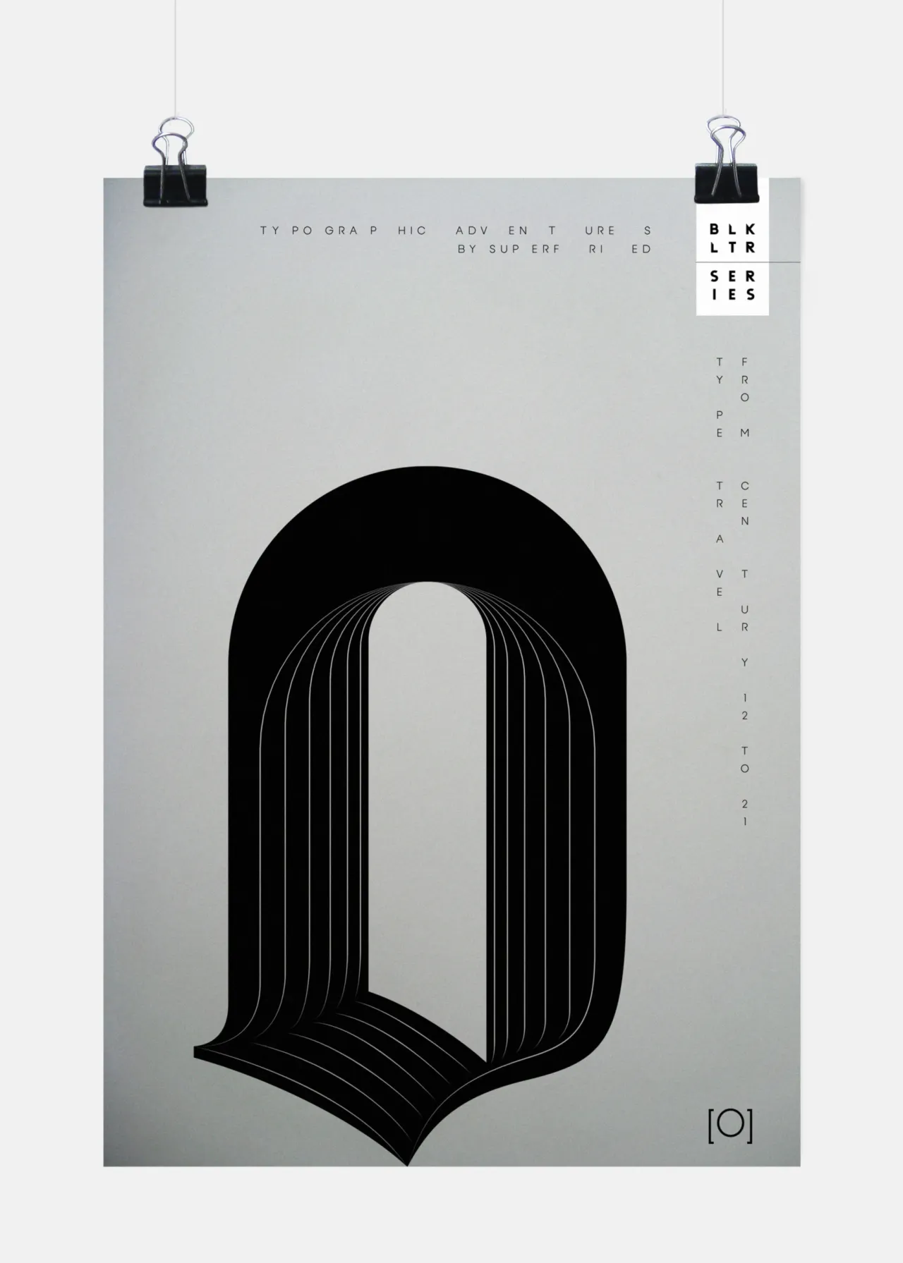
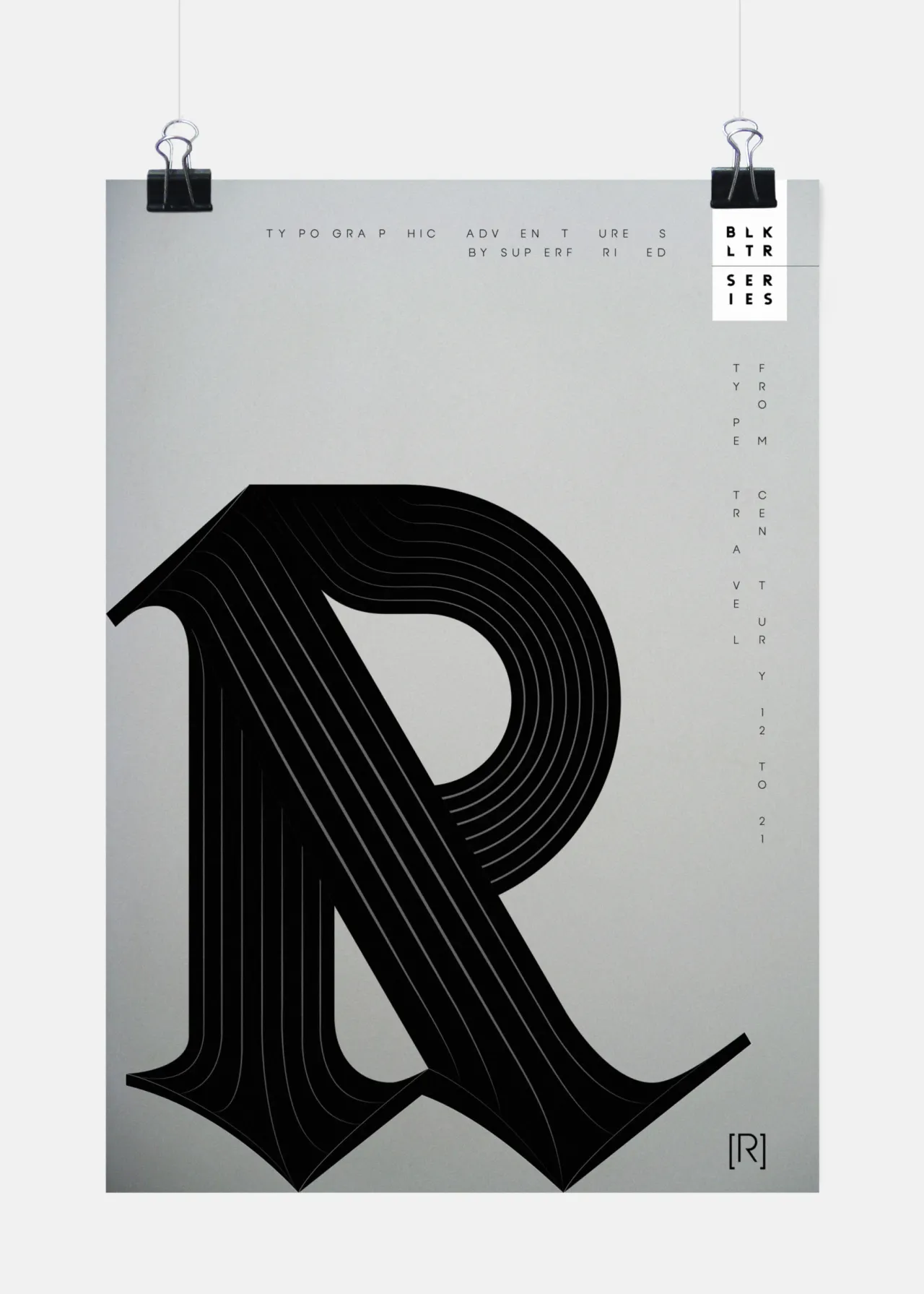
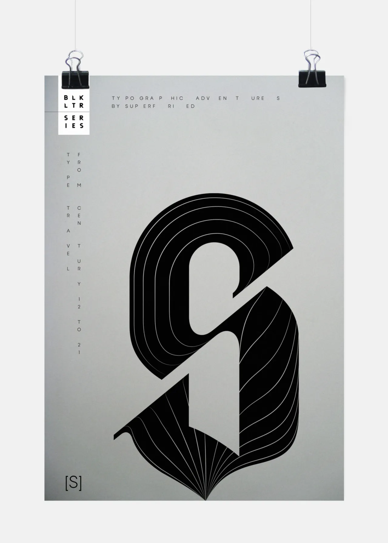
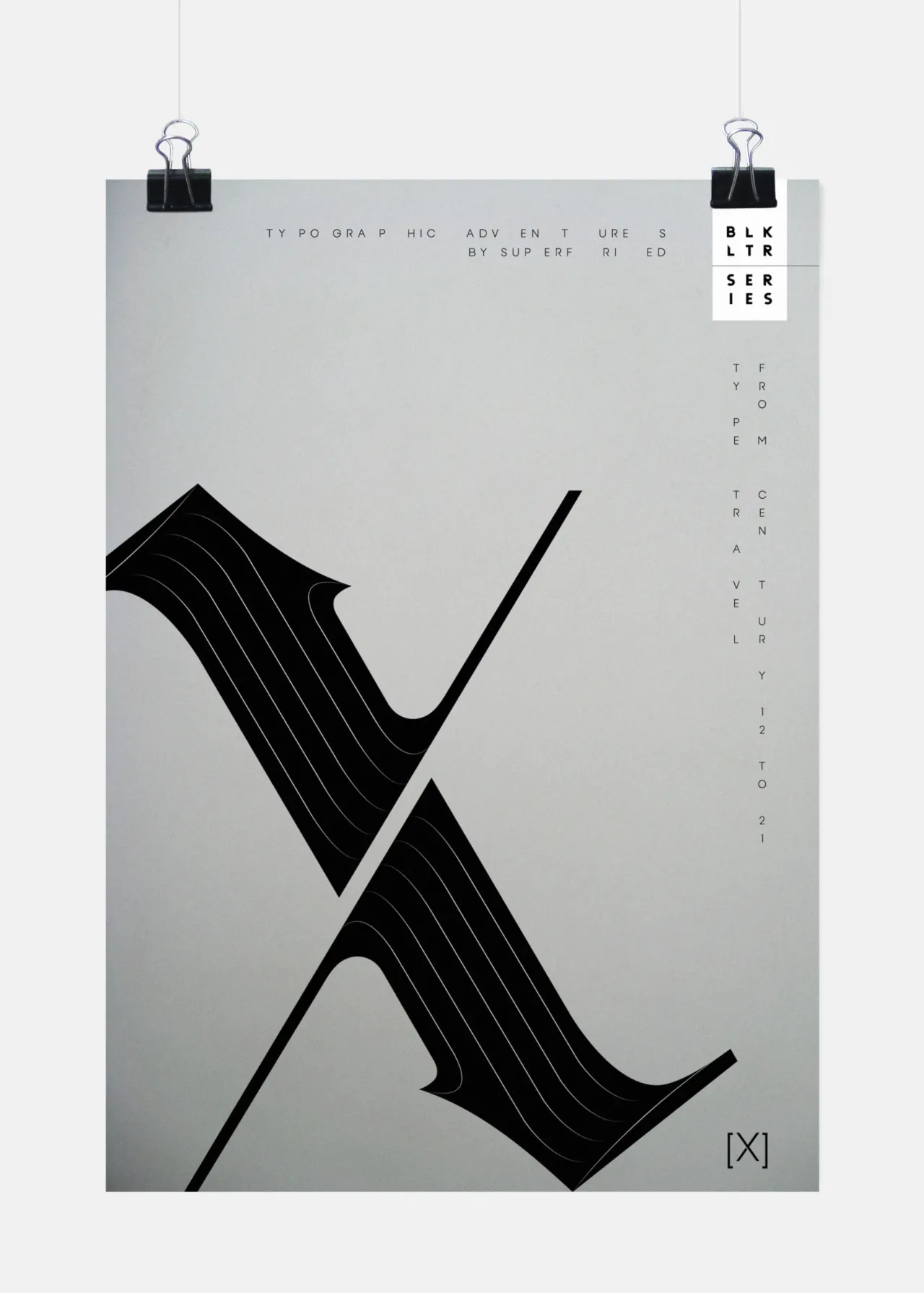
Whilst contemplating a blackletter typeface for a recent project, Mark Richardson of London studio Superfried had forgotten how illegible the uppercase characters tend to be. This led to the idea of a personal project developing new, experimental, yet completely legible characters based on the signature blackletter forms.
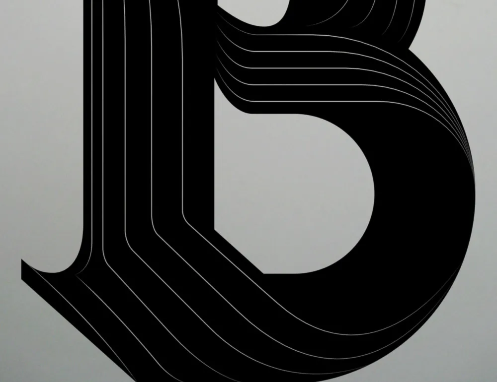
Rather than approaching the project like a typeface, each character has been developed in isolation as a one-off. Mark explained: "This eradicated any potential constraints allowing the distinct blackletter characteristics to lead as the shapes were combined to develop each specific glyph. Once each letterform was complete, experimental paths were employed to suggest depth, flow and optical ambiguity."
Based in London, Mark of Superfried designs and develops graphic based solutions for screen and print. The diverse work reflects the clients, who vary in sector and scale from start-up to multinational. Since 2007 Superfried has worked closely with its clients to create bespoke solutions for a wide range of projects, with an emphasis on brand identity, experimental typography and illustration.
A passion for type has inevitably led to the development of his very own typefaces. To date Superfried has released 15 families featuring 29 fonts. They are available through Hype for Type, MyFonts and You Work for Them.
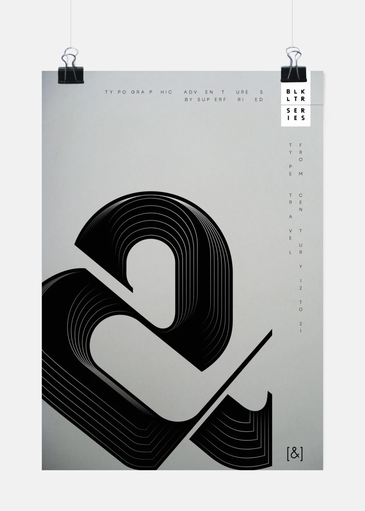
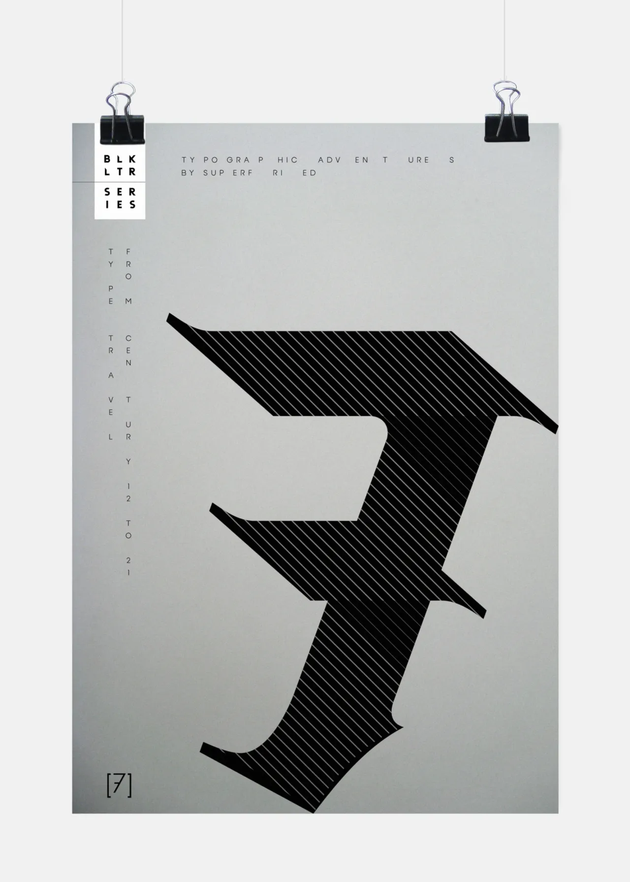
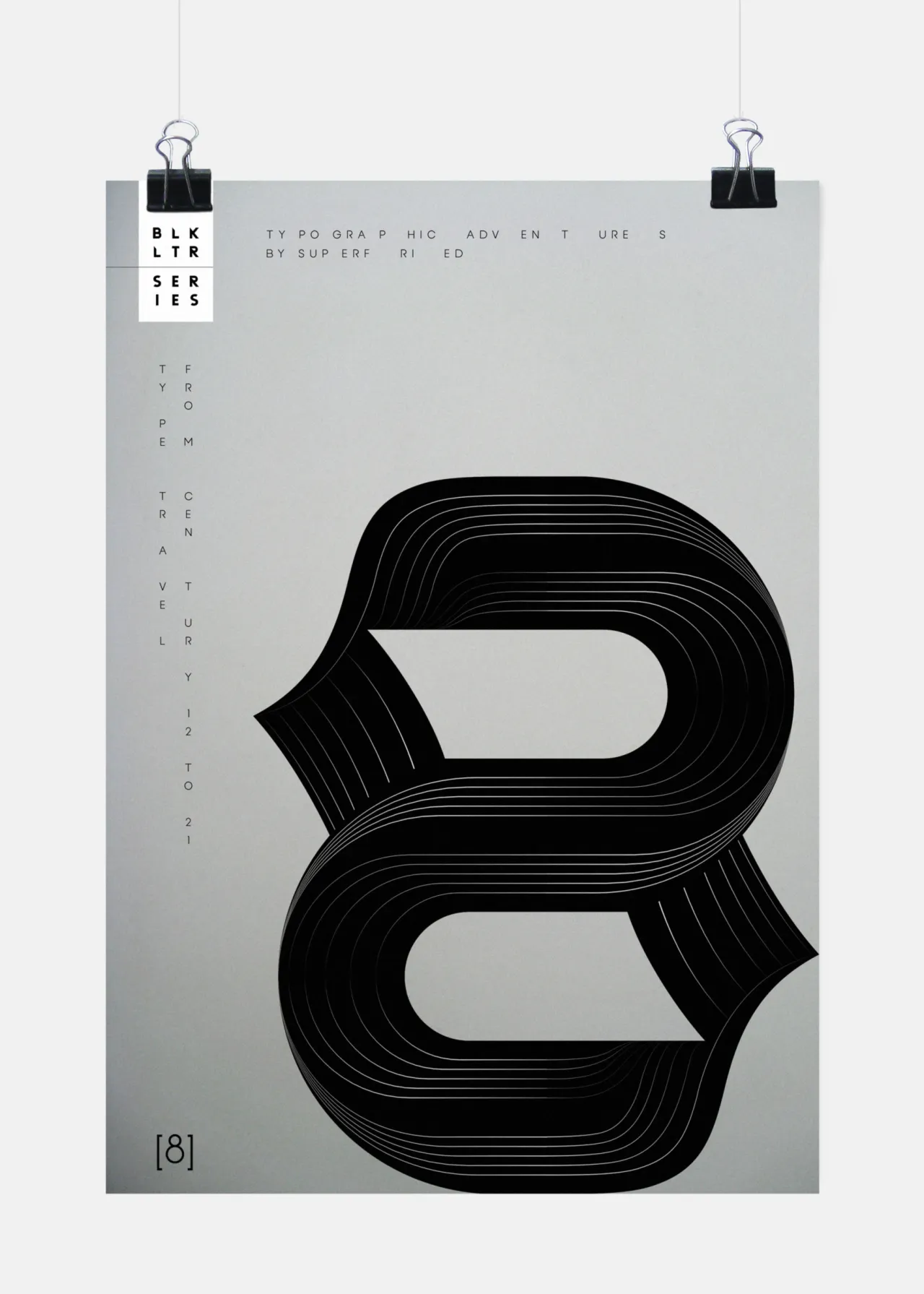
![Poster featuring an experimental blackletter letterform "B" with flowing lines and striped texture, held by two black binder clips against a light grey background, with vertical text on the left side and [B] marker at bottom](https://media.creativeboom.com/2c5a942c-18c0-401e-b30b-eb4ef4ce19a7/conversions/b9605eebf2d1da03138c3e958ca6f3e1c2c88abb-medium.webp)
Editor's Picks





Trending






Latest Jobs
Account Manager at BUILDHOLLYWOOD
Full-time·London·£34k–£38k
Graphic & Motion Designer at The SHARP Agency
Full-time·Leeds·£26k–£33k
Design Director, Opinion at The New York Times
Full-time·New York·$160k–$180k
Project Manager at A Practice for Everyday Life
Full-time·London·£37k-£46k
Creative Project Manager at Analogue
Full-time·Leeds·£28k–£35k
Senior Front End Developer at Crown Creative
Full-time·Belfast·£50k–£60k